Five design tips for productive meeting spaces
Comfortable meeting spaces are more important than ever in the modern hybrid office. With many shapes, sizes and guises from private catch-up lounge to open-plan conference area, here’s how they work.
mayo 9, 2023 | 10:00 pm CUT

The world of work is changing has changed – goes the edited maxim. Whether working from a home office, in-office work pod or acoustic furniture arrangement, solo tasks can now be gifted with quiet privacy rather than the raucous mayhem of the office floor. But the need to meet is still ingrained in the way we work – collaboration being key to motivation, creativity and innovation, and building better social relationships with our co-workers makes working relationships easier.
"
The need to meet is still ingrained in the way we work
As the calendar-Tetris process of building a hybrid schedule that works for all parties settles down, employees are starting to shed their ‘could have been an email’ approach to face-to-face meet-ups, treating them with more respect and possibly even excited anticipation. Here are five ways to ensure our meeting spaces live up to the hype.


Design flexible meeting areas rather than confined rooms
Instigating a more positive relationship with meetings, the post-COVID workplace features specifically-designed spaces of all shapes and sizes for those meetings to happen. By rearranging modular furniture in flexible open spaces instead of one-size-fits-no-one conference rooms – like employees at the Tezign office in Shanghai, China, who are able to ‘choose different spatial types according to the nature of their work,’ according to architects XFRAME – and combining sliding wall partitions like dormakaba’s Moveo walls, with modular seating, we can extend or multiply meeting spaces as size requirements see fit. Serving anything from weekly, monthly or even annual departmental reports, or previously exhausting multi-day workshops, with either more spacious or less cavernous environments.

Encourage sharing with privacy and comfort
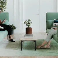
For smaller, quicker meeting spaces, meanwhile, unannounced desk visits from overbearing managers – open for all the office to hear – can be replaced with more acoustically-private one-to-ones with the use of sound-enclosing furniture like the Cabana Lounge series from Haworth, or with standalone meeting pods or booths like those in the Ghobadian office project in Tehran, Iran by Persian Garden Studio.

The importance of feeling comfortable while at work has never been better understood than it is now, with manufacturers like Boss Design focussed on bringing comfort to workplaces with home-inspired collections like the Ola Tub chair, and the offices of UK post-production studio Black Kite, providing comfortable break out spaces that feel more like a psychiatrist’s office, alongside the cabin-fever atmosphere of enclosed edit suites.


Improve meeting spaces by naturally controlling light and air quality
Although scheduling meetings directly after lunch is a productivity no-no, the busy time-zone-hopping nature of international business often makes drowsy get-togethers unavoidable. With soft lighting sending attendees to sleep and harsher lighting bringing on a headache, natural light is a key component. When you fill a confined space with people, however, especially alongside the warmth of the early afternoon sun, heat and humidity rise while air quality drops. Alternatively, large, openable windows like those at the Roovice office in Yokohama, Japan, can draft in energising air."
The busy time-zone-hopping nature of international business often makes drowsy get-togethers unavoidable
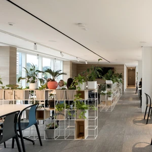
At this coworking [hub] in Uzbekistan, meanwhile, [a:kitekt] has improved the working environment’s air quality and wellness on a budget by filling space-dividing shelving with foliage, like the iPot Ad Hoc system from iPot, which fits either a shelf or a living pocket inside each square section. Mixing storage, partitioning and biophilic design.

Ensure everyone can be heard and understood
Presentation technology has come a long way in recent years, making it even easier to explain complex strategies to colleagues across both space and time. When we do have the opportunity to get together in the same room, however, there’s no better way to explain a concept than by writing it down. The Flomo wall system from wp_westermann products includes removable whiteboards for taking diagrams and ideas with you, while the frames they sit in can slide to rearrange ideas as they take shape."
There’s no better way to explain a concept than by writing it down
Colourful meeting spaces at the Shopify offices in Berlin, meanwhile, are defined by curtaining which can be drawn to reveal writeable surfaces underneath. For an idea to be understood, however, it must first be heard. Johanson Design’s sound-absorbing acoustic panelling Decibel ensures presentation information is kept clear and unaffected by outside influence.


Decorate identifiable meeting rooms to inspire and energise
The colourful be-curtained extremities of Shopify’s Berlin offices seem to go against common design rules for meeting rooms. Ignoring the overly-sensitive call for neutrality, the spaces are defined by their colour, with calming tan, dusty pink or duck-egg blue areas invoking relaxation, and brighter yellow and orange encouraging excitement and energy.While colour offers a simple way to identify meeting rooms of variable size and use, and keeps a company’s office booking system simple to use, photographic wall coverings are a more creative way to separate individual rooms. Redfort’s Dedots wall covering even allows office owners to change its pixelated image by returning, rearranging and recycling its pixels.
© Architonic
Head to the Architonic Magazine for more insights on the latest products, trends and practices in architecture and design, or find inspiration in a whole world of projects from around the globe through ArchDaily’s architecture catalogue.
Galería de proyectos


