Four tunnels brought to life with absorbing interiors
Texto por James Wormald
31.08.22
The dark, unwelcoming atmosphere of a tunnel can make them hard to use as interior spaces, but as these refreshed underground passageways prove, there’s light to be found at the tunnel’s end.
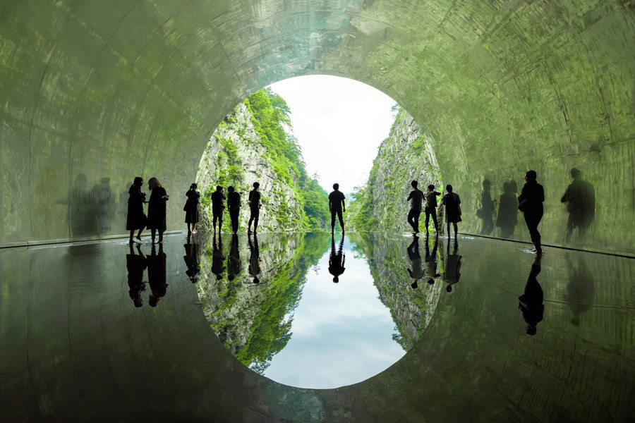
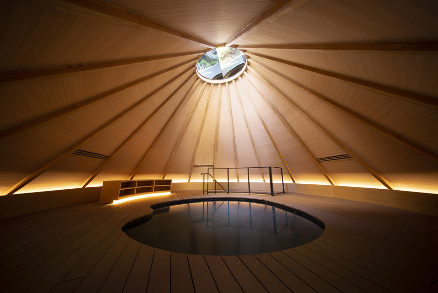
A fitting finale in the Kiyotsu Gorge Tunnel’s 750m-long passageway, the Light Cave rewards visitors by reflecting the landscape across its steel walls and shallow water. Photo: Nacasa & Partners Inc

A fitting finale in the Kiyotsu Gorge Tunnel’s 750m-long passageway, the Light Cave rewards visitors by reflecting the landscape across its steel walls and shallow water. Photo: Nacasa & Partners Inc
×Are you afraid of the dark?
After visiting Punchdrunk’s immersive theatre experience Tunnel 228, deep in the catacombs underneath Waterloo Station in London, UK, I learned that I most certainly was. Unused for decades prior – said to have previously been occupied by a morgue – the tunnels’ Victorian architecture and lack of natural light gave the scene a dark and eerie character.
With actors and artists performing strange and chilling activities whilst mingling amongst a masked free-range audience, Punchdrunk tapped into humans’ natural fear of the dark and used it for theatrical effect. But it’s not the only project to realise the awaiting capacity of these long-forgotten subspaces. Add a little light and give them a sweep, and tunnels become much more welcoming.
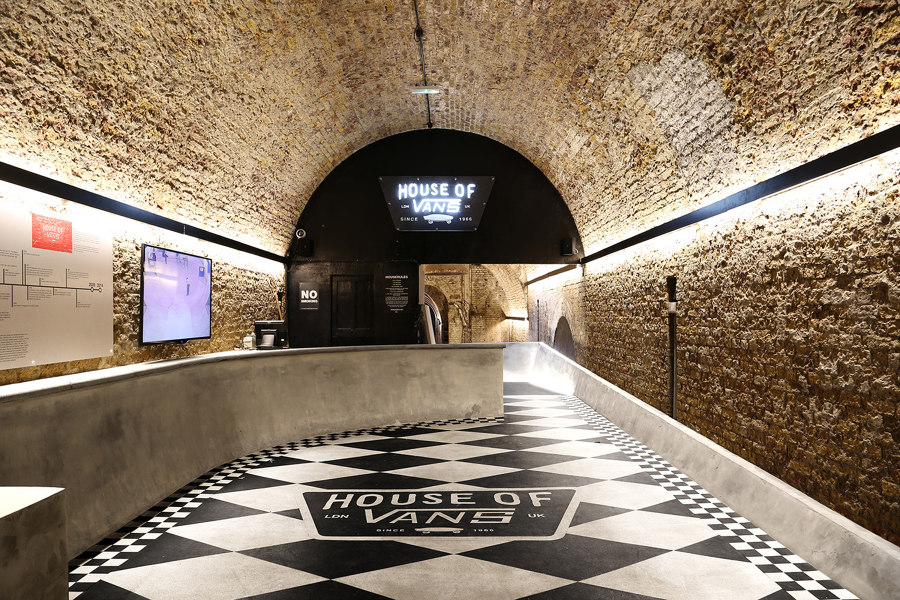
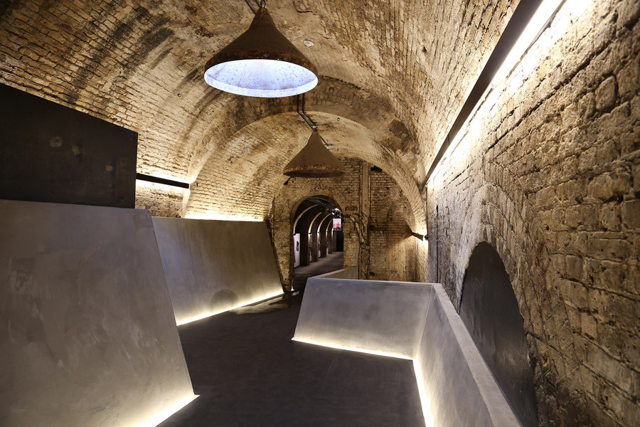
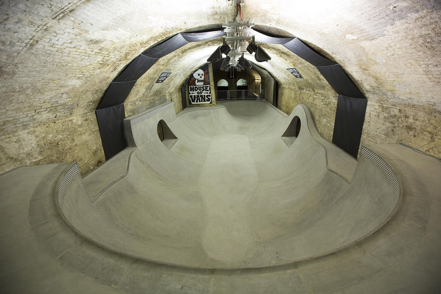
Set underneath Waterloo Station’s rail lines in London, UK, House of Vans greets boarders with concrete details (top, middle), before dropping them into the real thing (bottom). Photos: Tim Greatrex

Set underneath Waterloo Station’s rail lines in London, UK, House of Vans greets boarders with concrete details (top, middle), before dropping them into the real thing (bottom). Photos: Tim Greatrex
×House of Vans in the Waterloo Station tunnels, London, UK, by Tim Greatrex
On the same site as Punchdrunk – taking up Tunnels 228-232 – House of Vans utilises the underground space as a celebration of the skateboard counterculture synonymous with the brand. In an area of London known for celebrating the creative, expressive and artistic side of graffiti, the brand – unlike the theatre company – moved away from the tunnels’ historic darkness, filling the five sections with good lighting and good vibes.
With a three-tiered skate park waiting in the two furthest tunnels, visitors’ initial experiences of the space are defined by the use of iconic skate park forms and materials. Concrete ramps, banks, pipes and transitions are peppered amongst the venue’s entrance area, bar and cafe, all serving to whet visiting skaters’ appetites with anticipation.
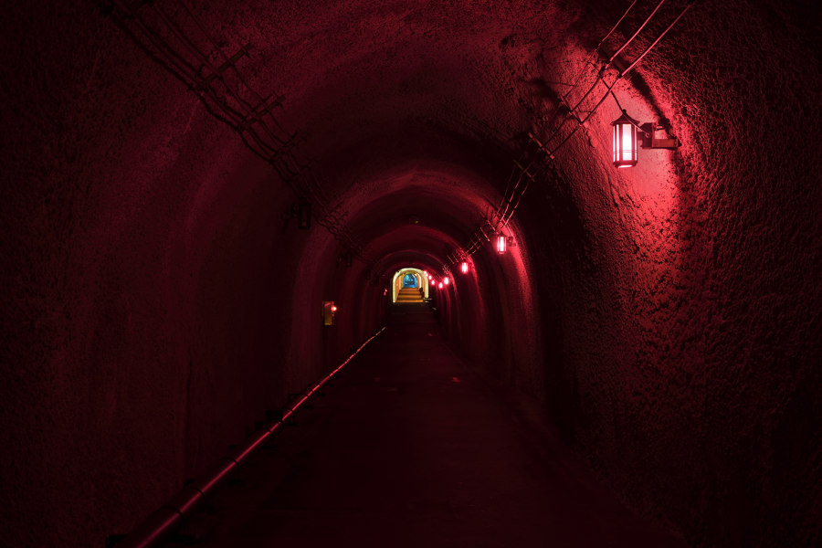
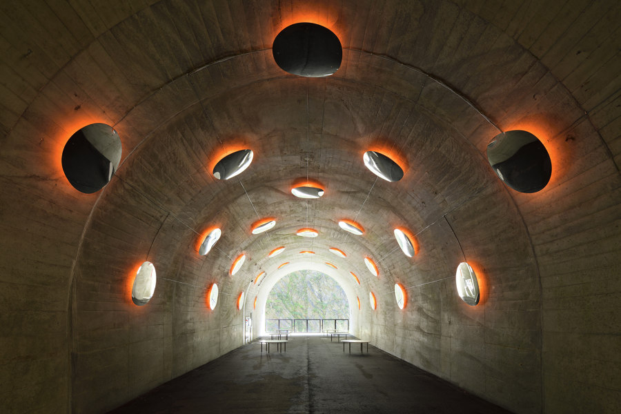
Meditative space Periscope (top), Expressions of Color light tunnels (middle) and convex mirrors in Drops (bottom) added to the natural pull of the Kiyotsu Gorge Tunnel. Photos: Nacasa & Partners Inc

Meditative space Periscope (top), Expressions of Color light tunnels (middle) and convex mirrors in Drops (bottom) added to the natural pull of the Kiyotsu Gorge Tunnel. Photos: Nacasa & Partners Inc
×Tunnel of Light in the Kiyotsu Gorge Tunnel, Echigo-Tsumari, Japan, by MAD Architects
While the House of Vans project takes the naturally dark environment of a subterranean tunnel and utilises it to transport visitors to an alternative world, the artistic installations in the Kiyotsu Gorge Tunnel of Light, by MAD Architects, encourage visitors to appreciate the real natural world around them. Built for visitors of the nearby Kiyotsukyo hot spring to appreciate the gorge after a rockfall made its previous climbing path unsafe, the 750m-long passageway forks at three points, each ending with panoramic views across the drop, before curving back on itself to view the entire chasm as one.
Each of the three lookout points is defined by its own creative artworks and fed by coloured tunnel lighting, while the passage’s cultural culmination is a stainless steel-walled Light Cave. Reflecting the image of the gorge back onto its walls and shallow water feature, the Light Cave enables visitors to mysteriously change the landscape’s reflection as they near the tunnel’s edge.
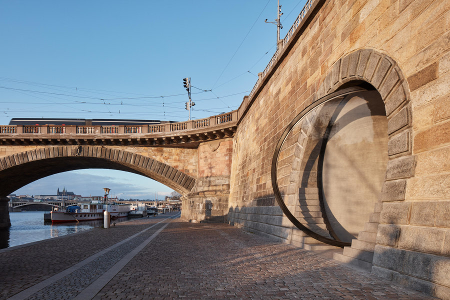
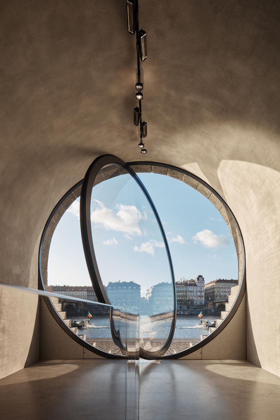
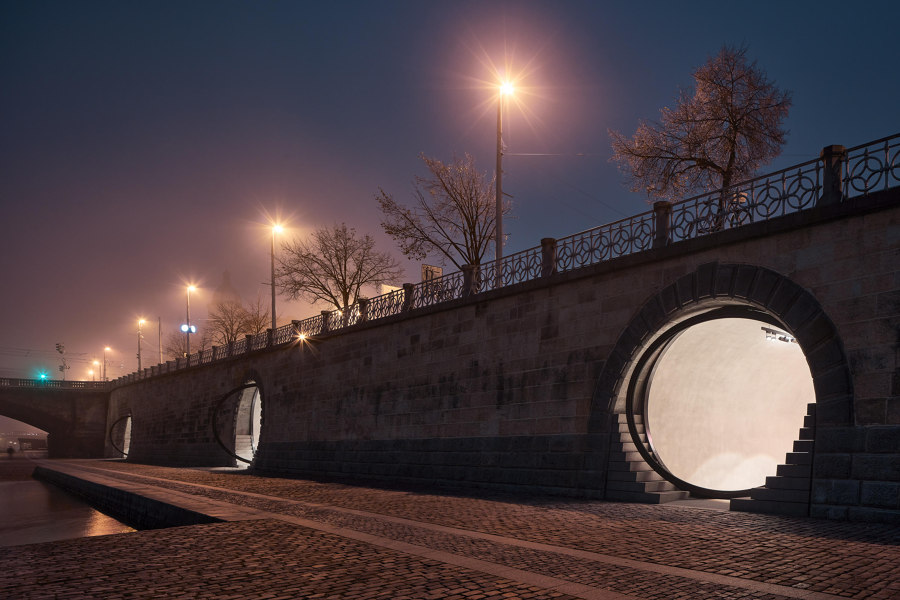
Unused tunnels in Prague’s waterfront walls were exchanged for customisable units, with iconic pivoting glass doors making a feature of their circular entranceways. Photos: Boys Play Nice

Unused tunnels in Prague’s waterfront walls were exchanged for customisable units, with iconic pivoting glass doors making a feature of their circular entranceways. Photos: Boys Play Nice
×Revitalisation of Prague riverfront in Prague, Czech Republic, by Petr Janda / Brainwork
The natural beauty of water will always call visitors to walk alongside it. On Prague’s riverfront, however, the enriching waterside walk was being ruined by parked cars and ageing architecture with little attraction. In 20 of the riverside wall’s tunnels – vaults previously used to store ice – the metal security entrance grates were knocked through and rebuilt with identifiable circular entranceways, served by glass doors pivoting on their axes.
With more foot traffic encouraged to take the peaceful waterside route, the 20 vaults were made suitable for a variety of uses, including private businesses like cafes, bars, studios and galleries, as well as public services like a library, community hub and public toilets. Because although the call of nature is strong, and sometimes not welcome, it’s always hard to ignore.
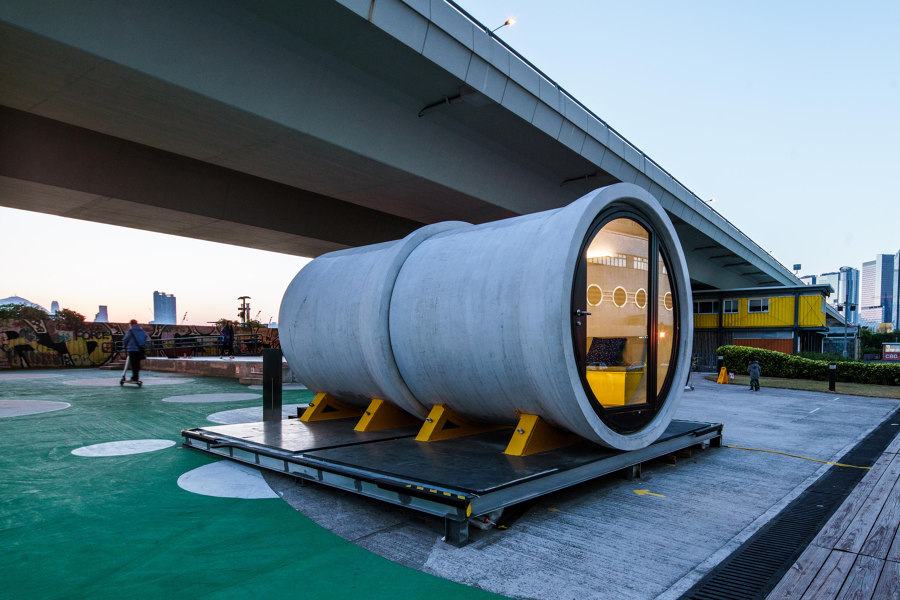
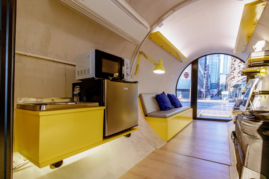
The OPod Tube social housing concept uses concrete water pipes to form quick but comfortable micro-homes for short-term use. Photos: James Law Cybertecture

The OPod Tube social housing concept uses concrete water pipes to form quick but comfortable micro-homes for short-term use. Photos: James Law Cybertecture
×OPod Tube House in Hong Kong by James Law Cybertecture
The OPod Tube Housing project, by James Law Cybertecture, is a concept for large-scale social housing projects, using concrete water pipes as small-scale temporary living spaces. The benefit of the uncommon residential shape, is that cylinders are naturally self-supportive structures, yet can be stacked and arranged efficiently and aesthetically, and are quick and simple to manufacture and install, as well as to move and reinstall elsewhere.
The drawback, of course, is attempting to arrange modern furnitures and fittings – designed with flat walls in mind – to fit efficiently against curved walls. To counter this, the tube interiors are split into thirds inside. A levelled-off central path gives enough headroom to stand comfortably while two serving thirds, needing less foot or headroom, are installed with custom-built furniture and storage alongside.
© Architonic
Head to the Architonic Magazine for more insights on the latest products, trends and practices in architecture and design.
