Four ways to bring biophilia into the urban workspace
Texto por James Wormald
27.02.23
By connecting workspaces to the natural world around them, we improve wellness, focus and productivity. But when the surrounding environment has no natural world left, bring it to them instead. Featuring: CnT Architects, MIA Design Studio, Sid Lee Architecture and Switchup.
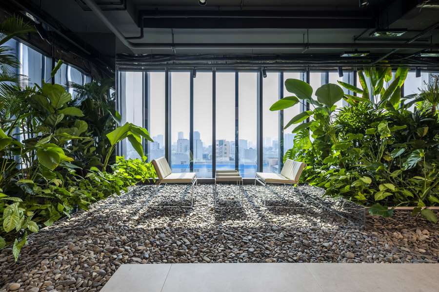
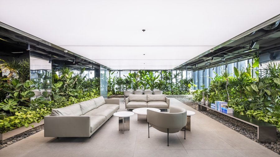
Peaceful seating areas in Mr. Green’s Office in Vietnam have the feel of a Zen garden, encased by lush, tropical plant life. Photo: Hiroyuki Oki

Peaceful seating areas in Mr. Green’s Office in Vietnam have the feel of a Zen garden, encased by lush, tropical plant life. Photo: Hiroyuki Oki
×Biophilic office design is not just a passing trend. It rather represents a seismic shift in how we design and build our office spaces and work environments, with every employer from multi-national giants of industry to two-person bedroom startups getting on board. But this weighed-down bandwagon of empathetic, wellness-focused workspace still has plenty of room on the back.
Biophilic office design takes a lot more than a few scattered pot plants and floral art prints
One aspect many newcomers fail to realise, however, is that biophilic office design takes a lot more than a few scattered pot plants and floral art prints. These four office spaces from across the globe utilise not just plant life, but also water, sunlight and natural materials to connect even the most urbanised office spaces to the calming benefits of nature.
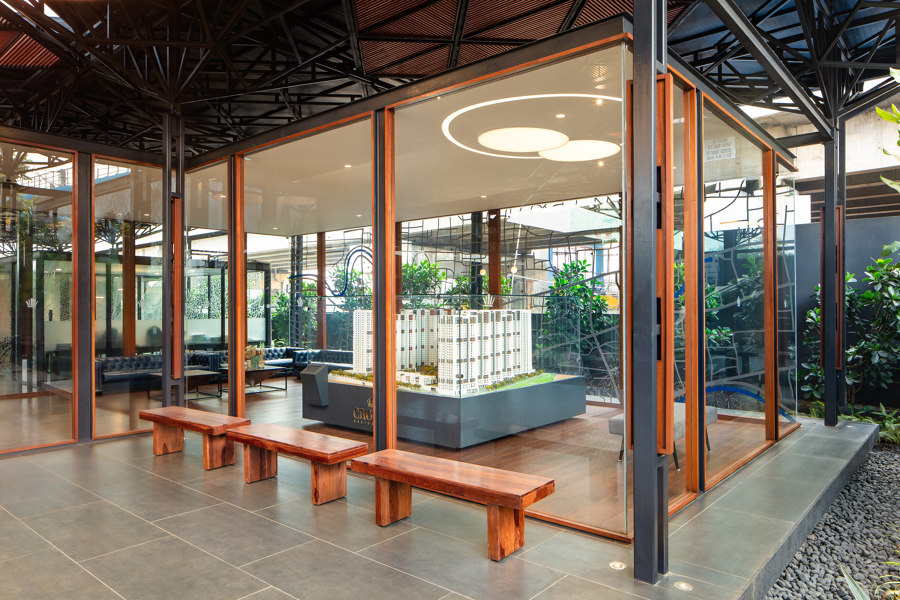
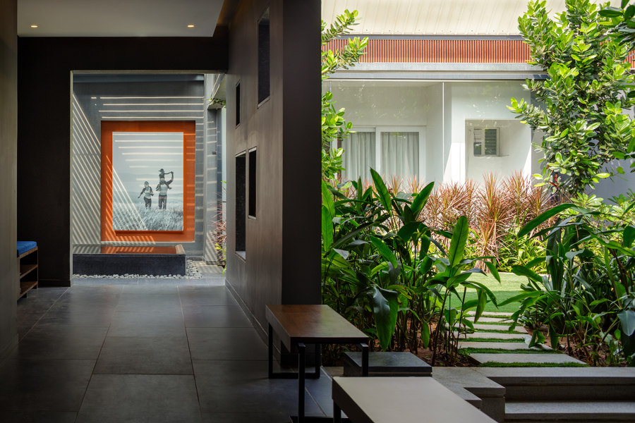
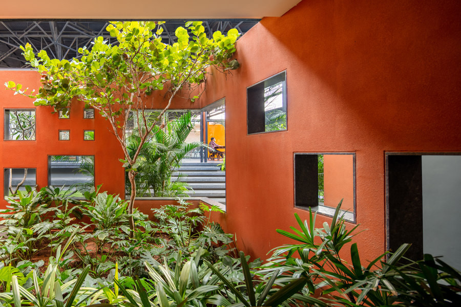
This apartment complex showroom uses glazed walls (top) to keep bordering greenery in view and guides visitors through the gardens as part of the experience (middle, bottom). Photos: Andre Fanthome

This apartment complex showroom uses glazed walls (top) to keep bordering greenery in view and guides visitors through the gardens as part of the experience (middle, bottom). Photos: Andre Fanthome
×Experience Center in Chennai, India, by CnT Architects
The Experience Center is a new-build apartment complex showroom and sales and marketing office in the centre of Chennai, where, as the name suggests, it’s all about the experience. Presenting three alternative versions of available apartments, along with sufficient office and marketing areas, the large-scale showroom could easily have become cold and cavernous. Not one to associate with a luxury new home.
‘A landscaped plaza creating a tranquil arrival experience is first on the entry sequence,’ explain the project architects, CnT Architects, about the choice to encase the entranceway transition from city to site with enough tropical greenery to rival an island resort, ‘filtering the unwanted external buzz.’ Visitors are then led on a route through more lush shared office space, underneath an architectural canopy of slatted steel and glass held by structural ‘trees’, towards a viewing platform overlooking the construction site.
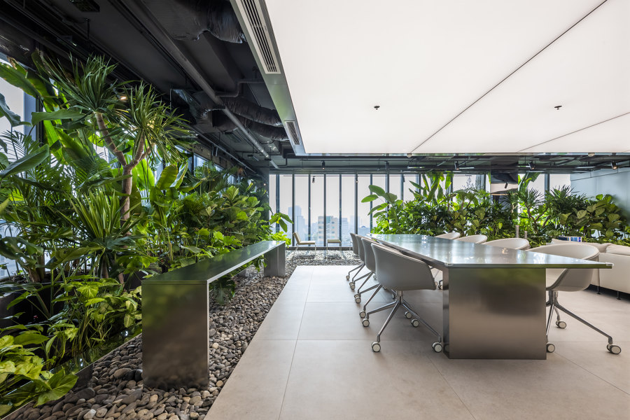
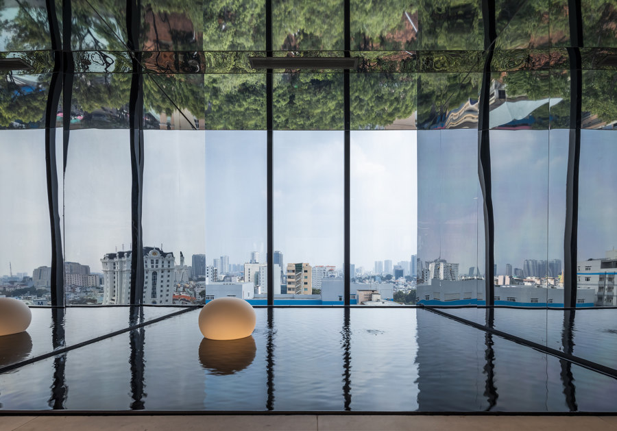
Reflective surfaces multiply the presence of vegetation in Mr. Green’s Office (top, middle) while a rippling water feature puts visitors at ease in the director’s office (bottom). Photos: Hiroyuki Oki

Reflective surfaces multiply the presence of vegetation in Mr. Green’s Office (top, middle) while a rippling water feature puts visitors at ease in the director’s office (bottom). Photos: Hiroyuki Oki
×Mr. Green’s Office in Vietnam by MIA Design Studio
With a strong passion for the tranquility of nature, Mr. Green requested his work environment be transformed into an ‘outdoor office.’ The problem being, explains project architect MIA Design Studio, that ‘Vietnam’s urban areas are increasingly losing the inherently green spaces necessary for the living environment,’ and there wasn’t any actual outdoor space to work with.
‘Vietnam’s urban areas are increasingly losing the inherently green spaces necessary for the living environment’
Undeterred, however, the architects simply made one. By sacrificing roughly half of the office floor space, communal areas like a meeting room, lounge and restful breakout area are encased by garden on all sides, reducing glare and blocking out the outside world so only the garden remains. A cool and unusual surface material palette of reflective metal and pebbles relaxes employees, while a meditative pond calms visitors to the director’s office.
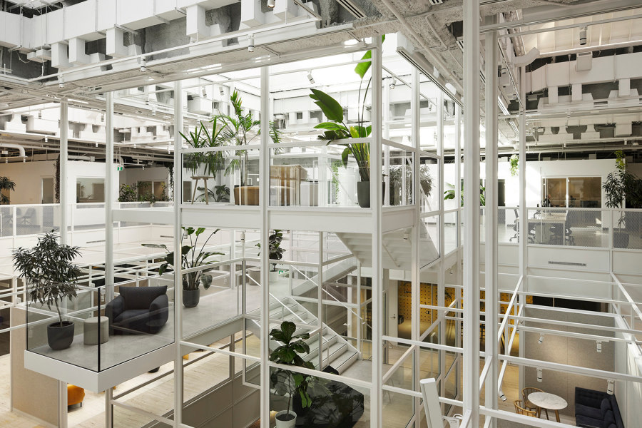
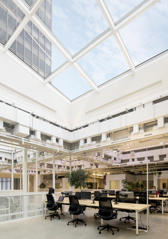
Light from enlarged skylights (bottom) is guided through a grid-formed central staircase atrium (top, middle) at the Place Ville Marie. Photos: Maxime Brouillet (top), David Boyer (middle, bottom)

Light from enlarged skylights (bottom) is guided through a grid-formed central staircase atrium (top, middle) at the Place Ville Marie. Photos: Maxime Brouillet (top), David Boyer (middle, bottom)
×Sid Lee Biosquare in Montréal, Canada, by Sid Lee Architecture
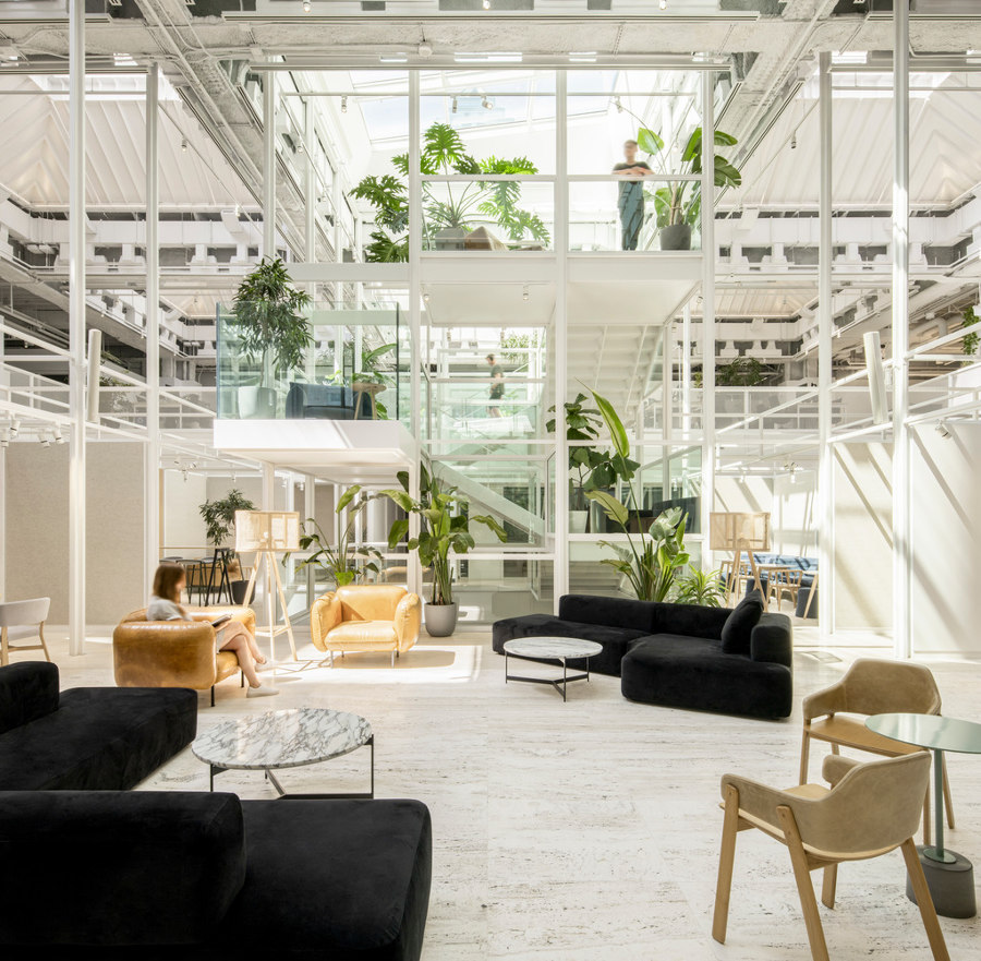
In the shadow of the huge, 47-storey cruciform office tower, Place Ville Marie, sit its four quadrant feet. Void of windows on the upper floors, these structures rely almost entirely on the skylights for natural light. So when Sid Lee Architecture took over a portion of the building as office space, creating a more inspiring biophilic environment for the firm’s teams was top of their agenda.
‘Thanks to the linearity of the aerial grid, our gaze is led upward to the vast swathes of sky’
Several of the skylights were ‘stripped to reveal their structure,’ describe the architects, and ‘strategically enlarged,’ showering a cube-formed atrium staircase with natural light that trickles down, bouncing off the white-painted grid. ‘Thanks to the linearity of the aerial grid,’ they explain, ‘our gaze is led upward to the vast swathes of sky that were deliberately highlighted and made visible from most workstations.’
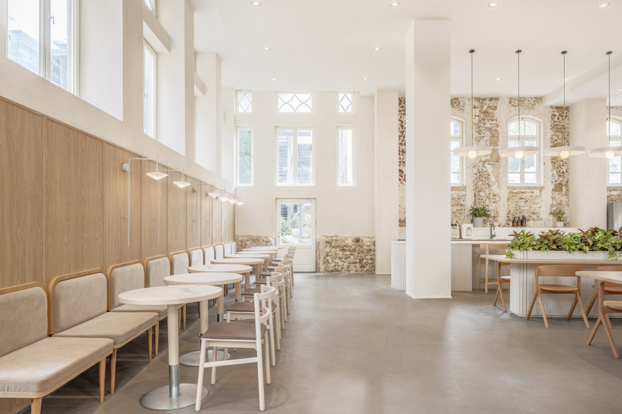
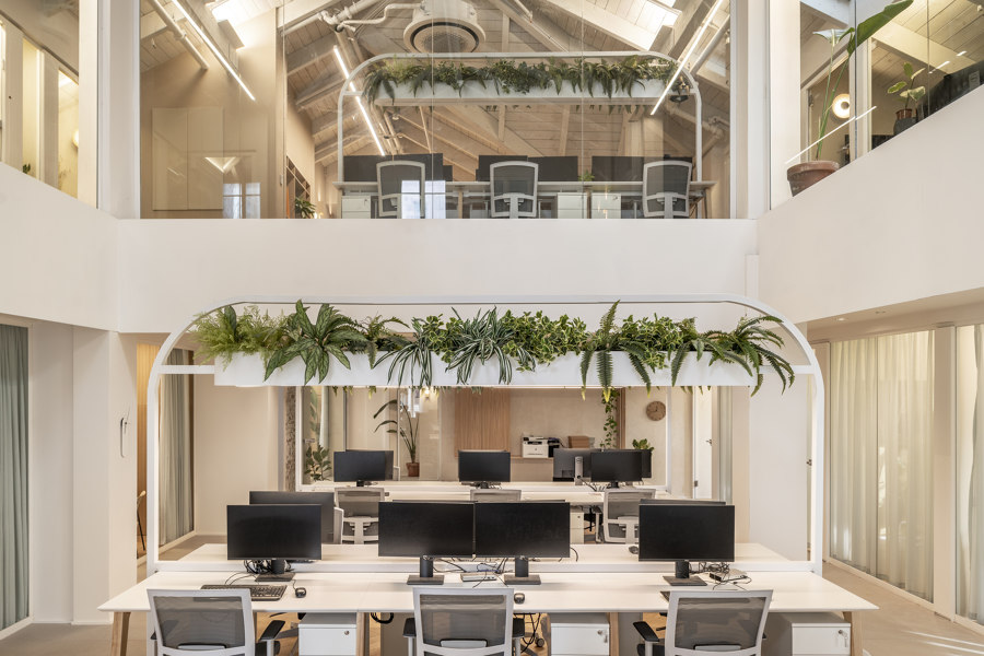
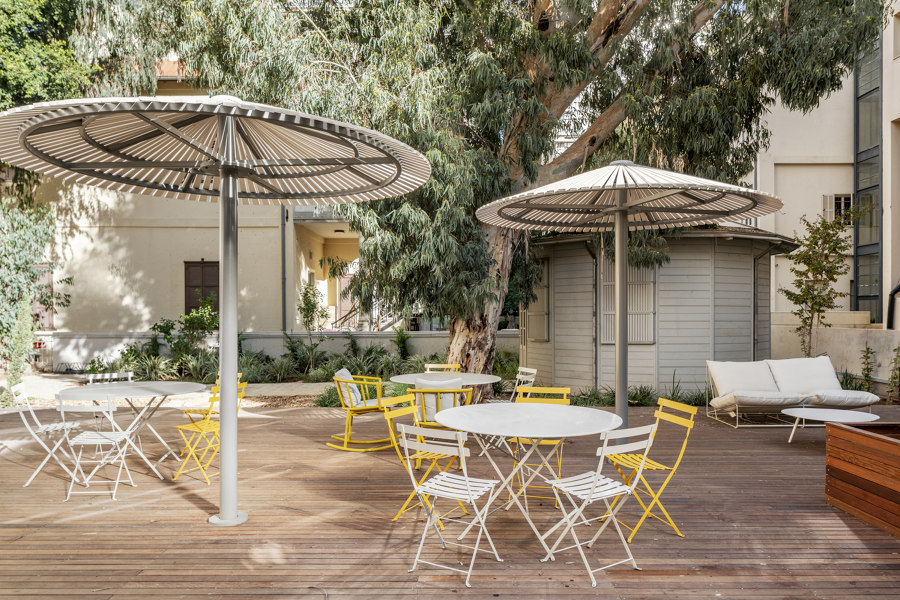
Natural material and neutral colour palettes of exposed brickwork, wood and hanging plant beds, along with café-style outdoor seating, make this startup’s employees feel at ease. Photos: Peled Studios

Natural material and neutral colour palettes of exposed brickwork, wood and hanging plant beds, along with café-style outdoor seating, make this startup’s employees feel at ease. Photos: Peled Studios
×Artlist Office in Tel Aviv-Yafo, Israel, by Switchup
Home to Artlist, a small but rapidly expanding tech startup, this office redesign needed to retain its creativity while ensuring the efficiency, collaborative capacity and wellbeing of its employees. Alongside its neutral interior of Scandinavian minimalism, clean lines and foliage, by exposing the exterior walls’ stonework inside, the office is gifted a rustic charm, enhanced by a painted wooden vaulted ceiling.
‘Clean, warm beiges and wood tones are coupled with a rustic painted brick wall to give the space eclectic, comfortable cohesion,’ share the project architects, Switchup, while a seating area set immediately outside the office space is utilised as a breakout area with the feel of a Saturday afternoon café.
© Architonic
Head to the Architonic Magazine for more insights on the latest products, trends and practices in architecture and design.
