Split-level: mezzanine floors that reorganise the floorplan
Texto por James Wormald
28.06.23
Either by building a two-level structure inside a high space or by removing part of the floor, installing a mezzanine level involves architectural bravery and design nous, but can be worth it.
Seemingly set inside the mind of MC Escher, the Chongqing Zhongshuge Bookstore combines split staircases and multiple mezzanine layers to keep near-infinite bookshelves in view. Photos: Feng Shao

Seemingly set inside the mind of MC Escher, the Chongqing Zhongshuge Bookstore combines split staircases and multiple mezzanine layers to keep near-infinite bookshelves in view. Photos: Feng Shao
×At first glance, adding a mezzanine floor to a layout either seems like a complete waste of good floorspace or a clumsy attempt to squeeze two storeys into one – like wearing skinny jeans after Christmas – both spaces end up feeling constricted and uncomfortable.
But whether the intermediate-level floor is achieved by addition – erecting an extra level in a high-ceilinged room, or by subtraction – removing part of the floor to connect with the one below, mezzanines are a relatively simple way to dramatically change and improve how we use and interact with our existing environments.
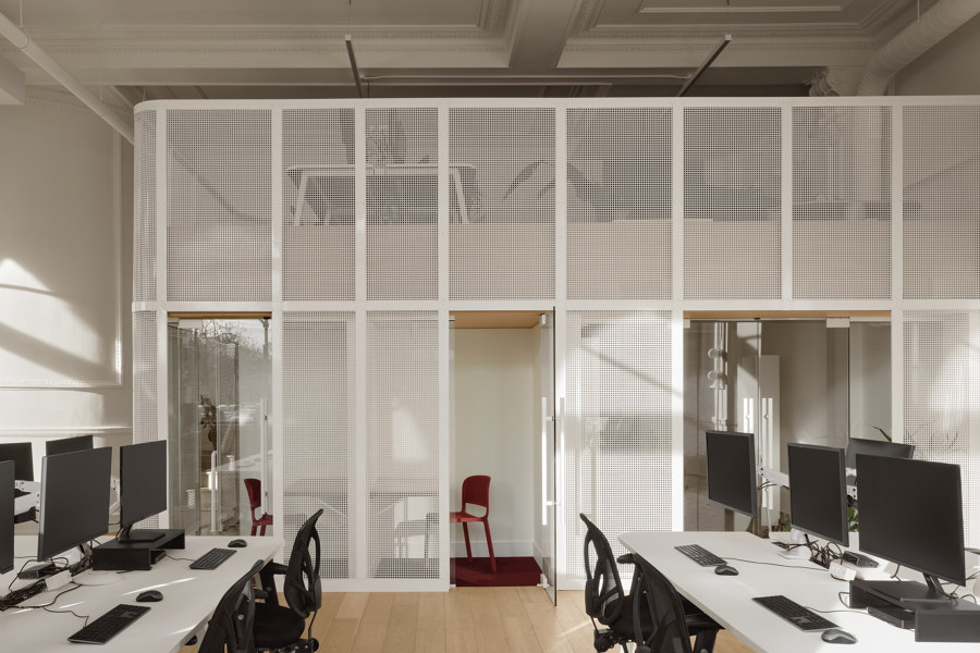
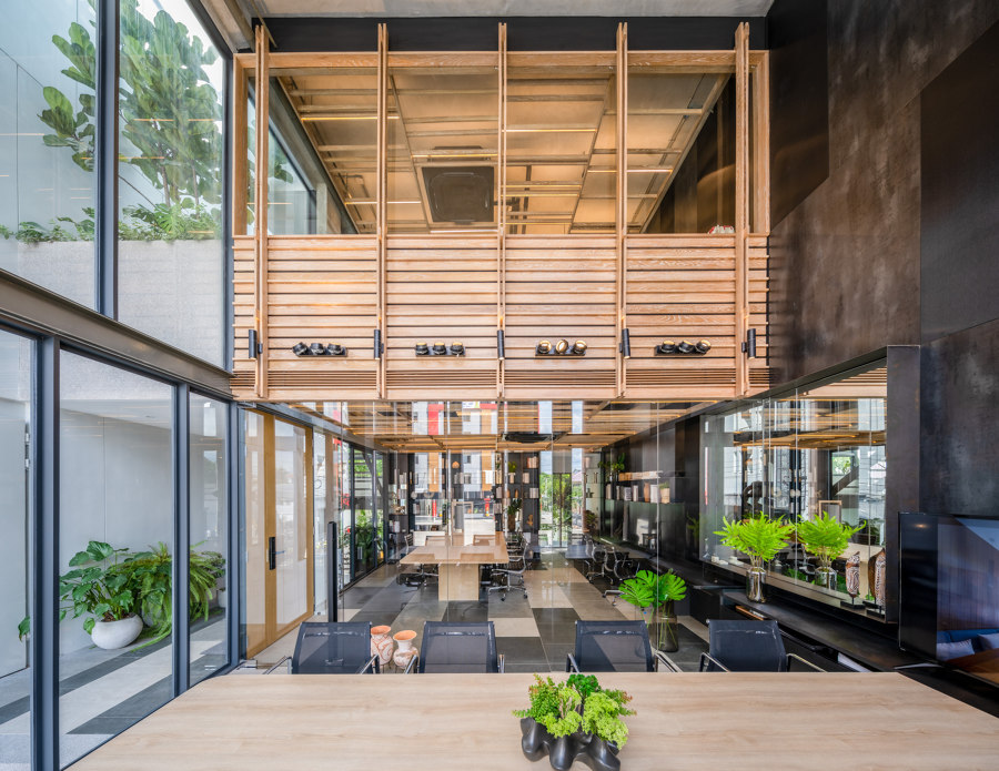
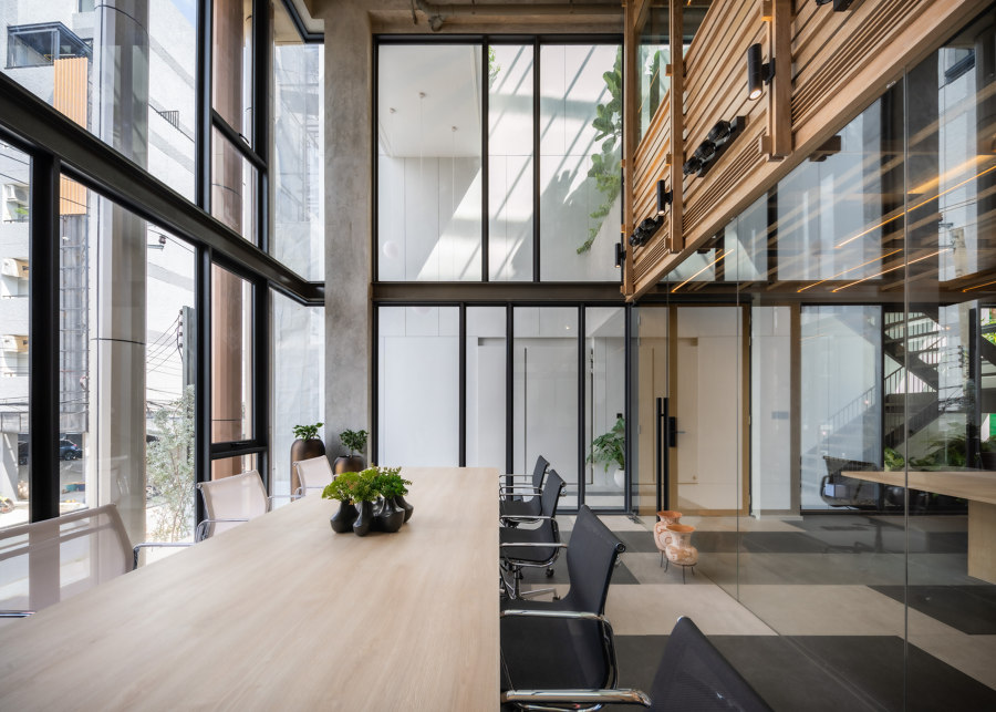
The Cardigan Office adds a double-storey structure to its high-ceiling workplace (top) while baan puripuri pull back a storey to bring in natural light. Photos: Alex Lesage (top), Beersingnoi (middle, bottom)

The Cardigan Office adds a double-storey structure to its high-ceiling workplace (top) while baan puripuri pull back a storey to bring in natural light. Photos: Alex Lesage (top), Beersingnoi (middle, bottom)
×Addition or subtraction: two ways to create a mezzanine floor
As businesses change, so do their office requirements. For workplaces left with unused height or floorspace, mezzanine levels can use the extra space, making it work better for everyone. The Cardigan Office in Montreal, Canada, by IVYSTUDIO, for example, took advantage of its high ceilings to add a new double-storey structure inside, bringing two important benefits: the internal structure’s lower half creates private space for meeting rooms, while the mezzanine level above provides quieter, more intimate workspaces, away from the hubbub of the main floor.
The mezzanine level provides quiet, more intimate workspaces away from the hubbub of the main floor
By using subtraction, however, the architecture office baan puripuri removed a section of their mixed-use residential/office buildings’ second floors, opening up the architecture to serve conference spaces underneath with double-full-height windows on two sides and ‘prioritising natural light and green space to facilitate living conditions and improve working practices,’ explain the architects.
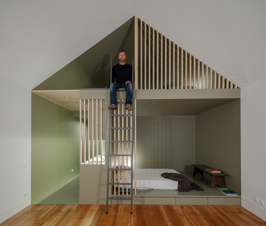
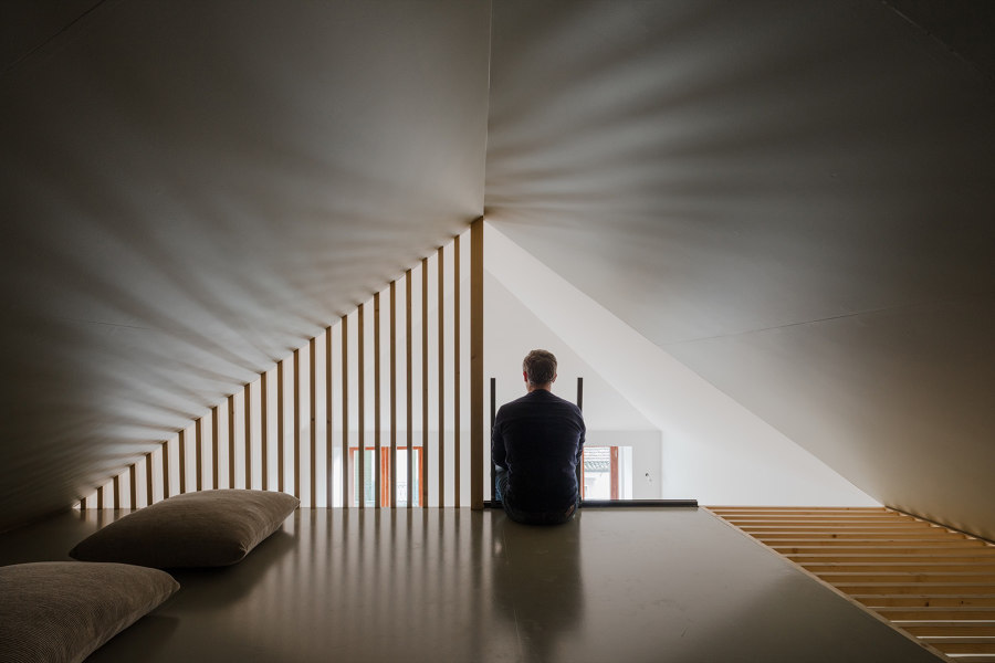
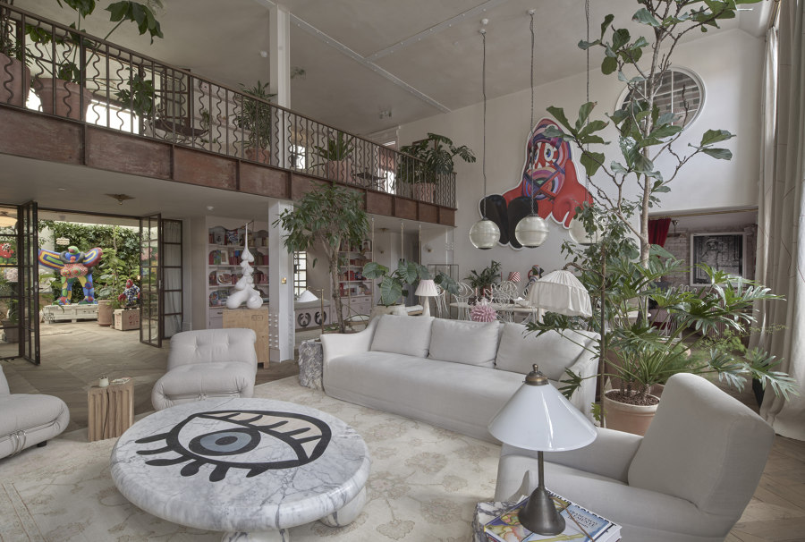
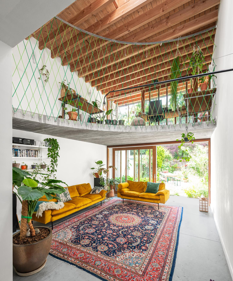
The Green House slides a second bedroom atop its first to double up on space (top, middle) and Maison Colbert opens up (bottom). Photos: João Morgado (top, middle), Edmund Sumner (bottom)

The Green House slides a second bedroom atop its first to double up on space (top, middle) and Maison Colbert opens up (bottom). Photos: João Morgado (top, middle), Edmund Sumner (bottom)
×Mezzanine floors reutilise big and small spaces at home
Micro-living is the latest trend in many cities, but rather than a desire for less space, the rising cost of it is the driving factor, meaning designers need to make each square metre count. In a tiny 36-sqm apartment in the centre of Porto, for example, architects URBAstudios have expanded the floorplan of The Green House by almost 40% with the construction of a mezzanine level, transforming the apartment from a one- to two-bedroom.
The most luxurious thing you can do with space is to lose it
If you find yourself in the enviable situation of having more room than you know what to do with, however, the most luxurious thing you can do with space is to lose it. By removing the internal walls and some of the floors from five side-to-side four-storey terraced houses in London, Maison Colbert is a shockingly huge space hidden inside multiple small ones, ‘like a Tardis,’ explain the architects, Chris Dyson Architects and Buchanan Studio. The resulting mezzanines inside ensure ‘moments of enclosure widen out to reveal spectacular double- and triple-height volumes.’
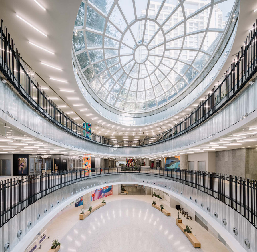
The mezzanine balconies of the Xintiandi Style II Shopping Center (top) and ‘crazy stairs’ at the Chongqing Zhongshuge Bookstore (middle, bottom). Photos: Wen Studio (top), Feng Shao (middle, bottom)

The mezzanine balconies of the Xintiandi Style II Shopping Center (top) and ‘crazy stairs’ at the Chongqing Zhongshuge Bookstore (middle, bottom). Photos: Wen Studio (top), Feng Shao (middle, bottom)
×Using mezzanines to connect the vertical open-plan
Shopping centres are long-time users of mezzanine levels to order their environments, cutting central atriums through two, three, four or sometimes even more storeys to create a retail paradise. The technique keeps consumers visually connected to storefronts on upper and lower levels, and to entertainment and promotional activities in central plazas at ground level, while also helping them to keep their bearings. Mezzanine walkways at the Xintiandi Style II Shopping Center in Shanghai, China, for example, cover each level with natural light from a shared glass roof, improving consumers’ comfort and encouraging them to spend longer in the store.
While they may not provide the most efficient use of display space, mezzanine levels are a common feature inside stores, too. At the Chongqing Zhongshuge Bookstore in China, for example, book lovers are treated to multiple mezzanines and connecting staircases that wind their way up to a mirrored ceiling, creating a magical cave of literary wonders. Far more inspiring than the glorified filing cabinet of a traditional library.
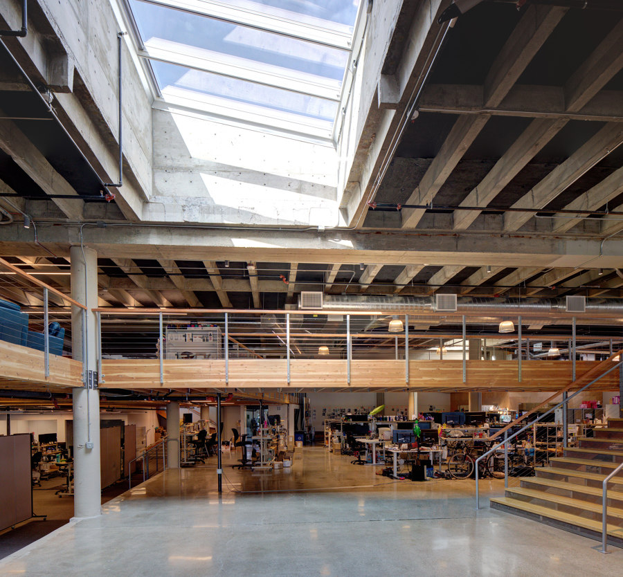
Mezzanine levels at the True Headquarters office (top) and the private Brecht & Nele House residence (bottom) improve communication. Photos: Steve Hanson (top), Mr Frank (bottom)

Mezzanine levels at the True Headquarters office (top) and the private Brecht & Nele House residence (bottom) improve communication. Photos: Steve Hanson (top), Mr Frank (bottom)
×Improving cross-floor communication in the workplace or at home
By keeping two separate levels connected through an open space, split-level environments ensure communication between floors remains open, as if they were one. When True moved into an existing warehouse in Seattle, for example, it was a cold, concrete shell. The high ceilings and uninterrupted floorplan, however, allowed LOC Architects to build a surrounding mezzanine level and connecting bridge, ‘creating connections and unprogrammed spaces to encourage collaboration and the exchange of ideas,’ explain the architects, and allowing natural light from the new glass shutters and skylights to flood through the entire space.
Split-level environments ensure communication between floors remains open, as if they were one
On the residential side, meanwhile, owners of the Brecht and Nele House tasked their architects Atelier Vens Vanbelle with creating ‘a chill-out area for the children,’ as the architects narrate. By adding a multifunctional mezzanine, ‘the children can fill it in as they wish and perform all kinds of activities,’ while the parents can still hear what is happening from the living area.
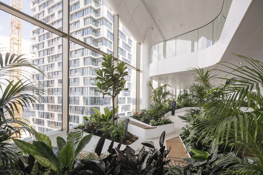
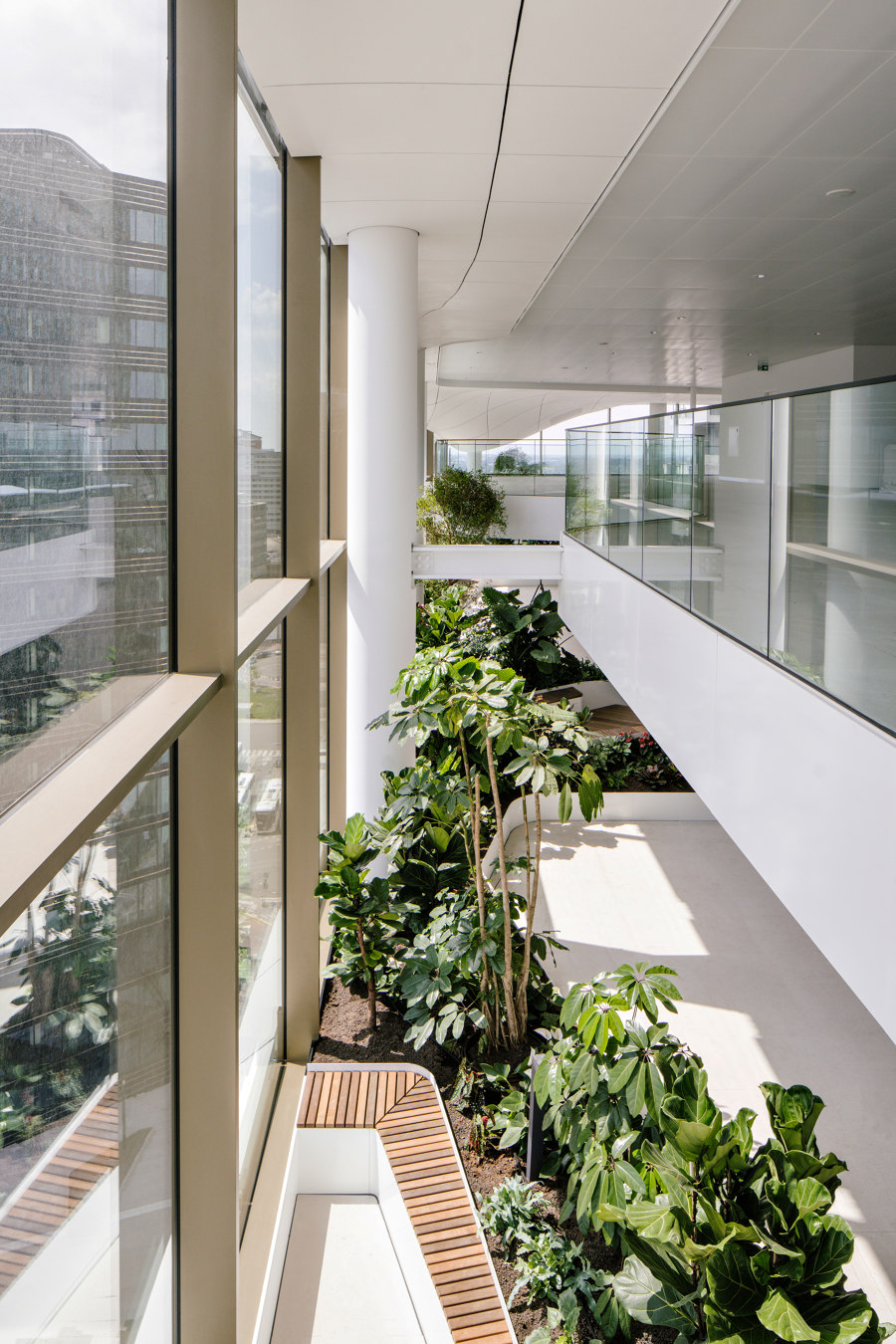
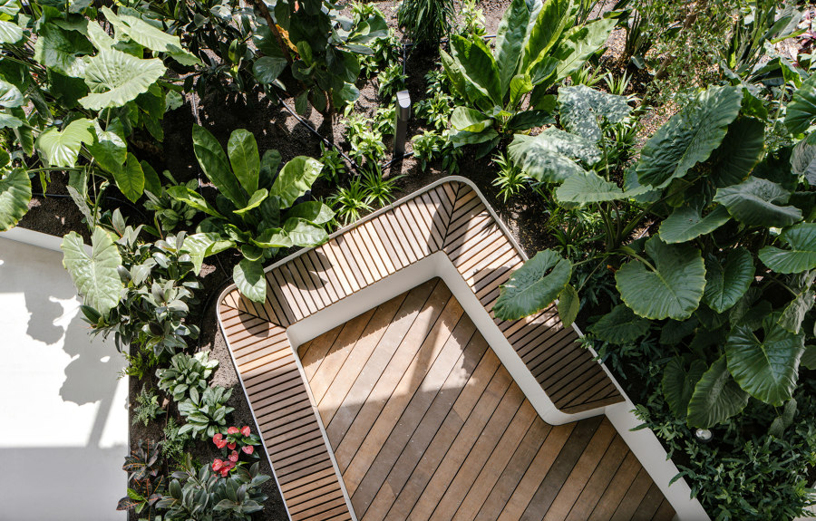
The indoor park and balcony created by losing the edge of the Central Park Office Tower’s 11th and 12th floors give employees a meditative garden to roam and overlook. Photos: Sebastian van Damme

The indoor park and balcony created by losing the edge of the Central Park Office Tower’s 11th and 12th floors give employees a meditative garden to roam and overlook. Photos: Sebastian van Damme
×Create safe balconies to enjoy the view
At its most basic level, a mezzanine floor is simply just an interior balcony. But while exterior balconies provide fresh air and sunlight, as soon as you get high enough to enjoy the view, safety restrictions – not to mention the nauseating feeling of vertigo – come with it. In order to combine both 12th-storey views and a connection to fresh air and stress-reducing plantlife, architects GROUP A replaced part of the 12th floor with interior safety glass balustrades, creating a mezzanine balcony to overlook the lush greenery and decking of an indoor park, as well as the city beyond.
© Architonic
Head to the Architonic Magazine for more insights on the latest products, trends and practices in architecture and design, or find inspiration in a whole world of projects from around the globe through ArchDaily’s architecture catalogue.

