Switch it up: five light switch questions to help turn interiors on
Often taken for granted but never missed, the light switch is a small but important element of interior design. Here’s how to make the material and design choices that push all the right buttons.
abril 11, 2023 | 10:00 pm CUT

If you were to ask me what my light switches look like, I’m not sure I could tell you. For a product we interact with on multiple occasions every day, we rarely tend to actually look at our light switches in detail. But that doesn’t mean we don’t see them.
Choosing the right type of ergonomic switch operation, or a switch and plate with the right material and finish to complement surrounding walls and accompanying hardware, can have a huge impact on the overall look and feel of an interior. Not to mention the switch’s main function – what it controls. So whether you’re lighting up a new space or just switching up the decor in an old one, here’s how to make sure you get the best out of the switch.

Do you want the light switch to blend in, or stand out?
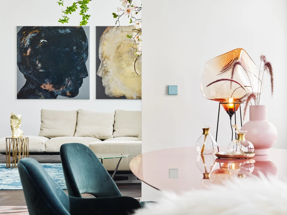
Such is their ubiquitous presence and placement, that even in an unknown environment, visitors can easily find the light – at around shoulder height, 15-20 cm away from the door opening – so switches don’t need to be especially noticeable.Van den Weghe’s Lapris multi-pushcontact switch, for example, is a recessed switch completely integrated into the wall, the only clue to its presence being a mysterious circle cut into the surface, while the collection’s touch-sensitive version offers no clue at all. Alternatively, Forbes & Lomax produce the Invisible Lightswitch, with a screwless transparent switchplate.
"
We rarely look at our light switches in detail. But that doesn’t mean we don’t see them
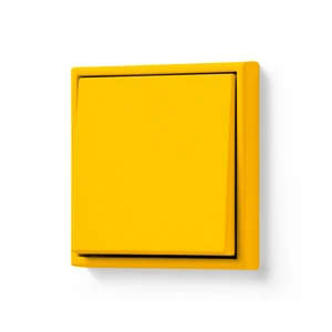
On the other side of the switch, for designers who prefer to use the switch plate as an opportunity for contrast, many are available in bold standout colours such as JUNG’s LS 990, offered in the 63 Les Couleurs® Le Corbusier colours, while Lithoss’ two-tone, two-way piano-key Piano switch turns the switch on its side.

Which material and finish is best suited to the interior?
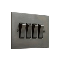
For 99% of its lifetime, a switch will be seen and not used, and the right choice of material and finish can ensure it works with the rest of the interior, rather than against it. Statement metallic switches, for example, can combine with other hardware elements like door and window handles, electrical points or light housings and roses.Polished switch plates bring a classical edge that can add depth to the design palette of modern interiors, while dark metallic tones such as this antique brushed bronze rocker switch from Forbes & Lomax, add a sleek, contemporary touch. To avoid highlighting the inevitable build-up of fingerprint marks on switches and plates, a brushed or matt finish such as with the brand’s Verdigris range, hides them well, while Verdigris’ oxidation process creates a deep and unique patina.

How do you want the switch operation to feel?
The standard finger-width two-way switch is the popular operational choice, and for good reason. If the light has single-switch control, then a two-way switch pressed down means it is on, making it safer and easier to make sure it’s off. This version of Forbes & Lomax’s two-way rocker switch contrasts the metallic finish of the switch with a black or white insert, for example."
Toggle switches put up more resistance before a satisfyingly heavy click
Alternative options include push-button switches which add a symmetrical look to the plate but can be hard to know if they’re on at first glance, toggle switches like 1G from Buster + Punch – which put up more resistance before a satisfyingly heavy click and make the user feel like they’re readying for a rocket launch or softer and easier-to-operate full-width two-way switches, which are better for visually or physically impaired users.
What does the switch control?
But why restrict yourself to just the two options when you can have more? Dimmer switches like the 3G from Buster + Punch allow you to create the perfect ambience in mixed environments. Meaning open-plan lighting schemes can be twiddled and tweaked to fine-tune the right level of bright task, or soft ambient light, whether you’re working in the kitchen or relaxing on the sofa.The touch-sensitive Enzo switch from Basalte, meanwhile, is the perfect way to control every aspect of a smart-home automation system. The four sectors can be set to control combinations of light, blinds, music, heating and more.
Which modern light switch features are useful, and which are not?
There was a time when we naively assumed reaching for the light switch would be a bothersome task our future selves would not have to deal with. Instead, we thought our lighting would be controlled via a single all-powerful remote control, specific hand claps or voice command. But the future, as it turns out, is not that different from the past. I still constantly lose the remote control, hand clap switches require two hands instead of one so are, in fact, harder to use and I still can’t get my smart speaker to accept I exist."
Open-plan lighting schemes can be twiddled and tweaked to fine-tune the right level of light
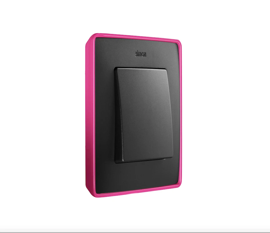
There is one light switch innovation, however, that makes it easy to see the future, and the rest of the room. Light-up switches like Busch Jaeger’s Impuls mean instead of fumbling around in the dark, users are easily oriented to the switch. Similarly, the fluorescent border surrounding Simon’s Detail 82 switch makes it easy to find in the dark, even during a power cut.
© Architonic
Head to the Architonic Magazine for more insights on the latest products, trends and practices in architecture and design, or find inspiration in a whole world of projects from around the globe through ArchDaily’s architecture catalogue.
Galería de proyectos


