Tread lightly: shoe stores with brand-focused lighting concepts
Texto por James Wormald
08.01.24
With lighting as bold as their architectural concepts, these fashion-led sneaker stores run away from convention. Featuring SAKUMEISHIMA, NiiiZ Design Lab, Various Associates and Studio Animal.
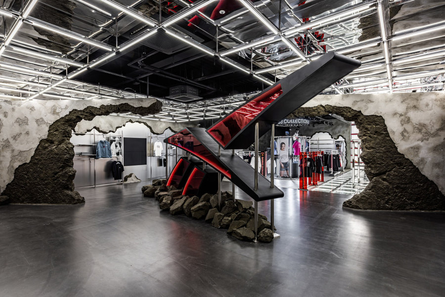
The ‘Superhero Re-Landing’ concept in Reebok’s flagship store in Jung-Go, South Korea, sees an oversized Reebok logo burst through concrete walls, symbolising the change in brand positioning. Photo: studio gothic / Jae Sung LEE. Tak Hyun Kim

The ‘Superhero Re-Landing’ concept in Reebok’s flagship store in Jung-Go, South Korea, sees an oversized Reebok logo burst through concrete walls, symbolising the change in brand positioning. Photo: studio gothic / Jae Sung LEE. Tak Hyun Kim
×The task of creating suitable lighting for retail spaces seems simple enough. By balancing individually considered task lighting together with more ambient general lighting, stores can highlight products without revealing their flaws, while also ensuring that important signage and other store sections remain visually available. And all without flooding the space with uncomfortable white light.
As any Hollister store will tell you, however, in the world of fashion, retail design is less about selling products as much as selling an image. Famous for their poorly lit, deafeningly loud interiors with the intense scent of cologne, the American fashion retailer positions itself definitively and exclusively towards the young, namely by excluding anyone old (and uncool) enough to complain about the conditions.
Retail design is less about selling products as much as selling an image
Once a purely performance-focused sportswear product, sneaker retail and marketing concentrated on high-tech innovations like support, cushioning, aeration and endurance. However, with the leisure footwear market now a well-respected player in the world of fashion, the narrative of in-store ambience is just as important to a brand’s marketability as its products’ performance. These high-concept shoe stores use integrated lighting techniques to tell their individual brand stories.
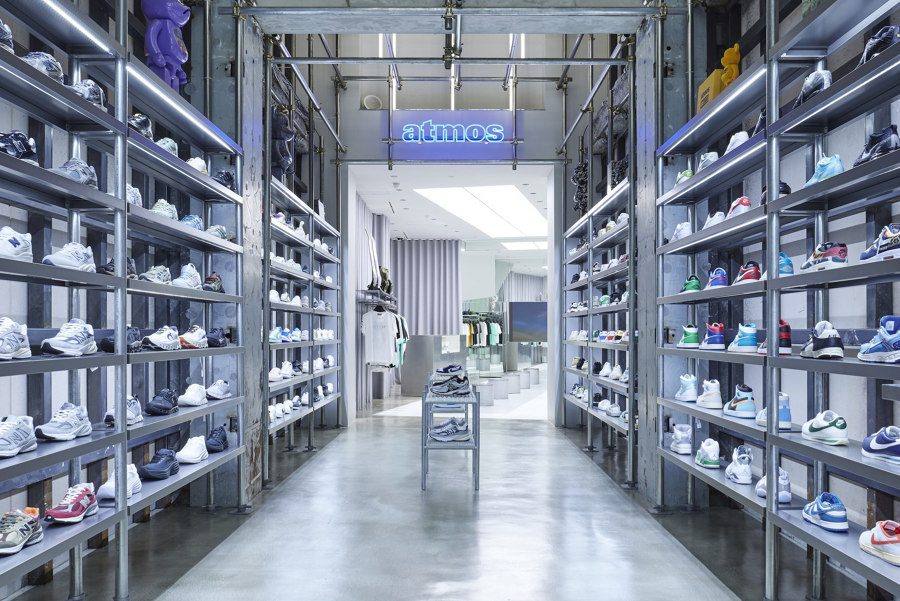
atmos’ Omotesando store in a trendy spot of fashionable Harajuku, Japan, combines scaffolding materials with line-drawn lighting to create a street atmosphere. Photos: Masaaki Inoue / BOUILLON

atmos’ Omotesando store in a trendy spot of fashionable Harajuku, Japan, combines scaffolding materials with line-drawn lighting to create a street atmosphere. Photos: Masaaki Inoue / BOUILLON
×atmos BLUE Omotesando Store in Shibuya, Japan, by SAKUMEISHIMA
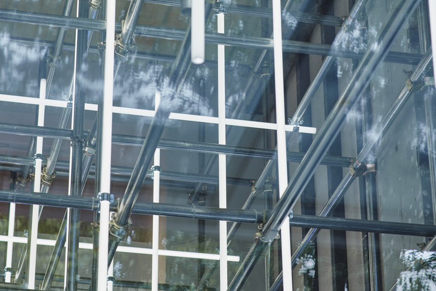
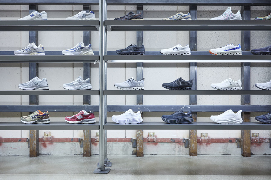
Although atmos sells a range of skater-style apparel, accessories and hardware, the retail brand’s sneaker collections are positioned at the very front of the store’s narrow floorplan, enticing passersby on the fashionable Omotesando street in Shibuya’s Harajuku district – known as a key area for Japan’s youth culture. Creating a ‘rough and abandoned impression,’ explain the project’s architects SAKUMEISHIMA, ‘a space composed of temporary single-pipe scaffolding’ is created that ‘evokes a street-like atmosphere’ at the front of the store and blends seamlessly with a grid of line-drawn light fixtures, rising into an atrium.
‘Temporary single-pipe scaffolding evolves a street-like atmosphere’
As the site becomes irregularly shaped towards the rear of the store, SAKUMEISHIMA chose to split the space into two separate areas. As customers move toward the back, ceiling lighting and glass tile flooring enclose a ‘futuristic white space,’ describe the architects, ‘contrasting with the derelict atmosphere of the sneaker zone.’ Using this combination of spaces, atmos draws the flow of customers towards the rear of the store.
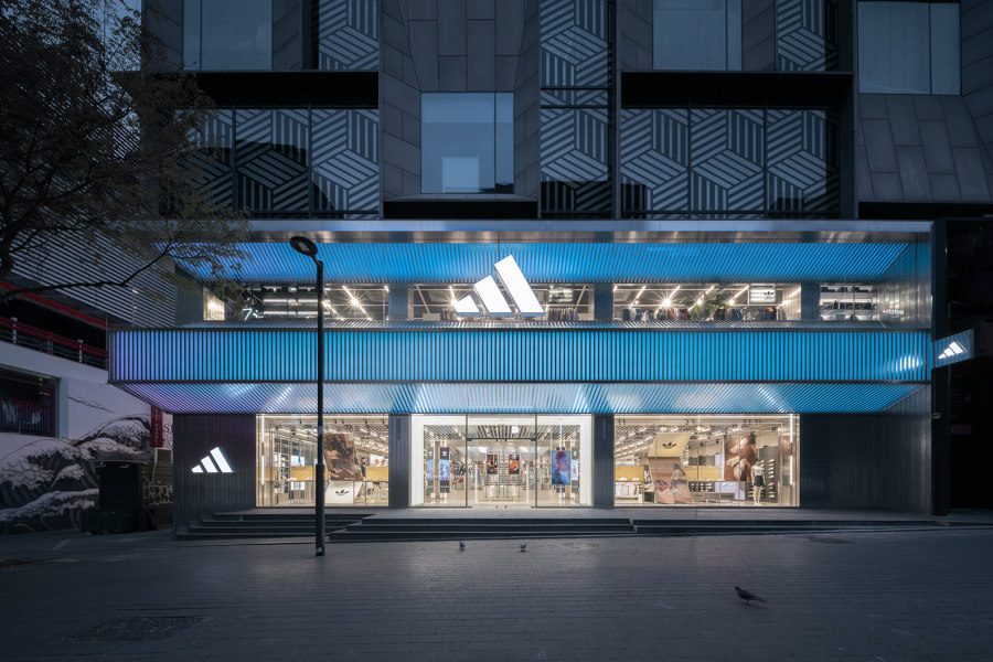
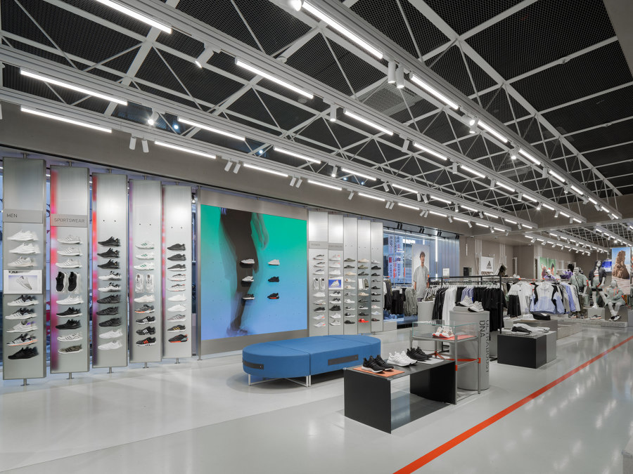
Combined with sporting references, adidas’ stripes motif is peppered throughout the lighting design of its new flagship store in Seoul, South Korea, pitching it as the “Home of Sport”. Photos: SFAP

Combined with sporting references, adidas’ stripes motif is peppered throughout the lighting design of its new flagship store in Seoul, South Korea, pitching it as the “Home of Sport”. Photos: SFAP
×adidas Asia Pacific Flagship Seoul in Jung-Gu, South Korea, by Various Associates
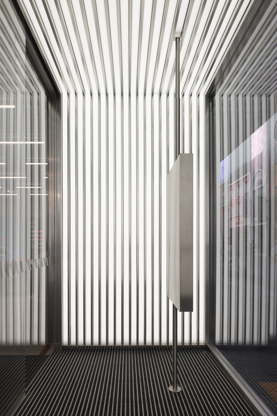
To ‘convey the core values of friendliness and inclusivity’ in Korean culture, explain architects Various Associates, a creative and welcoming light display – created using the brand’s iconic “stripes” motif – was installed as an integral part of the frontage of adidas’ first Asia Pacific flagship store. ‘The concise and clean layers with dynamic lighting effects emerge from the lively streets as pure and dazzling scenery of Myeongdong,’ introduce the architects.
A creative and welcoming light display was installed as an integral part of the frontage
Meanwhile, a custom vertical sneaker display again utilises the strip elements from the sports manufacturer’s logo in the store's interior. Along with other features such as lining up ceiling lighting strips underneath triangular supporting truss work inspired by stadium architecture and the use of luminous line-work to interpret the lines of a basketball court, these effective lighting design techniques combine to subtly position the brand and its flagship store as the ‘Home of Sport’.
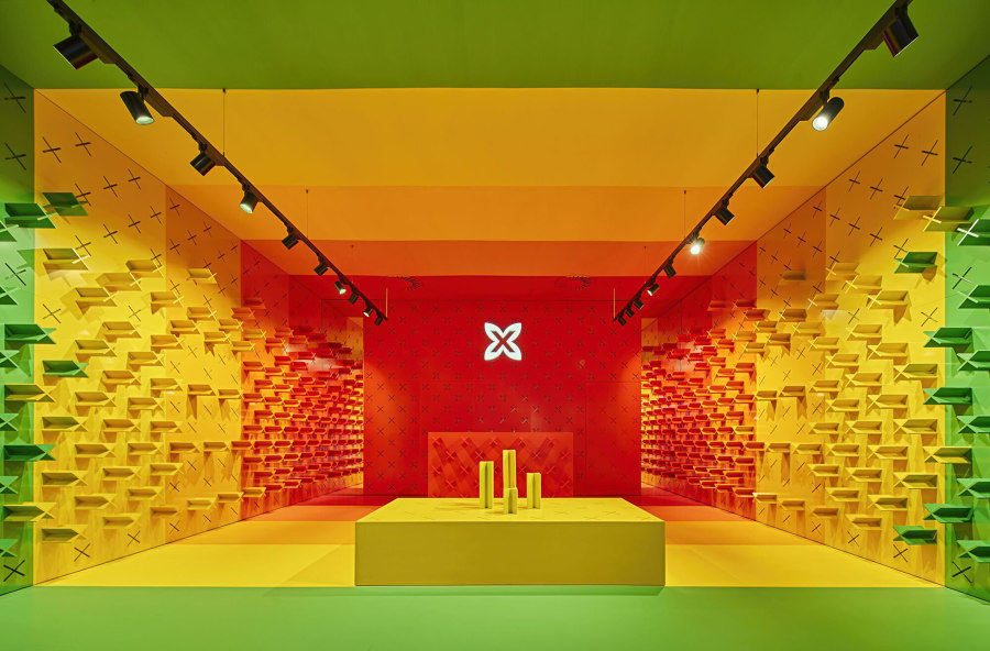
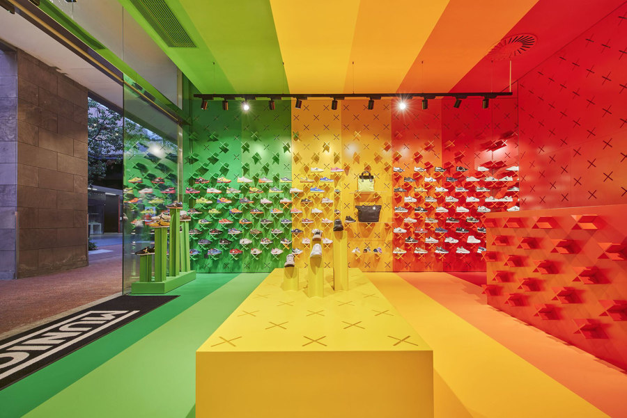
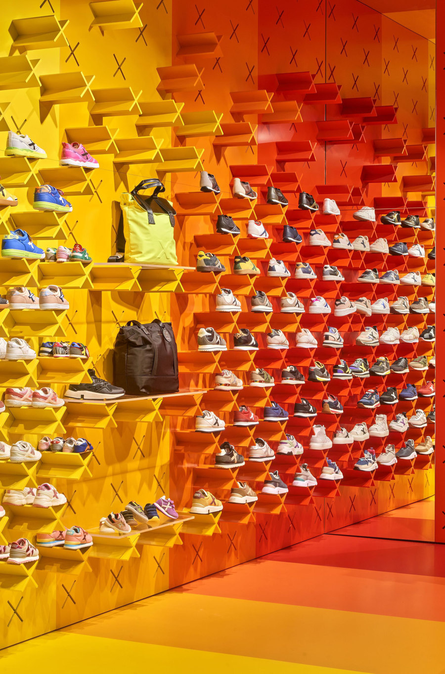
This Munich store in Barcelona adheres to the design cues of Studio Animal’s Meta system with rainbow-striped colour blocking continuous across all four surfaces and the system’s customary ’X’-shaped shoe shelving. Photos: José Hevia

This Munich store in Barcelona adheres to the design cues of Studio Animal’s Meta system with rainbow-striped colour blocking continuous across all four surfaces and the system’s customary ’X’-shaped shoe shelving. Photos: José Hevia
×Munich Store in Barcelona, Spain, by Studio Animal
By integrating the brand’s logo – an ‘X’ – into the store’s product display design and developing a decorative surface design system ‘that works with repetition, assembly and colour,’ explain the project architects, Studio Animal has provided footwear retailer Munich with a recognisable brand image that can cross ‘from one store to another’ in numerous locations throughout Spain.
‘The ease of adaptation, reproduction and assembly’ become the engine of the project
Display shelving formed with hundreds of extruded X’s becomes a repeated yet individual feature amongst all Munich stores, as well as its use of bold colour-blocking techniques and, in many cases, graphic layouts. The chosen rainbow colours at this Barcelona store, for example, extend in stripes that continue across the ceiling, floor and opposite walls, attracting experience-searching consumers into its enveloping environment. ‘The ease of adaptation, reproduction and assembly becomes the engine of the project,’ explains Studio Animal.
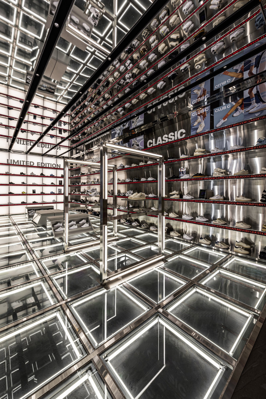
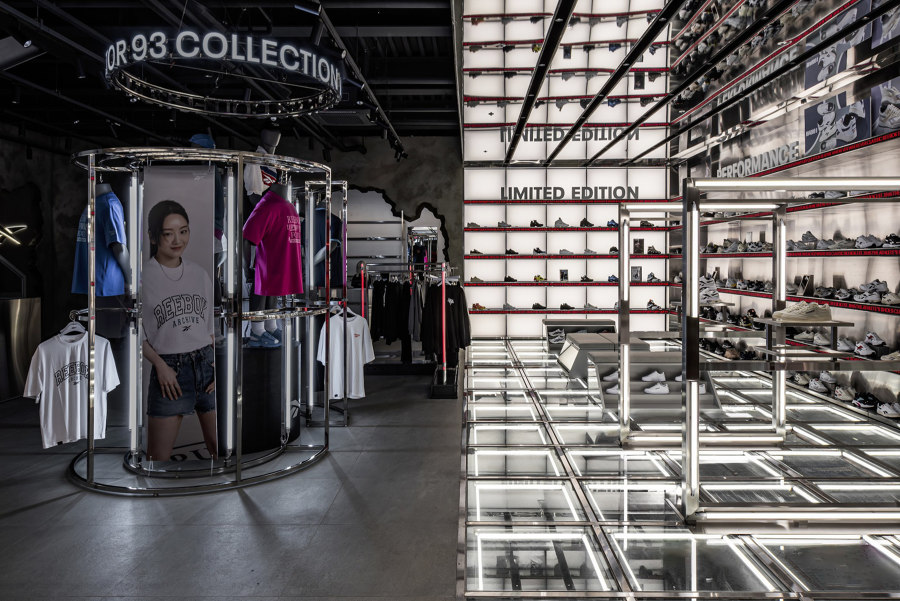
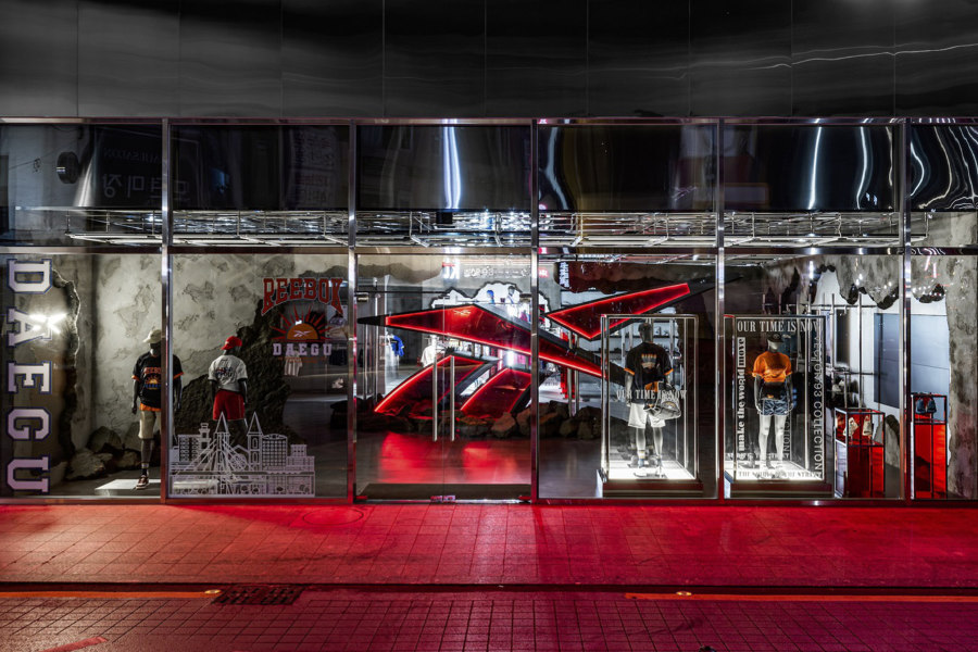
With an oversized red-tinged logo at its gateway, Reebok seduces customers inside before splitting the space into two zones with concept surfaces and lighting. Photos: studio gothic / Jae Sung LEE. Tak Hyun Kim

With an oversized red-tinged logo at its gateway, Reebok seduces customers inside before splitting the space into two zones with concept surfaces and lighting. Photos: studio gothic / Jae Sung LEE. Tak Hyun Kim
×Reebok Flagship Store in Jung-Gu, South Korea, by NiiiZ Design Lab
As another sportswear and sporting equipment brand with a previous positioning based on performance, Reebok also noticed the movement of sporting apparel into the popular and even luxury fashion markets. With trending designer collaborations and a nostalgia-fuelled classic collection burning a fashionable hole in its back pocket, the brand decided to present this evolved identity at its new flagship store in Jung-Gu, South Korea, with a bold concept.
A hero figure sinks through the ceiling of the building
The store’s ‘Superhero Re-landing’ concept tells the story of ‘a hero figure sinking through the ceiling of the building,’ explain project architects NiiiZ Design Lab, ‘leaving cracked and broken parts of concrete walls behind’ as they ‘tear through their daily outfits’ to reveal a new costume, thus representing the brand’s breakthrough into a new identity. Fronted by this heroic red-hued logo, the space is split into an apparel zone with these urban, broken surfaces, and a sneaker zone with glass flooring over a square grid of light and backlit display shelves.
© Architonic
Head to the Architonic Magazine for more insights on the latest products, trends and practices in architecture and design.
