Good hair day: four salons with sculptural and surreal interiors
Historia de la marca de Katharina Schwarze
20.07.22
We take a look at hair salons from Japan and Sweden whose interiors venture far beyond the traditional boundaries of Scandinavian minimalism and Japanese wabi-sabi.
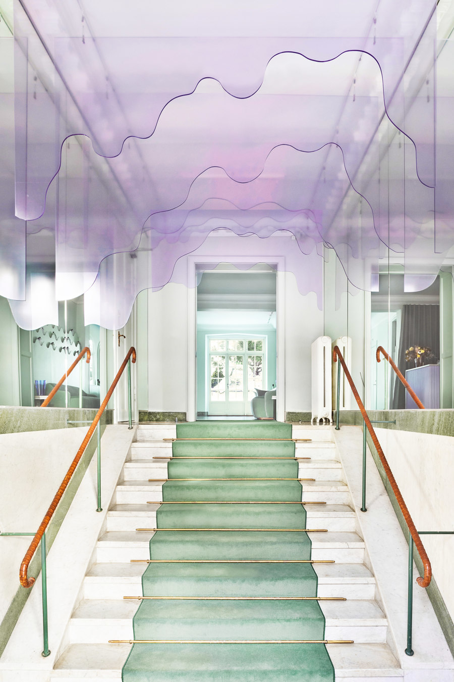
The entrance to the head office of Maria Nila in Stockholm, Sweden, by ASKA leaves a lasting first impression. Photo: Mikael Lundblad

The entrance to the head office of Maria Nila in Stockholm, Sweden, by ASKA leaves a lasting first impression. Photo: Mikael Lundblad
×A Swedish woman and a Japanese woman walk into a hairdresser's… And the punchline? Actually, there isn't one, but there is a high probability that the salons' interiors are remarkably well designed. The aesthetics from the far north and the far east have more parallels than one might think at first glance – it is not for nothing, after all, that they are so popularly combined with each other, creating the term Japandi.
Here we present four hair salons from Japan and Sweden that venture beyond the classic boundaries of Scandinavian minimalism and Japanese wabi-sabi – skilfully hitting a broad range of interior notes, from the sculptural to the surreal.
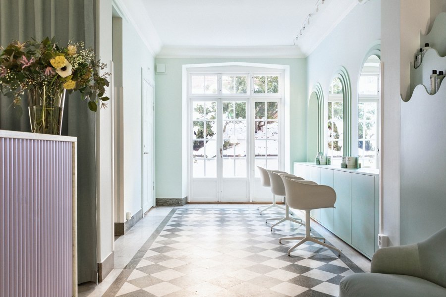
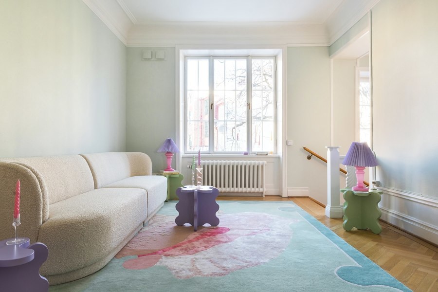
A four-storey townhouse in Stockholm was transformed into the new headquarters and salon of haircare brand Maria Nila by Swedish architecture firm ASKA, using pastel tones and organic shapes. Photo: Mikael Lundblad

A four-storey townhouse in Stockholm was transformed into the new headquarters and salon of haircare brand Maria Nila by Swedish architecture firm ASKA, using pastel tones and organic shapes. Photo: Mikael Lundblad
×Maria Nila Head Office, Stockholm, Sweden, by ASKA
Shampoo seems to drip from the ceiling here – in the form of an art installation made of shape-cut Plexiglas panes. The architects behind Swedish studio ASKA took the brief to put the product at the centre quite literally and transformed the entrance area of the head office of the haircare brand Maria Nila in the centre of Stockholm into a liquid-looking, lilac-coloured shampoo space.
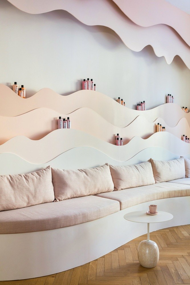
Another distinctive feature of the salon is the wave-shaped shelves on which the haircare brand's products are presented. The organic shapes combine with playful elements and pastel colours to form the DNA of the design concept.
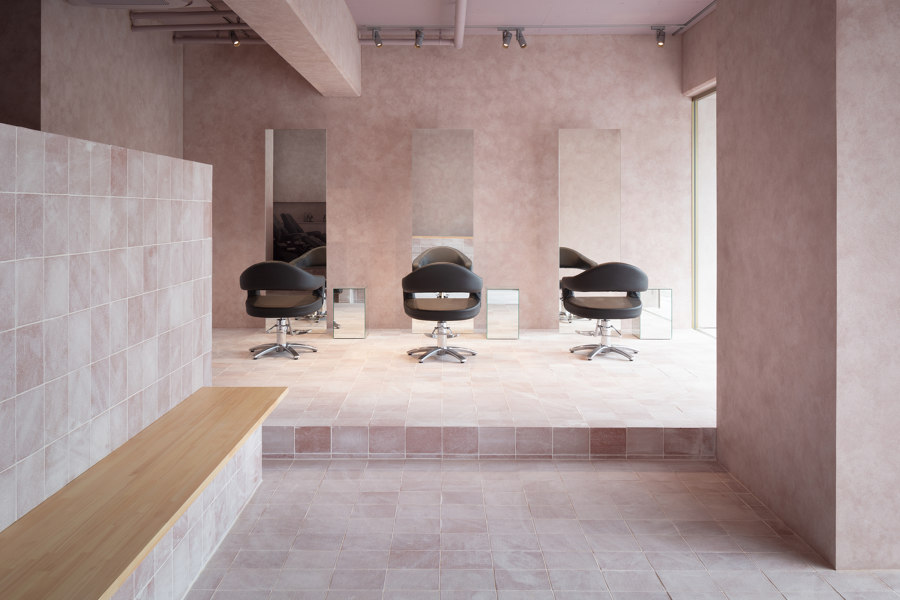
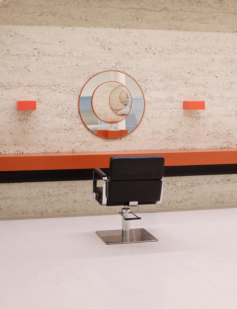
Who am I and if so, how many? The colour pink, according to Yusuke Yoshino Architects, is used in combination with mirror elements at Lula Hair Salon in Osaka, Japan, to create the most stripped-back space possible. Photo: Takumi Ota

Who am I and if so, how many? The colour pink, according to Yusuke Yoshino Architects, is used in combination with mirror elements at Lula Hair Salon in Osaka, Japan, to create the most stripped-back space possible. Photo: Takumi Ota
×Lula Hair Salon, Osaka, Japan, by Yusuke Yoshino Architects
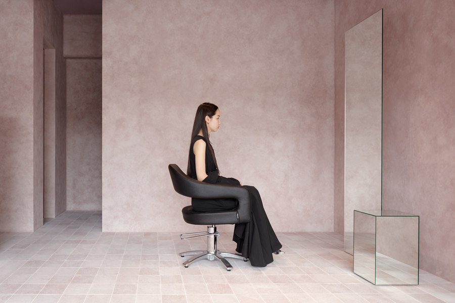
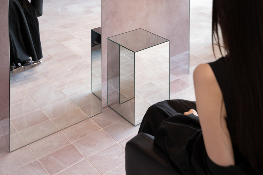
A phenomenological space, like a mirage – this salon, designed by Yusuke Yoshino Architects, is located on the first floor of a five-storey residential building in Osaka whose main feature is its classic tile cladding. Its interior seems intangible, with iridescent pink tones on the floors and walls that give the eye no real foothold and floor-to-ceiling mirrors and mirrored side tables that also play with perception. Unrealistic beauty standards may be a curse of our time, but this unreal-looking beauty space is a real experience.
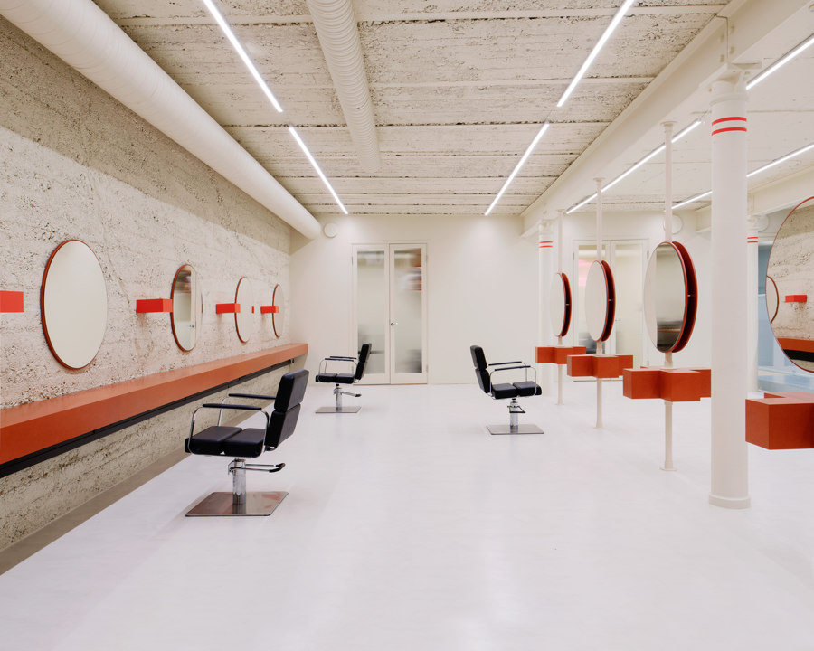
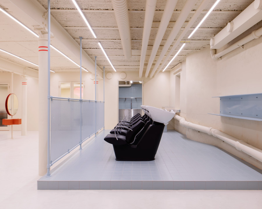
Makeover: A 220-sqm basement and former office in Stockholm was completely gutted by Westblom Krasse Arkitektko and transformed into the industrial-looking Little Faktory Hair Studio. Photo: Mikael Olsson

Makeover: A 220-sqm basement and former office in Stockholm was completely gutted by Westblom Krasse Arkitektko and transformed into the industrial-looking Little Faktory Hair Studio. Photo: Mikael Olsson
×Little Faktory Hair Studio, Stockholm, Sweden, by Westblom Krasse Arkitektkontor
The Little Faktory Hair Studio is located in a 220-sqm basement in Stockholm. So the architects from Westblom Krasse Arkitektkontor found a place with a lot of space but little light.
They decided to paint the entire space in a creamy, powder-yellow colour and, to emphasise the industrial character of the space, to light it with neon tubes. The result is a gallery-like space in which the freestanding round mirrors with plus-shaped shelves look like exhibits from the Pop Art era.
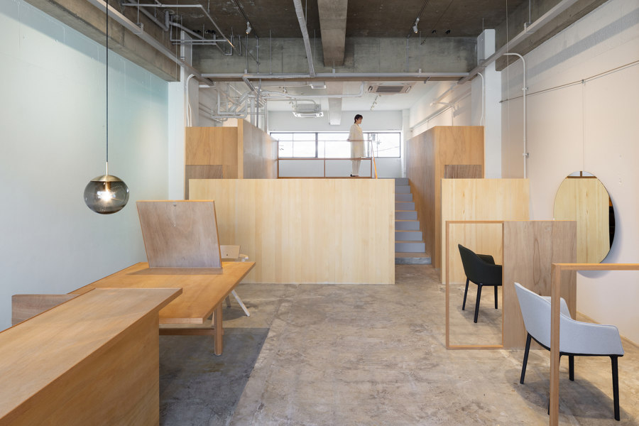
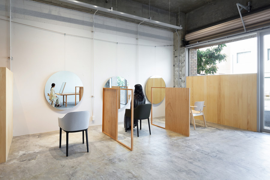
I woke up like this: effortless in the best sense, the design of Laughter Hair Salon in Shinagawa City, Japan, by SIDES CORE. Photo: Takumi Ota

I woke up like this: effortless in the best sense, the design of Laughter Hair Salon in Shinagawa City, Japan, by SIDES CORE. Photo: Takumi Ota
×Laughter Hair Salon, Shinagawa City, Japan, by SIDES CORE
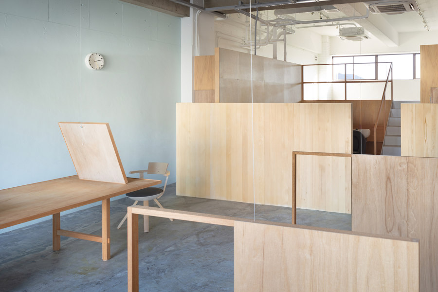
Laughter is generally not the reaction you want to elicit when showing off a new hairstyle. If you're not put off by the name of this salon in Shinagawa City by SIDES CORE, you'll find a space whose design comes across as absolutely effortless. The half-height, wood-panelled walls look as if they have been placed or leaned against each other randomly, creating an exciting collage.
Of course, nothing here is random. The wooden panels structure the room in a decidedly clever way, creating private corners and different levels, while always letting in enough light to maintain the openness of the location with its north-south orientation. So, nothing to laugh about here, but certainly something to raise a smile.
© Architonic
