Understanding Architects´ criteria
Texto por Nora Schmidt
Berlin, Alemania
04.11.08
Until the end of last year Marc Krusin had spent ten years as head of the design department at Lissoni Associati. Now he concentrates on the work in his own studio.
Until the end of last year Marc Krusin had spent ten years as head of the design department at Lissoni Associati. Now he concentrates on the work in his own studio. We met him in London during the 100%Design
You moved to Milan just after you finished your studies. In recent years the British furniture industry seems to have been developing. Why did you leave the UK?
Marc Krusin: Well, British design has a long tradition and an outstanding reputation. However, when I left the UK you could count the manufacturers who were really design oriented on the fingers of one hand, although I believe that this has changed in recent years. From what I hear some British firms seem to be re-defining themselves, which is a good thing. In spite of this British manufacturers probably still don't have the skills to produce innovative furniture with the degree of flexibility and creativity that is enjoyed by producers in Italy.
Why are the Italians so good at this?
I think there are cultural reasons for it. I could give you a list of the faults of the Italians right now, but their biggest talent is for producing things like furniture, fashion, cars and so on. And this capacity is based on production conditions which are rich in tradition - I mean small batch producers who work closely with designers and produce objects because they like them and find them beautiful, and are prepared to accept the risk which is connected with this. This concept is not something which is anchored in the British mentality, as far as I can judge. It seems that UK producers are put off by such risks and this hesitation suppresses any kind of creativity. This sounds very critical, but it's the way I see it.
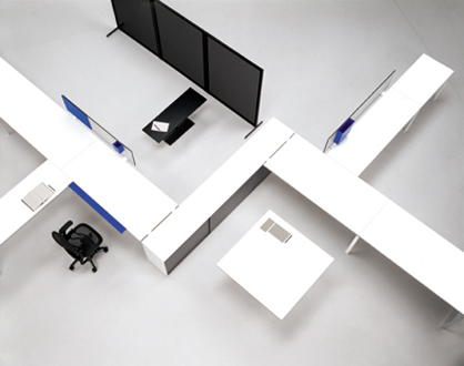
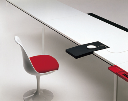
WA office system by Piero Lissoni and Marc Krusin for Knoll
You worked for Lissoni Associati for ten years until December 2008 and you became head of the design department pretty rapidly. What do you think qualified you in particular for such a position of responsibility.
Oh, that's a difficult question for me to answer. Perhaps it was my ability to get on with people and to put together a team of people who would approach their work with motivation and enthusiasm. In addition I find myself naturally aligned with Piero's way of designing, which is of course fundamental to such a position. This is why we still work together, for example for Knoll.
What kind of office/working-situation did you see as precondition for your design?
For sure we had concepts of what an office should be, how people should work and what they should need. This was also to be combined with Knoll's and the known market requirements for an office system.
With this project we considered very closely the user and specific unresolved problems that arise from working all day at a desk, such as aches and pains deriving from using a mouse - hence the "arm-rest-mouse-pad", and arm ache from forearms resting on hard, sharp desk edges - hence the "soft arm pad".
I personally believe that part-time freelance work is, in many cases, a very positive thing as it allows people to organise their own time, to focus on certain tasks and work intensively and with motivation on them, rather than waste time in the office at times when perhaps there is actually nothing to do! This style of working improves the quality of life for the worker and allows more freedom to spend time with family, friends etc.
Thankfully, increasing numbers of people are working temporarily, freelance or as consultants and therefore may have more temporary positions on a larger "bench type" structure, or may spend much time out of the office. Considering this we also focused on personal space within a bench system and created the pin board and writing mat as well as a series of acessories for personal use and a storage system which may be ordered in small modules to provide larger, lockable space for personal documents.
Another design angle was of course re-use. All the WA sytem can be very easily set up and taken down again and re-used in other ways and configurations. This means that the system can grow and adapt as a company grows and adapts. The system can even move buildings with it's owners.
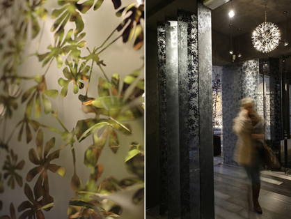
Reception and entrance lobby interiors at the Traversi building, Milano, designed by Marc Krusin
What kind of vision do you personaly have for a future office?
Today, many people do an awful lot of work to make a very few people rich. My vision is of structures in which each individual's contribution to a company is fully considered - even those at the bottom of the ladder - and in which individuals are encouraged to grow. I see environments with less rigidity and more consideration for human beings. More emphasis must be placed on quality of life for all involved as well as innovation and sensibility and less emphasis must be placed solely on making money. My vision is of a future office that reflects this.
So far you have designed things mainly for industrial, more or less large scale- production. Would you also like to produce things for smaller series?
Industrial production is fascinating to me, but of course not everything needs to be produced in that way.
For me the preservation of local craftsmanship is very important. It's great when countries look after their traditions of craftsmanship for a specific type of product. This is a wonderful feature especially when they use this basis to innovate and discover new possibilities.
The kind of limited editions of many namable designers we have seen recently on the art market are something different. They mostly serve the purpose of experiment. This is of course an important part of the design world, but that's not my part. I could imagine designing small-scale series for a specific type of architecture. For example a very complete and satisfying project would be to design a building and everything in it - that is, furniture intended specifically for that building.
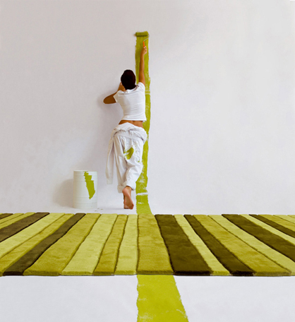
Rugs Tiptop, Lines for Gandia Blasco, by Marc Krusin
The dialogue between architecture and design seems to play a decisive role in your work. Is that the result of years spent working together with an architect?
Definitely. Piero is an architect himself and he has passed this point of view on to me. A fundamental difference between design and architecture is that design is normally produced on a mass basis. This means that you design a chair which has to fit into a variety of environments. At the majority of design colleges you are taught how to design an object, but they often forget to include the space in which the object is to find its home. As a result many designers have never designed a room or selected furniture for a room. They therefore have trouble understanding the criteria which an architect uses in selecting a table or a chair. In my opinion this often restricts the capabilities of the designer.
As a designer you create consumer goods and you accordingly have a certain amount of influence on the ecological aspects of a product. How far do you think this influence goes?
Well, the designer is of course only one part of a whole chain of responsibilities. For good or for ill. A lot depends on the commitment of the manufacturer. Sure, you can try to suggest using material which can be recycled and there are a few possibilities for influencing this, but it's always up to a certain point only. At Knoll we have invested a good deal of work in sustainability, bringing in a lot of consultants and experts. I don't know if you're aware of the fact that all steel is either fully recycled or fully recyclable. I didn't know that.
Okay it is recyclable, but only at very high energy costs.
Exactly. And that immediately brings us to the point where things get complicated. There are lots of aspects which have to be taken into consideration when it comes to sustainability: transport, packaging and so on. People have their own opinions on these matters, but there's no standard. One person will tell you that chrome plating is the most damaging thing there is for the environment, while other people say that it makes the material more durable and is therefore sustainable. It all depends on who you talk to. It's probably more of a social discussion than a debate about design, because more sustainability means above all a reduction in consumption.
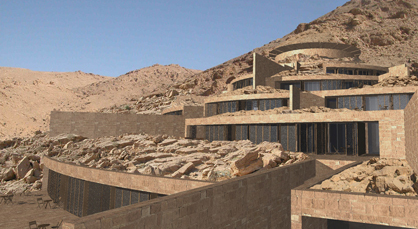
Spiritual Oasis in Deir Mar Musa, Syria, by Marc Krusin
You're working on a concept for a spiritual centre in Syria at the moment.
Yes, my wife and I are very spiritually oriented – it's an important part of our lives. This place of retreat that we're planning in Syria is close to a Christian monastery in an area which is mainly populated by Moslems. Moslems and Christians actually live in relative harmony in Syria and the centre is to set an example as well as encourage continuing exchange between the two religions and also others. All groups can practise their own individual religion while at the same time learning from the other groups and coming to understand them.
The building merges with this environment in that it has as little impact as possible on the ecological system. Local materials are used in combination with an ecological energy concept. It's a great project and I would be really happy to concentrate on the architecture of such centres, because I believe that we really need them.
Thank you very much for talking to us.
