In the bag: new retail-interior concepts
Texto por Peter Smisek
08.05.19
Through their design-led, social-mediatised interiors, retail projects are getting out there.
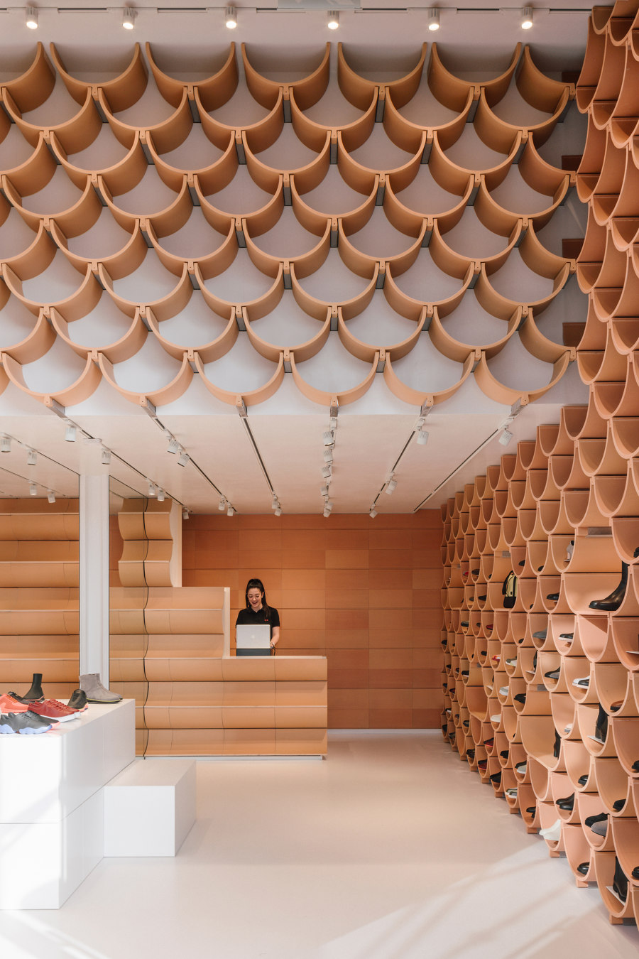
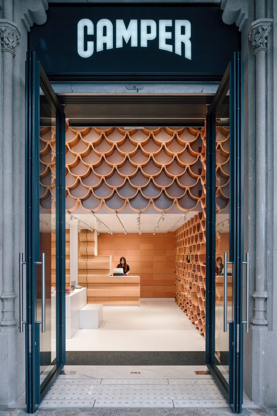
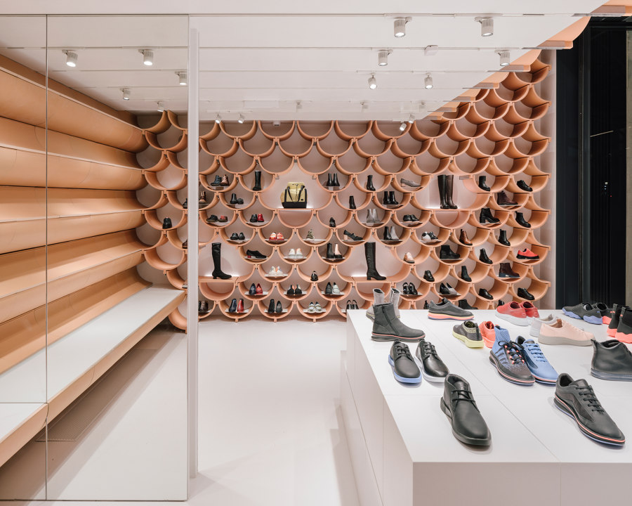
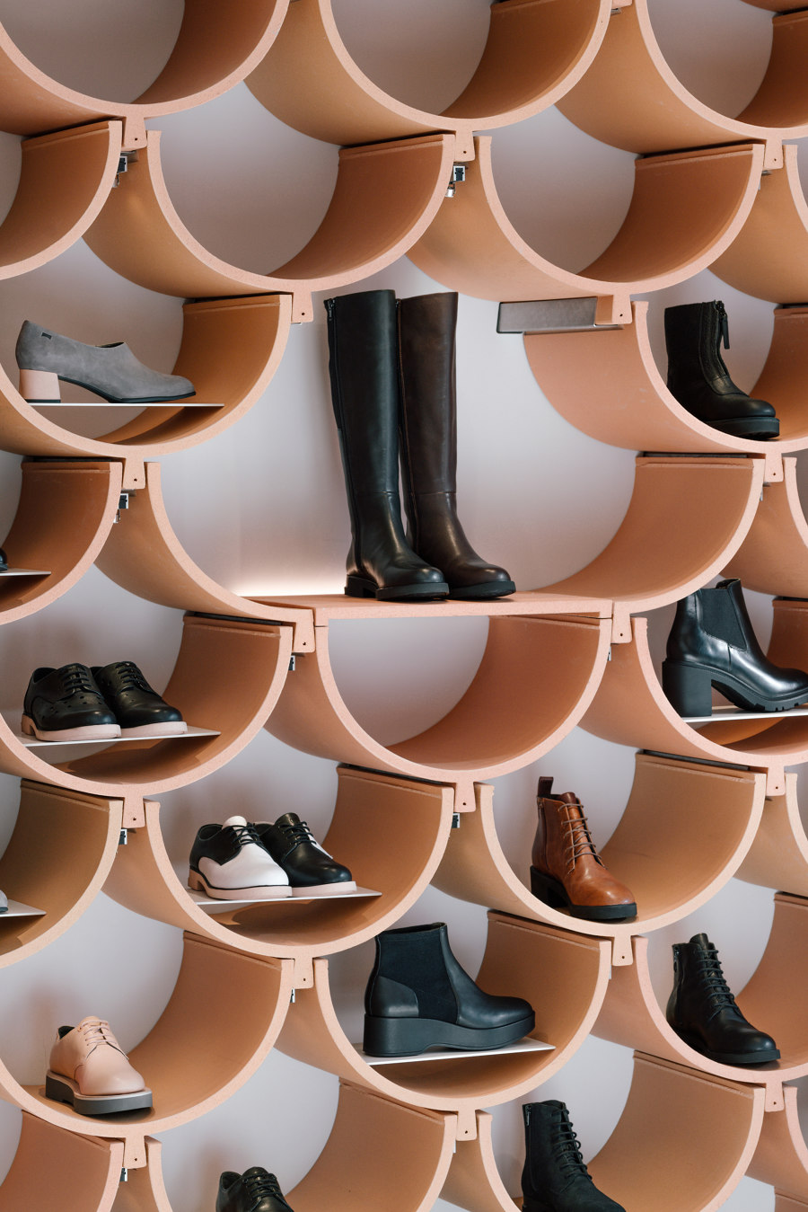
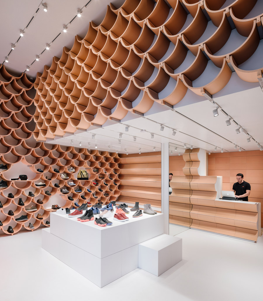
Kengo Kuma & Associates' utilised ceramic plates inspired by traditional Catalan vaults to individually showcase products at the Camper store in Barcelona. Photo: ImagenSubliminal (Miguel de Guzman + Rocio Romero)

Kengo Kuma & Associates' utilised ceramic plates inspired by traditional Catalan vaults to individually showcase products at the Camper store in Barcelona. Photo: ImagenSubliminal (Miguel de Guzman + Rocio Romero)
×Retail has changed, and while online shopping may have left some on the high street struggling, social media has also renewed global interest in visually appealing retail interiors. Images of new retail-interior concepts are shared by ordinary users and influencers alike, transforming the store from a mere point of sale to an online advertisement for the brand.
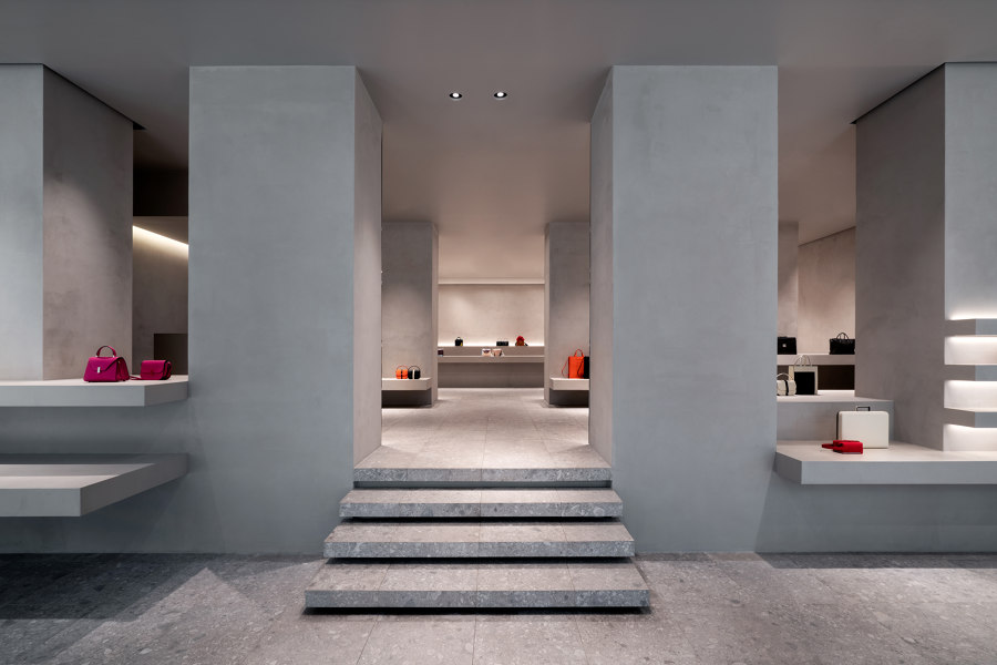
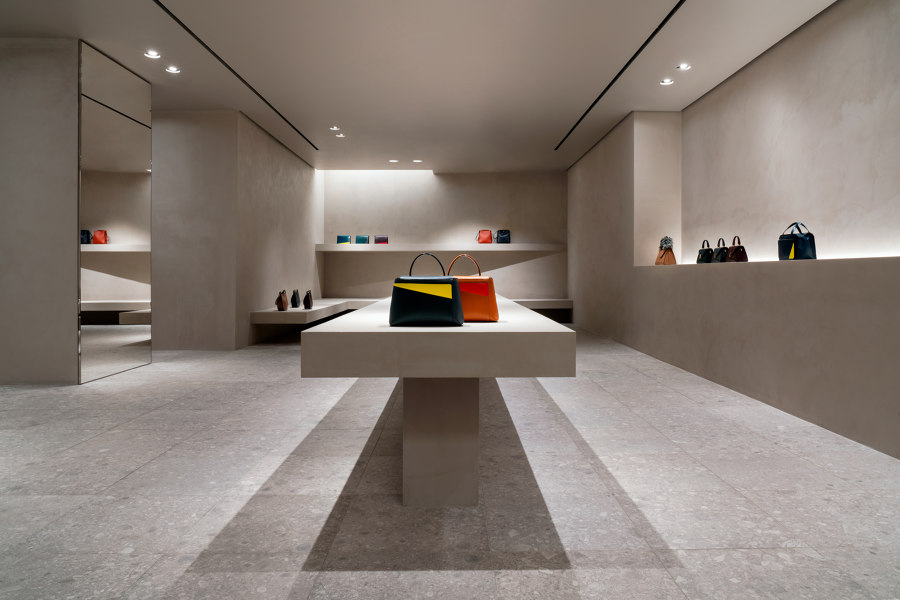
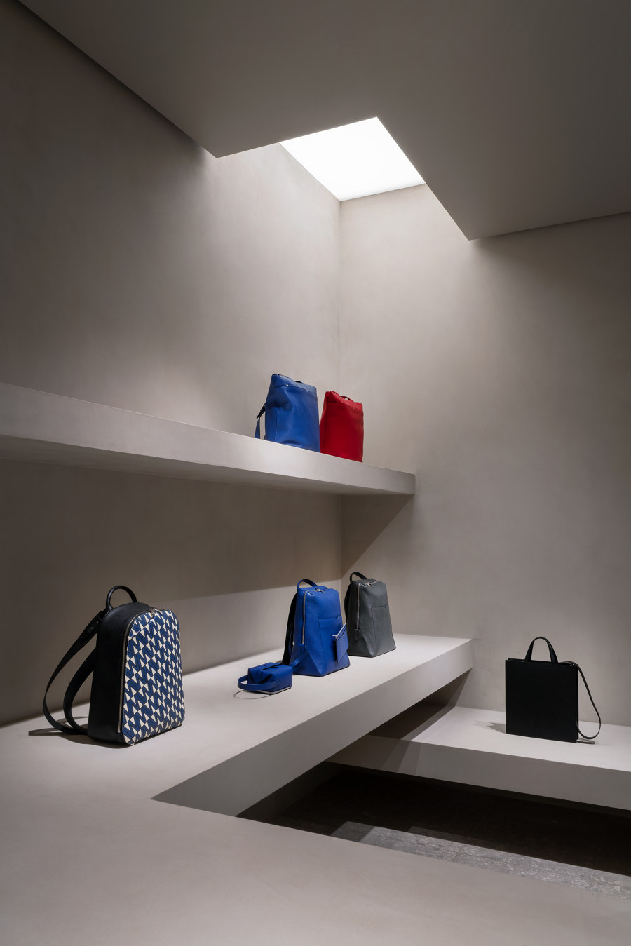
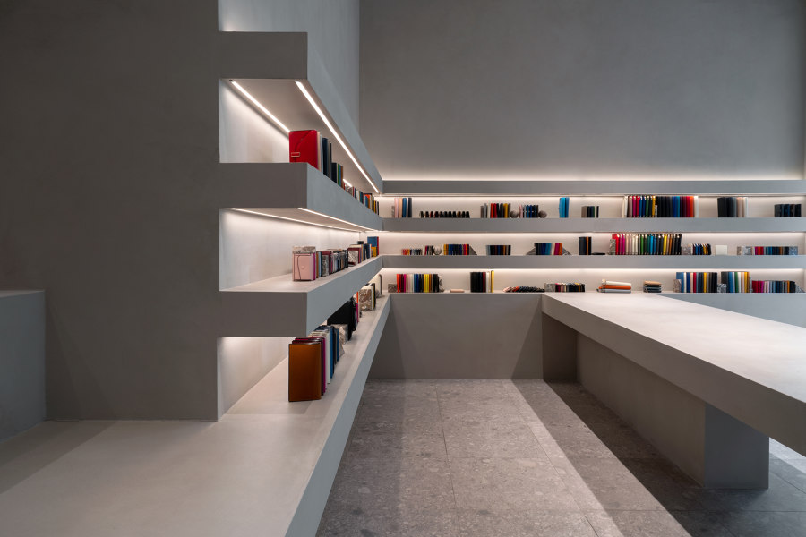
The Valextra Store in Milan has been through a number of redesigns in the last couple of years, each by a different architect. This is not because the previous retail concepts, which were designed by the likes of Martino Gamper, Snarkitecture and Kengo Kuma & Associates have been ineffective, but because the redesign and its unveiling is part of the brand's marketing strategy. The latest monochromatic iteration, conceived by minimalist John Pawson, creates a robust, monumental space in which the brand's luxury leather goods take pride of place.
Introducing new retail interior concepts by different high-profile architects and designers is a deliberate strategy through which Valextra generates extra publicity and shows off the strength of their own design tradition. Photos: Andrea Martiradonna

Introducing new retail interior concepts by different high-profile architects and designers is a deliberate strategy through which Valextra generates extra publicity and shows off the strength of their own design tradition. Photos: Andrea Martiradonna
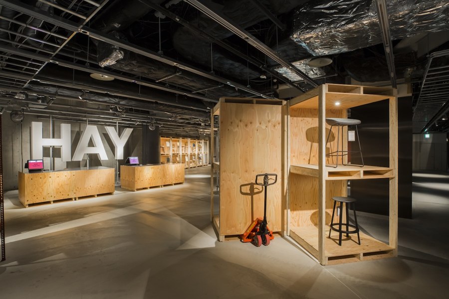
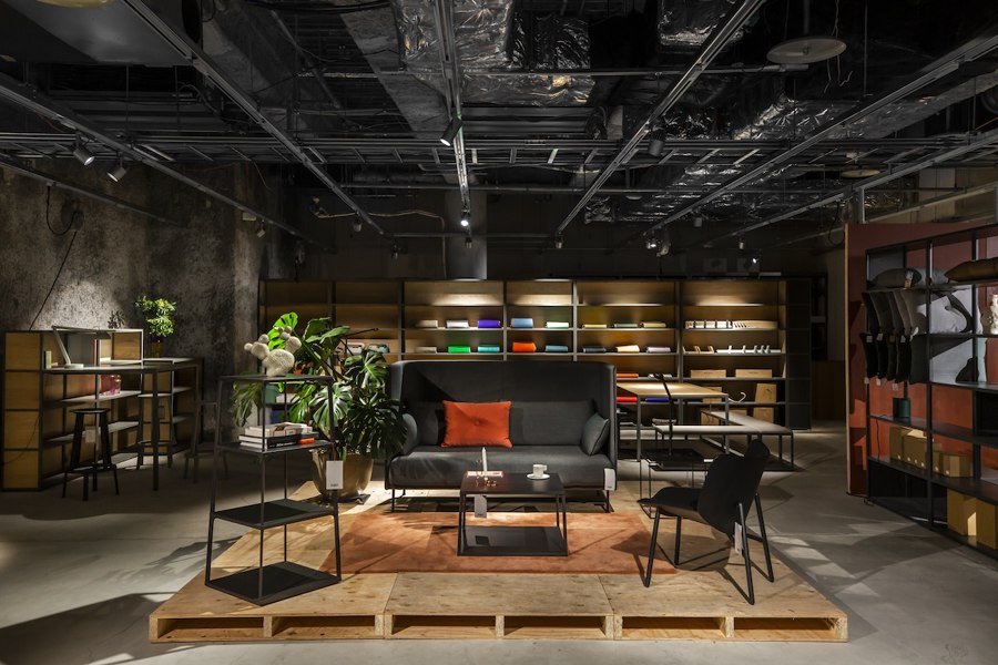
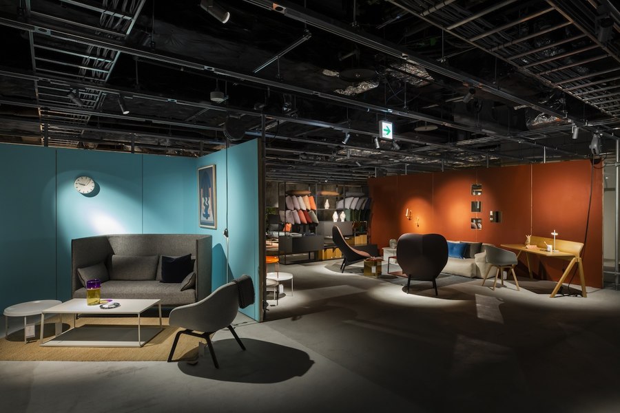
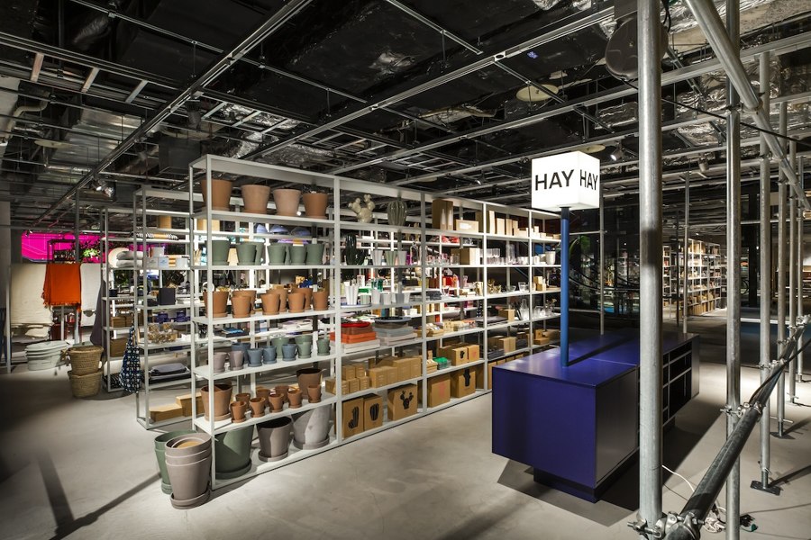
×In Tokyo, Schemata Architects have designed a new retail-interior concept for Danish furniture brand HAY. The new pop-up store features what the architects call "interfaces" – movable and flexible stage sets which invite visitors to imagine and re-enact various day-to-day activities within them. Combining geometric rigour, bright colours and HAY's distinctive furniture, these changing displays are just as suited to physical interaction as they are to sharing on Instagram.
By combining visual appeal with interactive set-pieces, Schemata Architect' HAY pop-up store in Tokyo is a good example of the current trends in new retail interiors. Photos: Masataka Nishi

By combining visual appeal with interactive set-pieces, Schemata Architect' HAY pop-up store in Tokyo is a good example of the current trends in new retail interiors. Photos: Masataka Nishi
×New interior-retail concepts are also used to strengthen a brand's origin story. Kengo Kuma & Associates’ Camper Paseo de Gracia uses a set of modular, ceramic elements, inspired by traditional Catalan method of building vaults, to refer to the footwear's local provenance. Serving as a visual leitmotif, the ceramic modules are used as decorative interior cladding, individual display shelves, and are stacked to form benches and a counter.
The striking visual appearance of the display shelves in Kengo Kuma & Associates' Camper Paseo de Gracia store allows for a high degree of flexibility. Photos: ImagenSubliminal (Miguel de Guzman + Rocio Romero)

The striking visual appearance of the display shelves in Kengo Kuma & Associates' Camper Paseo de Gracia store allows for a high degree of flexibility. Photos: ImagenSubliminal (Miguel de Guzman + Rocio Romero)
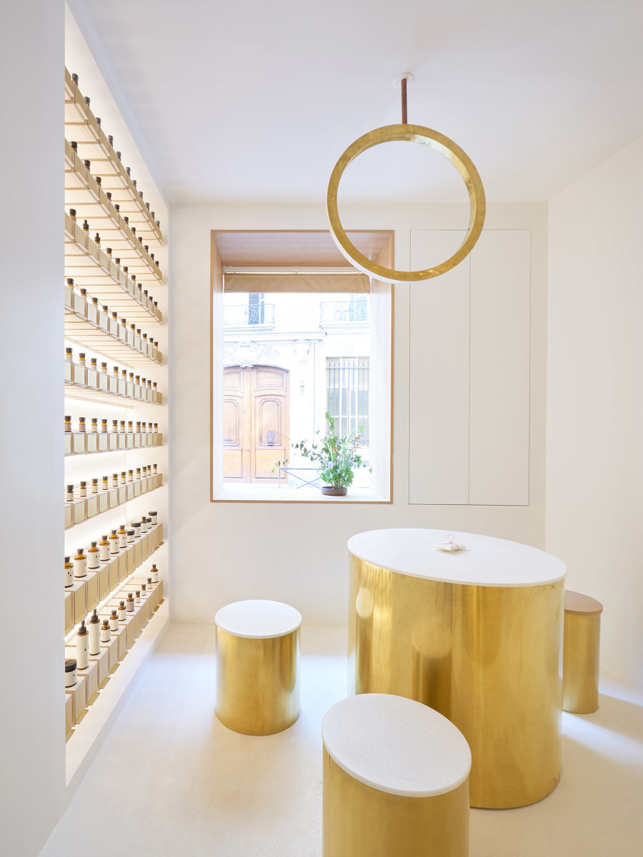
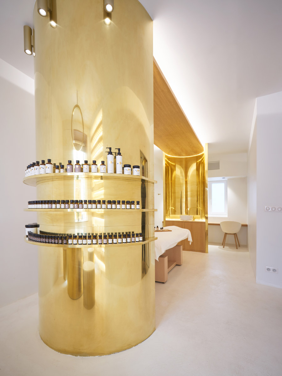
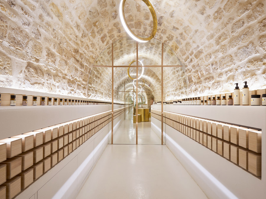
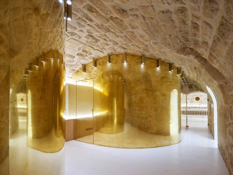
×Of course, many new retail interiors are not just visually appealing. The new En skincare store in Paris, by Japanese outfit ARCHIEE, combines polished brass elements with white-washed walls on the ground floor and exposed stone vaults in the basements. The way products are displayed on shelves and stored in wooden boxes is reminiscent of a winery, while a separate massage and treatment room underscores the experiential aspect of the new space
The focus on luxurious materials and customer experience in ARCHIEE's En skincare store are typical features of contemporary retail interior concepts, which often seek to reinvigorate perceptions of the brands they contain. Photos: David Foessel

The focus on luxurious materials and customer experience in ARCHIEE's En skincare store are typical features of contemporary retail interior concepts, which often seek to reinvigorate perceptions of the brands they contain. Photos: David Foessel
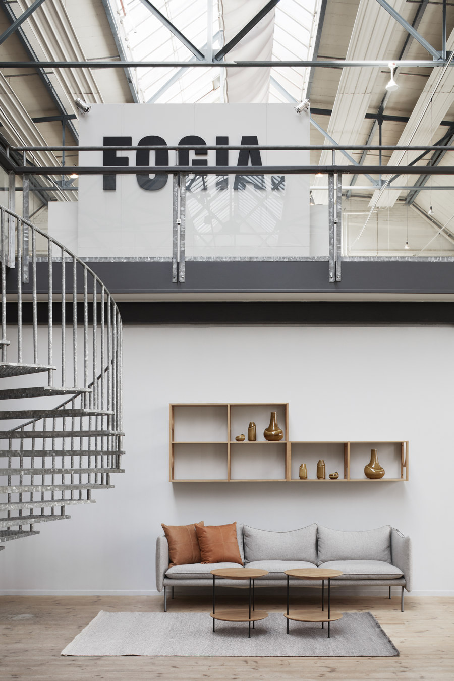
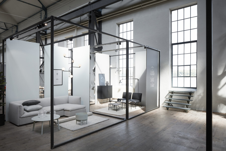
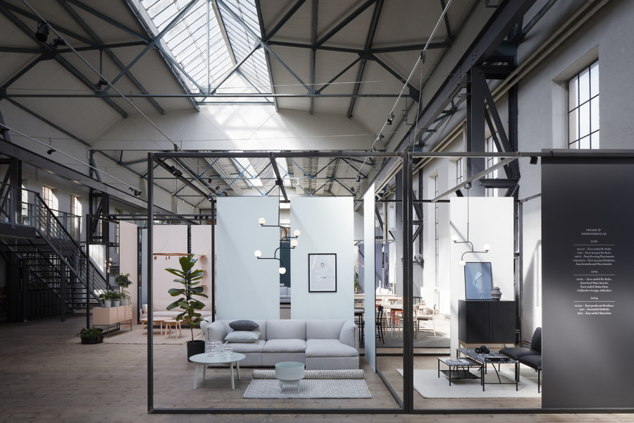
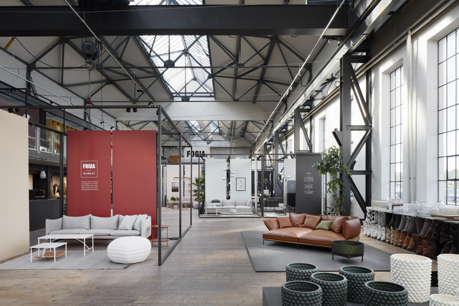
×Making the most of an existing, post-industrial space, Fogia's new showroom in Stockholm is located in a 19th-century steam engine workshop. The new retail space concept, designed by creative agency Code Concept, has preserved the building's industrial structure and complemented it with steel display modules, in which furniture and accessories can be arranged to create self-contained setups, while allowing free movement of customers around the store. The monochrome yet highly specific backdrop of the factory creates a suitable framework for Fogia's elegant, subtly coloured furniture.
The flexibility of the displays within the overarching, stable framework of the old factory in Code Concept's Fogia showroom in Stockholm creates an ideal space that encourages customer-product interaction. Photos: © Mårten Ryner

The flexibility of the displays within the overarching, stable framework of the old factory in Code Concept's Fogia showroom in Stockholm creates an ideal space that encourages customer-product interaction. Photos: © Mårten Ryner
ש Architonic
