Industrial design elements in retail interiors
Texto por Peter Smisek
17.11.21
The latest retail projects reveal how the textures and materials of industry have been elevated and combined to create an otherworldly, often hard-edged, yet alluring aesthetic.
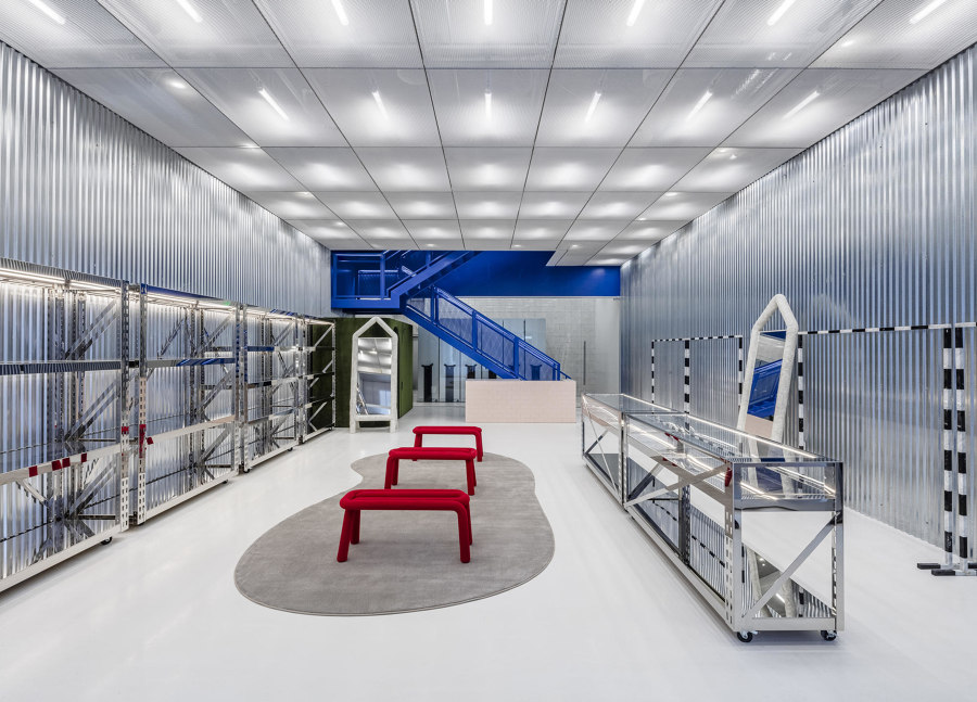
Virgil Abloh + AMO took the use of industrial elements even further in their design for the Off-White Flagship Store Miami. Photo: Courtesy of Off-White

Virgil Abloh + AMO took the use of industrial elements even further in their design for the Off-White Flagship Store Miami. Photo: Courtesy of Off-White
×At the start of the 20th century, modernist architects were inspired by the vast industrial structures of their age – train sheds and factories, for example – as well as new machines and vehicles, such as steamboats and motor cars. These industrial elements have even entered the world of high-end retail interiors. In these projects, architects and designers have elevated and combined the textures and materials of industry to create an otherworldly, often hard-edged, yet alluring aesthetic.
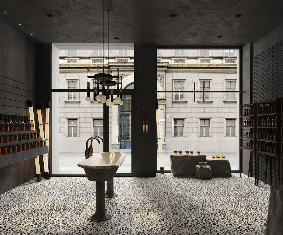
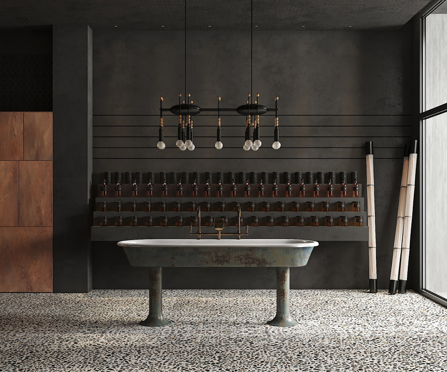
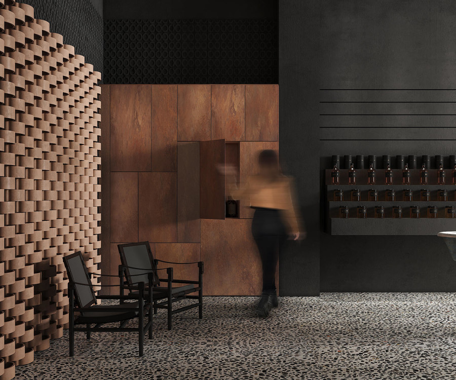
By combining industrial elements with natural materials and dark hues, Puntofilipino created an alluring retail interior for Honeyz Concept Store Berlin. Photos: Polina Parcevsky

By combining industrial elements with natural materials and dark hues, Puntofilipino created an alluring retail interior for Honeyz Concept Store Berlin. Photos: Polina Parcevsky
×In the case of Honeyz Concept Store in Berlin, the Madrid-based studio Puntofilipino employed a limited number of industrial elements, such as a large, distressed sink, a pebble concrete floor and a weathered steel wall, and combined them with more domestic touches, such as an ornate, Apparatus chandelier. The designers clearly delight in exploring this tension: the pared-back timber shelving units have expanded metal mesh on the side, and a ceramic screen made of a single repeated element points both to industrial as well as artisanal techniques. The dark colour palette lends the space a slightly dystopian feel, referencing a wartime bunker that once existed in the building.
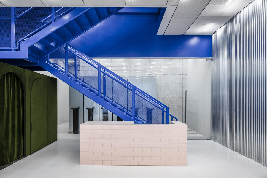
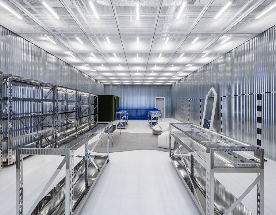
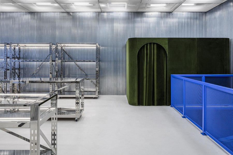
Combining a contemporary industrial look, functional elements like castors and playful furniture brings a sense of fun to Virgil Abloh + AMO's sophisticated Off-White Flagship Store Miami retail interior. Photos: Courtesy of Off-White

Combining a contemporary industrial look, functional elements like castors and playful furniture brings a sense of fun to Virgil Abloh + AMO's sophisticated Off-White Flagship Store Miami retail interior. Photos: Courtesy of Off-White
×The front of the store consists of transparent polycarbonate sheets, while the walls are clad in highly polished corrugated metal, and the floor is made of polished concrete. An electric-blue metal stair connects the ground and the first floor, while the storage area is hidden behind transparent sheets of glass. Metal shelving units along the walls are mounted on castors, allowing for flexibility if necessary, while the seating consists of carefully selected design classics from designers such as Pierre Paulin and Maarten Baas. An additional moving element that normally serves as the display can be moved along the length of the store to create a temporary space for events, and a green velvet dressing room adds a splash of luxury in a contrasting texture.
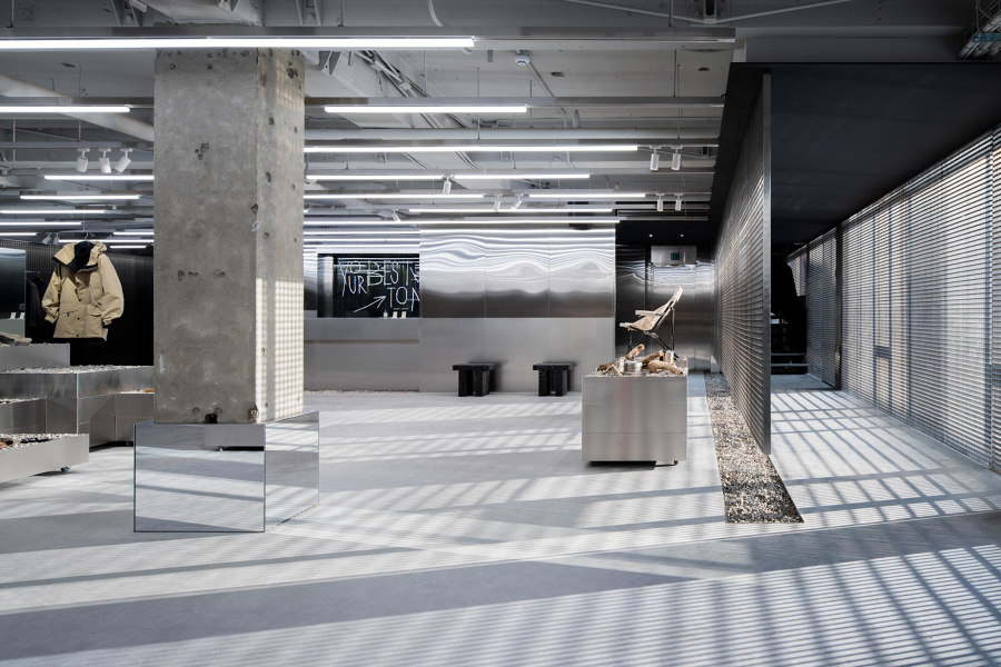
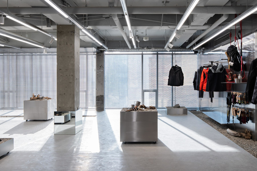
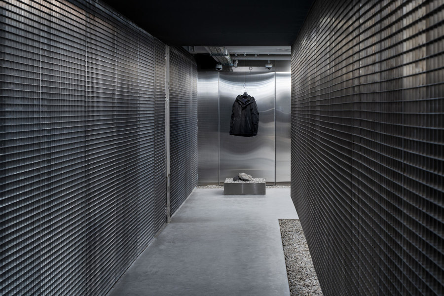
KOLON SPORT Hannam Store by studio fragment combines metal industrial elements with gravel and planting to create a hybrid natural/urban retail space. Photos: Kim Donggyu

KOLON SPORT Hannam Store by studio fragment combines metal industrial elements with gravel and planting to create a hybrid natural/urban retail space. Photos: Kim Donggyu
×In Seoul, studio fragment have designed the KOLON SPORT Hannam Store around a combination of sleek industrial elements and nods to the natural world. Spread across two polished concrete floors, the retail interior features polished steel panels as well as metal gratings to delineate the space. Rough concrete columns and ceilings are left exposed, while stainless-steel display cubes are topped with gravel. A stair connecting the two storeys features a planted urban patio underneath, embodying the KOLON SPORT brand ethos of enjoying the outdoors, whether in the city or the countryside.
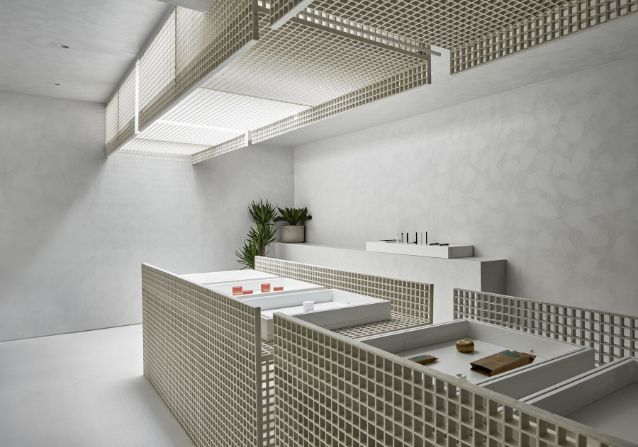
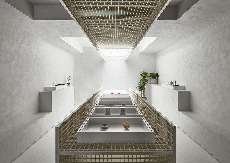
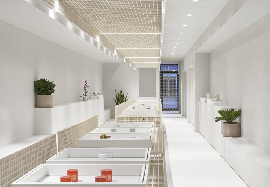
StudioAC's design for EditionX Store uses a single industrial element to create a minimalist retail interior, helping to draw attention to the brand's products and wares. Photos: Doublespace Photography

StudioAC's design for EditionX Store uses a single industrial element to create a minimalist retail interior, helping to draw attention to the brand's products and wares. Photos: Doublespace Photography
×As a result of its recent legalisation, architects and designers in Canada have been redefining the aesthetics of cannabis. In downtown Toronto, StudioAC opted for a pared-down, monochromatic industrial look for the design of EditionX Store. A central, sculptural display element, running the entire length of the narrow retail interior is assembled from metal grids and has been painted in a warm white colour to match the rest of the space. The same elements also comprise large parts of the ceiling, creating an eye-catching motif that helps to elevate the brand's products while also keeping fit-out costs low – important for a new business in a fledgling sector of the economy.
© Architonic
