My office, my way: new workplace design
Texto por Peter Smisek
09.10.19
Same chair, same desk, same office – not anymore. Today's office workers are increasingly demanding more from their workspaces and designers, as well as manufacturers, are responding.
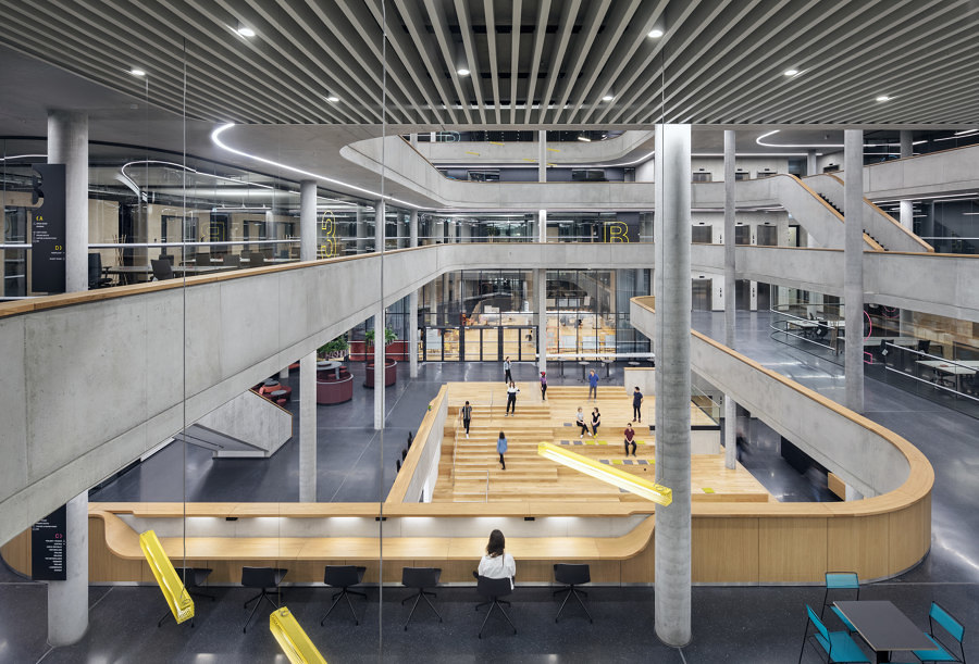
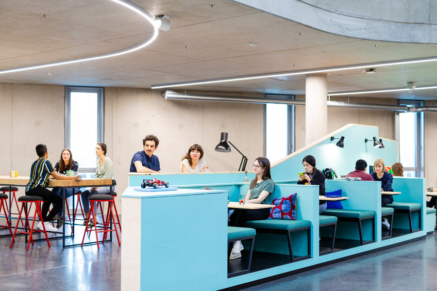
The modern office is more than just a place to clock-in and clock-out. The creative design of many modern workspaces is a reflection of the way that people want to work today. Pictured above, Zalando Headquarters in Berlin. Photo: © Werner Huthmacher

The modern office is more than just a place to clock-in and clock-out. The creative design of many modern workspaces is a reflection of the way that people want to work today. Pictured above, Zalando Headquarters in Berlin. Photo: © Werner Huthmacher
×As the workplace changes to accommodate a more diverse workforce, so office design adapts to suit a new, more flexible and more diverse set of demands that prioritise employee interaction and collaboration. The one-size-fits-all approach no longer works and architects are coming up with creative solutions, both for new and existing spaces.
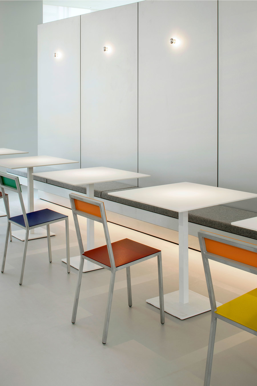
Alex Cochrane Architects' design for Selfridges Offices in London includes pared-back furnishings and a soft monochrome palette, enlivened by considered use of bright colours. Photographer: © Ståle Eriksen

Alex Cochrane Architects' design for Selfridges Offices in London includes pared-back furnishings and a soft monochrome palette, enlivened by considered use of bright colours. Photographer: © Ståle Eriksen
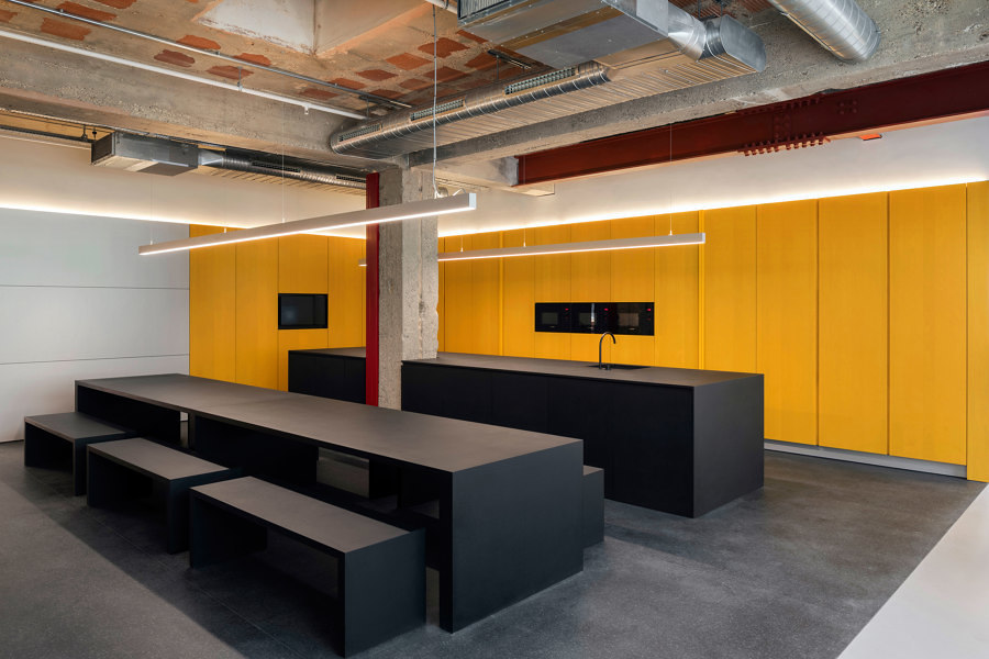
×Even blue-chip companies, such as Selfridges, are overhauling their workspaces to encourage a more innovative and interactive work environment. The existing space of Selfridges Offices in London has been designed by Alex Cochrane Architects who opened up the space and painted the walls white. The office is now zoned into different areas, including rows of desks, quiet workspaces and meeting rooms, informal break-out spaces, a shared canteen, as well as a flexible playroom.
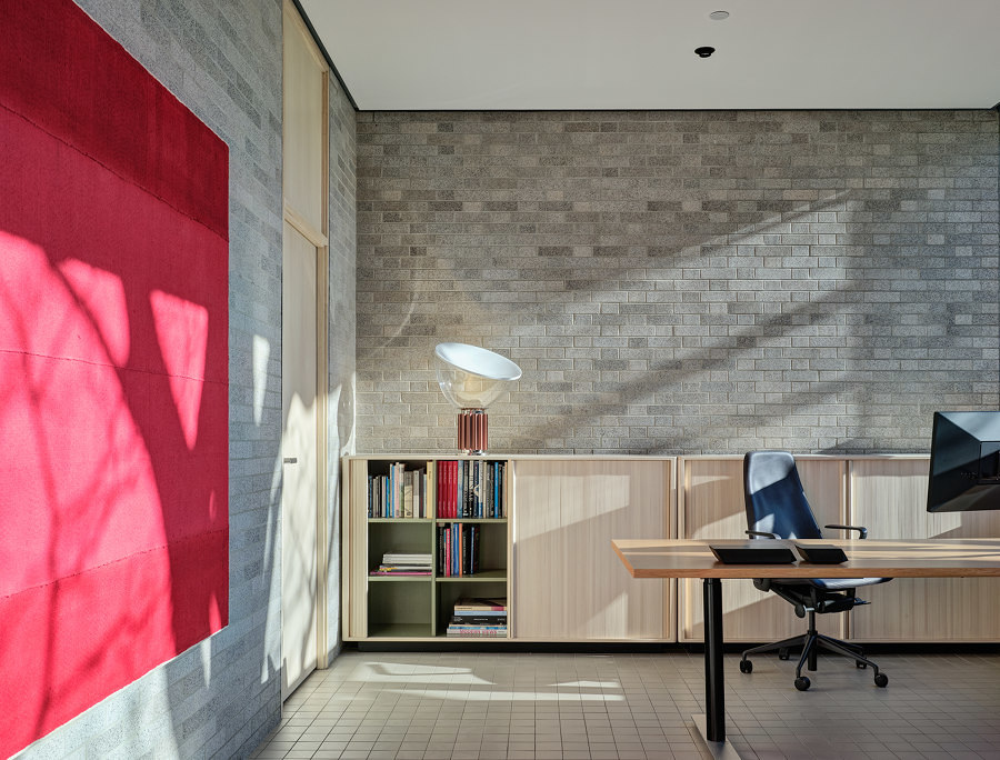
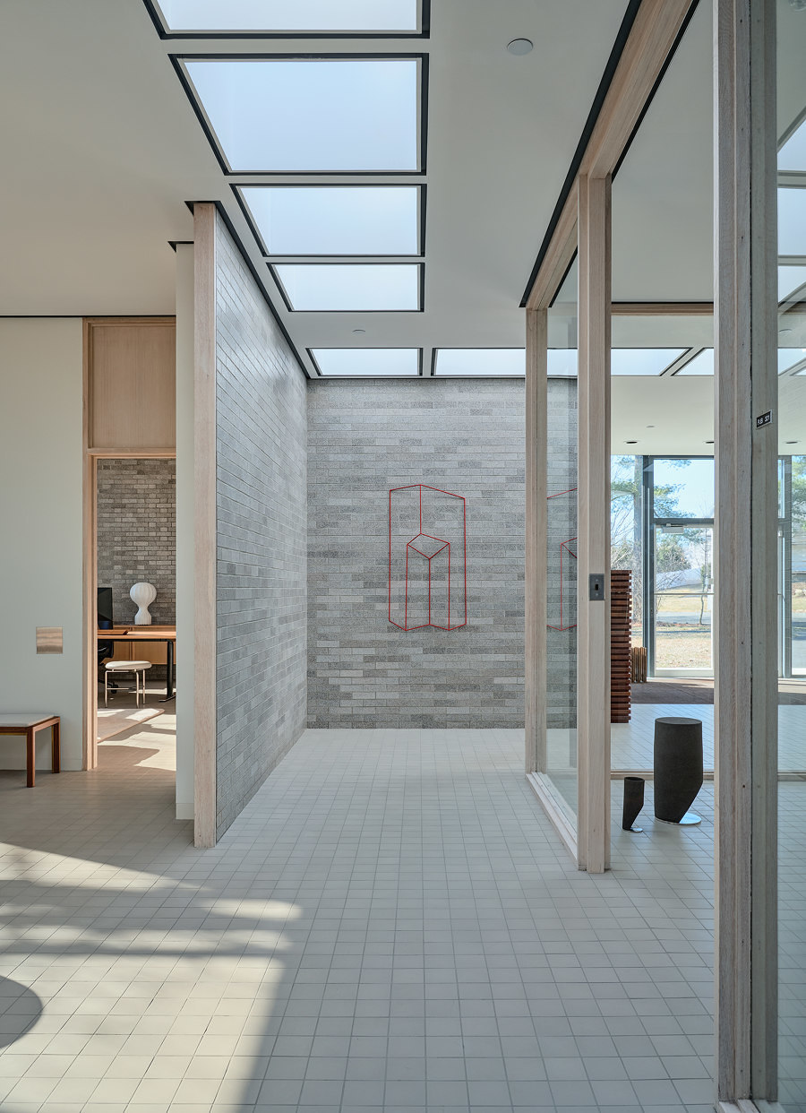
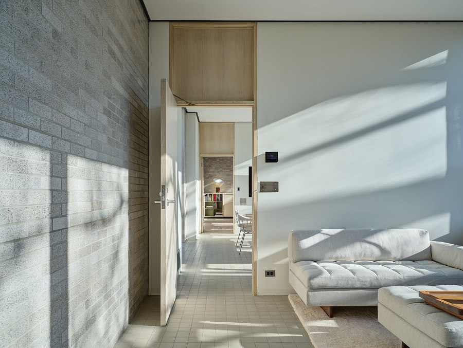
BassamFellows Headquarters shows how architects and designers can respectfully adapt and faithfully renovate heritage buildings, while making them fit for the 21st century user. Photographer: Michael Biondo

BassamFellows Headquarters shows how architects and designers can respectfully adapt and faithfully renovate heritage buildings, while making them fit for the 21st century user. Photographer: Michael Biondo
×In the US, design agency BassamFellows renovated one of the finest early suburban offices into their new headquarters. Originally designed by Pritzker Prize winning architect Philip Johnson in 1951, the building has been brought back to its mid-century modern glory by carefully restoring and updating original details such as glazing and frames, as well as keeping services hidden within the structure. However, as the toilets and kitchen were originally located in other parts of the campus that are now demolished, these functions had to be carefully reintegrated within the existing structure.
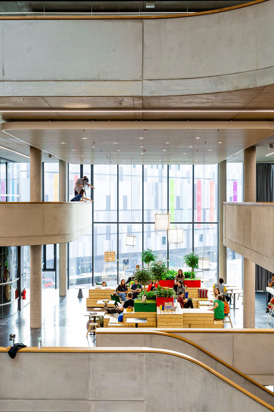
Zalando Headquarters in Berlin, designed by HENN and Kinzo Design Studio, shows the importance of designing human-scaled spaces within large new buildings. Photographer: © Sebastian Doerken

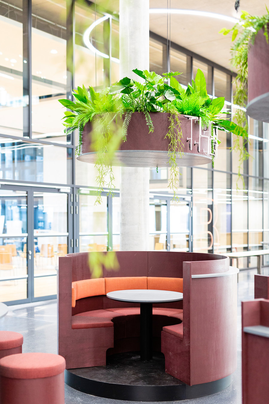
Zalando Headquarters in Berlin, designed by HENN and Kinzo Design Studio, shows the importance of designing human-scaled spaces within large new buildings. Photographer: © Sebastian Doerken
×But offices are still being built from the ground up. Zalando Headquarters in Berlin, designed by HENN and Kinzo Design Studio, is a sleek glass edifice from the outside, but the inside has been designed to reflect the city's industrial heritage, with exposed concrete columns and balustrades surrounding a large atrium. Although the large central space is adapted for interaction and can be turned into an event space for 1,500 people, the designers have also created more private nooks for concentration and meetings.
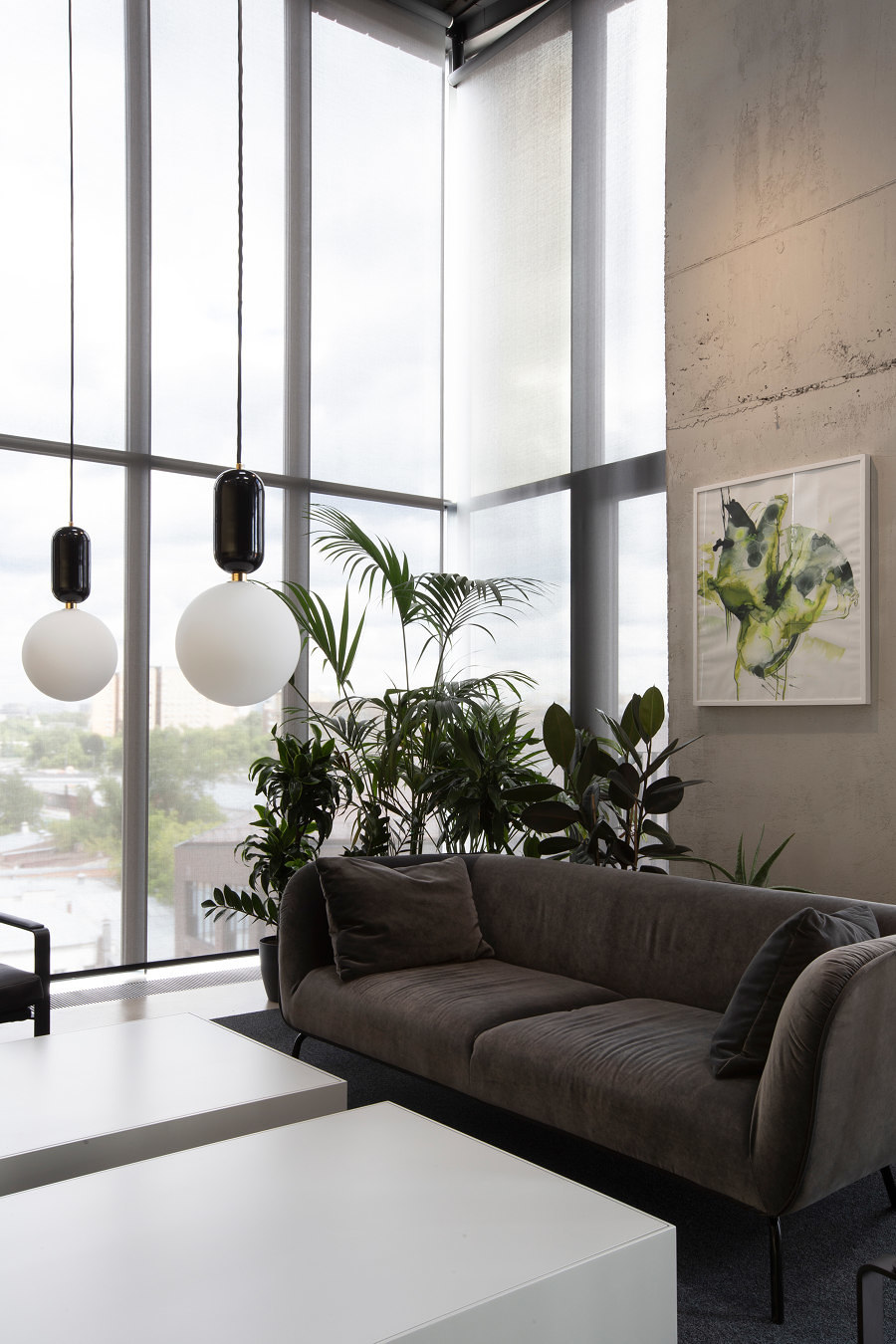
Muted tones and pared-back custom furniture, designed by Alexander Volkov Architects, create a beguiling space for NV/9 ARTKVARTAL Sales Office. Photographer: Ilya Ivanov

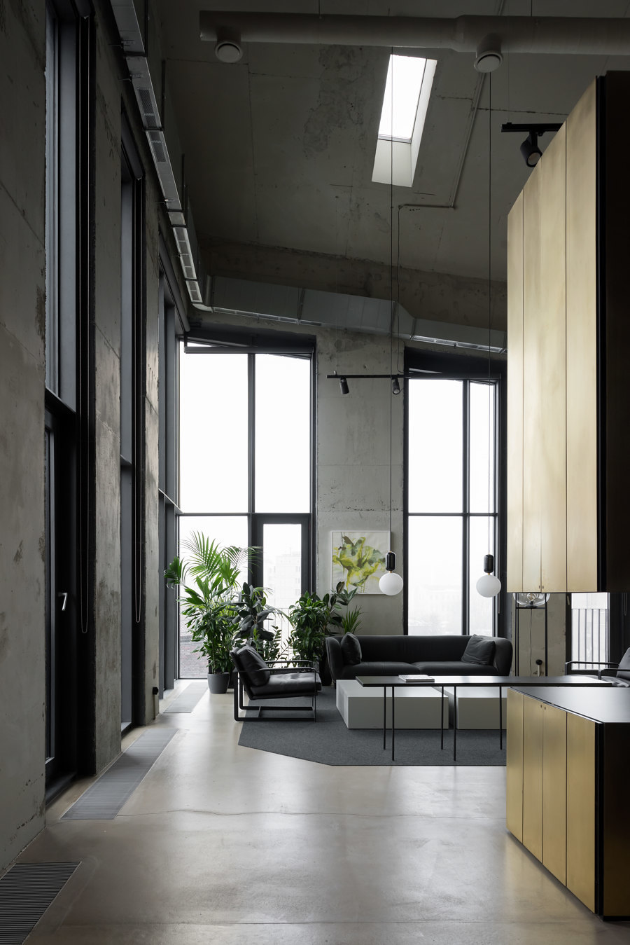
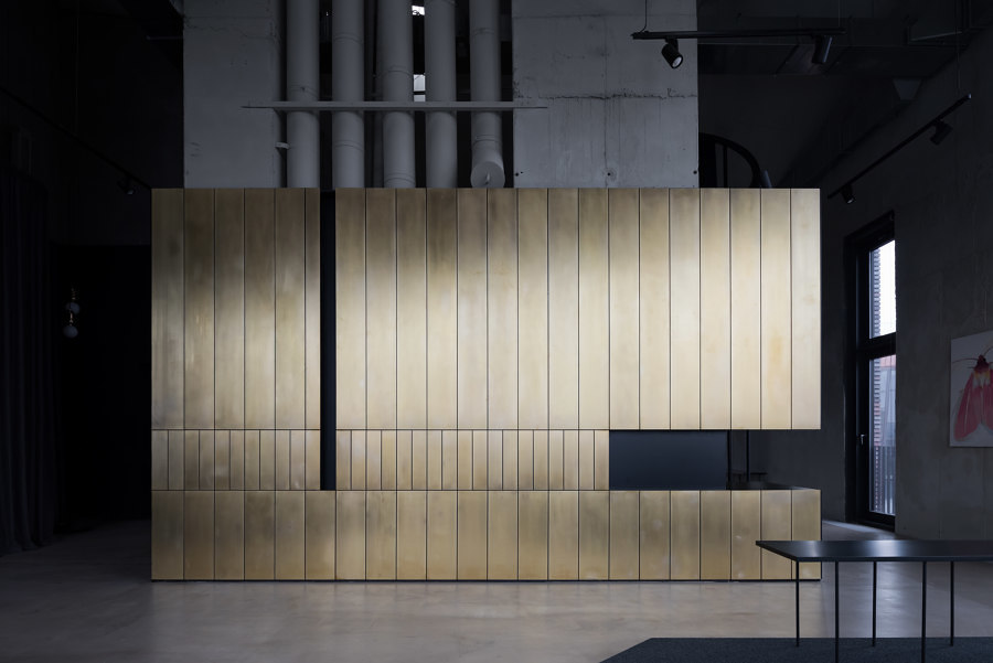
Muted tones and pared-back custom furniture, designed by Alexander Volkov Architects, create a beguiling space for NV/9 ARTKVARTAL Sales Office. Photographer: Ilya Ivanov
×A wholly different brief is the design of a sales office. Here, the sales representative space is of the utmost importance, while that of other employees can be more modest. Moscow's NV/9 ARTKVARTAL Sales Office is located in an 8.5 metre tall, loft-like space, in one of the prestigious new developments in the city centre. In order to accentuate the height of the space, Alexander Volkov Architects have designed a large, movable navy blue curtain that acts as a flexible divider, and hides a private, circular meeting room in the middle of the office. Two large, brass-clad cabinets on either side provide hidden storage and a bathroom.
© Architonic
