Playtime!: pavilions that push the boundaries
Texto por Peter Smisek
29.06.18
Pavilion projects are like catnip for architects. These often impermanent structures provide the ideal testing ground for new concepts, forms and material expression.
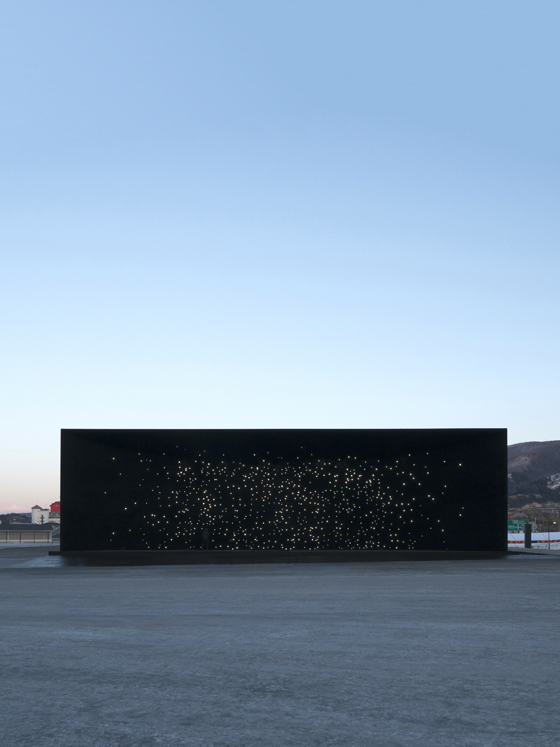
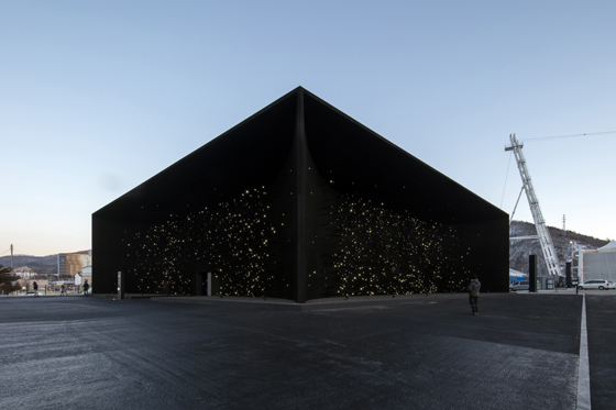
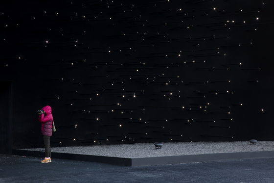
The 10-metre tall parabolic facades covered in Vantablack VBx2 – the world's darkest pigment, which absorbs 99% of light – skew the three-dimensionality of Asif Khan’s Pyeongchang Winter Olympics Hyundai Pavilion. Photo: © Luke Hayes

The 10-metre tall parabolic facades covered in Vantablack VBx2 – the world's darkest pigment, which absorbs 99% of light – skew the three-dimensionality of Asif Khan’s Pyeongchang Winter Olympics Hyundai Pavilion. Photo: © Luke Hayes
×Pavilions are small structures not to be confused with their more whimsical counterpart, follies. While performing a basic function, they afford designers the freedom to experiment with spatial sequences, materials and ideas. Architects have always been happy to try their hand at these small buildings, developing concepts they can apply in their other projects, and often showcasing their approach to a wider audience.
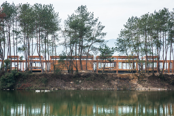
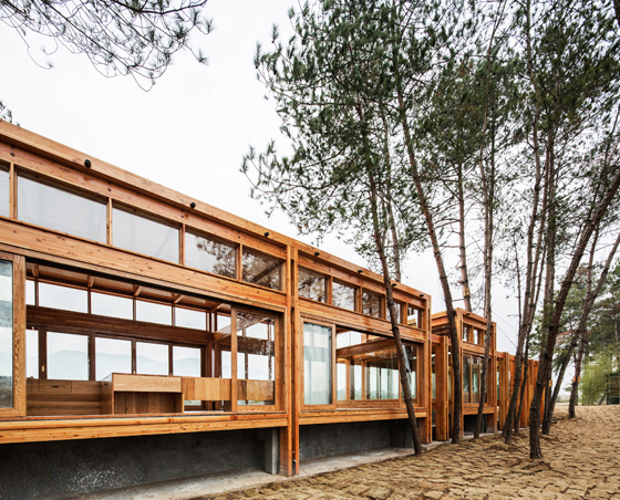
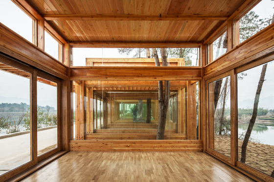
One such experimental structure is the Pine Park Pavilion in Lishui, China. Designed by DnA Design and Architecture, this linear building sits on the bank of the Songyin River. Made from prefabricated timber elements, the Pine Park Pavilion accommodates toilets and a visitor centre, and features an installation about traditional resin production in the region. Large panes of glass offer panoramic views of the surrounding pine trees and countryside, while the pavilion's position on a tourist path serves both cyclists and hikers visiting the region.
The wooden structure of DnA Design and Architecture's Pine Park Pavilion in Lishui, China, is a reference to the area's traditional resin extraction. Photos: Ziling Wang

The wooden structure of DnA Design and Architecture's Pine Park Pavilion in Lishui, China, is a reference to the area's traditional resin extraction. Photos: Ziling Wang
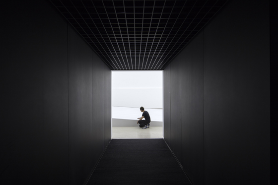
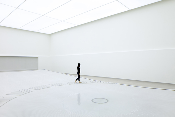
×Asif Khan's Hyundai Pavilion opened at the Pyeongchang Winter Olympics this year. The pavilion's exterior features Vantablack VBx2, the world's darkest pigment, and a light installation that resembled a starry sky against the pitch-black exterior. Inside, the entirety of the walls and the floor are the purest white, coated in a hydrophobic material that sends 25,000 droplets of water every minute down miniature grooves into a small lake. The pavilion has been commissioned by car-manufacturer Hyundai to showcase its hydrogen fuel cell vehicles – the exterior represents the universe, the source of hydrogen, and the droplets inside represent the individual hydrogen molecules that provide the cars' energy.
Asif Khan's Hyundai Pavilion for the Pyeongchang Winter Olympics in South Korea serves as the company's showpiece by combining novel materials with a highly conceptual installation. Photos: © Luke Hayes

Asif Khan's Hyundai Pavilion for the Pyeongchang Winter Olympics in South Korea serves as the company's showpiece by combining novel materials with a highly conceptual installation. Photos: © Luke Hayes
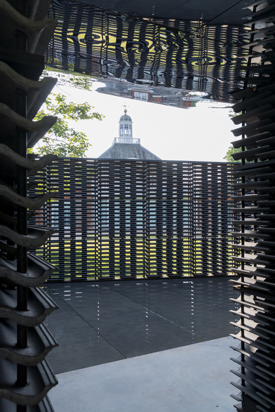
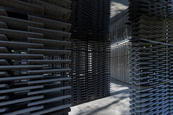
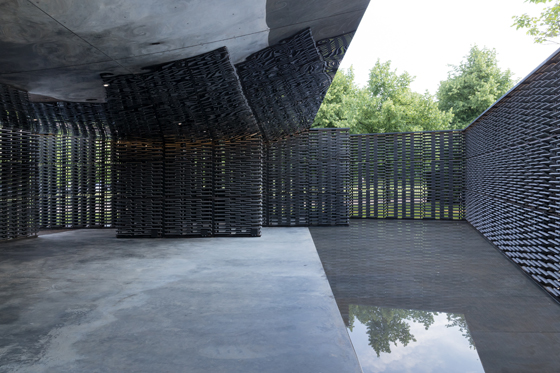
×In many cases, pavilions are commissioned as part of a long-running cultural programme. Frida Escobedo's Serpentine Pavilion 2018 is the 18th pavilion to grace the lawn in front of London's Serpentine Gallery, a tradition begun by the late Zaha Hadid in 2000. Nominally housing an outdoor café, the pavilion has become something of a career-defining moment for each designer. This year, the young Mexican architect has delineated two courtyards using stacked roof tiles, providing a semi permeable structure, while an overhead mirrored canopy and a mirror pool strengthen the play of shadows and light in one of the city's most popular temporary attractions.
Designing the Serpentine Pavilion for London’s Kensington Gardens requires architects to play to their strengths. In Frida Escobedo's case this meant using a simple material to create a dramatic space. Photos: Iwan Baan

Designing the Serpentine Pavilion for London’s Kensington Gardens requires architects to play to their strengths. In Frida Escobedo's case this meant using a simple material to create a dramatic space. Photos: Iwan Baan
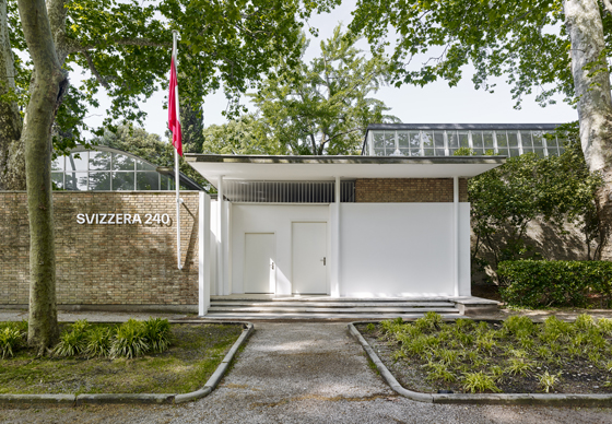
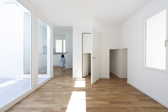
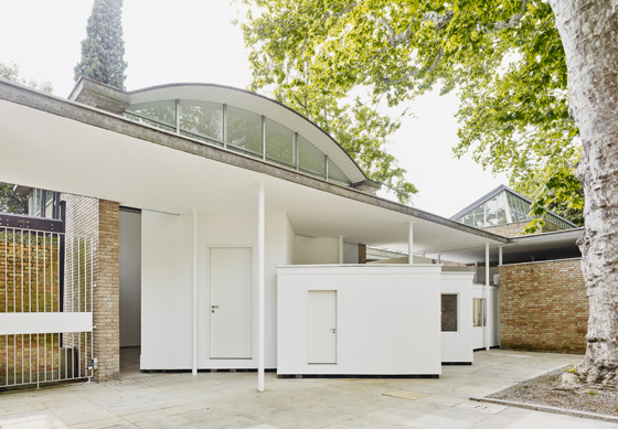
×Not all pavilions are new structures, some are existing spaces repurposed again and again. Venice's Giardini is filled with pavilions for each participating country, ranging from over 100 years old to those built in the last five years. Svizzera 240, the Golden Lion winner at this year's Venice Architecture Biennale, is the installation in the Swiss Pavilion. Alessandro Bosshard, Li Tavor, Matthew van der Ploeg and Ani Vihervaara have created a three-dimensional labyrinth where each room changes in size and scale, while their basic proportions – based on a typical newly built Swiss apartment – remain the same. Using this playful approach, the architects wanted to illustrate the disconnect between bland, unfurnished domestic interiors presented by developers and the often chaotic life they come to accommodate.
The surreal take on generic interiors was a firm favourite among Venice Biennale visitors even before the Swiss Pavilion won the top award. Photos: Wilson Wootton © Wilson Wootton, Alessandro Bosshard, Li Tavor, Matthew van der Ploeg, Ani Vihervaara

The surreal take on generic interiors was a firm favourite among Venice Biennale visitors even before the Swiss Pavilion won the top award. Photos: Wilson Wootton © Wilson Wootton, Alessandro Bosshard, Li Tavor, Matthew van der Ploeg, Ani Vihervaara
ש Architonic
