The face of retail: Aesop’s latest stores
Texto por Peter Smisek
30.09.19
The global skincare brand that’s long recognised how exemplary interior design can function as a powerful marketing device shows off the latest cohort of its architecturally expressive stores.
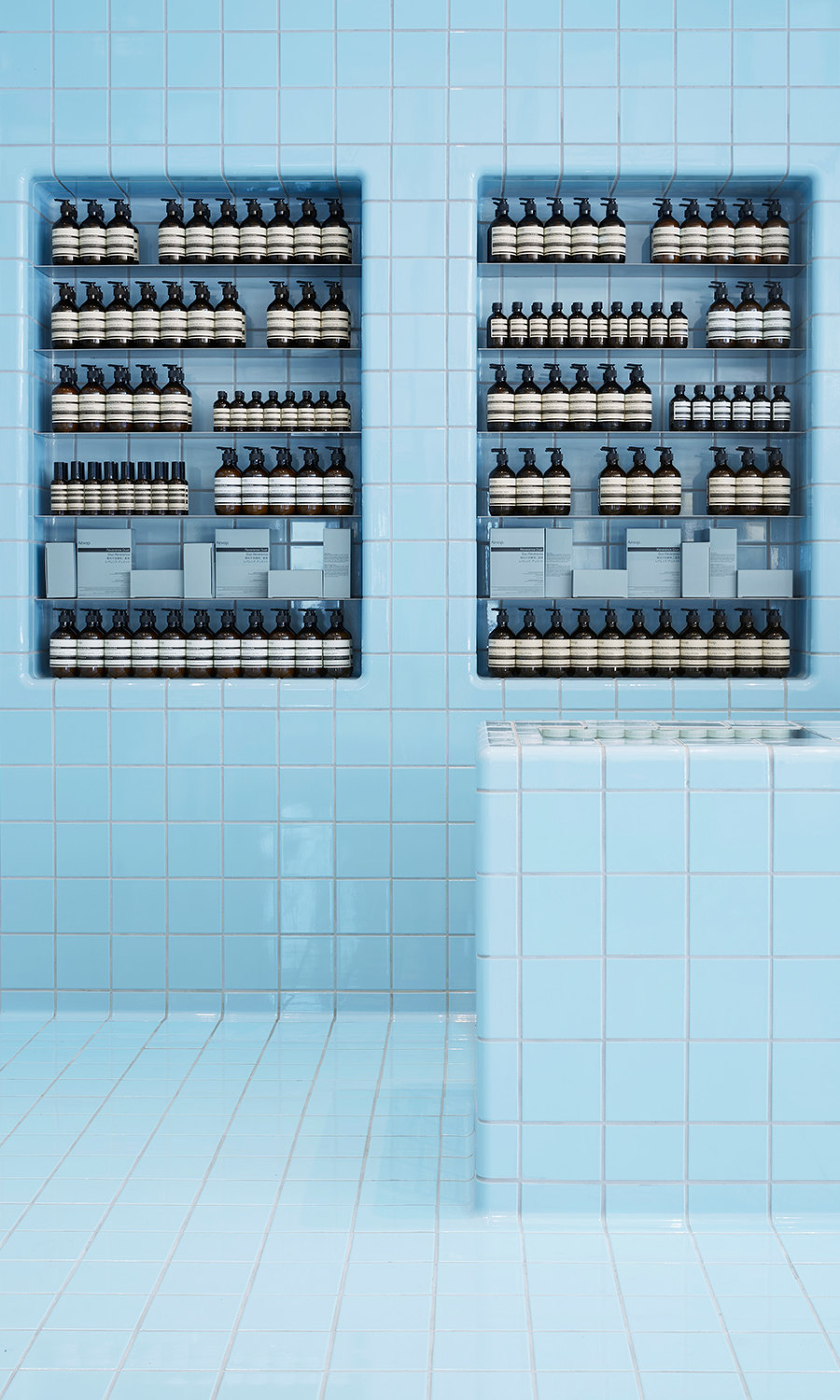
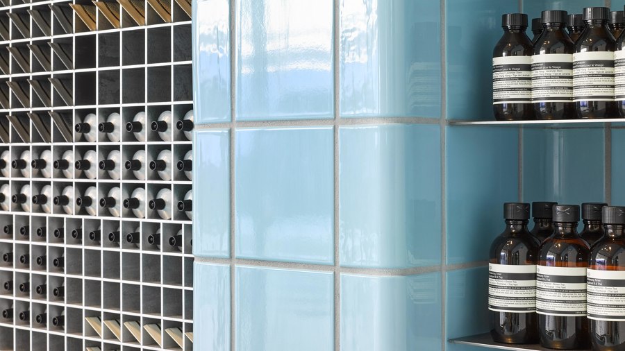
Blue-sky thinking: Aesop's approach to its retail spaces is unique, just like each one of its stores. Shown here, the Aesop Century City in Santa Monica, by their in-house design department

Blue-sky thinking: Aesop's approach to its retail spaces is unique, just like each one of its stores. Shown here, the Aesop Century City in Santa Monica, by their in-house design department
×Despite being first and foremost a skincare brand, Aesop is equally well known for its beautifully crafted retail spaces. Founded in 1987 in Melbourne, Aesop currently counts more than 300 retail outlets worldwide – and no two are ever the same. Always designed to reflect the genius of their locations, these spaces draw on the history and unique characteristics of each site. The only constant is the presence of the brand’s immaculately labelled products gracing the stores’ shelves.
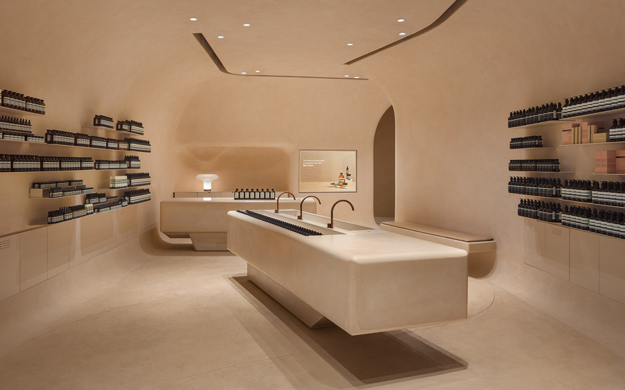
In Aesop Houston Galleria, Mlkk Studio designed a fitting, humane tribute to the American mid-century design and scientific progress

In Aesop Houston Galleria, Mlkk Studio designed a fitting, humane tribute to the American mid-century design and scientific progress
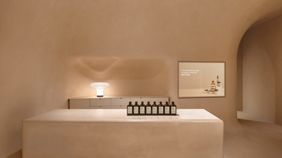
×In Aesop Houston Galleria, Mlkk Studio drew on the city’s history as a space exploration hub. The store’s interior, imagined as a single continuous cocoon, recalls the futuristic optimism so often associated with the era of the space race. Reminiscent of a lab, or perhaps a minimalist command centre, the designers succeeded in creating an intimate space by using round edges, recessed lighting and a single, warm muted colour inside.
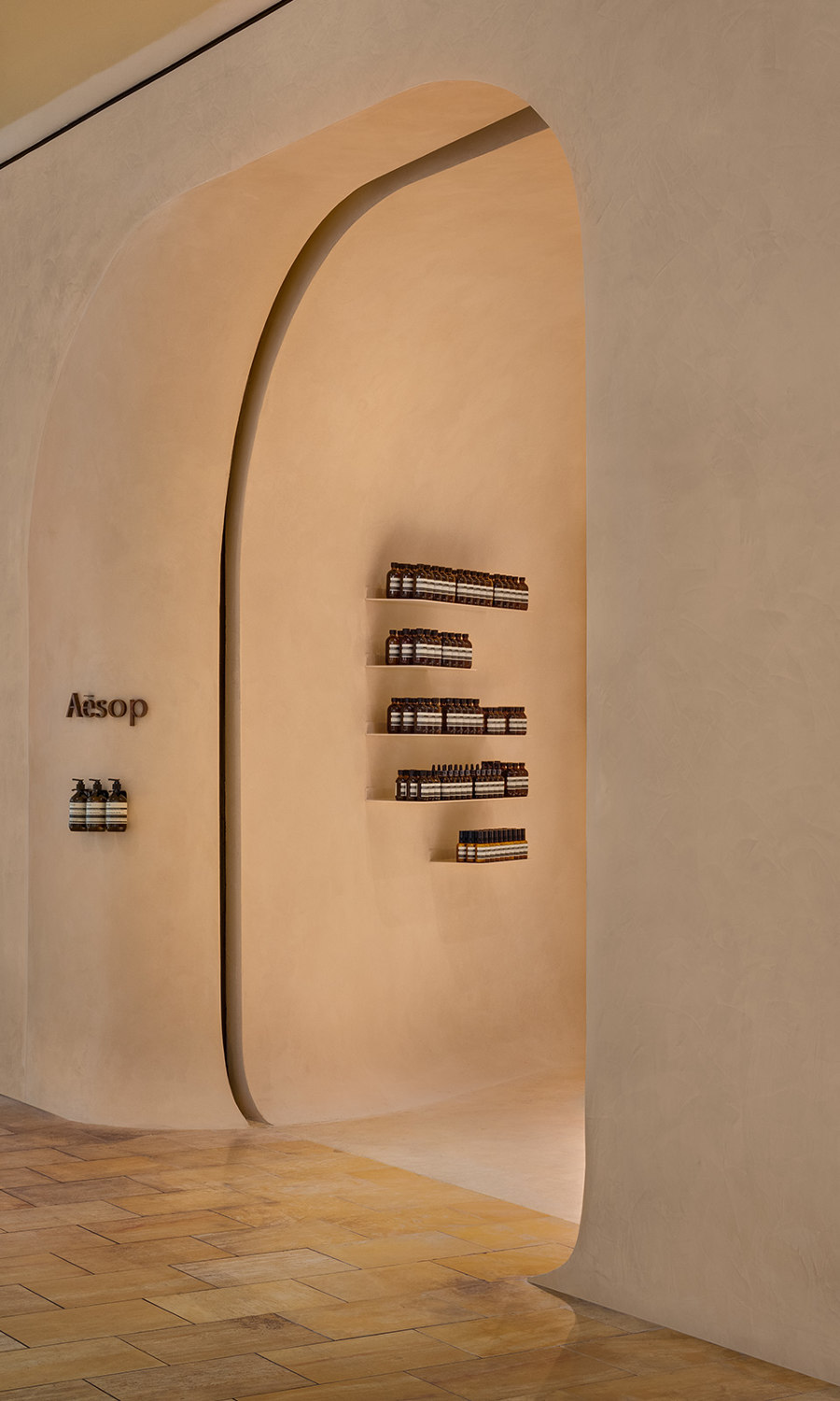
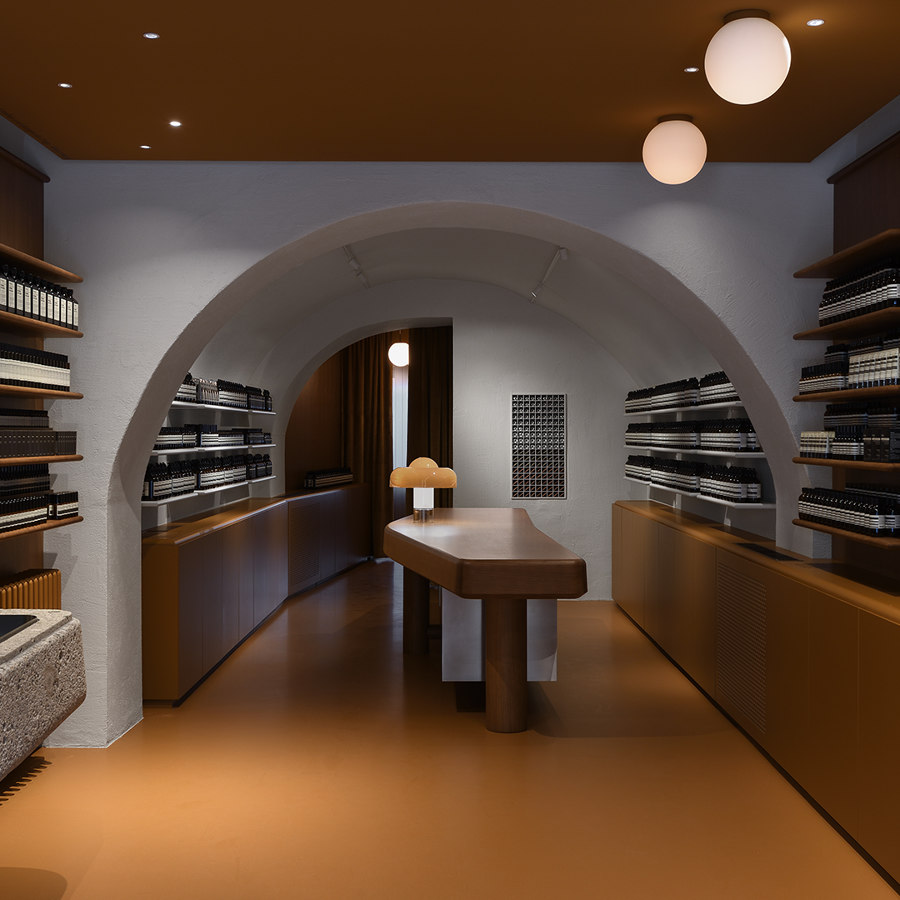
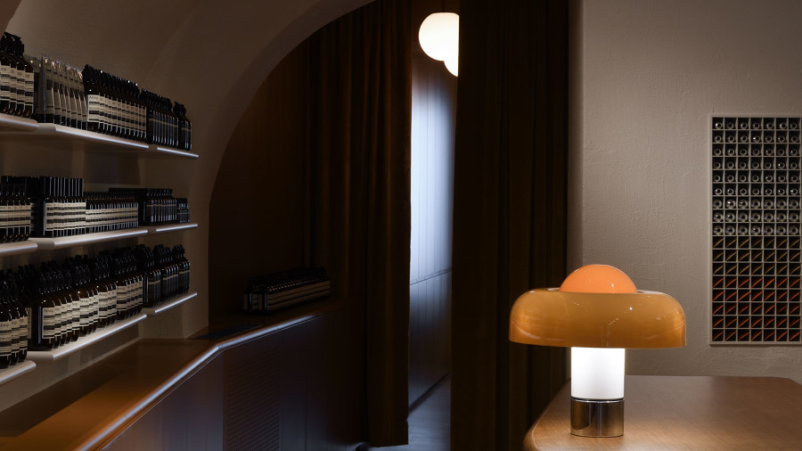
The Aesop store on Getreidegasse, designed by Jakob Sprenger and Götz Eßlinger, also gives prominence to the building’s original, vaulted ceilings, in a further nod to Salzburg’s baroque architecture

The Aesop store on Getreidegasse, designed by Jakob Sprenger and Götz Eßlinger, also gives prominence to the building’s original, vaulted ceilings, in a further nod to Salzburg’s baroque architecture
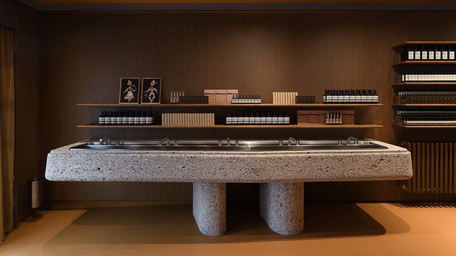
×In Salzburg, Austria, Jakob Sprenger and Götz Eßlinger designed a fitting tribute to the city’s history at the Aesop Getreidegasse store. Using a minimalist reinterpretation of oak panelling found in the city’s old cafés and a rough basin hewn from Nagelfluh stone, the design pays homage to Salzburg’s refined culture as well as its Alpine setting. The counter at the back of the space is modelled on the cembalo, an instrument on which, Mozart, the city’s most famous son, composed a great number of his famous works.
FARM Studio’s Aesop 1Utama retail outlet shows how effortlessly the brand’s considered, minimalist ethos melds with a more industrial aesthetic

FARM Studio’s Aesop 1Utama retail outlet shows how effortlessly the brand’s considered, minimalist ethos melds with a more industrial aesthetic
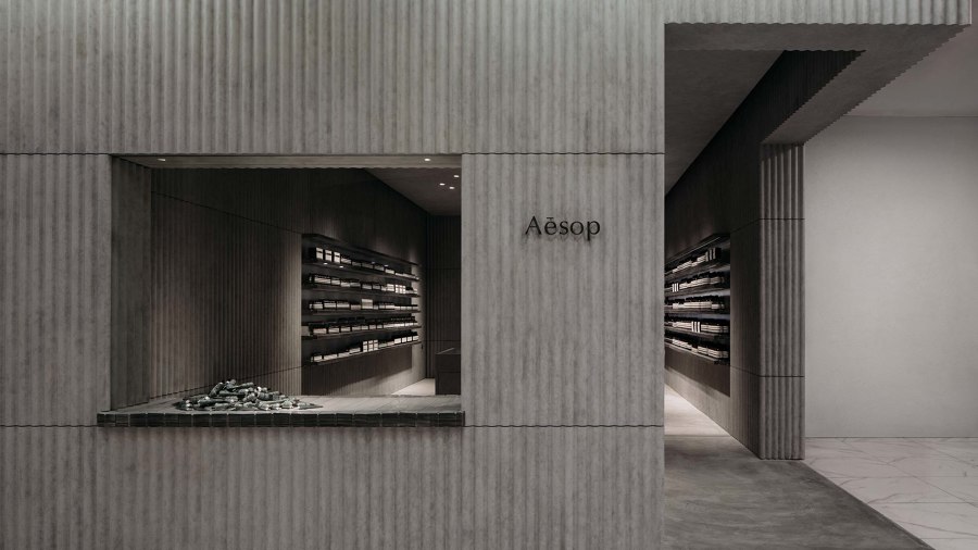
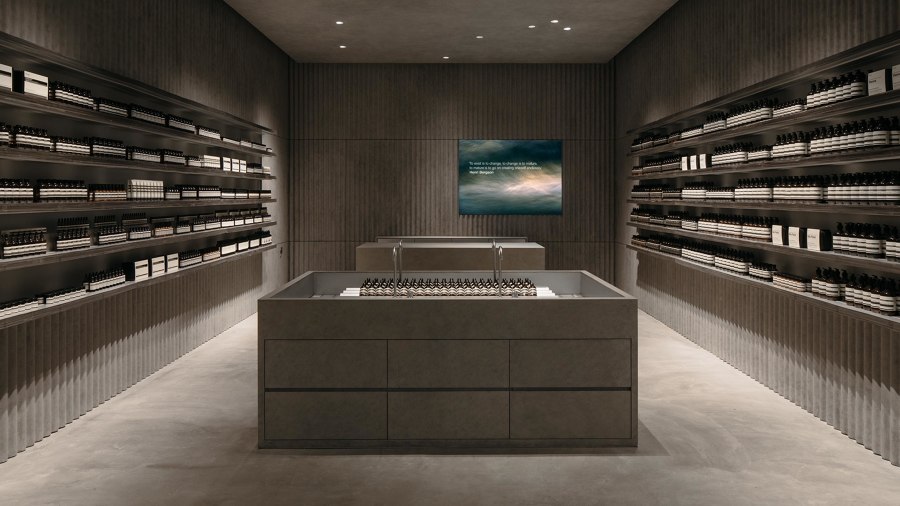
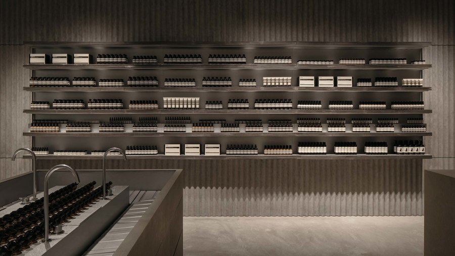
×A more industrial aesthetic, inspired by Malaysia’s 19th century tin trade, has been brought forward by FARM Studio in the design for the Aesop 1Utama store in Kuala Lumpur. The shop’s interior is clad in corrugated, galvanised metal sheets, with the shelves made from densely packed metal layers and set within the rhythm established by the wall panels. A contrasting concrete basin is placed in the centre of the space, while a small display window to the outside, with products arranged in a pile, recalls the messy vitality of a metal yard.
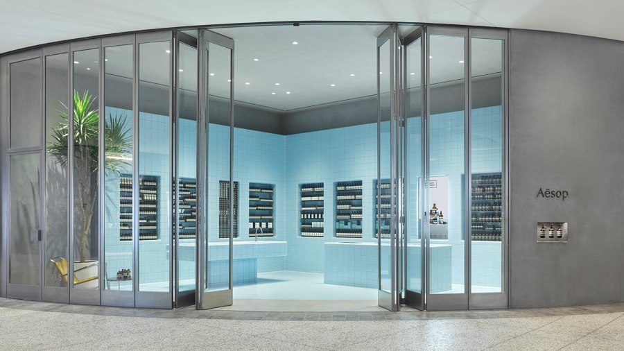
The image of poolside relaxation in the Aesop Century City store in Santa Monica is further reinforced by the inclusion of a large, potted palm tree and a bright yellow reclining lawn chair

The image of poolside relaxation in the Aesop Century City store in Santa Monica is further reinforced by the inclusion of a large, potted palm tree and a bright yellow reclining lawn chair
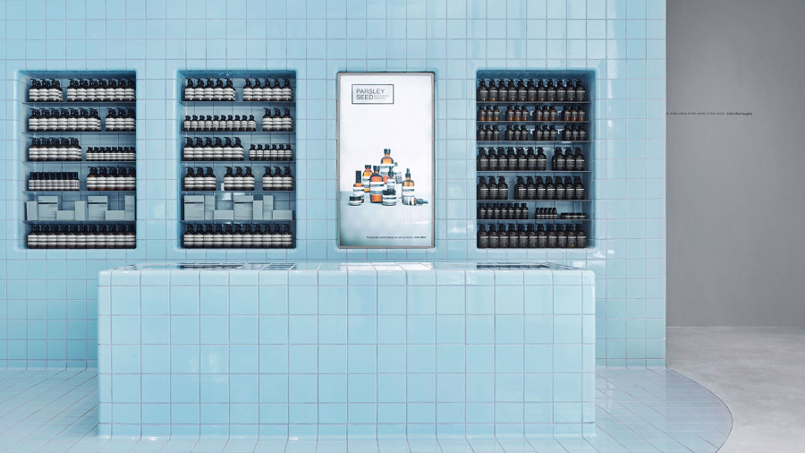
×Aesop Century City in Santa Monica, California, takes cues from an altogether more hedonistic tradition. Conceived by Aesop’s in-house design department, the space is clad entirely in 3,942 light blue tiles, a direct reference to South California’s obsession with the backyard swimming pool. They cover every surface, morphing into counters and set-back shelving spaces, and together with slender, floor-to-ceiling bi-folding doors, recall the aspirational and informal suburban lifestyles made famous by artists such as David Hockney and Ed Ruscha.
Photos: Aesop
© Architonic
