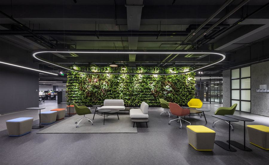
The use of colour on new office space projects
Texto por Peter Smisek
03.11.21
For interior architects and designers, colour represents a powerful tool for not only shaping physical spaces, but also shaping the atmosphere and mood of the people who work in them.
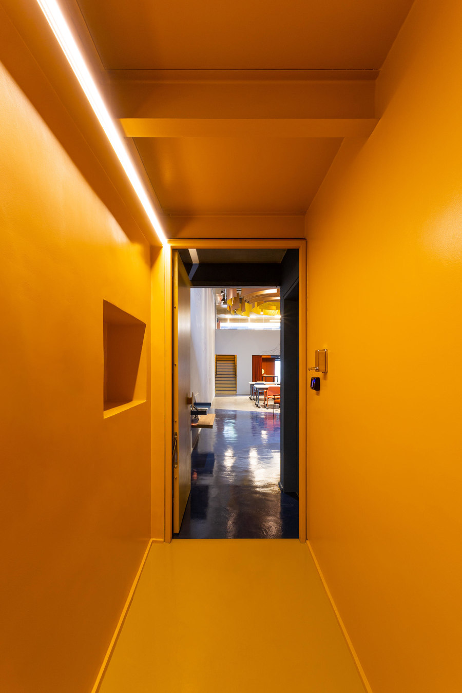
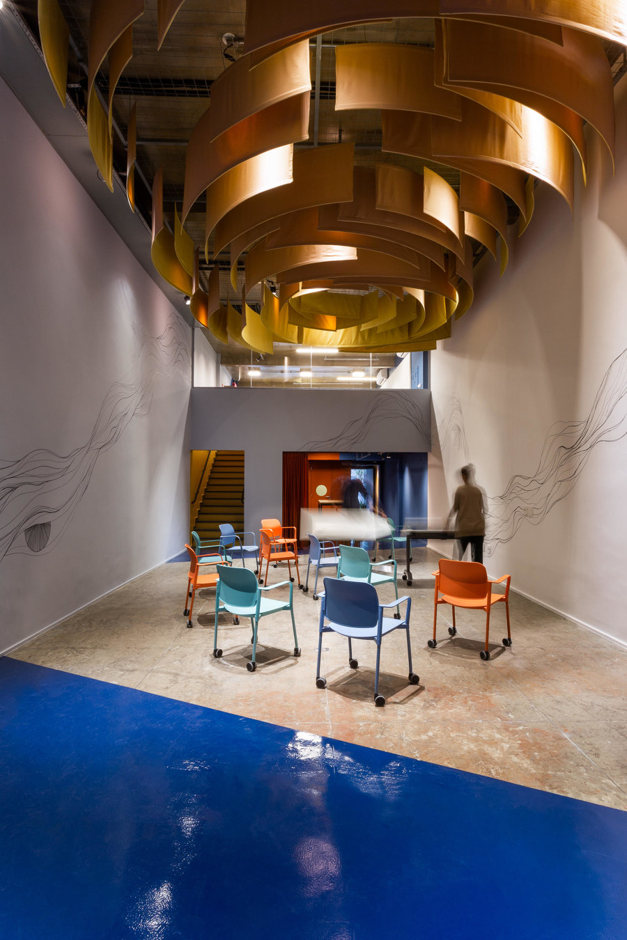
Superlimão's Canary project in São Paulo uses colour to create spatial distinctions within the narrow office space which formerly functioned as a gallery. Photo: Israel Gollino

Superlimão's Canary project in São Paulo uses colour to create spatial distinctions within the narrow office space which formerly functioned as a gallery. Photo: Israel Gollino
×The colour of a space can deeply affect the way that people feel in it, and the use of different colours in a workplace can help to create a more welcoming, stimulating environment for employees. And while in the past this may have resulted in more monochrome environments, architects and interior designers today are more interested in using complementary and analogous colours to create more vibrant, imaginative spaces, both at home and in the office.
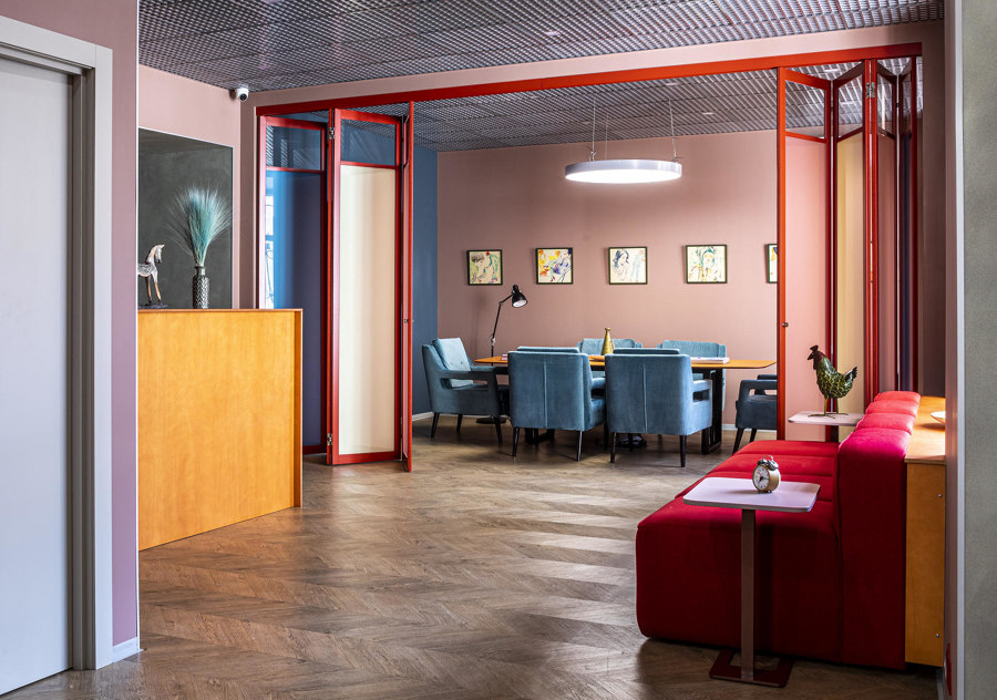
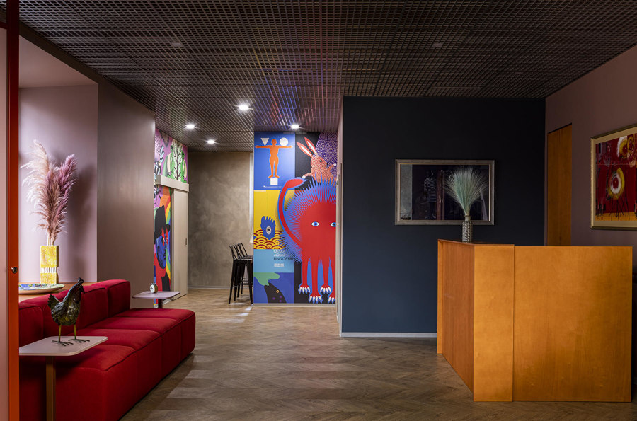
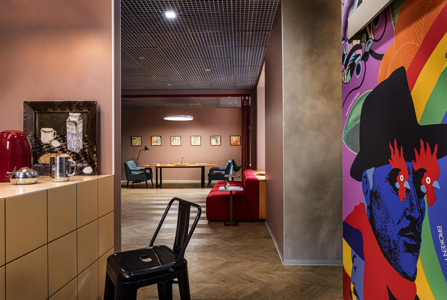
Both colour and texture, such as dark grey mesh ceiling, pale parquet floor and beige tiled kitchen counter, play an important role in Two Interior Design Studio's Record Company Office. Photos: Mikhail Stepanov

Both colour and texture, such as dark grey mesh ceiling, pale parquet floor and beige tiled kitchen counter, play an important role in Two Interior Design Studio's Record Company Office. Photos: Mikhail Stepanov
×In Moscow, Two Interior Design Studio did not have to look too far for inspiration when designing a new Record Company Office, as the space is located in a building that served as the home of Russian cubist painter Aristarkh Lentulov at the beginning of the last century. Taking cues from the painter's eclectic colour palette, the walls feature mostly muted earth colours, although the reception and the main meeting room have navy blue and dusky pink feature walls. A pale parquet floor unites the space, while bright red accents – think appliances in the kitchenette, a plush, blocky sofa in the reception and the frame of a colourful folding partition – add a touch of cubist liveliness.
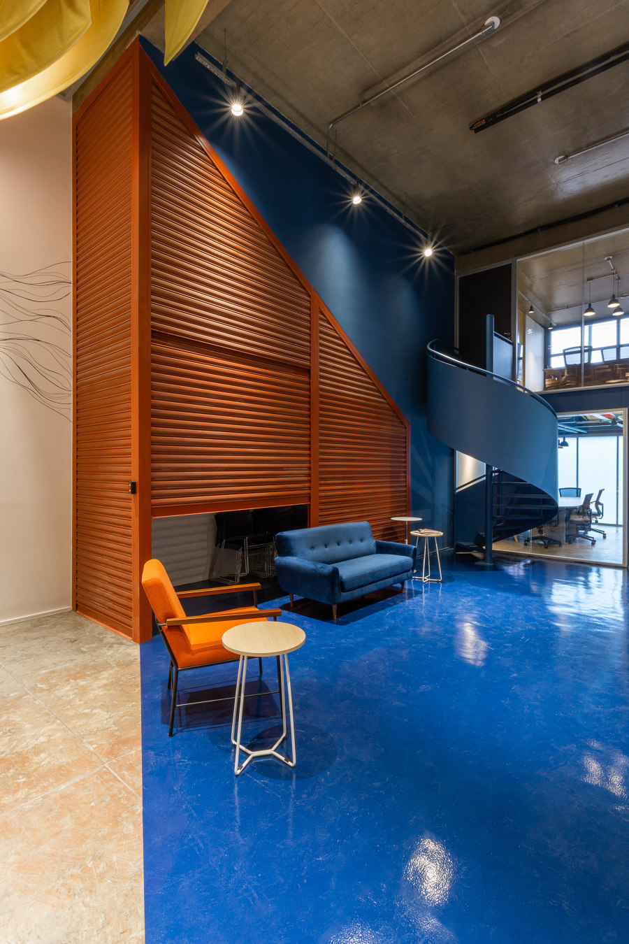
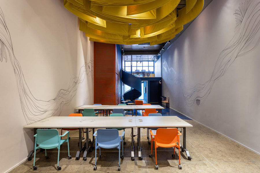
The colours in this office conceived by Superlimão emulate the interior design often used by young, dynamic tech firms that Canary invests in. Photos: Israel Gollino

The colours in this office conceived by Superlimão emulate the interior design often used by young, dynamic tech firms that Canary invests in. Photos: Israel Gollino
×Superlimão's design for investment company Canary in São Paulo uses colour to create spatial distinctions within the narrow office space which formerly functioned as a gallery. In the middle, a wedge of white, surrounded by dark blue walls and floors, creates a double-height space for more informal, open gatherings, while yellow fabric elements suspended from the ceiling create visual contrast but also ensure better acoustics. The toilet blocks are painted a dark terracotta colour, while stairs leading to the second floor are bright yellow on the inside. These colours can also be found as smaller rectangular shapes on the walls of the meeting rooms, while a verdant internal courtyard also contains a colourful custom mural.
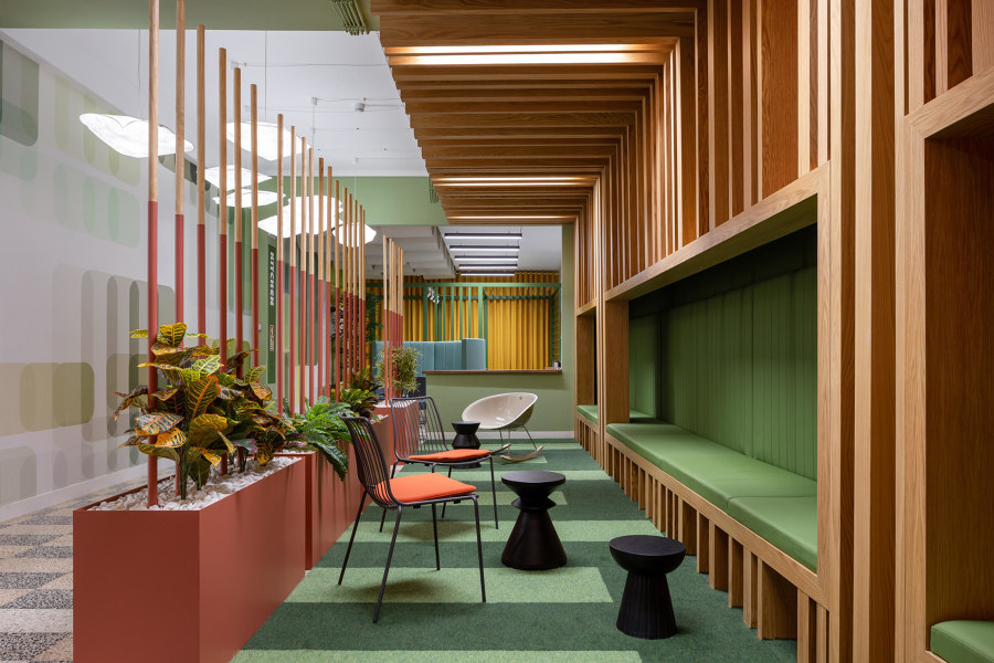
Galant I.D.Lda studio's RB Pharma Office uses analogous colours to create a unified aesthetic and uses complementary accents to add interest. Photos: Alexander Bogorodskiy

Galant I.D.Lda studio's RB Pharma Office uses analogous colours to create a unified aesthetic and uses complementary accents to add interest. Photos: Alexander Bogorodskiy
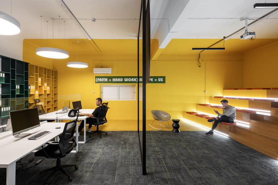
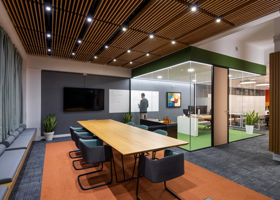
×Located in a former industrial structure in Lisbon, the RB Pharma Office is filled with colour to help to compensate for the lack of windows. Galant I.D.Lda studio use green seating, walls and a carpet at the reception and in breakout spaces, and a large splash of yellow at the end of the open office, alluding to the world outside. Other furnishing elements in various accent colours, such as teal, red and terracotta help add further visual interest.
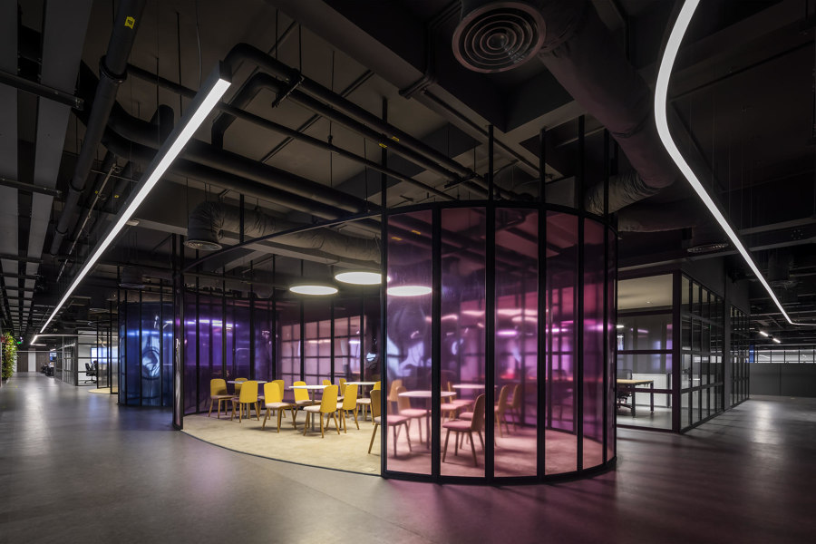
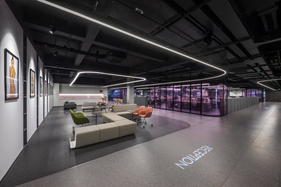
For Crystal Martin Vietnam Office, D&P Associates delineates different spaces by using soft colours against a dark background. Photos: Hiroyuki Oki

For Crystal Martin Vietnam Office, D&P Associates delineates different spaces by using soft colours against a dark background. Photos: Hiroyuki Oki
×An hour's drive outside of Hanoi, Crystal Martin Vietnam Office tackles a similar problem on a much larger scale. Located on the top floor of a modern garment factory, the expansive workspace receives little natural light, but D&P Associates Vietnam has divided the vast floorplate into several discrete open space offices, demarcated using translucent, coloured glass panels. Strips of LED lighting follow the spatial divisions, and together with dark floors and ceilings create an almost otherworldly sensation of workspaces floating in a void. In spite of this surreal approach, the soft and pastel accent colours of the furnishings help to create a surprisingly inviting place to work.
© Architonic
