A Life More Ordinary: Architonic meets Jasper Morrison
Texto por Simon Keane-Cowell
Zürich, Suiza
11.11.10
Respected British designer Jasper Morrison has learnt many things in the course of his career. For example, how to design products that create 'atmosphere', as he describes it, yet have longevity, and how to ignore the marketing machine that would turn design professionals into superstars. And how a violent pink can sometimes be, well, a bit too violent. Architonic spent some time at the recent Orgatec fair in Cologne with the thinking designer's designer.
Epistolary. What a nice word, I thought. Waiting for Jasper Morrison to arrive for an interview I'd arranged with him at this year's Orgatec fair in Cologne, I started to wonder whether talking to the respected British designer might not be such a good idea after all, and that perhaps I should have suggested a dialogue by exchange of email. Morrison is known, it's fair to say, as not being the most loquacious of people – something which sits in stark contrast to his trenchant and insightful writing on design, published over the last two decades in the form of numerous books and essays.
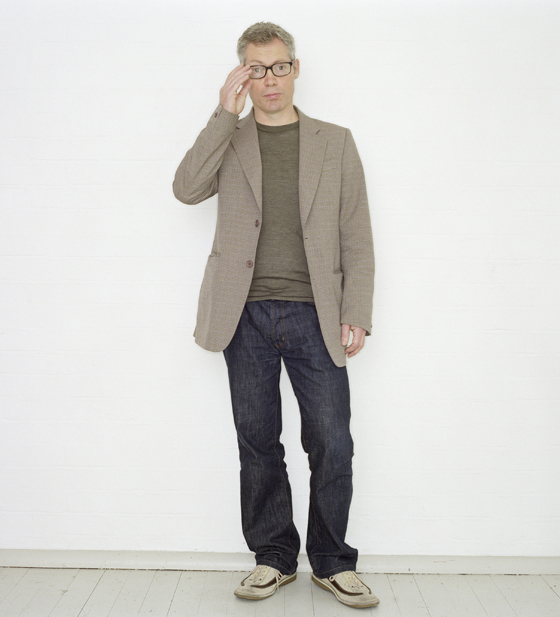
'I don't go out there wearing white suits and shooting my mouth off about things unnecessarily': Paris- and London-based British designer Jasper Morrison; photo 2007, Suki Dhanda

'I don't go out there wearing white suits and shooting my mouth off about things unnecessarily': Paris- and London-based British designer Jasper Morrison; photo 2007, Suki Dhanda
×Morrison's often restrained approach to conversation dovetails, however, with his design approach, one which eschews spectacle, excess and uselessness for rationalism, longevity and usefulness. In a world increasingly 'polluted' by design, by products whose sole purpose appears to serve a marketing-driven consumer need for the new, 'the leaving out the design seemed more and more the way to go,' as the designer wrote in his 2007 book 'Super Normal', which he co-authored with Naoto Fukasawa. Obsolescence, for Morrison, is itself an outdated notion.
But when it came to our particular conversation, Morrison spoke fluently and at surprising length about just what is at stake for him in this activity called design, about what it should mean, as opposed to what it has, sadly, come to mean to a lot of us. Yet in spite of his work functioning in part as a corrective (and a welcome one at that) to the surfeit of ill-conceived, or, even worse, unconsidered, products that fill our lives, he maintains that being a designer is 'just a job. The best thing you can do is stay in your studio and do it as well as you can,' he says. Jasper Morrison is just normal. Or maybe that's super normal.
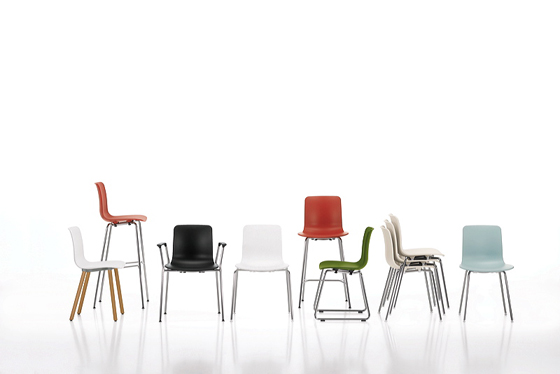
Jasper Morrison's new 'HAL' range for Vitra, 2010: 'We've spent three years working out what shape it should be. You'd be amazed how many one-piece shells aren't worked out at all, which are not comfortable'; photo Marc Eggimann © Vitra (www.vitra.com)

Jasper Morrison's new 'HAL' range for Vitra, 2010: 'We've spent three years working out what shape it should be. You'd be amazed how many one-piece shells aren't worked out at all, which are not comfortable'; photo Marc Eggimann © Vitra (www.vitra.com)
×.....
I visited your small exhibition in Kortrijk last week. What I particularly liked was the title, 'It was very poetic and meaningful at the time'. The notion of one's ideas changing over time. It reminds us that we're human, and, as such, are never consistent.
Well, it was meant as a joke, but they went and used it.
Has your thinking on design changed during your career? For example, this idea of design as pollution, that we have created a surfeit of designed objects that are not needed. You wrote a few years ago that the situation seemed to be getting worse and worse. Is this a view you still hold?
Well, I think it's always like that. But we notice it more because design has become more mainstream, so maybe the scale of the crime is bigger. And everyone is sort of complicit in causing the problem. It's a stupid system, but you can see why it happens. Because companies want to do products that get noticed. Designers also don't mind the publicity. And companies also think it's a cheap way to get attention for their products. Just sprinkle a little design on something. They don't think at all in the long term. So that leads to a complete misconception of what design should be about. It's become this sort of fast track to magazine coverage, free publicity. But two years later, because you designed it for that purpose, it's completely out of date.
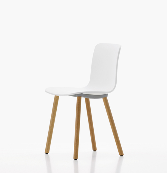
'HAL Wood' by Jasper Morrison for Vitra, 2010; photo Marc Eggimann © Vitra (www.vitra.com)
Are we complicit in that ourselves here today, being at a design fair and doing an interview under the auspices of Vitra and their desire to promote your new chair for them? I mean, design fairs are, by their very nature, fora for showing new things, and journalists are, of course, driven by their hunger to talk about the new, often regardless of whether it's any good. Is it possible to operate to outside that system?
I think so. The thing that astonishes me is to see your design to go out of style after two years. What's the point? It's torture. For me, it's sort of reassuring to see a design of mine that's still there, looking good, looking how it should and what it should be. Anyway, I'm a bit bored of slagging off my profession. I think there's a side of designer that's not really design. It's sort of been side-tracked to serve a marketing function, a consumer function.
It's interesting to think about this in relation to your new 'HAL' chair range for Vitra. Sitting in one of these chairs feels terribly familiar. It didn't feel new. The visual side of things to one side, I think that is quite important.
But I assure you if you line that up with as many as one-piece shell chairs as you can find, it's a big improvement in terms of comfort. And we've spent three years working out what shape it should be. You'd be amazed how many one-piece shells aren't worked out at all, which are not comfortable, which don't have the flexing or performance.
I should add that by saying it didn't feel new, I mean that it felt incredibly natural, that my body somehow recognised the rightness of it.
That's nice to hear. I've never thought of it that way, but I often think a product should look natural. The best products look natural, like they could be anywhere and they would not look ridiculous, or out of place. And it's opposite of the marketing approach, where things have to look unnatural to get attention.
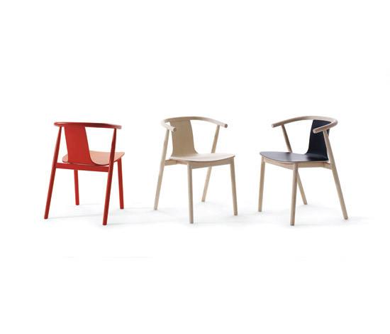
'Finding shapes which will be satisfying to use, and which may be good to look at, too. But satisfying in daily use': Jasper Morrison's 'BAC' chair for Cappellini, 2009

'Finding shapes which will be satisfying to use, and which may be good to look at, too. But satisfying in daily use': Jasper Morrison's 'BAC' chair for Cappellini, 2009
×Is it then hard for the types of products that you design and that you favour, which don't shout about themselves, to get noticed? Do they get lost in that design-polluted landscape that's getting ever louder?
Well, I've learnt my lesson. The 'Air' chair that I designed for Magis. One of the colours I chose was this violent pink, which I think is a nice colour if we use it in moderation. There was a Japanese café near my place in Paris, and they taken 40 of them and put them all over the pavement. It was just a moment of horror, to see such pollution. There were using it cleverly, as it drew attention away from everything else.
I guess at that point the chair is saying something completely different from its usual articulation.
Absolutely. The colour takes over. It could have been any shape. That much pink on the pavement. It was serving their purposes very well. And then I started thinking, 'How come designers never go to eat in designer restaurants?'. We all look for the traditional beer hall, the place where we can have a sausage and a beer. We are completely contradictory in our behaviour. And what is that? The answer is that we are particularly good at detecting good atmosphere. That's what our job is about. But we don't find good atmosphere in designer bars or designers restaurants. So, there can be only one reason. The products that are making the atmosphere.
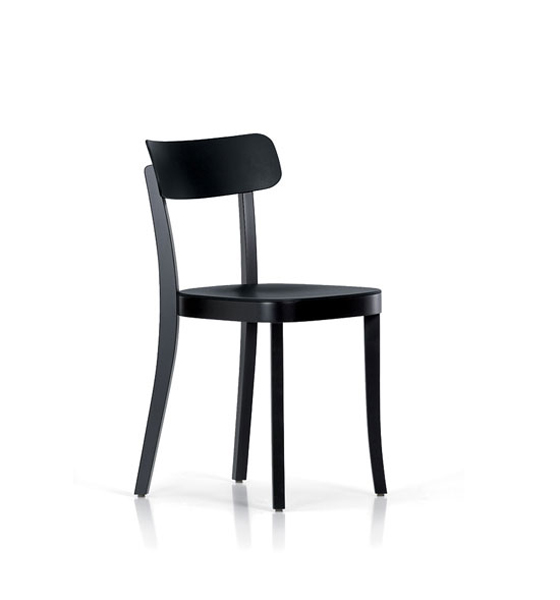
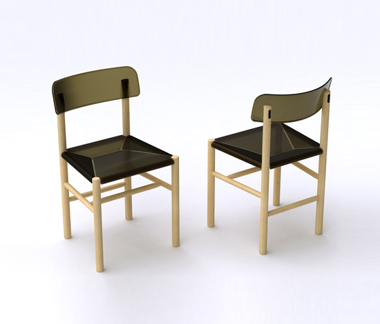
This was around the time I did the 'Basel' chair for Vitra. And other one for Magis called 'Trattoria'. Just a feeling that we were doing the wrong kind of products for public spaces. And this one is a bit the same. It's sort of quiet, a quiet shape. If you see a lot of it together, it will have a rather softening effect on a space. I think that's an important part of the job, to make a good atmosphere. Otherwise, we're just fucking it up.
The atmospheric is quite hard to define. Can it be theorised? I wonder how subjective it is.
It's subjective, but I put it to you: imagine yourself in an old German beer hall. Wooden-panelling, warm lighting and waiters carrying beautiful trays full of beer. A sort of warm buzz of conversation. Against a sterile, designer interior where there's the clinking of plates... I think we're all aware of that difference. That's all it is. That's all I'm saying.
'You can design things to have a built-in timelessness, which don''t disturb, which make good atmosphere': Vitra-produced 'Basel' chair by Jasper Morrison, 2008; © Vitra (www.vitra.com)

'You can design things to have a built-in timelessness, which don''t disturb, which make good atmosphere': Vitra-produced 'Basel' chair by Jasper Morrison, 2008; © Vitra (www.vitra.com)
×It's a compelling image. I guess working in this industry, so few of us would dare to admit that we prefer the former to the latter. Which goes back to what you were saying about the marketing machine.
One of the genuine and the other is artificial. And that takes me to the 'Super Normal'. Of course there has to be artificial atmosphere created nowadays because a business runs for a hundred years, from a sort of hand-made interior to getting its worn-in look, so there are some of them left and they are very nice places. But for the most part, places are made every few years and they have to be right at the beginning, so that was part of the idea of the follow-up to 'Super Normal' – you can design things to have a built-in timelessness, which don''t disturb, which make good atmosphere.
And which has nothing to do with style or fashion.
It's about finding shapes which will be satisfying to use, and which may be good to look at, too. But satisfying in daily use.
You've talked before about the anonymity of certain objects, and that we should possibly try and learn from objects that are without a known author in designerly terms. Given that you are a known and respected designer, I wondered what the possible contradictions there are in terms of...
Well, they're not my contradictions.
But I've come to interview you today, because of who you are. Because of your work, but also because I edit a magazine and I know that readers will be interested in a feature that has your name in the title. It's quite a tricky one to resolve.
But I don't go out there wearing white suits and shooting my mouth off about things unnecessarily. I'm not blaming people who do. Some people are good at it, but I'm not. But for me there's no contradiction. 20 years ago or more, when I started, nobody knew about the role of a designer. I used to get questions like 'Where's your workshop?' because they thought I must be some kind of craftsman. So, I've grown up with it as a profession, and have had to learn to accommodate the other side of it that's come along with it in the meantime. The recognition and all that. Which is OK. It's not bad. There's nothing wrong with it.
Morrison's 'Trattoria' chair for Italian design manufacturer Magis, 2009
Does it get any easier, that accommodation of having a particular profile?
I think I get better at ignoring it. But, at the end, it's just a job. The best thing you can do is stay in your studio and do it as well as you can. And then occasionally you come out with a new thing and that's OK. But, also, it's a cultural activity as well as a commercial one. I enjoy through the website, or through Vitra's website, or through the shop in London, to have some kind of cultural thing going on, whether it's writing or photography, or exhibitions.
You've reminded me of an awards ceremony I went to a few years ago where someone from the Design Council described design as 'always a commercial act'. I remember thinking how reductive this was. I mean, design can be a commercial act, but it can also signify something else at the same time. Sometimes commerce doesn't feature in it at all.
It's just part of the equation, you could say. Even then, it's not always that. Think of someone like Bruno Munari. He wasn't at all about making a fortune. It was just a very generous gesture about trying to educate people, educate children. There are a lot of misconceptions about design. Unfortunately, too many people have come to the subject through the marketing type of design and think that's what it's all about. About making a show or conversation pieces.
Do you think that it might be an appropriate response on the part of some designers, if we do produce too much and a certain amount of those products aren't any good or not needed, to just stop designing?
(Laughs.)
Would that be an honourable thing to do? (Laughs.)
That would be very honourable. They should have to go to interviews, where a panel would decide whether they should continue or not.
Jasper, thank you very much.
.....
