A Size Issue
Texto por Simon Keane-Cowell
Zürich, Suiza
31.07.10
Architonic reviews '1:1 – Architects Build Small Spaces', the latest exhibition at London's Victoria & Albert Museum
There's a scene in Ben Stiller's 2001 comedy 'Zoolander' where the eponymous male supermodel smashes up an architectural model of a new school that's due to be built in his honour upon seeing it for the first time. 'How are we supposed to teach kids to read, when they cannot fit inside the building?', rages the intellectually challenged fashion celebrity. His unfortunate misreading of scale is our comic delight.
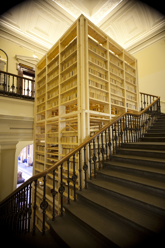
Rintala Eggertsson Architects' 'Ark', situated at the bottom of the National Art Library stairs; commissioned by the V&A, © Rintala Eggertsson Architects

Rintala Eggertsson Architects' 'Ark', situated at the bottom of the National Art Library stairs; commissioned by the V&A, © Rintala Eggertsson Architects
×Luckily, there have been no such dramatically destructive scenes at the Victoria & Albert Museum's latest exhibition, '1:1 Architects Build Small Spaces', which invites visitors to consider constructed space in a more immediate and affective way than table-top models, drawings and photographs allow. Each located in a different place within the museum, a number of specially commissioned structures, intimate in size, 'examine notions of refuge and retreat' (which, given the fact that the V&A is often heaving with cultural tourists, is no bad thing). But beyond the desire they create to get inside them, they encourage a reconsideration of the larger, contextual spaces in which they sit by dint of the spatial dialogue they hold with them.
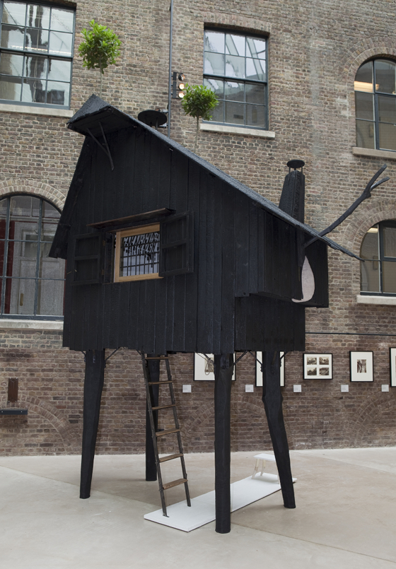
'Beetle's House' by Terunobu Fujimori, located in the Medieval & Renaissance Room; commissioned by the V&A, © Terunobu Fujimori

'Beetle's House' by Terunobu Fujimori, located in the Medieval & Renaissance Room; commissioned by the V&A, © Terunobu Fujimori
×19 architects were invited to submit proposals for the show, with seven being selected for realisation. (All submissions, however, are shown as part of the exhibition in the form of drawings and models. That's right. Models, Mr Zoolander.) The result is a series of intriguing structures, some conceptually stronger than others, whose strength lies in its serial presentation, the 'exhibits' occupying as they do discreet spaces rather than relating to each other. There is, of course, a benefit to a museum in arranging an exhibition across its site, as it exposes visitors to more of the institution's collection as they move between different parts of the show.
Rural Studio's 'Woodshed', which sits in the museum's Porter Gallery; © Rural Studio, Auburn University

Rural Studio's 'Woodshed', which sits in the museum's Porter Gallery; © Rural Studio, Auburn University
×Rintala Eggertsson Architects' 'Ark' sits in one of the many interstitial spaces that the V&A's mid-19th-century architecture provides. In the middle of the stairwell that leads to the museum's first-floor National Art Library, the Norwegian practice have created a latter-day, wooden Tower of Babel, which, dovetailing with the permanent Victorian staircase that surrounds it, leads visitors up its narrow, highly intimate structure. Its interior walls lined with books that are illuminated by the occasional Anglepoise lamp, the work produces a feeling of being cosseted, while, sitting as it does adjacent to the library, suggesting the idea of intellectual discovery and development.
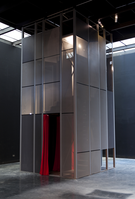
Another tower-like structure is provided by Brazilian studio Vazio S/A's 'Spiral Booths', located in the museum's Porter Gallery. Here, the already tight vertical space is divided into a series of even smaller spaces, in short a stack of velvet-lined booths negotiated by a narrow staircase. Moving upwards through the structure, the visitor encounters a number of loud, shrill actors performing monologues. (If it's retreat and refuge you're looking for, this may not be your idea of it.) While Rintala Eggertsson's tower privileges the written word, this one subjects us to the spoken. Both, however, encourage us to think about representation and, of course, its relation to space.
'Spiral Booths' by Vazio S/A, located in the Porter Gallery; commissioned by the V&A, © Vazio S/A, 2010

'Spiral Booths' by Vazio S/A, located in the Porter Gallery; commissioned by the V&A, © Vazio S/A, 2010
×Two projects use wood emphatically as their main building material, as well as part of their concept. Alabama-based Rural Studio's 'Woodshed' uses thinnings (a forestry management process whereby smaller trees, whose growth is constricted by other larger ones, are felled without harming others) to create an open-ended, low-cost sustainable structure. Outside, in the hydrangea-filled John Madejski Garden, a second Norwegian practice, Helen & Hard Architects, have created 'Ratatosk', an organic, highly ludic form made from pieces of split ash. The compulsion to climb the tree-like work is for younger (and perhaps some older) visitors is a strong one.
Sou Fujimoto Architects' 'Inside/Outside Tree', situated at the top of the stairs from the museum's Grand Entrance; commissioned by the V&A, © Fujimoto

Sou Fujimoto Architects' 'Inside/Outside Tree', situated at the top of the stairs from the museum's Grand Entrance; commissioned by the V&A, © Fujimoto
×Charred wood forms the basis for 'Beetle's House' by Tokyo-based architect Terunobu Fujimori. The blackened surface of the small house – which, evoking a kind of fairy-tale-like, cottage-in-the-enchanted-woods aesthetic, sits on Giacometti-limb-like stilts – serves to unnerve and fascinate in equal measure. Entry, via a ladder up to the under side of the structure, is for the truly committed only. What narrative lies within the interior space of this outwardly poetically expressive structure? In contrast, fellow Japanese architect Sou Fujimoto's project lays everything bare. Made of Plexiglass, his fully transparent 'Inside/Outside Tree' geometric structure, which is located at the top of the stairs from the Grand Entrance, allows a single visitor to enter it, to inhabit it, while remaining visible by others. Here, the idea of retreat is subverted as the person in question is afforded no scopic refuge. 'The tree is not a tree, but a void of a tree,' says Fujimoto, underscoring the project's concern with the presence of absence.
'Ratatosk' by Helen & Hard Architects, located in the John Madejski Garden; commissioned by the V&A, © Helen and Hard

'Ratatosk' by Helen & Hard Architects, located in the John Madejski Garden; commissioned by the V&A, © Helen and Hard
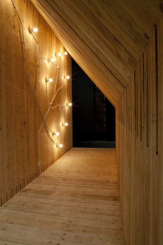
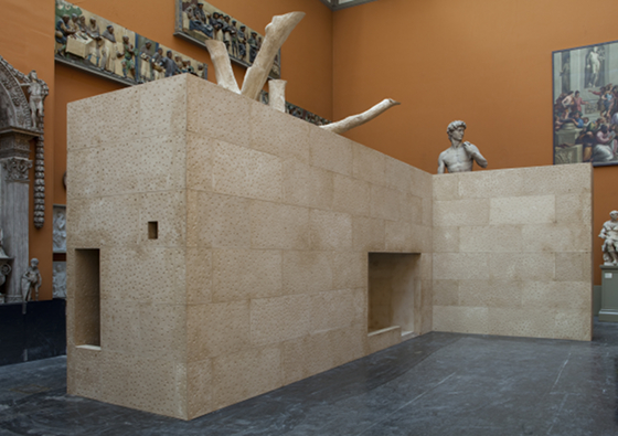
×Perhaps the most compelling of the structures on show, however, is Studio Mumbai's 'In-Between Architecture', which offers a cast, 1:1-scale replica of the unfeasibly narrow and 'unofficial' family dwelling that the architects discovered had been built behind their offices in Mumbai, a dense urban landscape where every last, interstitial space is filled. Situated fittingly in the museum's Cast Courts and reminiscent of British artist Rachel Whiteread's literally titled 'House' of 1993 (which consisted of a concrete cast of an entire Victorian London home), the structure communicates quite clearly a sense of the spatial conditions of such a marginal urban existence. Once inside, natural light is provided solely by small openings in the roof.
Studio Mumbai's 'In-Between Architecture', which sits in the Cast Courts; commissioned by the V&A, © Studio Mumbai

Studio Mumbai's 'In-Between Architecture', which sits in the Cast Courts; commissioned by the V&A, © Studio Mumbai
×Studio Mumbai's work is site-specific twice over, a copy of a particular building from over there created for a particular site over here. While the V&A exhibition shows how small-scale structures can afford architects a testing ground for a more creatively led and experimental type of practice (much like furniture designers who step out of the system of industrial production to create one-off pieces), it is projects like Studio Mumbai's that truly embrace such an exercise, charging it with real social significance. This is one small space that houses a very big idea.
