Helvetian Heroes: enduring Swiss design
Texto por Simon Keane-Cowell
Zürich, Suiza
08.01.11
It's fair to say that certain countries have, over the years, been more successful than others in terms of marketing a distinctive and compelling national design identity abroad. The very human kind of modernism expressed in the furniture of postwar Scandinavia, for example, is still very much associated in the international imagination with those Nordic countries, contemporary Scandi design profiting from this legacy as far as consumer interest is concerned.
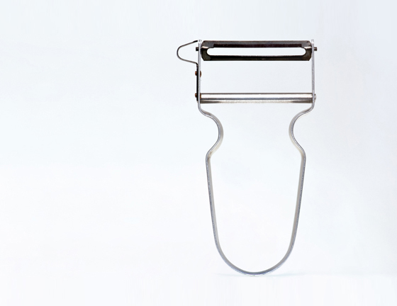
Copied the world over, the 'REX' peeler, designed in 1947 by Alfred Neweczerzal. 'The epitome of industrial design: perfection in every respect,' says Klaus Leuschel

Copied the world over, the 'REX' peeler, designed in 1947 by Alfred Neweczerzal. 'The epitome of industrial design: perfection in every respect,' says Klaus Leuschel
×Army knives and watches.
When it comes to how Swiss material culture is imagined abroad, it could be a lot worse. Spare a thought for a country like Belgium, where, in spite of an increasingly active contemporary design scene, it has yet to form a cogent image of itself in terms of design products that capture the international imagination.
This may, of course, have something to do with Belgium's internal political and linguistic divisions. It's hard to say something singular about yourself to the world when things aren't so joined up at home. That said, Switzerland too consists of a number of linguistic and regional-cultural identities, but it has nonetheless managed for decades to project a coherent, instantly recognisable design presence globally. Maybe it's the consistency of the modernist-derived Swiss design idiom – if we're to permit ourselves such an essentialist move – with its eschewal of the superfluous in terms of form and function and its emphasis on the built-in longevity of the objects in which it finds expression, that has something to do with it. So believes Klaus Leuschel, at any rate, author of a new book on Swiss design and its specificity, called 'Swissness' (Niggli Verlag).
Possibly the most iconic piece of Swiss design internationally, the Victorinox 'Swiss Army Knife', launched in the late 19th century and recently given the digital treatment with the addition of a data-storage function

Possibly the most iconic piece of Swiss design internationally, the Victorinox 'Swiss Army Knife', launched in the late 19th century and recently given the digital treatment with the addition of a data-storage function
×Design as a reflection of national identity aside, Swiss-designed products would appear to come with the notions of craftsmanship and reliability built into them. Indeed, their particular strength is the extent to which they manage to communicate these very values through their design to eager consumers. That said, Leuschel's suggestion that Swiss design is 'sexy', that is is 'constantly causing a stir', as he writes in his introduction, is questionable. The greatness of the 'Swiss made', I would suggest, has more to do with its unsexiness, its everydayness, objects that are so well considered they are almost taken for granted.
But pick up a copy of 'Swissness' and decide for yourself. Containing 43 diverse examples of Helvetian creativity, from Alan Frutiger's eponymous typeface of 1974 to the truly ubiquitous Swatch watch (from 1983), the small format book, itself testament to the understated, almost neutral coolness of Swiss typography, gives you ample food for design thought. But whatever your analysis, just don't shout it. That wouldn't be very Swiss.
The cover of 'Swissness', published by Niggli, whose pared-down typographic treatment underscores (literally), the sobriety characteristic of much Swiss design

The cover of 'Swissness', published by Niggli, whose pared-down typographic treatment underscores (literally), the sobriety characteristic of much Swiss design
×Spreads from Klaus Leuschel's book 'Swissness', showing the 'riri' zip, designed by Martin Winterhalter in 1925 and Andreas Christen's 1974 'Post and Deposit Box'

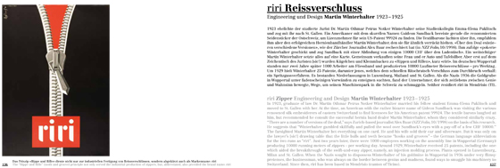
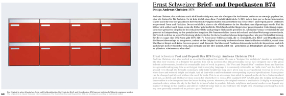
Spreads from Klaus Leuschel's book 'Swissness', showing the 'riri' zip, designed by Martin Winterhalter in 1925 and Andreas Christen's 1974 'Post and Deposit Box'
×.....
Architonic: Why did you decide to write this book? And why now?
Klaus Leuschel: It is as simple as this. I was preparing an article for the 'SonntagsZeitung' in 2008, and some people suggested to me that an extended version in the form of a book would be of interest. So obviously it came into being almost by chance.
The notion that your book suggests that 'Swissness' is, both home and abroad, cool right now... What is this based on? How is this being measured?
I think this has a lot to do with 'overdone’ designs worldwide. Obviously, currently there is a tendency back to 'keep it simple, keep it smooth', which, to me, also seems to be characteristic of Swiss design. From my point of view, another aspect needs to be taken into account: Swiss design differs from, say, Italian design through its long-term approach. Successful Swiss companies tend to stick to their products for years, enabling them to live up to longer lifecycles.
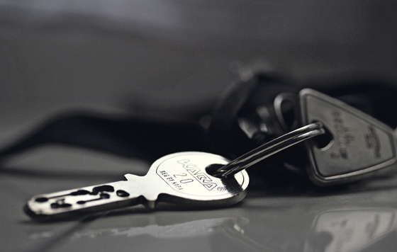
Yale was the market leader in keys in Switzerland before this indigenous design started opening doors. The 'Kaba' key, designed by Fritz Schori in 1934, marries a hand-friendly rounded form with the ability to create a complete access systems

Yale was the market leader in keys in Switzerland before this indigenous design started opening doors. The 'Kaba' key, designed by Fritz Schori in 1934, marries a hand-friendly rounded form with the ability to create a complete access systems
×Defining design along national lines can be a difficult enterprise. What are the peculiarities of such an undertaking in the case of Swiss creativity?
Yes. You are right. It is a difficult 'enterprise', as you put it. But a number of examples in my book represent products that are somehow either unique or have been invented in Switzerland. I tried to define 'classic' furniture design as a backbone, where artistic qualities could be tested, take shape, but this remains a field of interest for a minority of people only (according to marketing, approximately 10%), while SBB, Swissair and so on are far more identifiable by a much larger percentage of the Swiss population.
But these seem to have little to do with design. Design serves here as an added extra, a plus. For example, in the case of currency or a passport. But there is little chance of creating a passport 'without' the application of design, so a contrasting example might be the EU passport, which reduces everything to the lowest common denominator.
It's interesting to think about the 'national' in design and its relation, somehow, to folk culture. Why do the Dutch have strong graphics in public services (police, post, etc)? Why is Denmark strong in stainless steel (bathrooms, table tops, etc)? Why does Germany offer design in almost every field, but always as 'niche' (apart from the car industry, of course)? Why is the 'Best of British', a term coined by Tony Blair's spin doctors, almost 100% bespoke – and this in a country where the industrial revolution started?
The ubiquitous Swatch watch, first launched in 1983, which Leuschel argues started the ongoing cult for watches as a easily acquired (and disposed of) consumer object

The ubiquitous Swatch watch, first launched in 1983, which Leuschel argues started the ongoing cult for watches as a easily acquired (and disposed of) consumer object
×You cite the idea of an 'extended notion of design' as selection criterion for the book. Can you say something more about this? Again, is this something which can/should be applied in particular to Swiss design?
The 'extended notion of design' goes back to the 'extended notion of art’, a term coined by Josef Beuys. It means not to rely on any idea of design as defined through the Bauhaus, the Ulm School or 'Made in Italy’. For me, design has to be defined as an attitude because it has to respond to society’s needs. Those needs are in permanent change, as we all know. For example, car design was not considered a serious design profession in the 1920s when GM introduced the idea of permanent change. Nowadays, the focus is on digital media – which are not included in the book, as I wanted to avoid speculatation on what will be 'classic’ in the future. But, to return to your question, I doubt whether all this applies to Swiss design only. It should be possible to organise Italian or German design according to the same criteria.
From your book, would you be able to select five designs that are of particular note, giving the reasons for your choice?
* Victorinox 'Swiss Army Knife' by in-house design team, since 1891
The 'Swiss Army Knife’, renowned worldwide, has changed into something like the 'Swiss Data Protection Tool’ since 9/11. Adapting to the new post-atrocity safety regulations has meant that no workers have had to be laid off within the company. A crisis has provided the opportunity to create something new.
* 'REX' and 'STAR' peelers by Alfred Neweczerzal, 1947
If the 'Swiss Army Knife’ is considered worldwide as the most iconic Swiss design, the 'REX' peeler in aluminium, and its later stainless-steel interation ('STAR'), manufactured by ZENA, might be the most underrated. They are in everday use in Switzerland and have been copied the world over (but also at home, too – I was surprised to find copies at the Loeb department store for instance!) That said, the ZENA peelers mark the epitome of industrial design: perfection in every respect.
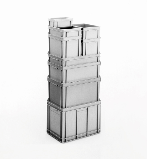
Georg Utz's 'RAKO-Box', developed in the mid-1960s to reduce the need for disposible packaging in the transport of goods, has been copied extensively, testament to its environmental benefits and cost-saving effects

Georg Utz's 'RAKO-Box', developed in the mid-1960s to reduce the need for disposible packaging in the transport of goods, has been copied extensively, testament to its environmental benefits and cost-saving effects
×* 'Swatch' watch by in-house design team, since 1983:
If someone attempted to write a critical history on the Swiss watch industry, it would prove how conservative 99% of the industry was...and still is. This can be explained through the conservatism of customers, as well as through certain aspects of Swiss mentality. Innovation came through the Japanese, and if the Swatch watch had not been invented, I shudder to think what most of the Swiss watch manufacturers' products would look like today. And I am convinced that the Swatch pluriverse of designs also defined the basis for today's watch cult, be it high-end, high-tech, analogue or digital.
* 'RAKO-Box' by Georg Utz, 1965–66:
We all know that this planet is doomed to fail if we do not change our lifestyles. The 'RAKO-Box' was one (just one) little innovation to reduce our amount of waste. It has been copied all over since it was launched (even in Switzerland), having proven that it has a much bigger signficance than serving simply as an intelligent substitute for disposable packaging within Swiss companies like Coop or Migros.
* 'Kaba' key by Fritz Schori, 1934:
On the one hand, it's little more than a simple Swiss alternative to the one-time standard in Switzerland, the Yale key. But it is, of course, much more intelligent and subtle, with its millions of combinations, allowing the creation of whole access systems without the need for more than one key. With its sleek, soft shape, it is also an object that caresses one’s hand, and is friendly to men's pockets and women's handbags...and gladrags.
All these designs mark intelligent alternatives to simple-minded engineering. ('Never let an engineer design your message!') Maybe the 'Swissness’ in Swiss design has much more of an impact that those (furniture-)design-oriented minorities elsewhere do. I hope this five examples illustrate this.
.....
'Swissness' by Klaus Leuschel
Published by Niggli
Clothbound hardcover
172 illustrations
248 pages
21cm x 15cm
German/English
ISBN 978-3-7212-0716-3
Published 2010
