Yorgo Lykouria: Industrial Poet
Texto por Simon Keane-Cowell
Zürich, Suiza
01.04.11
It's somewhat fitting, given the almost lyric quality of his name, that Canadian-born designer Yorgo Lykouria should be interested in reintroducing the poetic into everyday life. His latest product for premium bathroom brand Alape is a wash basin that eschews preconceived ideas of what such an object type should look like in favour of designing the actual experience of washing, one characterised by quietude and wonder. Meeting up with Lykouria at the recent ISH fair in Frankfurt, Architonic got its hands dirty with some serious design discussion.
For Freud, sometimes a cigar was just a cigar. Meeting London-based product and interior designer Yorgo Lykouria at this year's ISH bathroom-design fair in Frankfurt, I was expecting to talk sanitaryware and little more. Indeed, he's just designed a new, resolutely graphic wash basin for high-end German brand Alape. But, in conversation with the thoughtful, Canadian-born creative, his 'Tangens' basin turned out to be the touchstone for a bigger and much more fundamental discussion, in which we dirtied our hands talking about the meaning of ablution, the importance of questioning object typologies, and the challenge of squaring concept-driven design work with commerical realities.
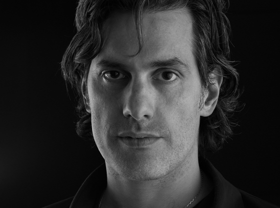
Canadian-born, London-based product and interior designer Yorgo Lykouria: 'The things that we experience are really what matter'

Canadian-born, London-based product and interior designer Yorgo Lykouria: 'The things that we experience are really what matter'
×A metonymic approach to design is perhaps one way of describing what Lykouria does. He's concerned not just with giving form to a product, like, for example, a wash basin, but also with how his design designs the user's experience – in this case their perception of, and interaction with, water. For him, it's about reintroducing moments of conscious reflection, of pleasure and awe into everyday life, turning the mundane and the prosaic into poetry. 'For me, a precious commodity is human consciousness,' he explains.
In Alape, Lykouria – who, at one stage, headed up the interiors and design department at respected Chicago architectural office Murphy/Jahn – has found a client that is responsive and trusting. But like any long-term relationship, it's not always easy. 'It's a bit of cliché to say this,' says the designer, 'but it's like a marriage, which means that you can really bug each other sometimes. But that's part of the growth experience. We're pushing each other.' Read on to find out how Lykouria keeps the marital magic alive, how minimalism for him is a dead end, and why Rutger Hauer's android in 'Blade Runner' would appear to hit the nail on the head.
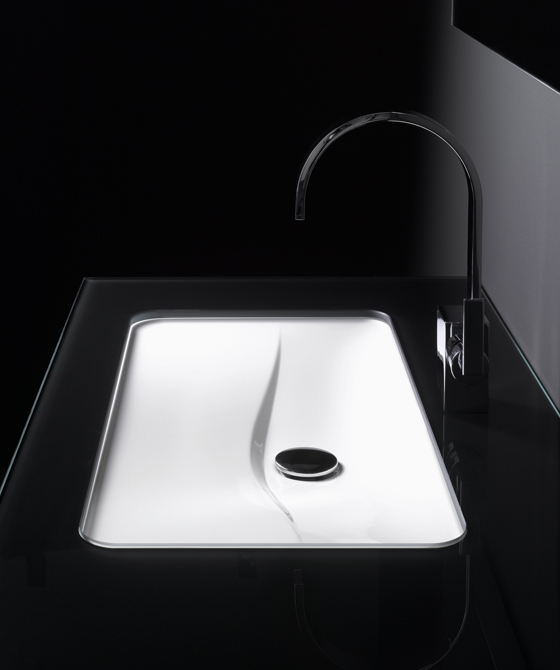
'I wanted to capture that initial sense of wonder you have when doing something for the first time': Yorgo Lykouria's 'Tangens' remarkably flat wash basin for Alape, where the water 'sheets' across the surface

'I wanted to capture that initial sense of wonder you have when doing something for the first time': Yorgo Lykouria's 'Tangens' remarkably flat wash basin for Alape, where the water 'sheets' across the surface
×…..
Why did you design the 'Tangens' wash basin? Why does it exist?
It's in line with the history I have with Alape. In 1999 we designed what they were calling flat wash basins. And for them it was revolutionary because no one had thought about wash basins in that way. Most of design, as you know, is derivative of expectations. For instance, the basin needs to be a bowl, or have a certain depth, and there's a plug at the bottom and so on.
The bowl function for a basin is something that I wanted to take away from it. Starting in a way with a fresh look at it. I don't design things with a formal preconception. Obviously, I have my own formal preferences, but it's not about 'I want to do something that looks like this.' The starting point is always 'What can it be that it's not already.' The idea of the flat basin, of which we've designed several for Alape, some of which were not produced: the approach was always about the poetry of the experience.
And what informs this approach, do you think?
Well, it's simply that we've seen everything that there is to see in this world, especially in our lifetime. We're bombarded with information and images. We can travel anywhere and do anything. We've really seen it all. We don't really give that much attention to those moments like the ritual of washing your hands, which we do several times a day. It's forgotten. We do it automatically, like many things.
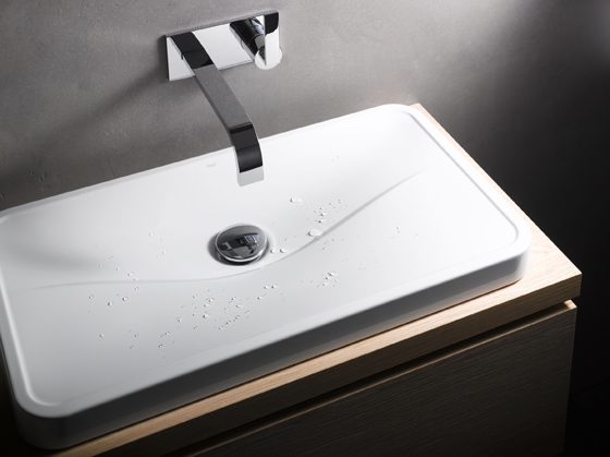
In designing this particular product, I wanted to capture that initial sense of wonder you have when doing something the first time. So it's not that the product just looks different, it's that the experience is difference. The way the water cascades over the surface and sheets away. There's something happening there. There's a quietness about it. There's not that hollow sound you get with a bowl, where the water goes into a void and disappears down a drain. And there's a sense of water being wasted. Washing your hands is a very poetic experience, right? It's in literature. It's biblical. It's so many things. It's an important part of our lives, I believe. In designing the product that was the starting point. So the flat series went in that direction.
Lykouria's 'Tangens' wash basin is the latest product to emerge from the designer's long-standing creative relationship with German brand Alape, which began over a decade ago

Lykouria's 'Tangens' wash basin is the latest product to emerge from the designer's long-standing creative relationship with German brand Alape, which began over a decade ago
×How on board were the client from the start?
Designing this piece was an attempt to save Alape from minimalism, because that's where they were headed. The whole thing about purism, purism. We had several philosophical discussions that would break out in the middle of something else. And I kept saying 'Listen. Minimalism is a dead end. Everyone is producing a box and a circle and a square. And then what? Where's the difference then between Alape and so and so?' There is none, so we need to get beyond that. We need to dig deeper and invent a new language. But it's one that is still purist. It's not frivolous.
I mean blob architecture and blob design, which has been around for a while now, was very cool in the beginning, but it's become like minimalism: anonymous. You don't sense the mind of the designer in it anymore. I design in CAD software as well, and I know how easy it is to do those things and get 'cool' results and impress in terms of formal complexity. But that's more about the tools that we use rather than 'Why are we doing this?' If we're going to produce another product – a chair, a basin, a lamp – it's got to be meaningful, otherwise don't do it.
Absolutely. Surely we've come to the point where everything has to be justified, has to have a reason to exist? Also from a moral point of view.
It's interesting you talk about making the user of your new basin aware of what is happening in the moment as they are experiencing it. I think that goes to the heart of the question 'What is design?', whether it's purely about utilitarian function or whether, as is the case with this product, it attempts to foreground the ritual of washing your hands, making your more conscious of it. A metaphor for this might be food: do we eat solely for the purposes of energy, of fuel, or is it because we want to taste, which has more to do with poetry than prose?
And it's about life. You know, the beautiful setting of the picnic table, out in nature. It's about why we're alive, because, without that, we're animals, really. That's the separation.
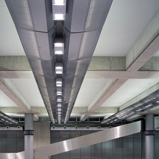
Among Lykouria's completed projects are the interiors at Cologne/Bonn Airport, which include lighting fixtures, check-in counters, passport-control boxes, bars and the restaurant. Chicago-based practice Murphy/Jahn were responsible for the building

Among Lykouria's completed projects are the interiors at Cologne/Bonn Airport, which include lighting fixtures, check-in counters, passport-control boxes, bars and the restaurant. Chicago-based practice Murphy/Jahn were responsible for the building
×Was it hard to use this kind of language, to introduce these kinds of ideas for a project that, of course, sits within a commercial context? This is industry.
There are a few things that are difficult. Firstly, communicating to the end-user what it's about. They are not always going to see it the way I see it, right? In a commercial context, Alape cannot necessarily speak about the things I'm speaking about. People aren't interested in being lectured to and told what to do and how to live. Although, in the most recent campaign, they've started doing that. And so we had a great session with the current head of the PR department at Alape. This inspired a new direction for the media campaign. The direction is no longer purism. We're calling it 'emotional purism'. So they've absorbed these concepts and we are pursuing them more and more with the next products.
It was in one way easy and one way difficult. Difficult in the sense that they had come to believe that it was a good marketing strategy and a good commercial strategy. But ultimately, they do believe in what they do. Obviously, there are a lot of ways to make money. Alape has a lot of integrity because of the quality of the materials, the quality of the production, the quality of the design. Everything is very carefully done. I appreciate that. But sometimes, because of this careful, cautious approach, it can be difficult to move them in a certain direction.
What are the advantages and disadvantages of you working as a designer over a number of years with the same manufacturer?
Well, it's a bit of cliché to say this, but it's like a marriage, which means that you can really bug each other sometimes. But that's part of the growth experience. We're pushing each other. There are times when I felt taking for granted, in a way, in a sense of where the potential isn't being realised. But we've grown through that, I think. We're on the same page. And likewise they were probably annoyed with me pushing, pushing, pushing all the time for a certain thing, and having to tell me 'No, that's too far.' So, there's this kind of point where we found this ground that was, like that acronym goes, MAYA – most advanced yet acceptable'. It's the right balance between innovation and commercial enterprise basically. So, I think, between us, having a common interest in the middle, we've managed to find that balance. But it's like any relationship. You sometime's take the other person for granted, but there's also an element of trust that's invaluable.
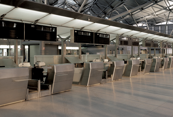
'Crossing that line between the human and the machine world': the check-in counters at Cologne/Bonn Airport

'Crossing that line between the human and the machine world': the check-in counters at Cologne/Bonn Airport
×Maybe you need to have an affair to reintroduce...
(Laughs.) That's a good point.
Speaking in purely metaphorical terms, you understand. (Laughs.)
Obviously, there isn't an exclusive arrangement with Alape, but out of respect for the relationship I don't sleep around.
Let's park that metaphor there. I was wondering to what extent the idea of design that a clear emotional aspect to it, as evinced in your 'Tangens' basin, is joined up with your other work across different sectors and disciplines?
This is the core of my thinking. It's in everything I do.
Do you want to say more about that?
Well, a good example are the interiors at Cologne/Bonn Airport. Taking one element of the project, the check-in counters. We all know what a check-in counter looks like. Most architects or designers start with a sense of precedence – what's been done and build on that. Rather that start with precedence, I started with a critique of why I hate the check-in counter and why it's wrong: this box which is cluttered and has nothing to do with the excitement of air travel with the experience. You're about to depart, you make contact with another human being who is going to give you passage to flight. It's quite a beautiful moment for me. I wanted to make the passenger aware that this is a special moment by designing the check-in counter in a way that they start to feel that excitement. Now they're crossing that line between the human world and the machine world. They're about to experience a technological miracle, the fact that we can fly. That was the impulse, the poetry if you want, behind that initial sensation.
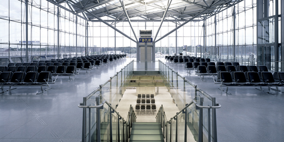
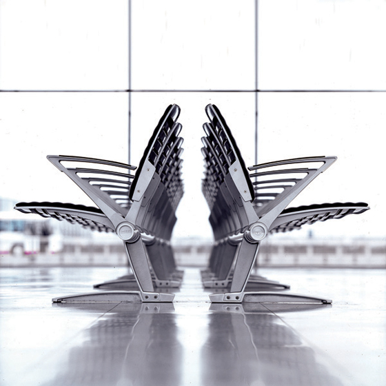
'I guess I'm utopian in my approach. Not what something is or has to be, but what it should it be?': seating designed by Lykouria at Cologne/Bonn Airport

'I guess I'm utopian in my approach. Not what something is or has to be, but what it should it be?': seating designed by Lykouria at Cologne/Bonn Airport
×What was the process of realising this like?
Marrying that wish with the technical aspects of the check-in counter was demanding. I always try to work between the functional requirements and the very poetic and bring them together. It's naturally how my mind words. So with the check-in counter, all the functional aspects were hidden. Even the monitor. There's this kind of leaning towards the passenger. A greeting. A handshake, almost. They are like sentinels as you move from landside to airside, from human to machine. That was the metaphor. The language starts to become mechanical, but, at the same time, it's like a robot making a human gesture.
Trying to create an interface between the two.
Exactly.
And have you observed how the counters are actually used? Did it confirm what you believed and intended or was there anything that surprised you?
It confirmed most things. There's a sense of beauty in the way people approach them. The relationship isn't confrontational the way it is with a melamine box. Instead the passenger is greeted and then walks through, having checked in. So you really experience the passage, the gate.
The project was another case of thinking about how things should be and not relying on precedence. That's always my starting point. I guess I'm utopian in my approach. Not what it is or has to be, but what should it be? Of course, sometimes you can't get everything you want.
But you aim high initially.
And we usually get it. I'm not just saying that. It's because we marry the conceptual aspect of the project with the functional. The functional aspect includes the client relationship, politics, budget, timeline. All those are the reality of a project. How much time and money do we have? If it has to be done within a certain time and budget, there's only so much that you can do. But what can you do within those parameters? I'm not completely spaced out and thinking irrationally. So generally, you try to fit to the means of the situation.
The baggage hall at Cologne/Bonn Airport, part of Yorgo Lykouria's overall design of the building's interiors

The baggage hall at Cologne/Bonn Airport, part of Yorgo Lykouria's overall design of the building's interiors
×We've talked about the poetic aspect of design and the functional aspect. But there's also the issue of responsibility, is there not? In terms of your new wash basin, it's considering the usage of water. I wondered to what extent your 'Tangens' project was informed by that.
To be honest, I was thinking about water not so much as a precious resource, but more in terms of a precious entity, or substance. Again, the poetry of it. In a way, they arrive at the same place but via a different road. Realising that it's precious means being aware of the fact it's not to be wasted.
Well, maybe that's a more successful of getting people to think about the wastage of water.
Possibly. It's more emotional, certainly. More impactful. I think sometimes there's a bit of salesmanship on this aspect of ecological thinking and corporate responsibility. There are companies that do these things because they have to. They wouldn't be doing them if they weren't marketable. That's the sad reality. If you're doing it for that reason, then it's too much on the nose, and if you can find a more poetic approach it might be more impactful, because it gets to people in a more subconscious way.
I think sustainability is still at the point where it's being used by the marketing machine as a trend, as opposed to something that is innate and runs through everything.
For me, it moves from the marketing side of things into the functional side of things. Of course it has to be there. It has to work, of course it has to be ecological. If you're doing something that is wasteful, you need to stop and rethink it. But for me, it's not the only issue. For me, another precious commodity is human consciousness. Just our lives. The way we live. We're driven faster and faster. We're constantly being pushed and pulled. There are not enough of those moments to enjoy where you are and what you're doing. A simplicity. That's also a precious resource that we shouldn't waste. Ultimately, when we're all at our end, looking back, what are we going to think and feel?
It's like the end of the film 'Blade Runner'. Batty, the android, is dying, just having saved Harrison Ford's life, and he says, 'I've seen things you people wouldn't believe. All these moments will be lost like tears in the rain.' And, in a way, it's that. That's the essence of life. All these things that we experience are what really mater. It's not much how you accumulate. And that's what, in a beautiful way, dies with you. It's all yours and nobody else's. And that's why I design. It's for those things. Hopefully, I have the opportunities and abilities to do that in a better way each time.
Yorgo, thanks very much.
.....
