Sky-Frame: House G
Texto por Sky-Frame
Frauenfeld, Suiza
01.07.20
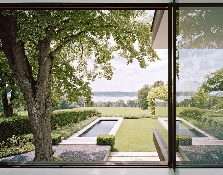
Nestled on the crest of a small hill overlooking the Ammersee lake is a modest, two-storey building which blends in unobtrusively with its lushly vegetated surroundings. The presence of nature, particularly the lake, pervades every space within the modern villa. Sky-Frame’s minimalist sliding window system generates an architecture of light.
The Ammersee is located in the Five Lake region just outside Munich and is a popular local recreation area. Gathered around the largely unspoilt shore areas are a collection of detached residential homes whose owners draw inspiration from the magnificent natural surroundings. Building plots on the edge of the lake are hard to come by as a result. After years of living in the heart of the Bavarian metropolis of Munich, a married couple decided they wanted a change of scene. After hunting for the ideal plot of land they finally found what they were looking for in Inning am Ammersee. This beautiful corner of the earth sits atop a gently undulating hilly ridge with a view onto the Ammersee and the surrounding forest area. The building plot faces onto a large natural meadow with a view out onto a sailing marina – the ideal location for a family home.
The construction client, who works as an orthodontist, finally had the chance to realise his dream of moving from an urban metropolis to a rural paradise. ’Architecture is my way of surrounding myself with beauty and aesthetics in my day-to-day life,’ explains the client – a purist who favours clean lines and timeless beauty. His affinity for architecture goes far beyond a mere hobby. This is reflected by the seriousness with which he pursues this passion. His work situation allowed him sufficient time to put his creativity and great passion to work on the building project. During the design phase the dental specialist worked closely with the architects. ‘I was striving for perfection in planning and craftsmanship,’ he recalls. ‘Reaching a consensus and putting this into practice was often very challenging given the short time frame. The clearer the concept and the greater the client’s demands, the more difficult it is to achieve the desired end result.’ That did not dampen the enthusiasm for the project though.
The inner courtyard as a place of communication
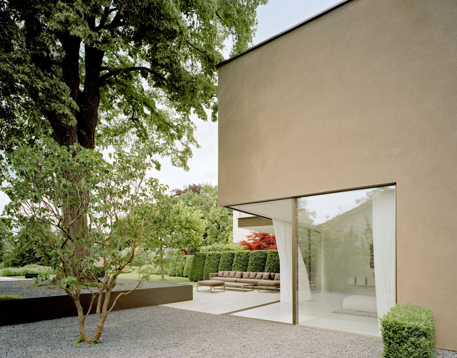
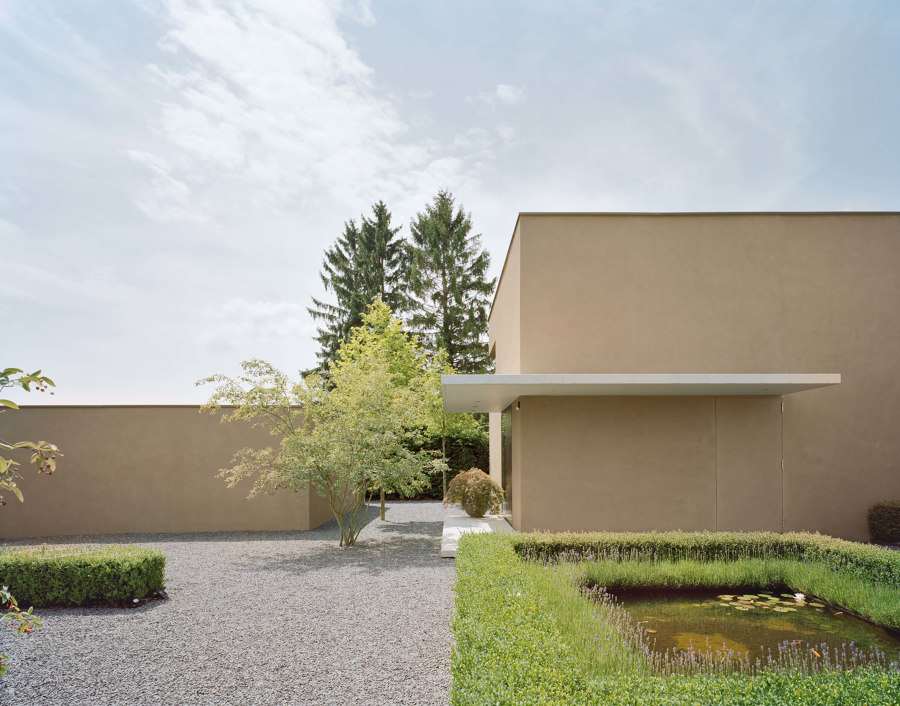
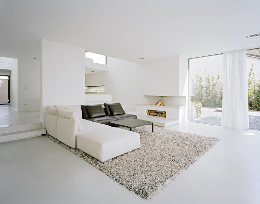
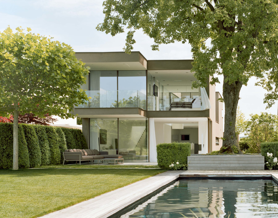
The house takes a back seat and blends into the surrounding natural environment – a concept famed many years back in the designs of former master architect Frank Lloyd Wright. From the rising street, the two-storey villa looks quite unobtrusive, and in no way imposing. The mineral sgraffito looks smooth and solid but the sunlight conjures up all sorts of different shadows on it. The windows are hardly visible. Once you have gone through the metallic entry gate, you are instantaneously enveloped by immense tranquillity. The calm inner courtyard with dark marble chippings serves as a public space and the focal point of the entire structure. This is the first indication of the client’s penchant for minimalist design. The clear geometry of the architecture is continued in the garden design. Cubic box hedges and a square pool with ornamental fish divide the courtyard, which has become a meeting point for the family. The colours of the plants and the materials like the grey of the gravel surface accentuate the intimacy of the courtyard. The building is positioned facing the lake. The theme of simplicity is continued in the interior areas. When drawing up the floor plan, the client avoided the kind of sprawling spaces that lose their intimacy due to their size alone. Not one centimetre was wasted – the floor plan was to be compact and neatly arranged. The entrance area has been kept functional. To the left are the kitchen and the pantry, then down to the right the wine cellar and the guest apartment which has its own separate entrance. But the light draws visitors up a gently rising ramp. Curious, they wander along the hall, before entering into the expanse of the central living area. The path which leads there is nothing short of an experience.
Here you can climb another floor to reach the couple’s private rooms. The client’s study is the only room which looks out onto the grounds facing away from the lake with a view of meadows and forests. An inner courtyard with a solitary bonsai tree separates and connects the work and sleeping area. This allows countless glimpses, panoramas and unobstructed views through the garden and down into the dining and living area. The bedroom and bathroom are divided only by sliding glass doors. Whether lying on the bed or in the free-standing bathtub, the view of the lake is breathtaking.
Architecture of light
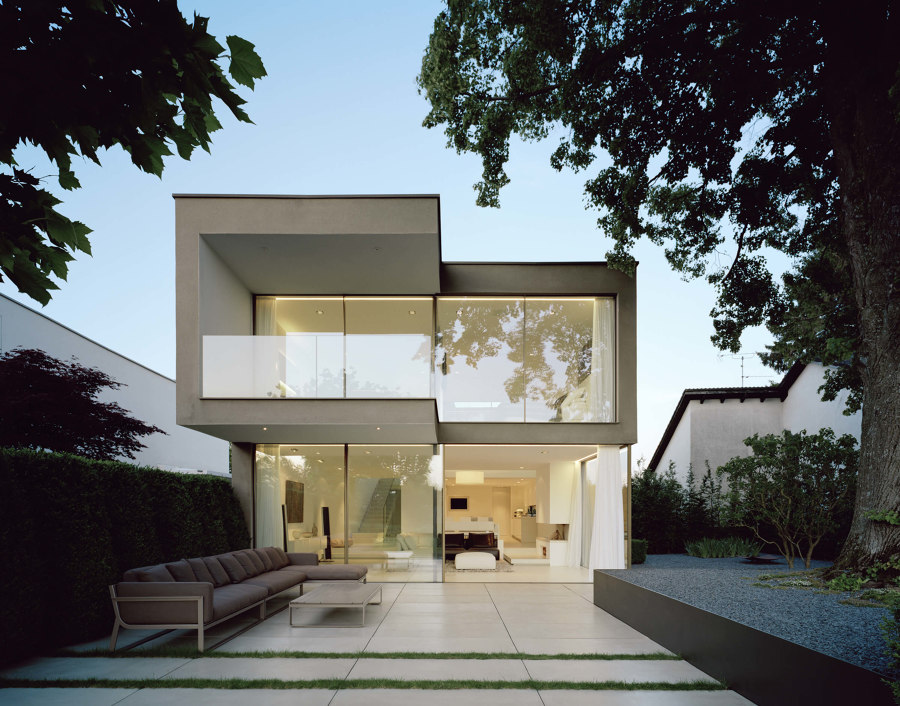
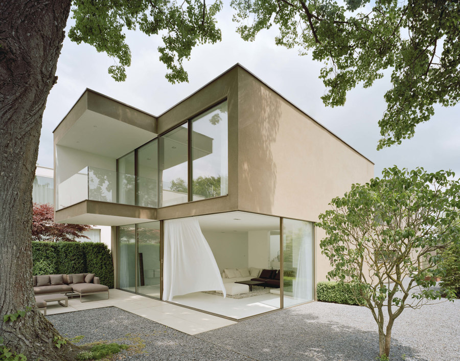
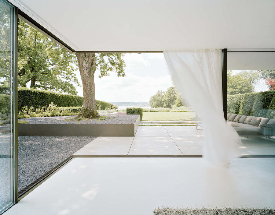
The kitchen on the ground floor is one of the most important places in the house for the couple. So much so that the client-centred his design around the cooking hob. Understated and sophisticated right down to the last detail – that’s the design vibe in the owners’ favourite place in the house. The light cupboard fronts with recessed handles, the metal cover on the kitchen island, the grey of the cement floor and the white of the walls blend perfectly into the modern surroundings. This type of purism was exactly what the couple were looking for – on the same wavelength when it comes to style. Only the most essential furniture and understated artwork on the walls – nothing was to detract from the view into the greenery. The kitchen, dining and living area form one flowing space which opens out onto the lake. The breathtaking panorama takes on the role of a painting. Sky-Frame’s minimalist sliding window system generates an architecture of light. The large window casements can be opened at the touch of a button and flexibly around corners too, merging the indoor and outdoor spaces seamlessly in the process.
The garden and the terraces were designed as an extension of the indoor area. To ensure that the officially approved height of the building was not exceeded, the client laid the foundation and thus the garden deeper. This ensured a suitable room height for the living room. The lushly grown lime tree is now positioned as if on its own specially designated podium. Here you can still distinguish the previous level. Clear geometries are prevalent in this part of the outdoor space too. Wild-look waves of grass act as a border between the meadow and the saltwater pool. The multi-faceted garden offers countless places to relax and serves as a well-used lounge in summer for the family’s many guests.
Harmonious coexistence with the lake
Blending into the landscape perfectly and unobtrusively outside, the house turns into a complex network of rooms inside. Each room is unique and features its own lighting arrangement. The interior spaces are tailored to the lifestyle of the inhabitants and arranged in harmony with the lake. When asked what he would do differently now if he were to design his own house again, the client gave the following response: ‘I would do the majority of it exactly the same, but too many custom measurements and a lack of tried-and-tested materials made the implementation extremely challenging. Ideally, when designing the next house I would try to strike a balance between the new and innovative and the tried and tested.’ And when asked about his favourite places, his eyes immediately drift across the Ammersee as he responds: ‘I love the openness and the clear links between the rooms. I can’t imagine anything I’d rather be doing than standing at the kitchen island in the evening and watching the sun go down over the lake.’

