Meet the new neighbours: Steelcase's Share It Collection
Historia de la marca de James Wormald
Munich, Alemania
30.01.19
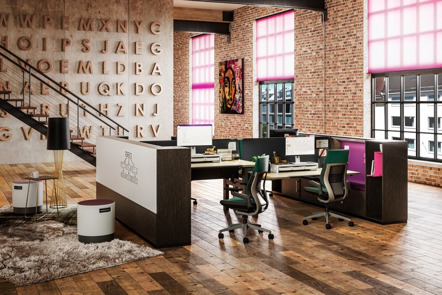
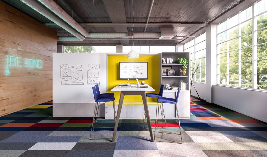
STEELCASE's Share It Collection combines open-plan design with private office elements that structure space into separate neighbourhood areas, providing both privacy and focus, as well as Team Hubs for colleagues to connect.
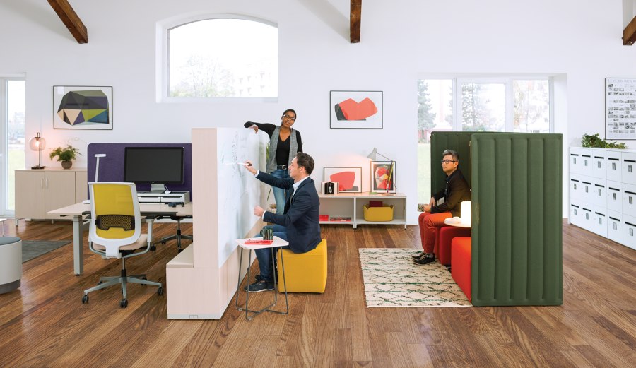
Markerboard surfaces can turn any flat edge into a whiteboard, meaning the side of a bank of desks becomes a quick, informal meeting space

Markerboard surfaces can turn any flat edge into a whiteboard, meaning the side of a bank of desks becomes a quick, informal meeting space
×My own various encounters with open-offices have – on the most part – been welcoming, collaborative, playlist-sharing experiences. But a desk-squeezing layout brings distracting chatter, meetings in unsuitable locations, uncomfortable and unfamiliar hot-desking, no secure personal storage and constant screen scrutiny from passing superiors. All factors combine for an unfocussed and uneasy working environment.
As with most things in life, compromise is key and this is the ethos behind Steelcase’s Share It Collection office furniture and design catalogue. The collection carefully selects and retains the best parts of the open-plan office and adds a few private office features. Together with a fresh, uplifting design and a little help from technology, the Share It Collection creates small office ‘neighbourhoods’ for teams to both collaborate and connect, as well as focus in a more private space.
With so many different configuration options available, any size or shape of space can house a combination of desking, seating, storage, acoustic panels, markerboard surfaces and a/v solutions

With so many different configuration options available, any size or shape of space can house a combination of desking, seating, storage, acoustic panels, markerboard surfaces and a/v solutions
×When open-plan office design works, it can transform the blank canvas of a former factory, let’s say, into workable space. Segmenting what was once cold and daunting, into individual fit-for-purpose areas that help focus the mind for the right task, improving visibility and collaboration.
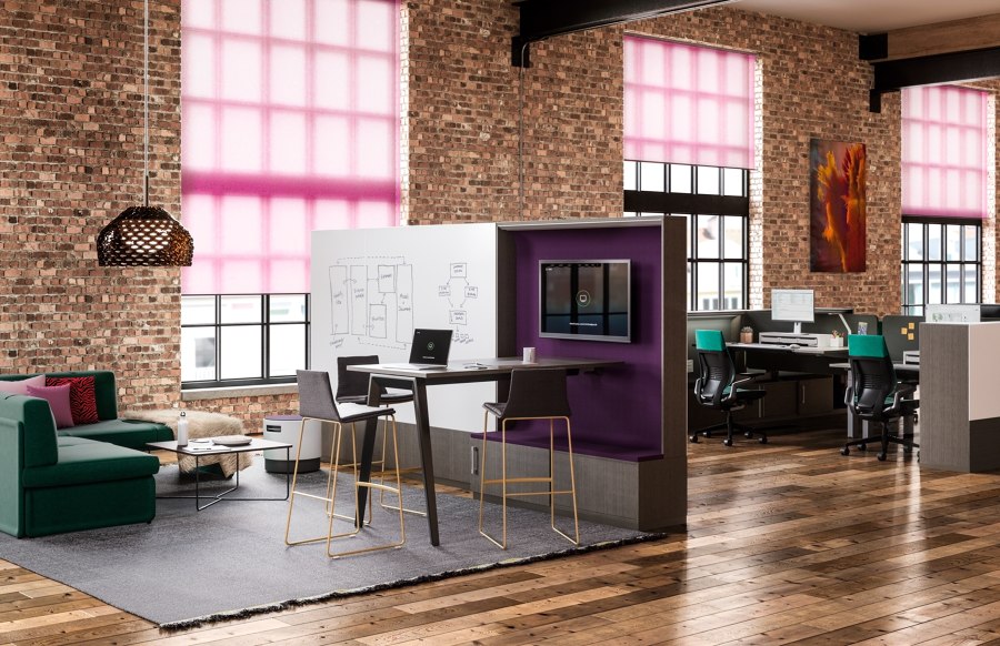
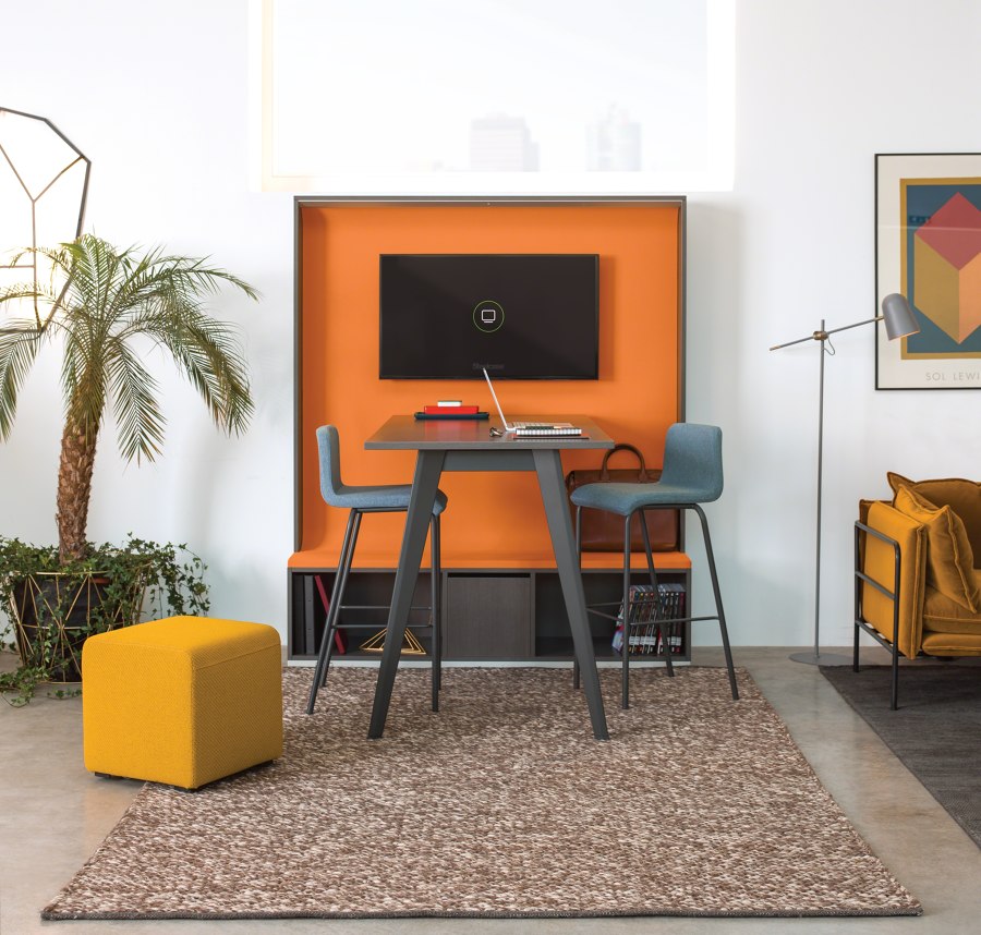
But visibility also means distraction. What initially seems a creative and engaging environment, can quickly become noisy and intrusive. Similarly, poorly considered break-out spaces can forget they’re actually for work. Often created with little more than a comfortable place to sit, they can force employees to huddle around one small screen on a co-workers lap. Instead of scrapping the unfit-for-purpose lounge seating, Steelcase have innovated the concept, stripped it down to what’s most important and combined seating, desktop, storage, audiovisual and connectivity elements. Meaning planners can create smaller and thus more prevalent informal ‘Team Hub’ spaces.
Restructuring space into private workstations and collaborative elements gives employees more control within their work environment. Steelcase’s research found this to enhance engagement, satisfaction and performance

Restructuring space into private workstations and collaborative elements gives employees more control within their work environment. Steelcase’s research found this to enhance engagement, satisfaction and performance
×All freestanding furniture solutions are available with integrated Markerboard surfaces. Clumsy A-frame flip charts can stay in the stationary cupboard of history, and projects can instantly be visualised at one of the Team Hubs or even in a one-to-one space. With lounge seating next to workstations, employees can connect quickly without leaving the workspace. All collaboration spaces include room for an integrated large screen monitor, which, when operated with Steelcase’s homegrown media:scape software, Virtual Puck, means users can effortlessly screen-share from laptop to any meeting area in seconds. No need to fumble around with cables, or the labyrinthine settings menu.
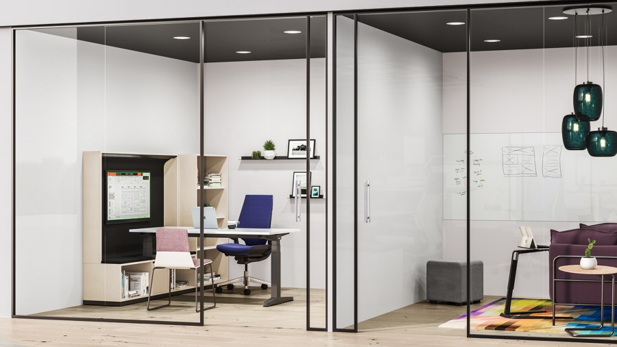
While the internal architecture of private offices blocked employees off from each other, closing the door on the natural connections where creativity and productivity thrive, they did provide a semi-private cocoon for employees to focus. The security and personal aspects of the private office meant workers could make their space more suited to their individual needs.
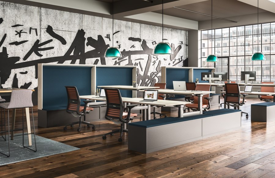
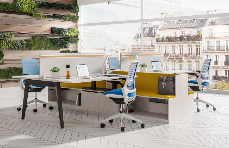
Private acoustic panels within workstations increase employee focus and privacy for added comfort and confidence. The pinnable screens, integrated with ambient lighting, offer space for visualisation aids and inspiration (top)

Private acoustic panels within workstations increase employee focus and privacy for added comfort and confidence. The pinnable screens, integrated with ambient lighting, offer space for visualisation aids and inspiration (top)
×Provided with more control over a personal, stable workplace, Steelcase’s research states employees feel more engaged and more satisfied. This is why the Share It Collection includes, in its range of workstation elements, sound-absorbent hutches for added privacy and to pin inspiration or visual aids; simple-to-use height-adjustable desks for increased wellbeing and performance; lockable desk drawers or centralised locker storage; along with thoughtful storage solutions such as bag shelves alongside desks and within break-out spaces, keeping bags and other personal items off the floor and out of walkways.
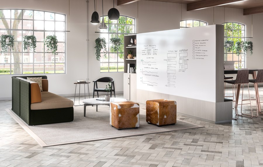
For meeting spaces, the collaborative elements can be configured with acoustic panels and varied tables and chairs so employees can sit or stand

For meeting spaces, the collaborative elements can be configured with acoustic panels and varied tables and chairs so employees can sit or stand
×With the Steelcase Share It Collection, employees of the modern office environment can enjoy the social, creative and collaborative benefits of the open-office space, while keeping the trust, control and comfort of the private.
They can both have their cake, and choose where to eat it.
Just don’t ask to share.
© Architonic

