Office Kersten Geers David Van Severen: Setting Parameters
Texto por TLmag
Brussels, Bélgica
27.10.16
Architects Kersten Geers and David Van Severen’s architecture is a negotiation between theory and practice. During the interview, they shared the thinking behind two of their recent projects: the RTS Campus radio and television building in Lausanne, Switzerland, and the scenography for the 2016 Biennale Interieur in Kortrijk, Belgium.
For architects Kersten Geers and David Van Severen, architecture serves to frame content, explore principles and rules and negotiate between spaces, materials and surroundings. They have developed their methods over the course of the nearly 200 projects they have completed since the founding of Office Kersten Geers David Van Severen in 2002. In recent years, their projects have spanned Belgium, France, Switzerland and the U.S.
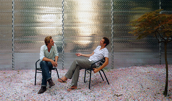
David Van Severen & Kersten Geers, © Tine Cooreman
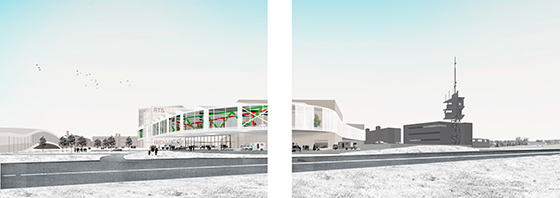
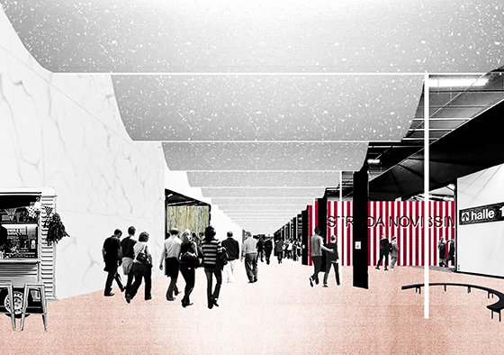
Campus RTS, Lausanne, Switzerland, 2014, collages
Geers and Van Severen’s architecture is deeply rooted in architectural theory and history. They bring the two disciplines together through their strong technical, technological practice. The marriage of the theoretical and the practical lies at the very heart of their practice. Both architects are deeply fascinated by rules and principles. Yet both eagerly admit that in the end, the way that the space feels is what matters, not the theory behind it.
We spoke with Geers and Van Severen in the meeting room of their firm, located on the tenth floor of an office building. The space is seemingly as visually straightforward as their architecture. White, no-fuss concrete beams and columns structure the lean lines of the space, which looks out over the city of Brussels on two sides. A rough concrete ceiling, also painted white, is lit by a series of fluorescent bulbs covered with functional, folded metal stripes.
“We often say that we believe that architecture as a practice allows you to search for a set of principles in form without knowing exactly what you are looking for,” Kersten Geers says. “It’s not necessarily trying to narrow things down, but rather an effort to accumulate knowledge along the way. It has a classicist aspect to it, a negotiation between rhythm and organisation. We are not neo-classicist although we try to be literal and translate different elements or proportions of certain elements. We do believe that certain dimensions or sizes work better than others.”
“Our collaboration is very much based on the fact that ultimately our projects are founded on our mutual understanding of what works and what doesn’t work; what is beautiful and what is not beautiful,” he continues. “I think that’s exactly it – making something that is beautiful; balanced spaces that are good to live in. That has driven our work and has somehow allowed us to touch upon some theoretical topics without the buildings turning into mere translations of the theories. We often used to say that we are searching for a certain hedonism. It’s not an interesting project if people merely understand the different layers. It’s about enjoying the place. I think that is a very important element for us.”
“We talk a lot about framing content but parameters are also important for us,” David Van Severen explains. “How do you define a parameter? A room is a one kind of parameter or frame. That is one thing that defines how we work. We started with built work but sometimes we say that it’s like a built manifesto. The things that you make also speak for themselves.. They stand on their own, even though you can tell that a lot of thought went into them.”
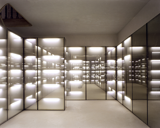
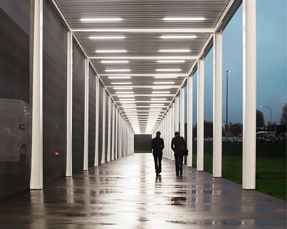
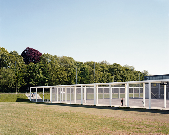
Biennale Interieur Kortrijk 2016. Exhibition design in coll. with artist Richard Venlet & graphic designer Joris Kritis, collages

Biennale Interieur Kortrijk 2016. Exhibition design in coll. with artist Richard Venlet & graphic designer Joris Kritis, collages
×Fulfilling Future Needs
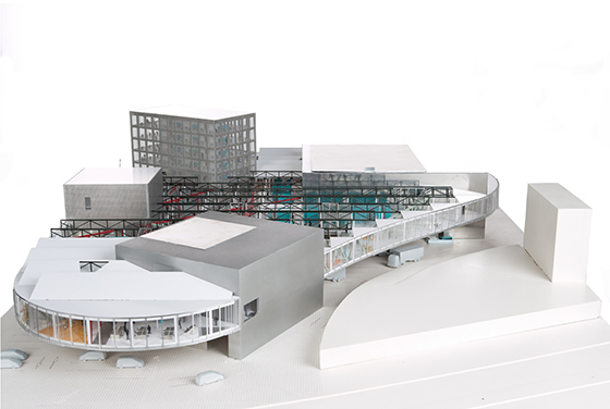
In 2014, Office Kersten Geers David Van Severen won an architecture competition for the Swiss Radio and Television Company in Lausanne, Switzerland. The RTS Campus building will be located on a campus that has gradually been expanding since the 1970s. Today, the centre of the campus is a learning centre designed by the architecture firm SANAA.
Geers and Van Severen have been in Switzerland for many years and admit that they are very invested in the country. Both teach in Lausanne and they sometimes stay in the city for work.
“It feels like a place that embraces you but at a slow pace,” Geers says. “That’s not necessarily a bad thing though it certainly is a fact.”
The nearly 35,000 m2 RTS Campus building focuses mainly on radio production. However, considering the fast-changing nature of the media today, the building needs to be flexible enough to accommodate possible future needs as well.
“The building is almost like a city that never sleeps, with continuous interior space for production. The space is structured by big cut-out spaces, such as large studios and a media centre. As with our other architecture projects, we believe it’s possible to define a set of parameters, which is to say envelopes, that are relatively autonomous. Then you can create a programme that is constantly in flux,” Geers explains.
“This project comes back to our fascination with the more technical aspects combined with our deep interest in architectural theory and history,” Van Severen continues. “The building tries to combine those considerations, which is perhaps a less common approach in Switzerland. Building with a certain economy of means is something that we bring with us from Belgium. That is a great fit for a media building because, in the end, what is a media building? It’s a very technical space but it is also an extremely virtual space that adds something quite new.”
Ideal Grids and Urbanity
Similarly hidden principles can also be found in the exhibition design of the Biennale Interieur furniture fair, which will be held in October 2016 in Kortrijk, Belgium. Nearly a decade ago, Geers and Van Severen transformed the Kortrijk Expo fair venue by designing the master plan, the exhibition hall and the fair centre entrance.
When it comes to the fair scenography, Geers and Van Severen have been working closely with their frequent partners, artist Richard Venlet and graphic designer Joris Kritis. Biennale Interieur will celebrate its 25th anniversary this year with a Silver Edition theme. In their design for the fair, Geers, Van Severen and Venlet are emphasising the fair’s streets and galleries with ‘silver linings’ that run across the ceilings. These linings are made of the same silver-coloured, sun-blocking aluminium material that they have used in some of their other projects.
“There are two key elements: the idea of urbanity and the idea of the ideal grid,” Geers says of the scenography. “We felt that they could have an interesting relationship to what you might call the healthy mess of a furniture fair. At a fair, you have stands that try to take up as much space as they can. It’s the idea of allotments.”
“It was crucial for us to take the whole Biennale Interieur back to the Kortrijk Expo complex and work on it as an urban area with more or less defined zones and elements,” he continues. “By bringing the off-programme back to the Kortrijk Expo from the city centre where it took place a couple of years ago, we allow the programme and the off-programme to collide. You can see the potential alternative future of furniture design while seeing everything else.”
“We believe that there is a way of making the Kortrijk Expo a real city, which is how we have always envisioned it in the architecture and the master plan,” Van Severen adds. “Now we have the master plan, the architecture and the interior as well. That is very interesting. We truly believe that by emphasising the grid, which is a hidden part of the larger complex, we can make the fair clearer and easier to navigate. With the grid as our main focus, we are able to mix all the different scales together.”
Interview by Heini Lehtinen
