The Park of Parks: Copenhagen's Superkilen
Texto por Valentina Ciuffi
Milan, Italia
05.04.13
A collage of stories and urban situations from around the world: BIG-Bjarke Ingels Group, Topotek1 and Superflex’s response to Copenhagen’s most multi-cultural district.
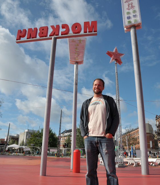
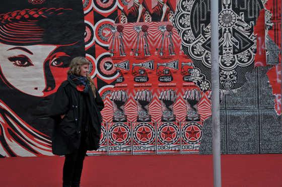
Superkilen is taking shape devoid of political correctness. Shown here, the park's red square
Everything about Danish architect Bjarke Ingels seems a long way from a minimalist approach prone to subtraction: his office’s name, BIG; the name of one of his projects, Superkilen(1); his motto “Yes is more”, a rereading of Mies van der Rohe’s historic dictum; his way of moving, working and expressing himself.
Excess, saturation and congestion are words that also frequently recur when he talks about Superkilen, a park in Copenhagen set to explode with symbols and colour, as well as an experiment with the direct involvement of its citizens.
This project, the winning entry in a competition financed by Realdania(2) and the Municipality of Copenhagen of Copenhagen’s Nørrebro district, is a joint work by BIG, Topotek1’s landscape architects and Superflex’s visual artists. These three players’ response to the brief for a city park that would promote social integration in Denmark’s most multicultural urban district – a place that has occasionally seen sporadic street violence – was to bring in urban narratives and situations from all over the world. Using newspapers, radio, the Internet, and e-mail or site boxes, they asked the district’s inhabitants to suggest urban furnishings for the future Superkilen park. Each of Nørrebro’s 60 nationalities had to be represented in the park by at least one item.
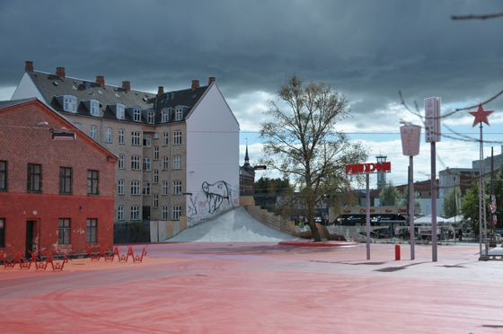
The wall from which the cement slide starts, just as the slide itself, will be soon coated in red: the park will appear as sloping from the house and the skaters, who already crowd the site at night, will have a new, quite original ramp at their disposal

The wall from which the cement slide starts, just as the slide itself, will be soon coated in red: the park will appear as sloping from the house and the skaters, who already crowd the site at night, will have a new, quite original ramp at their disposal
דWestern society sometimes prevents immigrants from wearing what they like,” says Topotek1’s Martin Rein-Cano, “but the prohibition is even more marked when it comes to their ‘items’, large or small as the case may be. I’m thinking here of the burqa, minarets and lots of other things that are prohibited in many parts of Europe. But to be integrated also means being able to ‘translate’ your native environment to the place you choose to live in. And in this fight against standardization the ability to bring bits of your own culture with you is crucial.” Bjarke Ingels is fascinated by the accumulation of all these bits of culture on the Superkilen stage. He is interested in the intersection of symbols and his motto “Yes is more” applies equally here. He likes the idea of being able to say yes to so many of the suggestions he’s received, since the project has no fear of crowding and overlap. He also likes the idea that the reasons for saying no had nothing to do with political correctness or any kind of social politeness.
“I don’t eat Chinese to be polite to the Chinese or make them happy, I do it because their food satisfies my needs and desires. Though they obey the rule that every ‘country’ has to be represented, the items in the Superkilen were chosen mainly because they work well, they do the job.” This is one of Ingels’ hobby horses, the one you least expect to come across when the talk turns to social integration and multiculturalism, namely Darwin’s theory of evolution, which always lies at the heart of his projects and architectural thinking. “Of all the items that were suggested” he explains, “it’s the best ones that survive, that continue to hold the stage at Superkilen. The success of the final selection is also due to the sheer number and variety of ideas we were able to chose from in the beginning ... It’d be ridiculous to think that the Danes invented the best bike racks and benches, the prettiest fountains or the brightest street lights ... It’s much more logical to think that by casting your net on a planetary scale, sifting all the world’s customs and specialisations, you’ll get the best items, the ones that are fittest for purpose.” He would like these things to populate the park and he realizes while talking that the term “Super” which is part of the name of the project refers to an attempt to bring the best in urban landscaping to this 30,000 sqm site in Denmark. “Thinking about it now, I could even imagine a Super-city created along the same lines, like the ones that are growing so fast in Asia. Though a bit absurd, the mix would be phenomenal. Amsterdam’s canals, Berlin’s tree-lined avenues, Denmark’s cycle paths ... the best bits of all the cities on earth.”
On the face of it, Bjarke’s sudden shift to evolutionary theory and a visionary city of wonders might seem rather puzzling, but then you realise that this all goes back to a point he has been insisting on for quite some time in project after project – a hedonistic sustainability which, in this particular case, becomes a hedonistic re-reading of social integration. The reasons for attempting to achieve it have changed: “Not because we have to, not because it’s right, but because it’s useful, worthwhile, it produces pleasure and beauty.”
In this respect the other two authors, who sometimes see what they do in rather different perspectives, are fully in agreement. To Martin Rein-Cano at Topotek1, the project’s playful, sexy approach to social integration enhances the neighbourhood’s diversity by mirroring its inexhaustible potential, while Jakob Fenger of Superflex thinks the park is becoming more and more beautiful, perhaps absurdly so, as it grows, because of the explosive energy already inherent in the various realities it brings together. Something that is generally seen as complex and problematic becomes a resource to draw on.
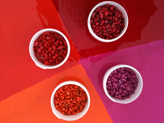
Some of the pigments used to colour the three areas
But they do seem to disagree somewhat over the aesthetics of the project, and how it should be achieved. BIG and Superflex – the former in the name of practicality, the latter in the name of a long-standing passion for bankrupt, out-of-control aesthetics – say they are prepared to see the park go in every possible direction, whereas Topotek1 sees Superkilen as an updated version of the romantic parks of the past, especially those of the 19th century, with their calculated surprises like a Chinese pagoda in Paris, or use of reconstructed Greek ruins in the English countryside. In today’s globalised, travel-savvy society, only new mechanisms and referencing can produce the same effect. Superkilen does some of this, mainly through the use of high-profile advertising signs and hoardings, which are reproduced from Chinese rather than American or Russian originals with a Scandinavian precision that to an extent adapts them to their new geographical and cultural location. These are the transfers and translations that interest Martin Rein-Cano: he hopes that their unexpected combinations will help park users to experience a new kind of complex, hybrid diversity that is all around us but risks being smothered by the widespread desire for flat, uniform scenarios. Hence the need for spaces where people will really look at and appreciate the things that are there. Improbable juxtapositions of advertising signs – talking trees of the 21st century orchestrated with Lebanese cedars and Ginko Bilobas – can create gardens of wonders capable of surprising even today’s disenchanted citizens by offering them one of Superkilen’s many possible stories for consideration.
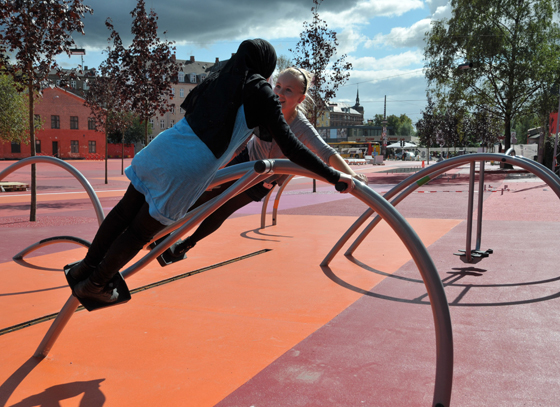
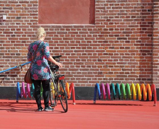
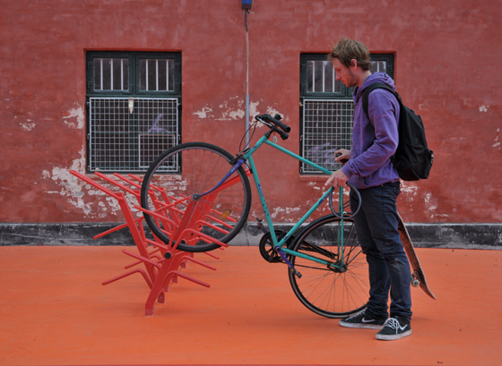
An octopus slide from Japan, rainbow bike-racks from Finland, pavement bollards from Ghana and advertising seats from Brazil are just some of the items already installed in the park

An octopus slide from Japan, rainbow bike-racks from Finland, pavement bollards from Ghana and advertising seats from Brazil are just some of the items already installed in the park
×Superflex insists on the importance of giving voice to the park’s stories. The unusual appearance of many of the items will in itself be a springboard for the imagination, and park users will also be stimulated by words written on the ground or the metal plaques next to each item. For example, a Ukrainian elephant-shaped slide, already a story in itself, will be described using the Danish word Rutsjebane and the Ukrainian Гiрка. An item from South Africa will be named in Danish and then in the country of origin’s eleven official languages. These stratifications of meaning, the number of possible stories, can be perceived already in the gaps between these linguistic signs, though small anecdotes chosen by the architects will help to amplify their meaning. “It might be interesting to know that the Ukrainian word for ‘slide’ is the same as the one they use for ‘a tot of bitter’, or that it took fifteen Japanese to assemble their octopus-shaped slide,” explains Jakob. “But we don’t foresee any kind of ‘compulsory’ explanatory support mechanisms built into the park, just a smartphone application for people interested in knowing more.”
As regards the desirability of intertwining stories, the authors are again totally and completely in agreement over the freedom they have allowed themselves in linking them together and in contrasting potentially discordant symbols and meanings.
“We wouldn’t have set the project up this way if we’d been afraid of producing complicated associations,” says Ingels. “Nothing prevented us from doing something balanced using signs that were as neutral and ‘inoffensive’ as possible. Superkilen is a totally different kind of experiment. We weren’t afraid of creating a tangled forest of symbols. What we wanted was a riotous mass of stimuli.” Ingels sees it as inevitable that such a wide variety of cultures and nationalities will react to each other in some fairly unpredictable ways. “For example, to represent Israel we chose an iron manhole cover. Given the size of the neighbourhood’s Muslim community, something tough enough to withstand potentially violent reactions was needed.” There’ll also be the Dancing Pavilion coming from USA, and sand from Palestinian, a piece of soil. “There’ll be a series of very meaningful, symbolic, emotionally-charged items placed mainly according to function,” adds Ingels. “We are not afraid of giving voice to all this all-too-often hidden diversity which can be found at this Northern crossroads. We trust in its strength, not its dangerousness.”
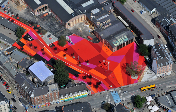
So the Superkilen will start to become crowded with items divided into three areas and colours: red for sports activities, green for the grassy children’s playground, and black for the food market and do-it-yourself picnic area. Against these coloured “backdrops”, which will be kept as neutral as possible by planting matching vegetation(3) as camouflage, a daringly vibrant design is beginning to emerge, still in its own way harmonious. In the best-case scenario, this harmony was implicit in the way things already were and Superkilen is mirror of this, or rather, an intentionally gaudy portrait, an effective way of making the harmony visible and ensuring that people truly experience it.
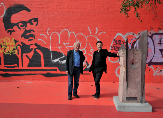
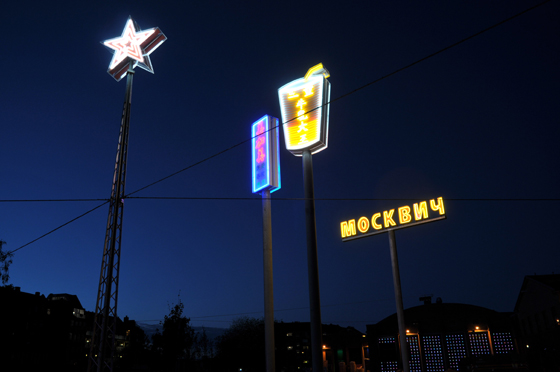
Red square at night. Advertising signs modelled on examples from all over the world act as unusual lamp standards for the park

Red square at night. Advertising signs modelled on examples from all over the world act as unusual lamp standards for the park
×....
(1) The Danish word kilen means wedge
in English The name Superkilen certainly expresses the intention that the park should drive itself like wedge between Nørrebro’s myriad cultural situations and open up
a new kind of space.
(2) Realdania is a Danish foundation created to finance or support architectural projects that seek to make the built environment more attractive and liveable (www.realdania.dk).
(3) The greenery, too, sticks to
the sub-division of the park into different colours. For the red square, for example “Royal Red” trees (acer platanoides)
with reddish foliage were chosen.
....
BIG–Bjarke Ingels Group, founded
in Copenhagen in 2006, is a leading international partnership
of architects, designers, and thinkers. The studio is currently involved
in a large number of projects throughout Europe, North America and Asia. A new office is being opened in New York in these days.
Superflex is an artists collective formed by Jakob Fenger, Rasmus Nielsen and Bjørnstjerne Reuter Christiansen in 1993, and working in Copenhagen and Brazil. They describe their practice
as the provision of ‘tools’ which affect or influence their social or economic context.
Topotek1 is a landscape architecture studio specialized in the design
and construction of unique urban open spaces. Founded by Martin Rein-Cano in 1996, is based in Berlin. The studio’s roster of German and international projects has ranged in scale from the master plan
to the private garden.
....
This article first appeared in Abitare, issue no. 516
Photos by Maria da Schio
