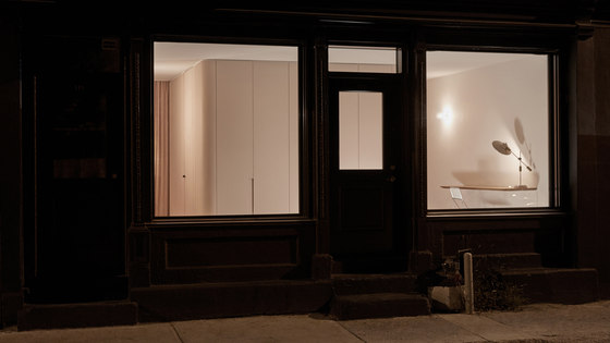
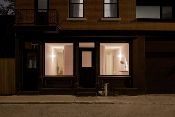
Atelier Barda has converted a building that once housed two apartments above a grocery store into a single-family home, "Résidence Villeneuve". The façade consists of two wood-framed storefront windows on either side of a central door. The plot on which the building stands is located between a southwest-facing side yard (formerly used for unloading and storing merchandise) and a long garage with a shed above.
The clients’ original program involved transforming the side yard into a garden—a rare and sought-after asset in this densely populated neighbourhood. The clients also wanted a complete redesign of the commercial space on the ground floor and the first-floor apartment to create a single-family home on two floors, keeping a rental unit on the top floor. A partial floor above the existing garage was built to create an additional living room and a small private deck overlooking the street.
The orientation of the façade and side wall offered great potential for openings and light, but the proposed transformation would inevitably result in a loss of privacy, given the proximity of neighbours and the street. Based on this observation, the proposed redesign sought to address the following challenge: how does one create a relationship between private and public in a residence with a storefront?
The first idea was to present the clients as the protagonists of the project, revealing fragments of their narrative to passersby while ensuring their privacy at specific times. The direct relationship between the clients and passersby would be highlighted rather than ignored. The entire redesign was guided by two complementary themes: a play between seen and unseen and cinematographic framing. The former storefront windows were conserved, not only to let in light, but also, importantly, to create some ambivalence between what is shown and hidden.
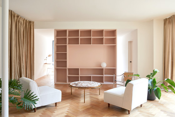
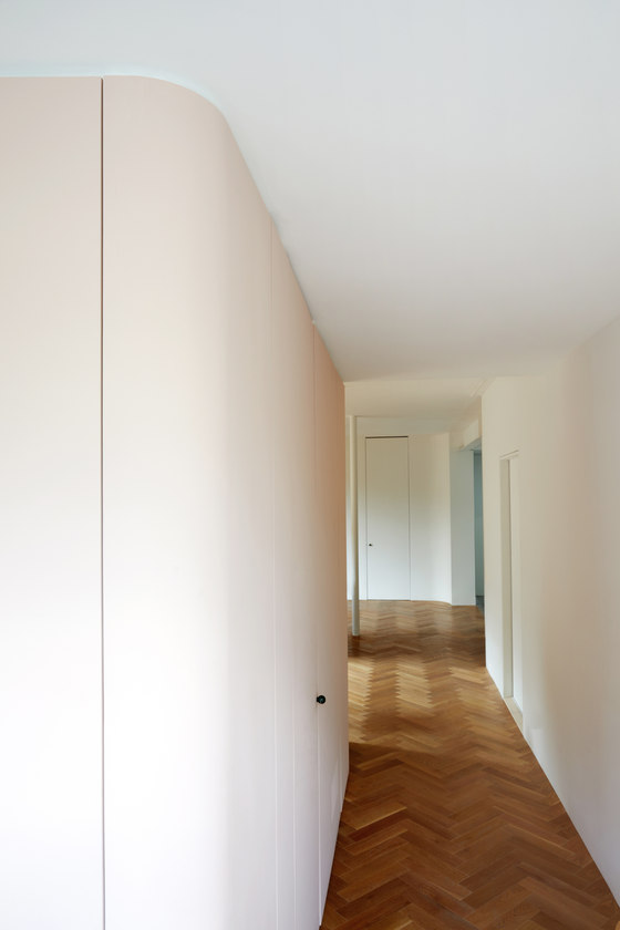
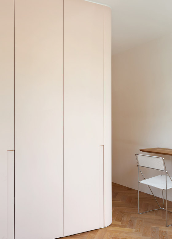
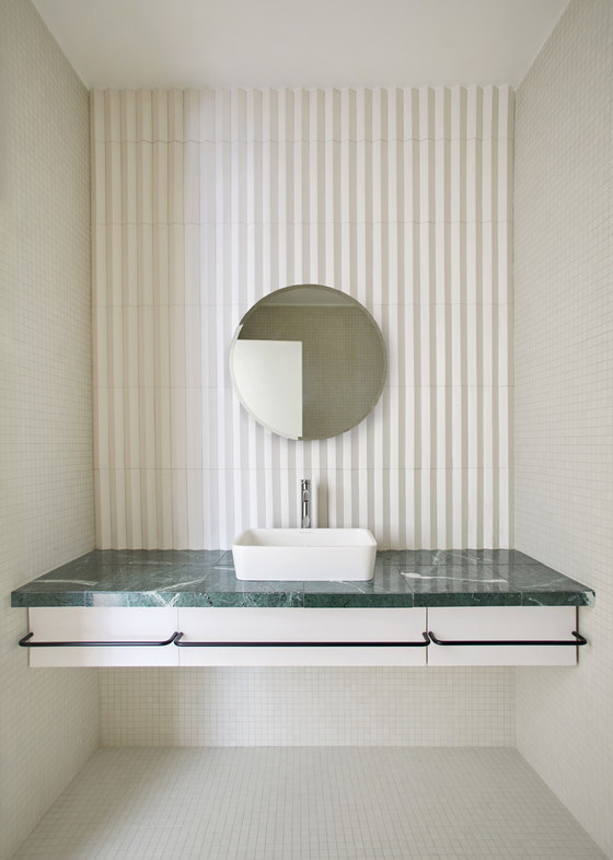
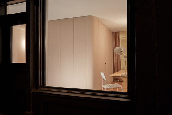
To achieve this effect, a service block was built in front of the window. Housing a closet, powder room and bookcase, it serves as a transitional space towards the private area on the ground floor (lounge, dining room, kitchen). Its role is to create a visual screen from the street without blocking the window. Passersby can therefore only catch glimpses of the family moving from one space to another.
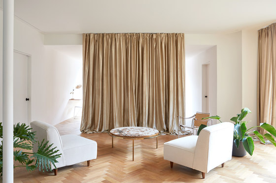
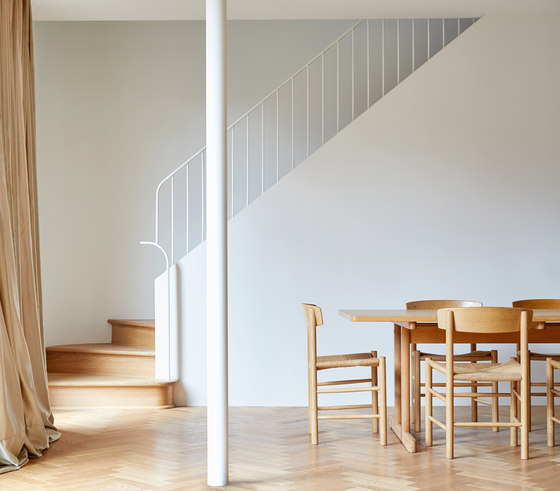
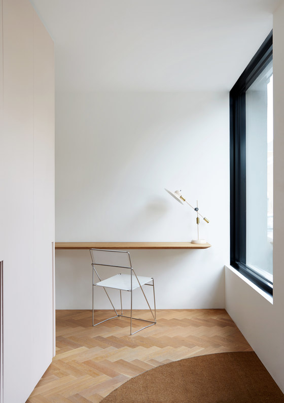
Although the façade is largely permeable, the entire living area on the ground floor is not visible from the street, other than the passageways and interstitial spaces. Curtains give the living area a theatrical look. An office space was also created in the entranceway. When the space is being used in the evening, it accentuates the cinematographic framing of the large front window, evoking the painting Nighthawks, by Edward Hopper.
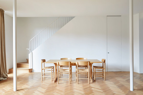
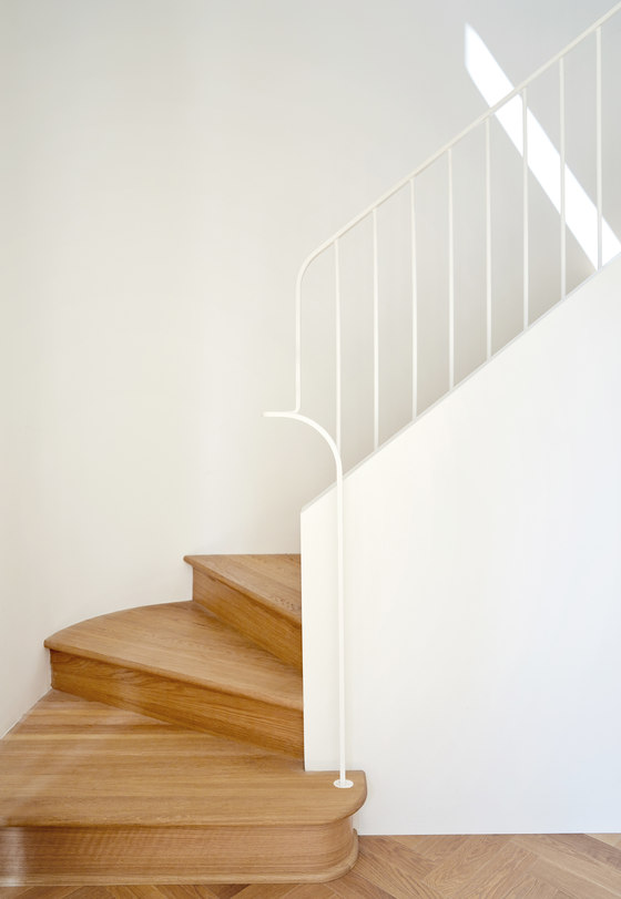
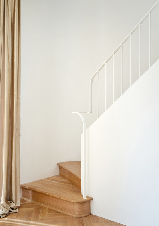
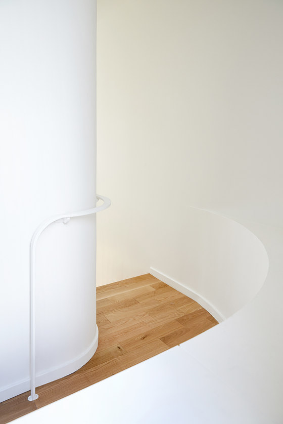
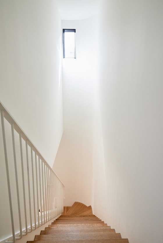
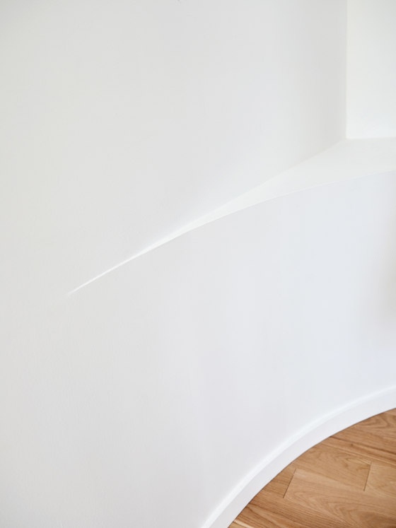
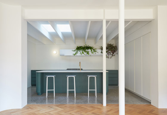
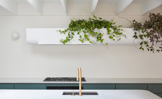
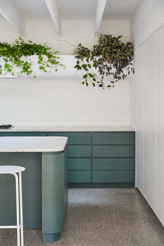
The use of colour also helps stage the space. From the street, the service block may be seen in subtle shades of pink. These contrast with the living area where the green shades of the kitchen complement the terrazzo-style concrete floor. Several architectural details create points of interest in the interior space—from the choice of materials, to the use of curves, to custom-designed elements such as the range hood and banister. By working with the constraints of the existing space, the design successfully reveals the building’s essence.
Atelier Barda
