A Parliament for the German-Speaking Community
After the end of World War I, with the Treaty of Versailles of 1919, the neutral area surrounding the municipality of Kelmis, Belgium, and the German administrative district of Eupen-Malmedy, Belgium, are annexed. As a result, some seventy thousand Germans become Belgian citizens. Since large-scale state reforms are enacted (1968–1971), Belgium officially consists not only of the Flemish and Walloon Regions along with Brussels but also of the German-speaking community with its recognized rights and autonomies. These rights have developed strongly in the last forty years. Since 1984, the community has both its own government as well as its own parliament with legislative powers. In order to create an appropriate spatial framework for this, the decision is made to house the parliament and its administration in a former sanatorium from the late nineteen-tens. Since representative spaces are lacking and the sanatorium would have to undergo substantial renovation, in the fall of 2008, an international architecture competition is organized for the expansion and remodeling of the sanatorium, which is won by Atelier Kempe Thill.
A Landscape Object in front of a Manor House
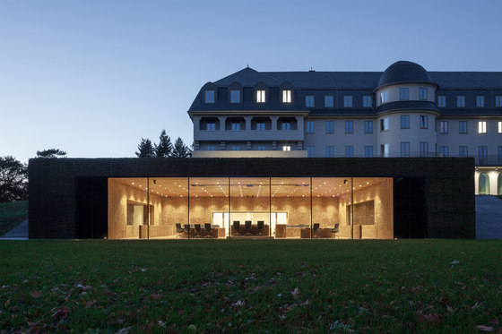
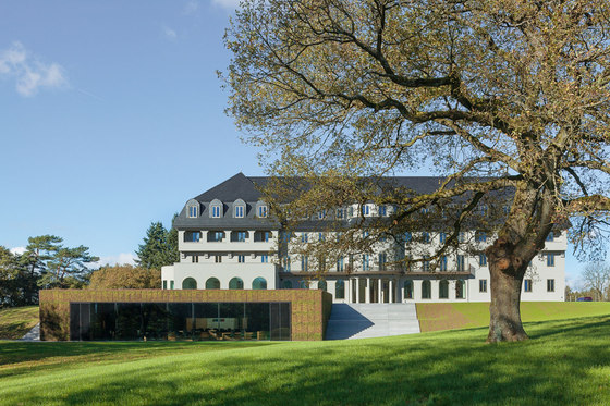
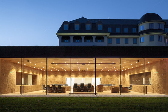
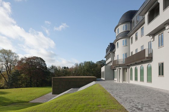
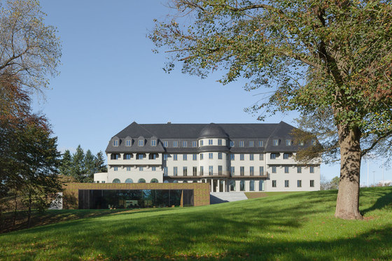
Both the competition design and the variant to be realized have the goal of uniting the old building and the expansion into a coherent composition in which the two buildings are each given their own character while nonetheless forming an architectural unit. The particularly delicate issue here is the position of the already existing sanatorium on the hill like a freestanding manor house. With a very representative appearance that is laid out in a classicist-frontal manner, every form of expansion can quickly be perceived as an insensitive intrusion or as too reserved. Atelier Kempe Thill’s design thus originated with the idea that the new building would be positioned visibly and offensively with respect to the old building as befits a representative parliament building. As a result of the nature of the hill on which the “sanatorium” stands, it was possible to position the new building directly in front of it through a simple reshaping of the terrain. Seen from the outside, the already existing building is not simply combined with a new building but instead enters into coherent synthesis with it. The new building forms an optical plinth for the “sanatorium,” which emphasizes its solitary appearance architecturally and symbolically. The roof and the exterior walls are completely covered with sedum plants. This results in the creation of the impression of a large “flower pillow” in front of the entrance to the entire complex, which generates an inviting atmosphere. This “landscape object” counters the naturally appearing nature of the park with the seemingly staged nature of an overgrown minimalist object. The new building is thus both a part of the landscape as well as a contrast to it.
In the variant to be realized, the new building had to be reduced in size due to budget constraints. In its extension, a broad flight of steps is situated directly across from the main entrance to the old building. As a result, the landscape character of the new building is somewhat decreased and what is created instead is an object. The flight of steps takes up the axial symmetry of the sanatorium to a certain extent and thus links it architecturally with the landscape and the new building. By aligning the plaster of the façade of the sanatorium with the color and texture of the ashlars in the outside space, and also by damping the intensity of the new building’s landscaping colors, a strong compositional coherency is created despite the different conditions.
A “New Old” Sanatorium Building
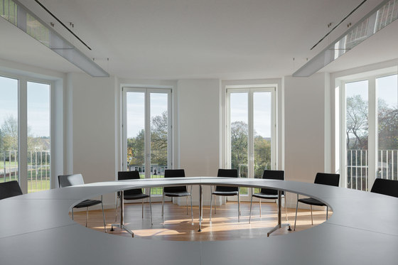
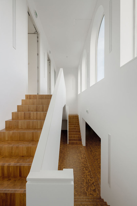
The sanatorium was strongly disfigured, mostly as a result of renovations in the nineteen-sixties and seventies. The renovation proposed therefore initially has the goal of substantially restoring the integrity of the sanatorium, and the original appearance of the building at the time it was created served as the basis for this. All existing details in the interior, such as the terrazzo floors in the halls and staircases, are repaired and supplemented in matching colors. The existing doors to the rooms in the connecting corridors are authentically rebuilt. In the case of the windows, it is necessary, in contrast to their original design with shutters and many divisions, to find an equivalent for the technical conditions of today. Compared to the earlier windows, the new ones are only divided in two vertically so as to achieve an elegant appearance despite the thicker, modern double-glazing as well as the thicker window frames. Adaptations also have to be found for the detailing of the roof as a whole, since as a result of the necessary thermal insulation, the position of the dormer windows is slightly shifted and their proportions change. Slate is used for the roofing in order to reflect the original roofing.
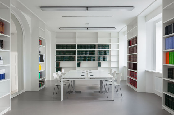
Beyond considerations of the materials used and the individual details, a larger conceptual problem is encountered: one of the requirements is very high energy efficiency in order to achieve low-energy standards, which, according to the most modern requirements, far exceed the original construction of the building and are supposed to be carefully integrated into the overall concept. To this end, very high-quality thermal insulation and, most especially, the integration of a ventilation system and new heating system based on pellets are of crucial importance. Moreover, a system is integrated for cooling the building by means of an adiabatic process based on the evaporation of water. This results in roughly five hundred drill holes needing to be made in the walls and ceilings, which thus severely impacts the quite fragile ceiling construction dating back to the building’s original structure. For this reason, some of the ceilings have to be replaced. So many channels are required for the ventilation system that the corridor is nearly incapable of accommodating them. Furthermore, suspended ceilings, which severely impinge on the proportions of the space, likewise become necessary.
These basic conditions as a whole are conceivably severe, particularly since the costs of the renovation turn out in the end to be nearly equivalent to the costs of a new building and thus shed doubt on the remodeling situation. Under these conditions, Atelier Kempe Thill attempts the balancing act of not disfiguring the building as a result of the remodeling while nevertheless protecting the integrity of the building or finding suitable architectural equivalents within the current requirements.
Scenic Interiors
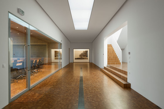
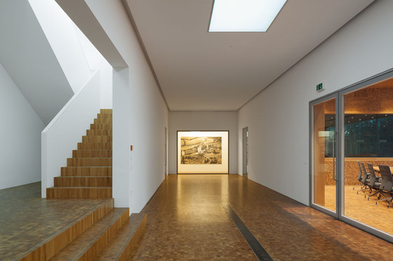
In the interior, architectural attention focuses on the question of the extent at which the different spatial conditions in the old building and the new building can be adapted to each other or designed in a manner that they overflow fluidly into one another. The hall and the new foyer, which due to their partially subterranean position below the sanatorium might quickly arouse associations with a cellar, require special attention. In this case, it is not sufficient to create a bright spatial ambiance by means of windows and skylights. At least just as crucial for the perception of the new building is the spatial scenario of all reception and foyer areas of both the old and the new structures. Along with the large new staircase, the foyer in front of the is given the function of mediating between the old and the new. The foyer is defined by a rigorously symmetrical spatial composition, which links the axial symmetry of the plenary hall and of the staircase with each other by means of large openings in the wall. The walls of the foyer are plastered white, while the floor here and in the hall is laid in end-grain wood, through which a spatial continuity is created. The foyer space thus provides a suitable and flexible framework for representative receptions, exhibitions, and the like. Its symmetry also forms a counterpart to the somewhat axial symmetry of the existing sanatorium. The composition from the outside is therefore coordinated with the interior spatial composition as far as possible. The new subterranean spaces should preferably be staged in such a way that they are ultimately perceived as the brightest.
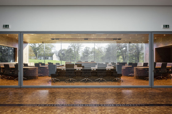
The large wall openings from the foyer to the hall are glazed and form a large picture window that allows a view from the foyer through the hall and into the park. This window is combined with a large, vitrine-like window at the front end of the space in which art will be shown, illuminated by a skylight. This lends the space a bright and airy character, which is emphasized even more by a generous, central skylight and the multifaceted visual relationships that are created.
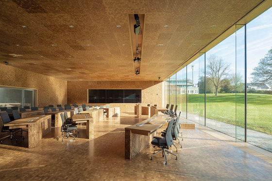
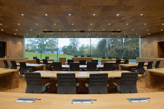
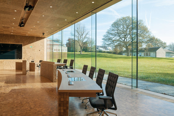
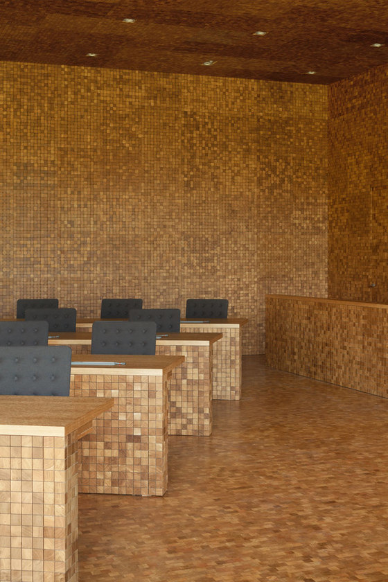
As a result of the positioning of the new building, the plenary hall is first provided with ideal conditions for an interior space. It is given a calm spatial character with an excellent view of the generous park in front of the building, so that the landscape becomes a fixed component of the interior. The parliament selected wood as a basic material for the hall. This is meant to form a link to the traditional wood culture of the region, with its cabinetry and carpentry, which arose from the forests of the Ardennes. Atelier Kempe Thill takes this desire for the use of wood literally and proposes a consistently wooden hall with a monolithic, calm, and modern spatial impression. The acoustic requirements are crucial here: since the hall is laid out for speech, it requires strongly absorbing room acoustics. Because veneered acoustic panels are not suited to the architectural requirements of an integrated concept, specially developed wall panels on the basis of end-grain wood parquet were proposed. End-grained wood parquet is normally used for flooring but can, however, also be used for various other purposes as a result of its being put together from small blocks of solid wood. And since it is also used for the floor here, what is created along with the wall panels is a simultaneously uniform and slightly varied appearance of walls, ceiling, and floor along with the permanently installed tables. With the blocks having been installed with three-millimeter-wide joints, it is possible to architecturally incorporate all the technical requirements—such as sound absorption, integration of ventilation, joints around doors, et cetera—without visible grates, air vents, and the like, thus fostering a consistent spatial ambience.
Parlament der Deutschsprachigen Gemeinschaft
Architects:
Atelier Kempe Thill architects and planners with
Artau scrl d’architectures
Competition:
Team Atelier Kempe Thill:
André Kempe, Oliver Thill with
Pauline Marcombe
Blanca Sanchez Babe
Philipp Stalbohm
Rafael Saraiva
Saskia Hermanek
Team Artau:
Luc Dutilleux
Fabienne Courtejoie
Planning|Realisation:
Team Atelier Kempe Thill:
André Kempe, Oliver Thill, Saskia Hermanek with:
Ruud Smeelen
Daniela Bergmann
Laura Paschke
Tobias Windhus
Helen Webster
David van Eck
Andrius Raguotis
Martin Hättasch
Wojciech Jakub Narloch
Giorgio Terraneo
Roel van der Zeeuw
Team Artau:
Alice Scheen
Gaëtan Lejoly
Katrin Ossemann
François Laurent
Roland Coulon
Project management: Drees & Sommer Luxembourg SARL, Mrs. Miriam Bah
Structural Engineer: Ney & Partners
Service Engineer Installations: Bureau Boydens
Building Physics: Graner und Partner Ingenieure GmbH, Bergisch Gladbach (D)
Structural Engineer: Kempen Krause Ingenieurgesellschaft, Aachen (D)
Service Engineer Installations: ZWP Ingenieur AG, Köln (D)
Quantity Surveyor: Atelier Kempe Thill / Artau
Tender documents: Atelier Kempe Thill / Artau
