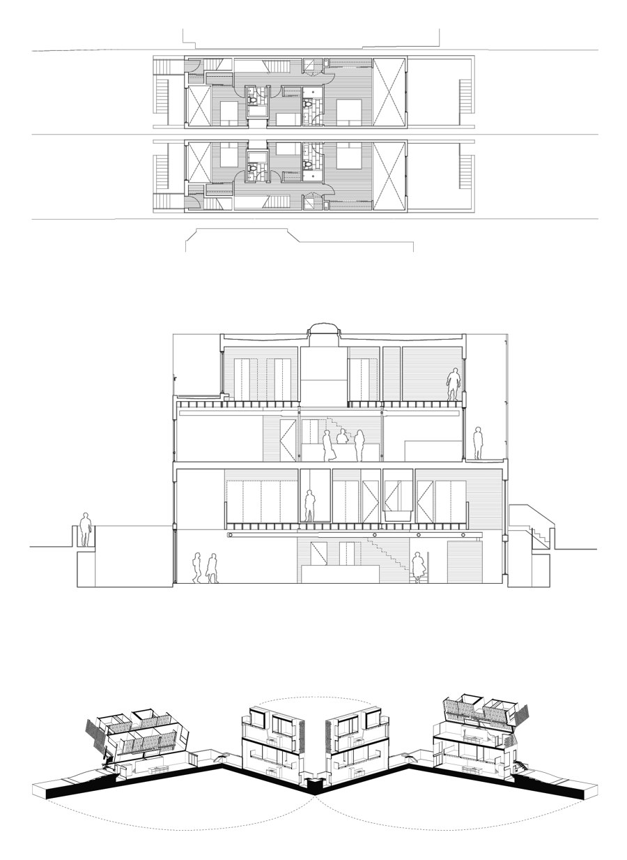
The Double Duplex was created in response to the cities growing need for alternative housing models due to the rising cost of urban real estate and the need for urban densification within Toronto's established residential neighbourhoods. A proliferation of high and mid-rise condo's have densified the urban core and serve as the predominant model for entry level home ownership within the city. However, very few new low rise infill models of densification or affordable living within Toronto's sought after historic residential neighbourhoods have been developed.
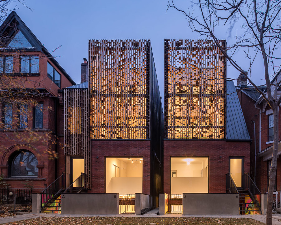
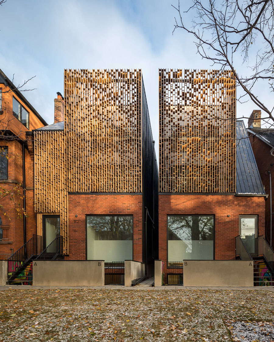
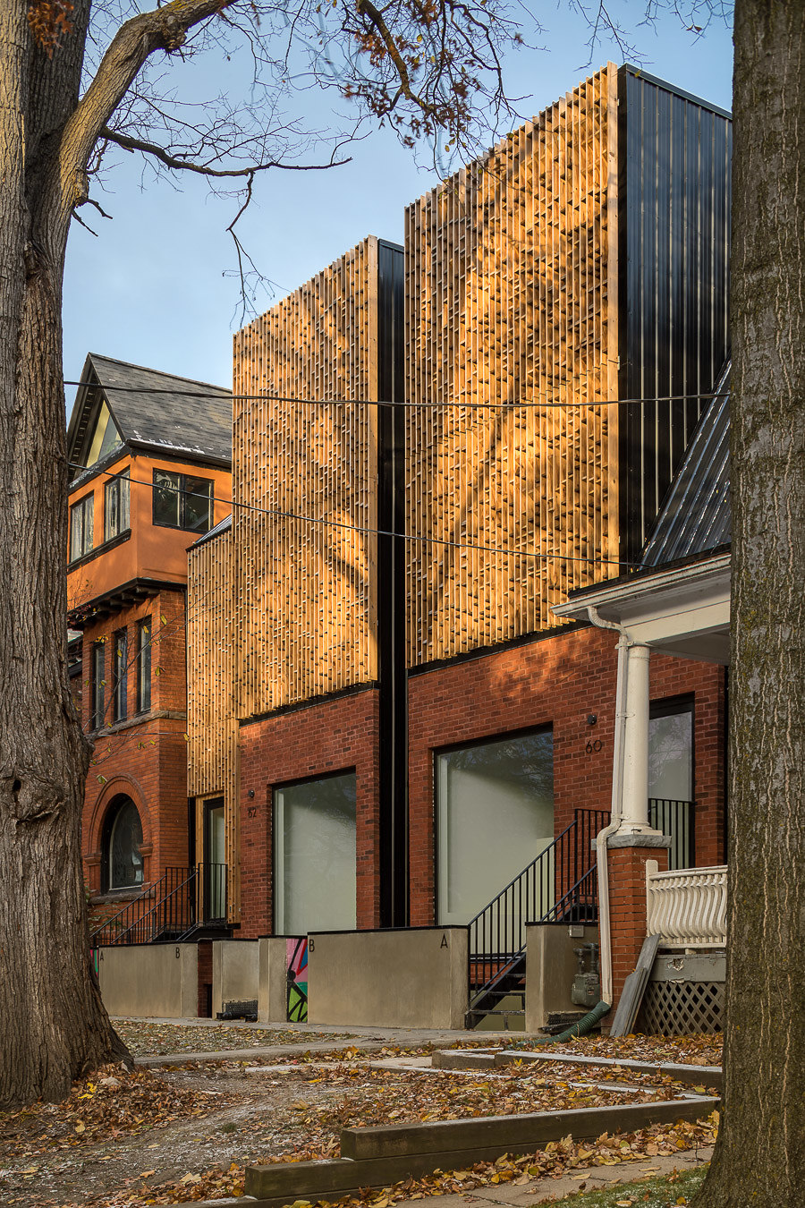
The Double Duplex infill project is located on Melbourne Avenue in Parkdale, one of Toronto's most notable historic neighbourhoods for their century old Victorian and Bay and Gable mansions. The existing double wide site was severed into two separate properties with a four storey 3,500 square foot detached duplex residence being constructed on each site, allowing property owners to either rent out one of the units to subsidize their own income or to use it as a live work space. Many of the 19th Century mansions, often later converted to rooming houses still exist and are being converted back into single family homes.
The unique Parkdale neighbourhood now finds itself home to a large burgeoning artist community. Double Duplex pays tribute to the existing context and the beauty of its craft and local artistry by making contextual relationships through massing and geometry along with texture and detail of paramount concern. Instead of trying to replicate the 19th century means and methods of craft we ask how can we contemporize and reinterpret the existing condition?
The Double Duplex massing emerges as a contemporary response to its context, using an abstraction of the pervasive Bay and Gable typology the project becomes a reinterpretation of key architectural elements. These elements include the large bay massing that usually covered over half of the front elevation, the steep roofs and sharp vertical lines, the front balcony, high ceilings with large windows which allowed light to reach the depths of the narrow floor plates, and elaborately decorated ornamentation in the form of motifs, mouldings and Brick Expressionism to create rich and textural facades.
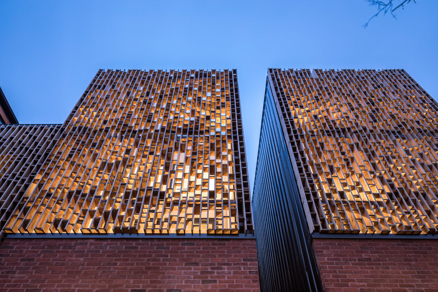
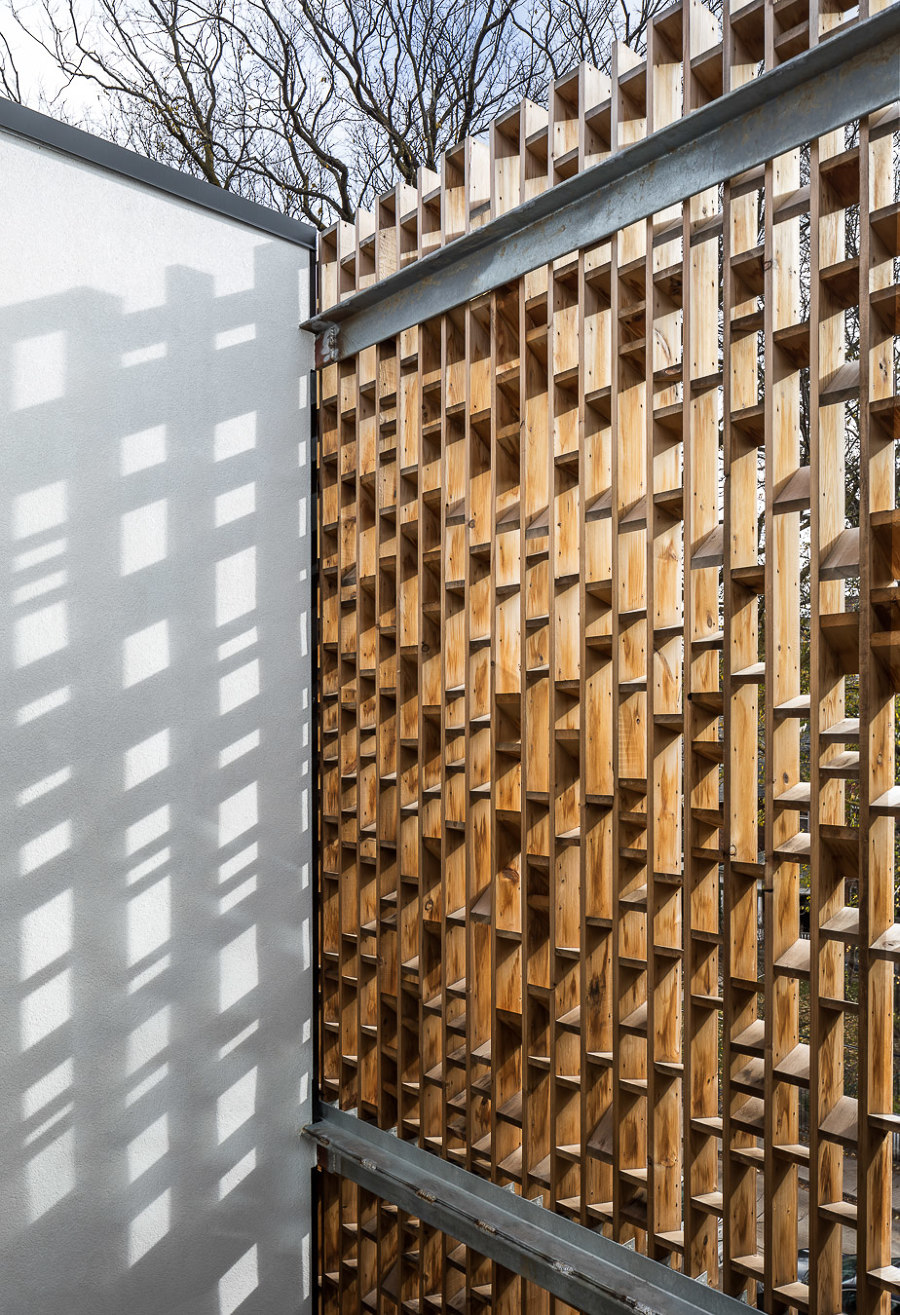
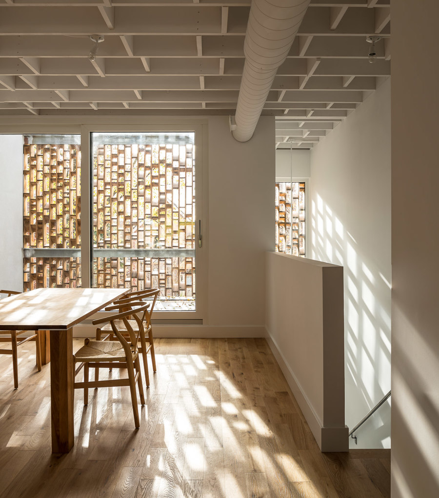
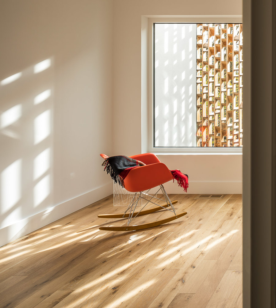
The Double Duplex geometry registers datum's of adjacent neighbours window and door opening heights, roof slopes and eave heights, and material transitions on either side producing specific formal relationships. By leveraging digital fabrication techniques and use of new material technologies for perceptual, spatial and formal effect we translate the notion of 19th century craft by way of a two story brise soleil. The brise soleil encloses the front and rear balconies, allowing for controlled lighting conditions and privacy. Constructed of a bio-enhanced, rot resistant and sustainable softwood the individual pieces are organized to create a large scale dynamic facade. During the day the light is filtered and illuminates the interior spaces with ephemeral dappled light effects. And at night the screen reads as a decorative glowing lantern.
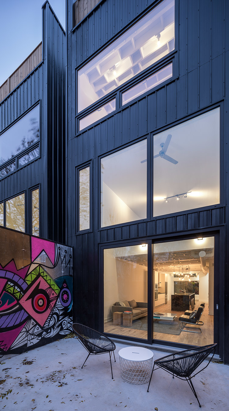
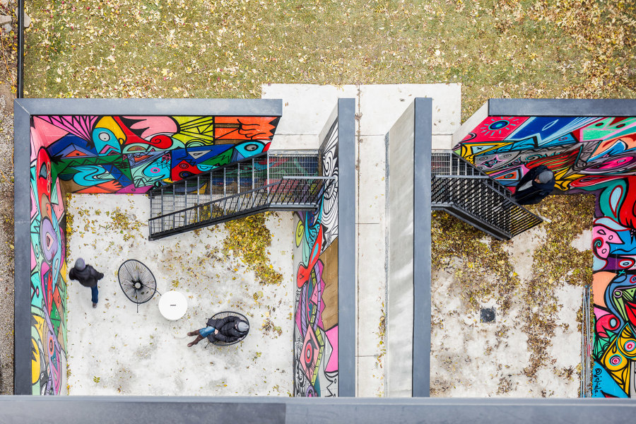
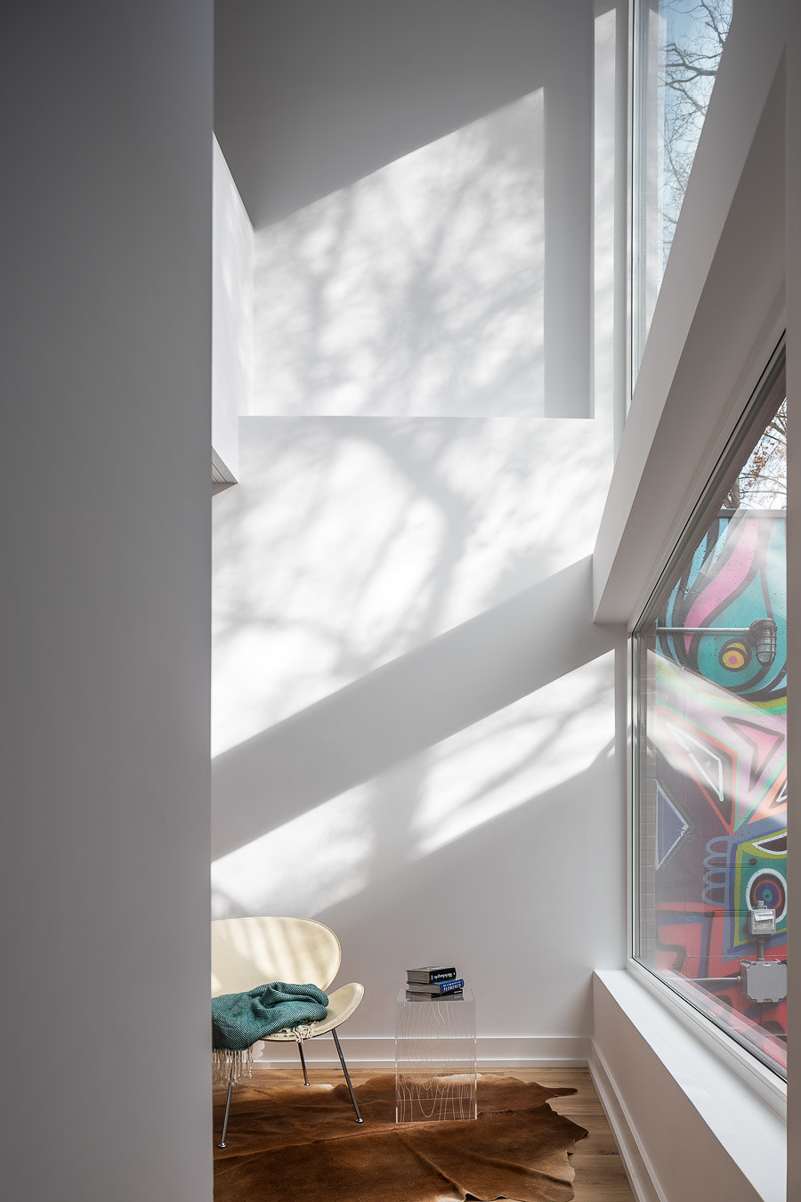
The project also represents strategies for dynamic and spatial integration of exterior and interior spaces within a typical narrow and deep Toronto infill lot. Each duplex residence consists of a two storey lower unit and a two story upper unit. The lower unit is carved out in the front and back with double height volumes that flow out to sunken courtyards maximizing the amount of natural daylight entering the unit and transgressing the basement apartment stereotype. The lower unit's courtyards are wrapped in brightly painted murals by local artists. The upper unit is organized around a double height atrium space which brings natural light and ventilation into the center of the unit. Two exterior courtyards punctuate either end of the floor plate behind the wooden brise soleil, to the front a double height balcony overlooks the street and to the rear provides for a master bedroom terrace.
Creating an activated urban environment on the busy residential street was of key importance. A modern static building facade could not contend with the ornate historical context. The response was to engage the movement of the public passing by through the tools of material and spatial depth, referencing a large art installation. The two story brise soleil is angled such that as viewers pass by multiple images appear, catching the light differently at different times of the day. The screen proposes a variation of figures that evokes loose, variable associations while still remaining in the realm of affect, giving viewers a free-association.
The patterns across the surface and varied interrelationships of depth, angle and shadow from one member to the next reinforce the abstractions they define in one moment and cloud it the next. Somewhat akin to the idea of cloud animals that we have all as children lost ourselves to in daydreaming. For artists and poets of the Romantic period, clouds provided a metaphor for mobility and transcendence. Clouds are as much a source of perception and transient states of mind as they are a meteorological phenomena. They mysteriously combine visibility and volume without space. For cloud painters like John Constable, clouds serve to abolish the representational realm altogether; they round out pictorial space instead of flattening it; they point to the organization of the pictorial as a dialectic of surface and depth.
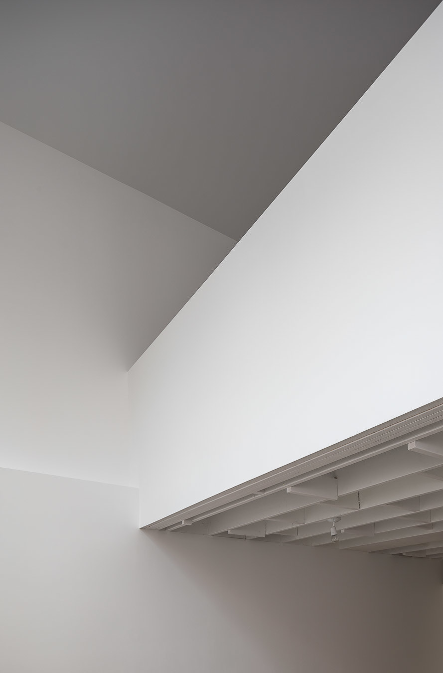
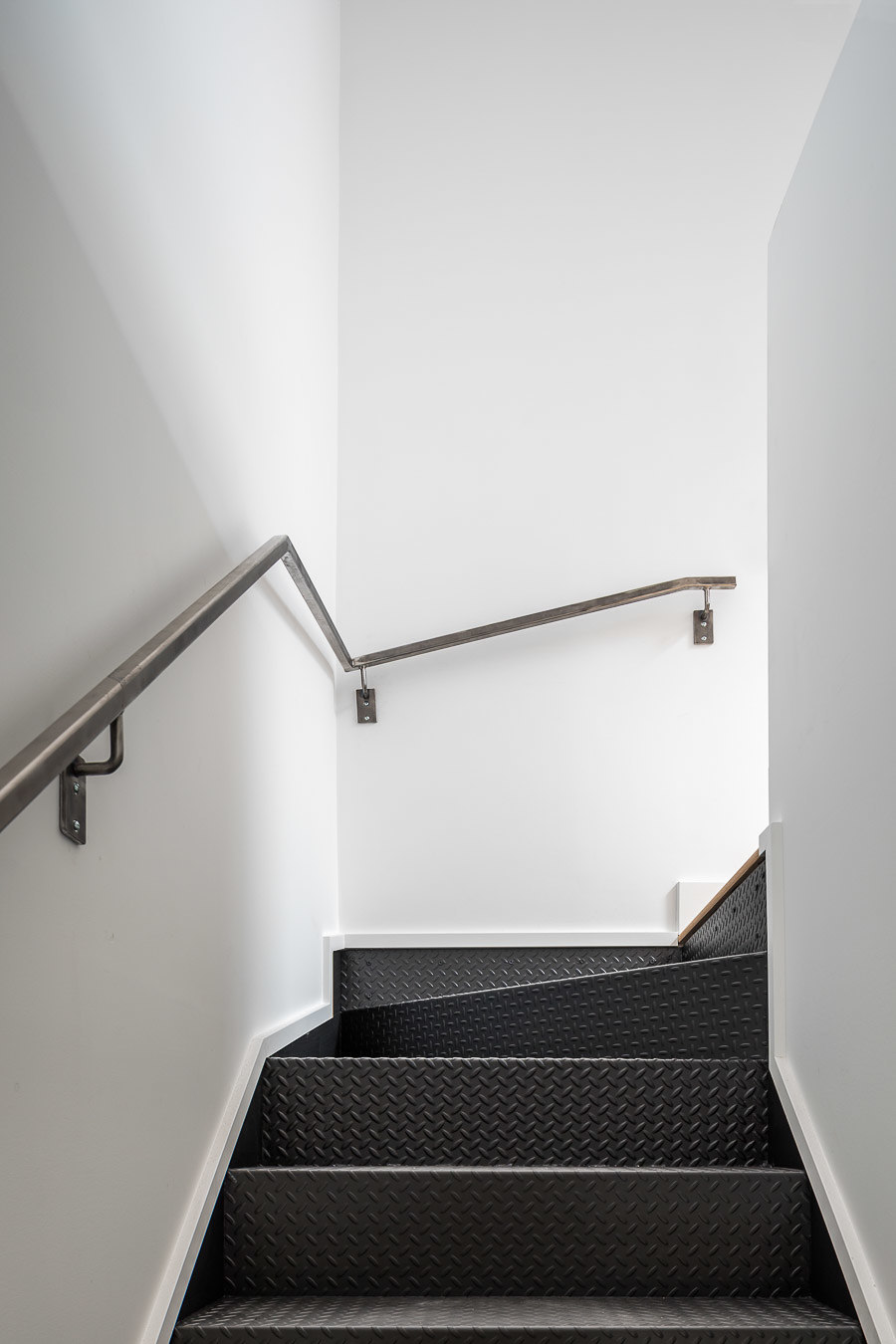
In addition to the spatial and sustainable goals, the interiors of the four Double Duplex units were defined by 2 large moves. The first being a translation of the textural facade to the interior public spaces via the exposed ceiling joists and increased number of blocking members. And second was to reduce the material palette to three monolithic materials within a neutral white backdrop; wood, stainless steel, and black honed granite . The white backdrop reflects light from the large double height light wells and exterior courtyards. The MEP systems are left exposed and painted white to add another layer to the textural ceiling.
Design Team:
Batay-Csorba Architects
