House C
Kermt–Hasselt, 2014
Projet de
CEADESIGNMots-clés
Références des fabricantes
In this project, the natural light pervades the rooms and penetrates the gaps in furniture, creating a spatial effect of general harmonisation and unification.
Simplicity, functionality and pure lines are the key principles of this project, reinventing the logics of contemporary architecture through the use of light and the organisation of space. The approach to the exterior design signed Klaarchitectuur, interprets the local architectural tradition through the combination of minimalism with rustic elements, such as thatched roof. The interiors, curated by GF concepts, are essential and innovative, characterised by nearly invisible cupboards, contrasting floors and furniture that disappears into the sunlight, to make the house even bigger. The elegant, clean lines of the CEA taps, exclusively made of stainless steel, stand out in the total white of the kitchen space.
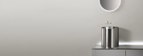
In the bathroom, a white floating cabinet runs through the walk-in shower’s glass panel, gliding on the dark wooden floor. The rigorour and essential lines of CEA collections in stainless steel, blend harmoniously with the room decor, with an extraordinarily elegant result.
Architecture: Klaarchitectuur + GF Concepts
Galerie de projets


