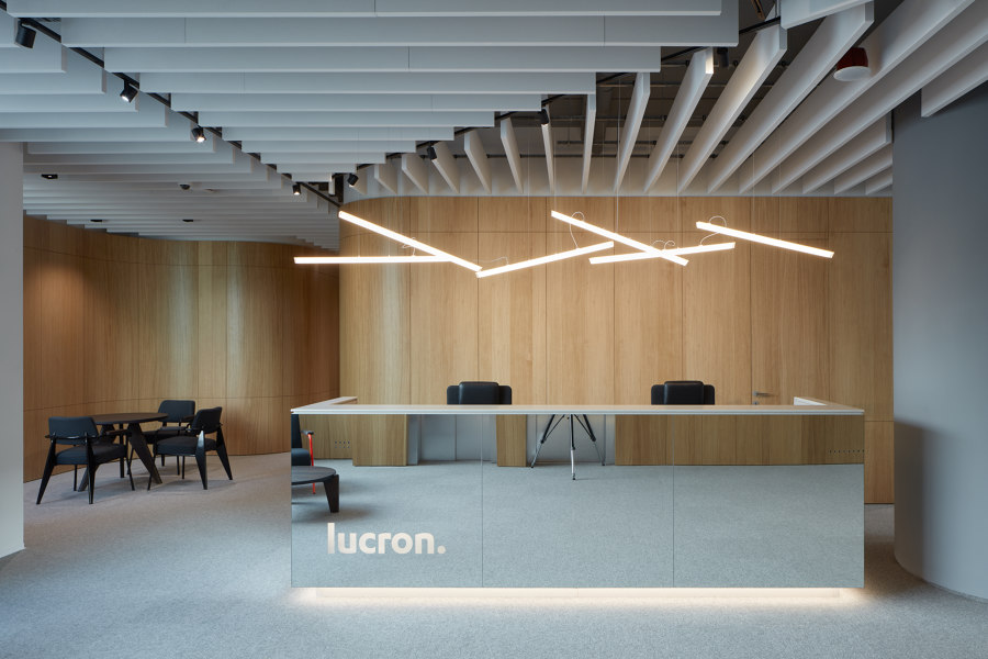
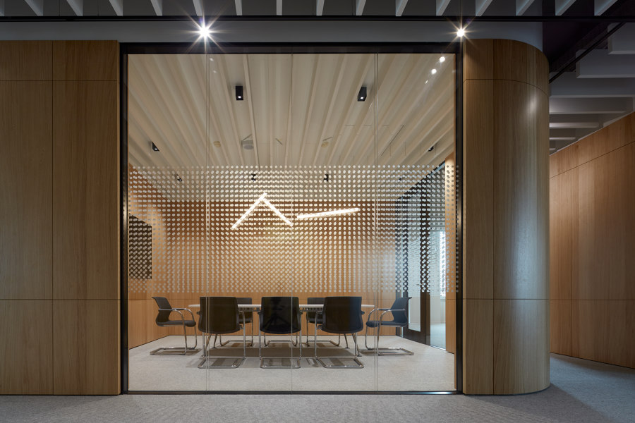
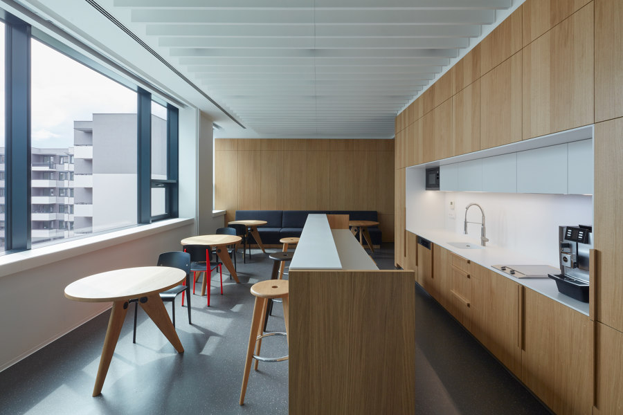
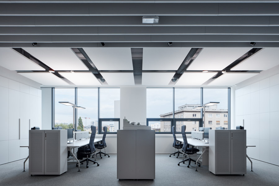
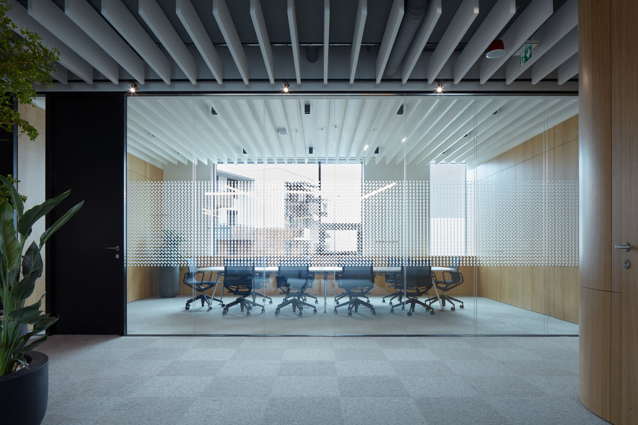
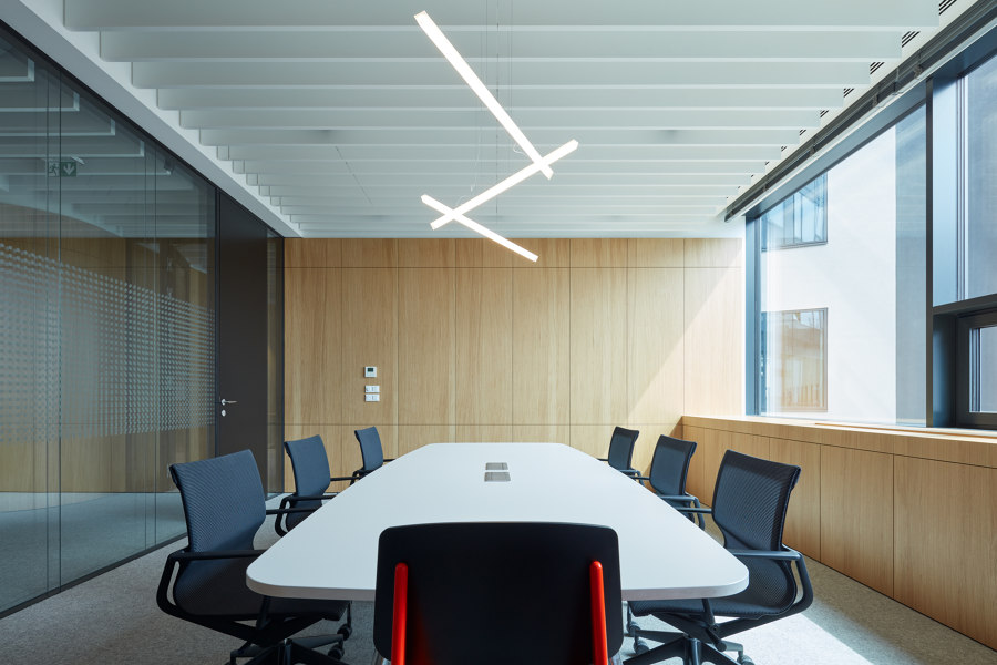
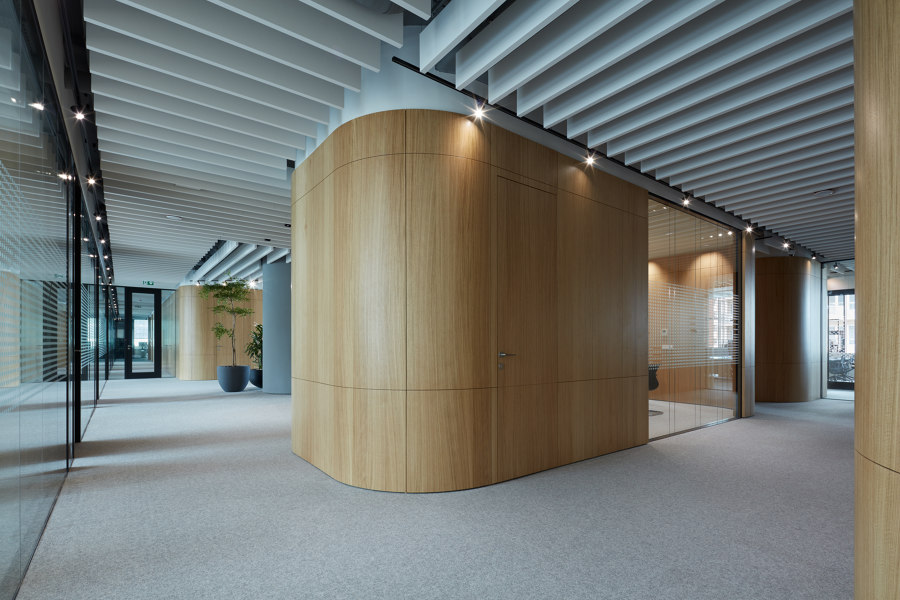
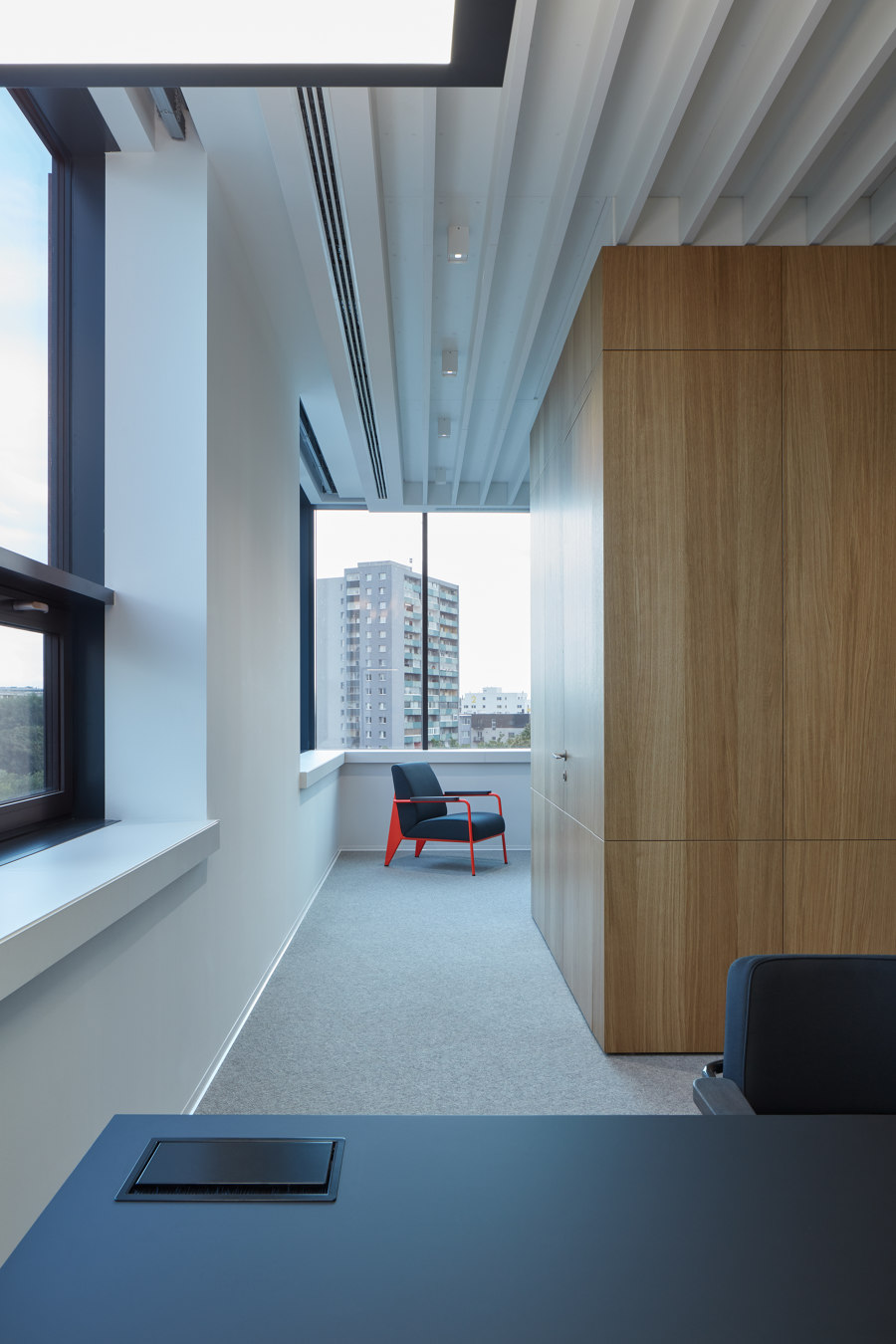
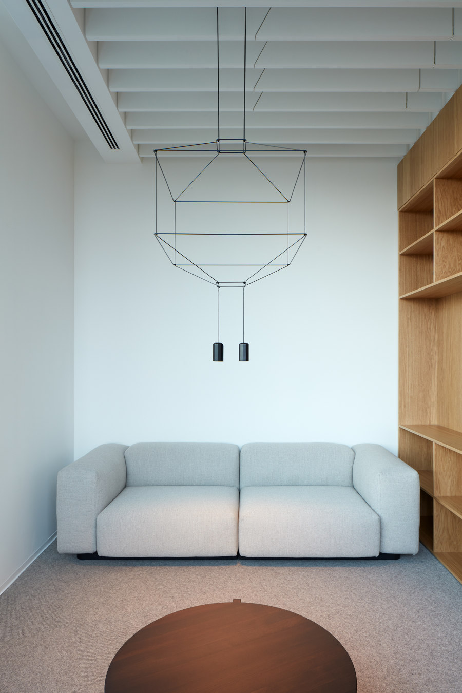
The new premises of LUCRON Development represent a focus on quality and professional responsibility. It was important for LUCRON that the interior design would create a space with a character that could be identified with and would leave a lasting impression.
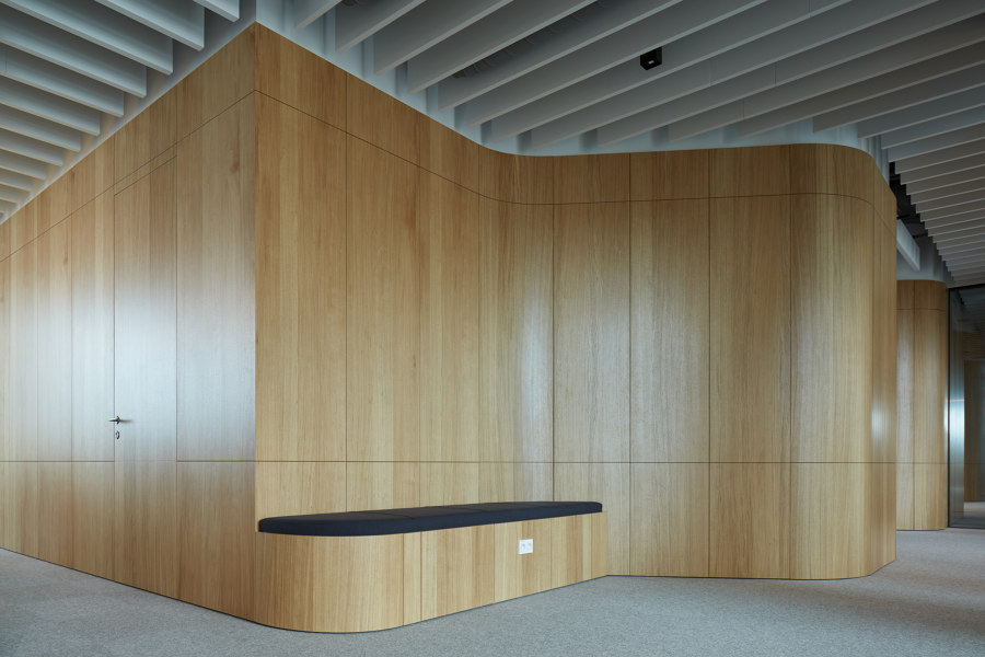
Architects focused not only on the selection of materials but also on modern and innovative technical details that are not immediately visible. They created a blend of materials that naturally complement each other with their simplicity and organic colours creating a backdrop for daily life.
In the new office premises the entrance guides first impression by one's own reflection. It is noticeable that everything has its place and there is space for everything.
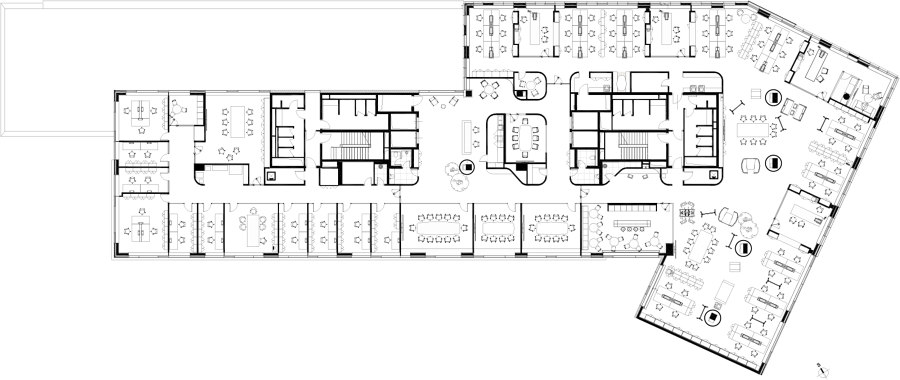
The new LUCRON office layout is divided into two parts. The northern part consists of offices formed in a traditional way with an exception of an inner core that includes all service areas.
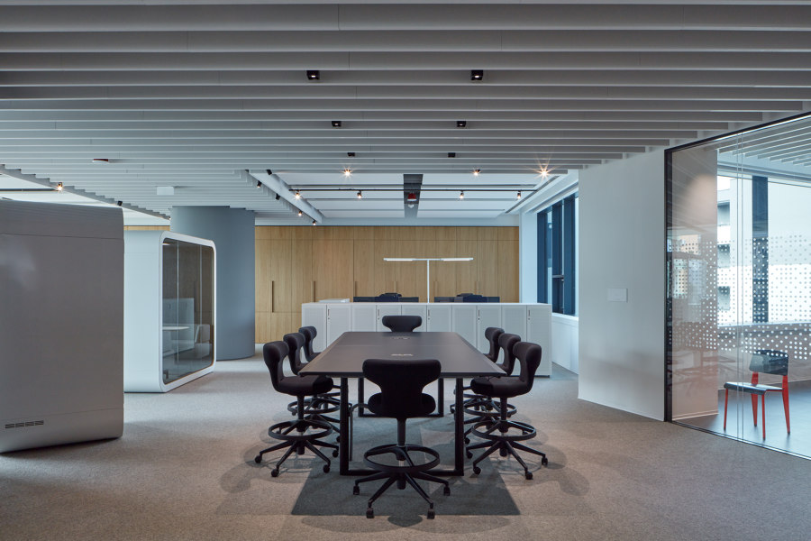
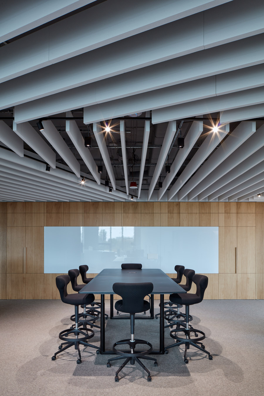
In contrast the southern part purposefully applies the flexible office theory. Dominant are large desks suitable for hosting consultations and meetings.
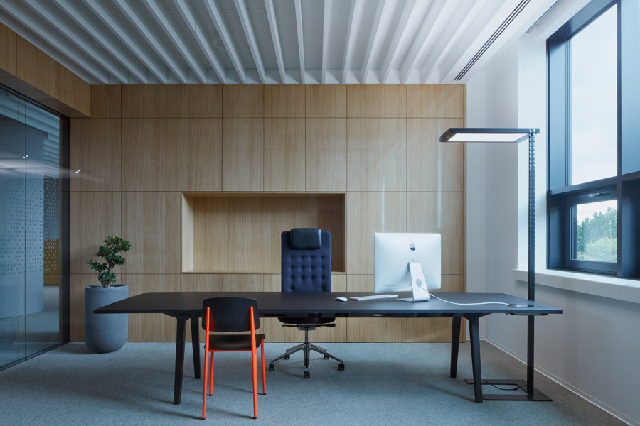
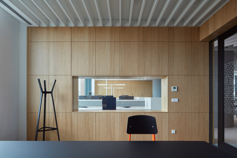
Another prevailing feature of the layout are offices for managers called 'Cottages' creating fixed islands within the office where each ‘Cottages’ represents a different department of the organisation.
High quality acoustics and autonomous lighting systems complement pleasant working environment. The interior as a whole is a symbol of a new trend and the company extent that LUCRON represents.
Design Team:
Čechvala Architects
Collaboraters: Tomáš Čechvala and Ivana Jeleníková
Client: LUCRON a.s.
