Photographe : Ewout Huibers

Photographe : Ewout Huibers

Photographe : Ewout Huibers
Concept
The starting point of developing a new Bijenkorf restaurant is that the restaurant has to be part of ‘de Bijenkorf’ and its philosophy. The restaurant as part of the department store,‘the restaurant as a kitchen’ of de Bijenkorf. The idea for the Bijenkorf restaurant is an open kitchen consisting of different cuisines from all over the world. The best ingredients from various countries make each dish into something very special.
Because we design a restaurant in a department store, the main focus lies on the ‘goods’ - the cooking material and food. We show the guest what ingredients the various dishes are composed of and what the dishes are based on.
From this thought, we came up with the idea to develop a cupboard in which all products can literally be presented.
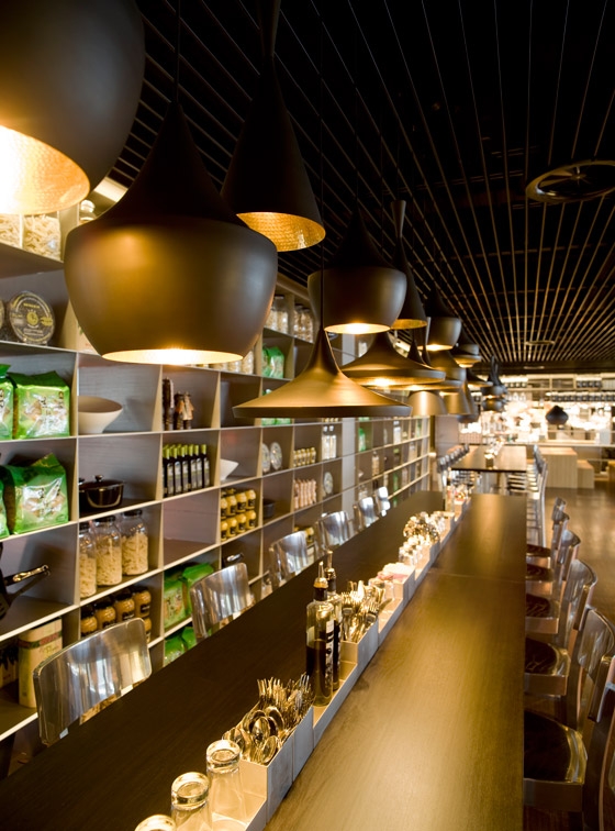
The cupboard is an architectural element that provides different zones within the restaurant and the various seating areas. It also provides storage space for the daily ingredients in the kitchen or functions as the back of a bar. Our choice to build a light steel construction means that the products can be shown to full advantage.
The kitchen has been placed in the middle of the space, because food plays the main role, because the kitchen is the heart of the restaurant and because the restaurant can be reached from two sides. With this central position two zones automatically appear: two seating areas ‘morphing’ into the kitchen.
Restaurant - Seating areas
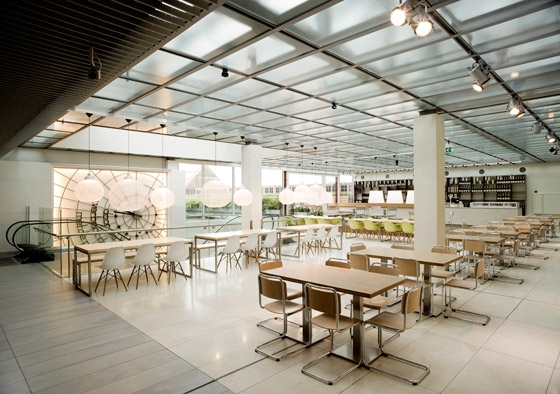
The structure of the existing building was both the starting point and inspiration for the design of those two areas. The seating area on the Amsterdam Exchange side (‘Beurszijde’) is very light because of the large amount of daylight coming through from the glass roof and big front. This front is orientated on the new roof garden and one can look over the Amsterdam Exchange (‘Beurs van Berlage’) from here. The seating area on the Dam square side, accessible from the fourth floor escalator, has a more modest and intimate atmosphere.
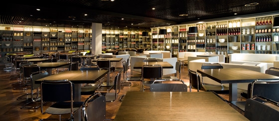
To emphasize these specifications, the idea arose to divide the seating areas into a light and an intimate restaurant. This theme mainly returns in the material usage but also in the choice of furniture and lighting. Our challenge was to create two different identities within one single restaurant.
Following this idea, the same materials were used in both areas but were given a different finishing touch. The floors and table-tops have been made out of bamboo, with colour variations depending on how the material has been treated. Caramelised bamboo has been applied in both areas, combined with natural bamboo in the light area and with baked bamboo in the intimate area.
Both areas have been supplied with a metal slats ceiling; on the light side the slats are white, on the intimate side they are black. The connecting hallway between the two seating areas has a ceiling with silver slats. The material concept has been kept quite simple and natural intentionally, but its different combinations make it very rich and diverse.
The seats have been arranged like a mosaic with different zones. Here, the cupboards divide the high and low seating areas or serve as the seating area’s back wall. There is a very broad range of seats from which everyone can choose its favourite spot: enjoy reading a newspaper at one of the long high tables or sunbathing on the long sofa by the façade, enjoy an elaborate dinner on one of Eames’ luxurious ‘la Fonda chairs’ or relaxing in the ‘Lekker strak’ couches in the lounge areas.
Kitchen
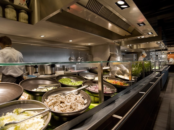
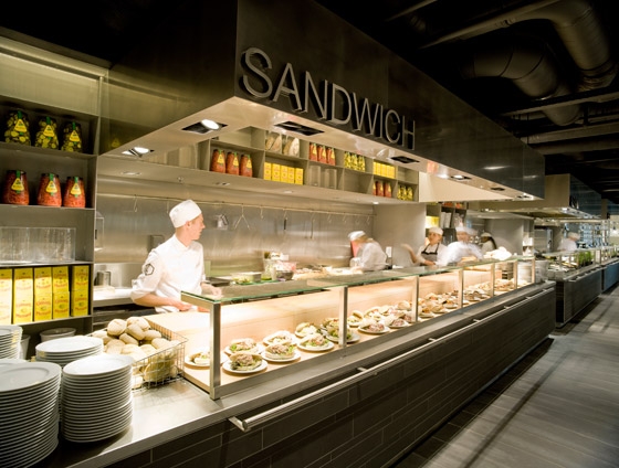
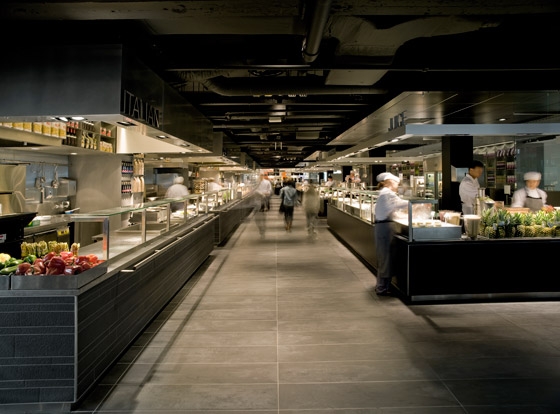
The kitchen area has been divided into hot cuisines and refreshment bars. There is a row of five hot buffets on one side and three ‘islands’ for cold dishes and fresh juices on the opposite side.
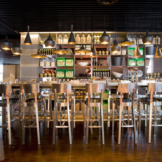
Behind the hot buffets there is a thirty metres steel cupboard wall, subdivided into the cuisines of the world. This open cupboard serves as a storage and presentation space for the ingredients used in the different cuisines. This way the specific products represent the characteristic ingredients of the related cuisines. In the Asian cuisine one can find big rice bags from Indonesia, next to fresh herbs from Vietnam and dried mushrooms from Malaysia. Behind the pizza and pasta buffet, olive oil cans are stored next to big pots of sun dried tomatoes and olives from Tuscany.
The material usage of the buffets has been adjusted to the dishes being served. The five hot buffets, from which all dishes are prepared in sight of the guests, have been provided with a stainless steel top. Because the counters are dressed with rough small anthracite tile strips (Terra Maestricht from Mosa) they look like stone blocks. All hot buffets have been supplied with a stainless steel hood in which cooker hoods and all other technique are integrated out of sight from the guests.
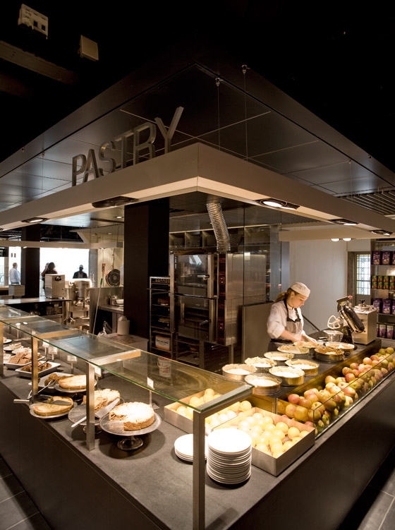
The three detached islands have a dark wooden front (baked bamboo from Moso) and a black natural stone top (nero assoluto). On those three ‘cold islands’ mainly fresh vegetable and fruit dishes, but also baking goods and desserts are prepared. The natural stone top is a presentational surface as well as a cutting surface. The fresh products are presented in glass trays on the counters, so that the guest can see the dishes as well as the fresh ingredients.
The coffee bar and check-out points have been placed at the kitchen’s entrance and exit. The back consists of a nine metre open steel cupboard. It has been supplied with one big window at eye level for maximum transparency and an open view between restaurant and kitchen. Here the material usage is a combination of the hot cuisines and refreshment bars, the front has been made of dark grey tiles and the worktop has been made of baked bamboo.
Roof garden
The roof garden is part of the light seating area. To fully integrate the roof garden with the new restaurant, a connection from the inside to the outside has been created. The floor gradually goes up to the roof garden which is situated half a metre higher.
Inside four extra steps of baked bamboo planks have been created as stages for a separate seating area. Over the entire length of the inside stages there is a bar. Here one can enjoy a glass of champagne with oysters, a lovely cappuccino with cake, a cold draught beer or a glass of red wine available from a wide selection.
Concrete Architectural Associates
project team: Rob Wagemans
Melanie Knüwer
Charlotte van Mill
Erik van Dillen
producers:
general: Bouwbedrijf Kühne BV
Varis International BV
interior: Benschop BV
Smederij van Rijn
furniture:Vitra
Satelliet Meubelen BV
lighting: Lichtontwerp

Photographe : Ewout Huibers

Photographe : Ewout Huibers

Photographe : Ewout Huibers

Photographe : Ewout Huibers

Photographe : Ewout Huibers

Photographe : Ewout Huibers
