Nanto, a small Italian town nestled among Berici Hills, is where Grassi Pietre has been based since 1850. The region has been famous for its unique quality stone, highly valued by the famous architect Palladio.
Today, the legacy of Grassi Pietre’s family owned quarries not only is synonymous with Vicenza stone but it also encompasses numerous collaborations with renowned architects. This legacy was what inspired the well-known design studio Debiasi Sandri when asked by Grassi Pietre to design a new showroom.
The Concept
‘It is more than a showroom, it is also a project space’ say Daniel Debiasi and Federico Sandri. ‘We wanted to convert an old warehouse with a long history into a space made to inspire people who are truly interested in working with stone’.
Daniel Debiasi and Federico Sandri, who founded their own design studio in 2010, have been working together with Grassi Pietre on a variety of projects since 2016. The new showroom is the latest successful outcome of this long-lasting collaboration. The concept aims to express the company’s identity through an immersive space, where architects and clients can follow different paths in order to discover materials and techniques.
The Space
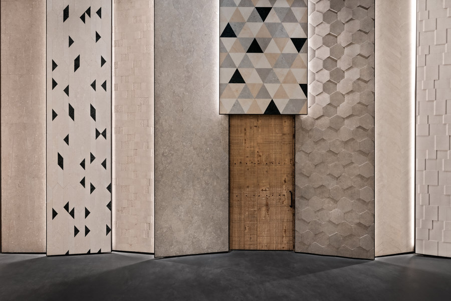
The entrance, a sliding custom designed door made out of reclaimed wooden planks with beautiful irregular linear grid-like patterns, serves as a meaningful connection between the newly built showroom and the company’s long-established experience. The patterns originate from an old stone cutting machine that to this day operates night and day in one of the warehouses.
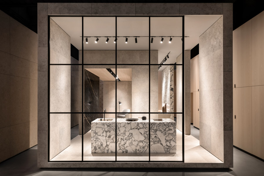
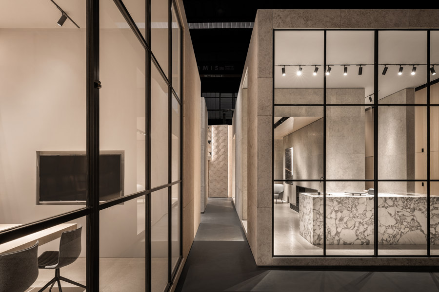
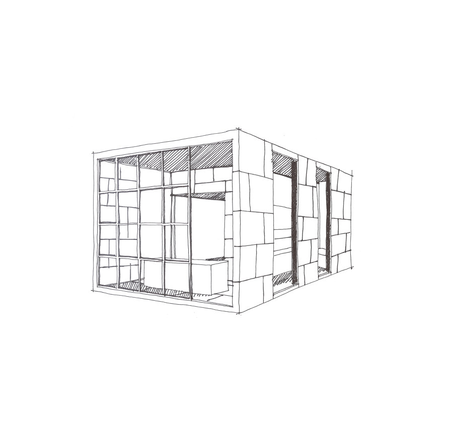
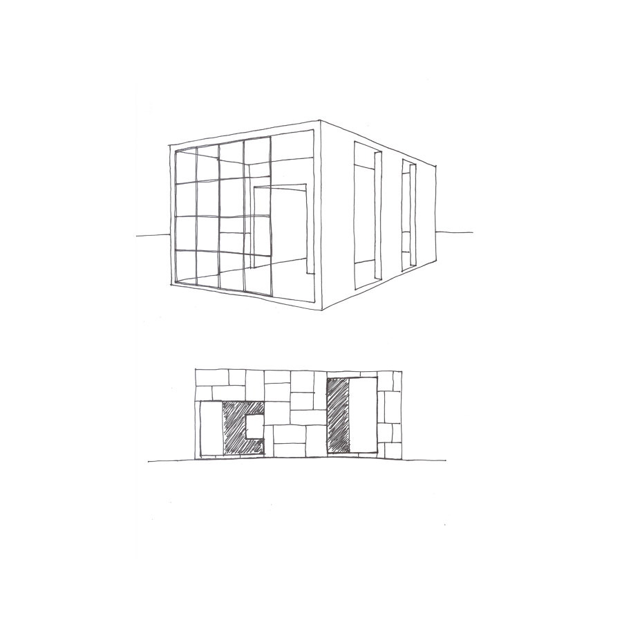
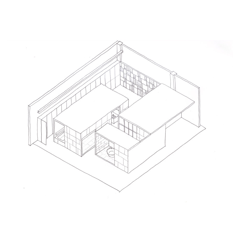
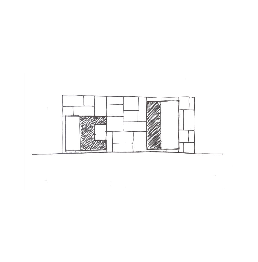
Continuing inside, Debiasi and Sandri designed three imposing geometrical volumes, all cladded with different types of stone and slightly elevated from the ground, that give form to the 300 square metre space.
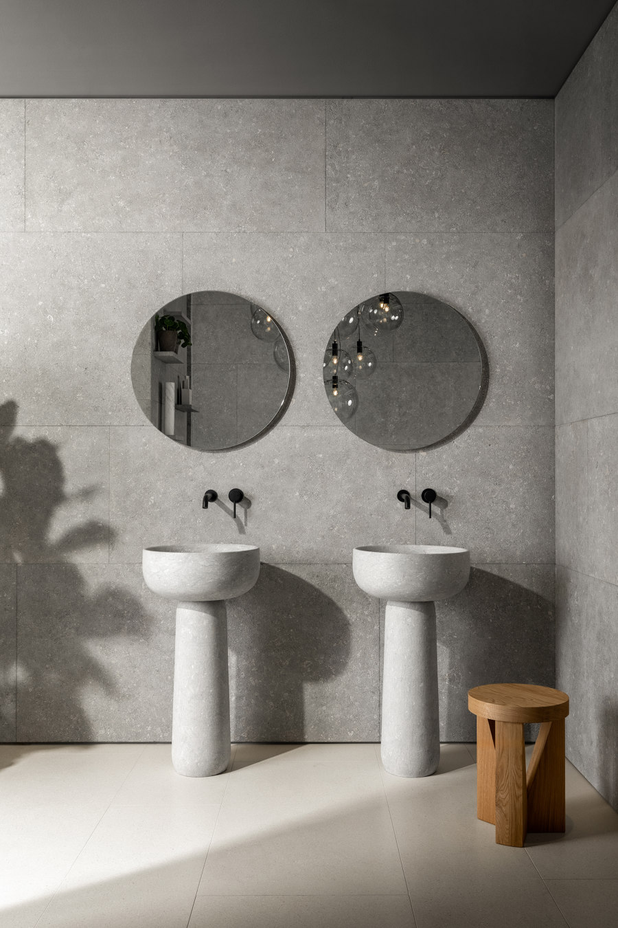
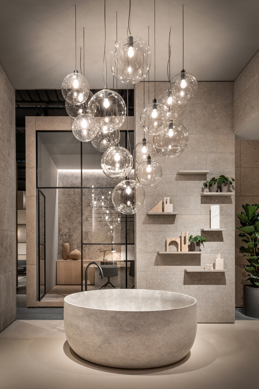
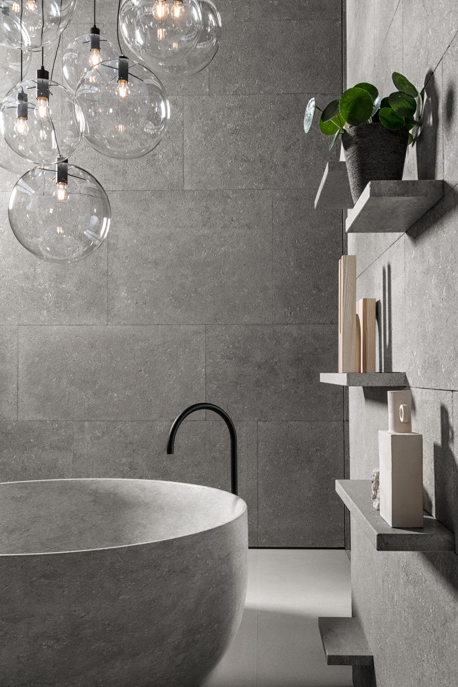
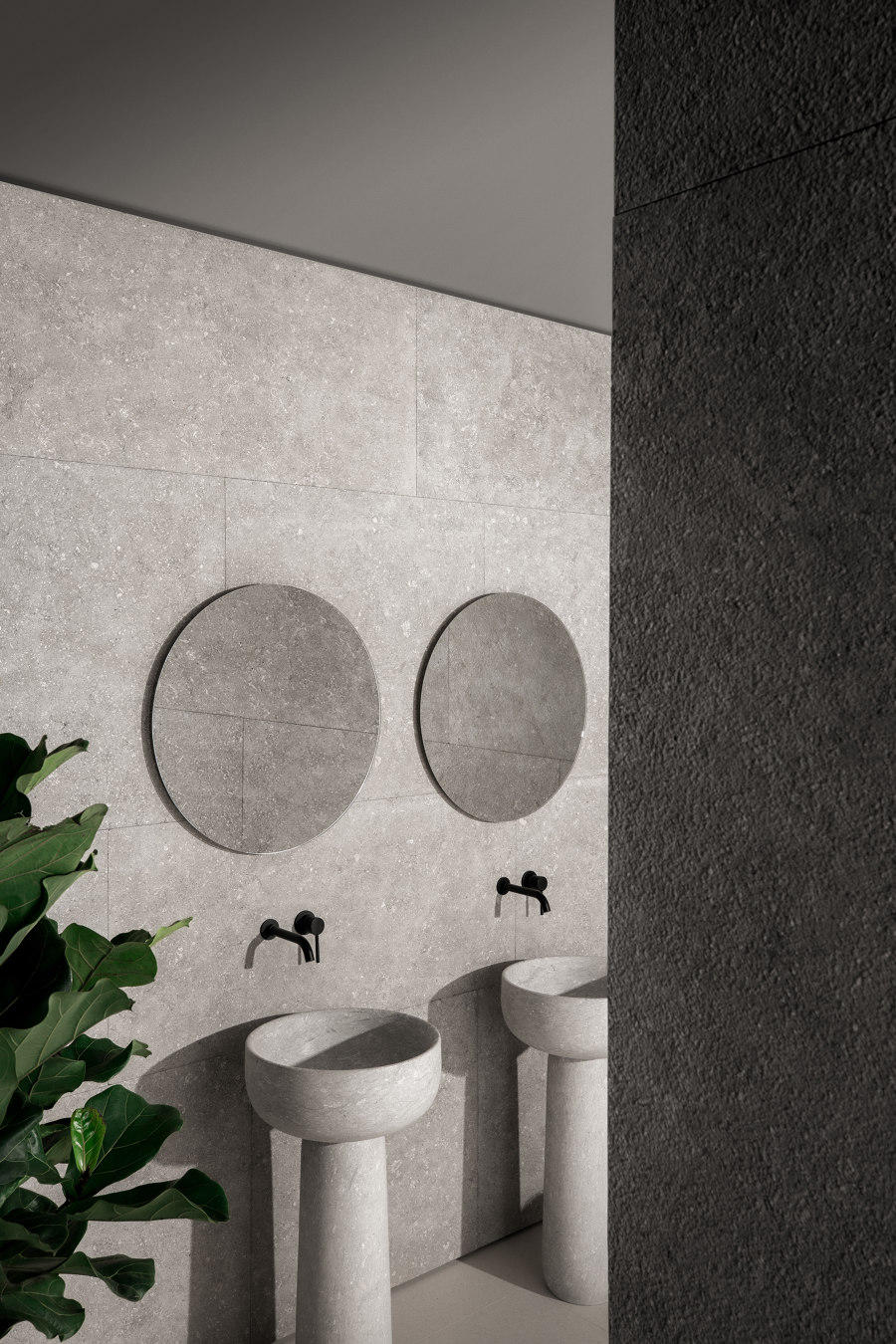
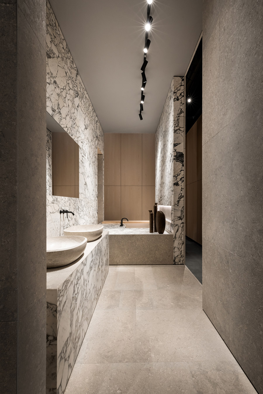
Grigio Argento stone was used throughout the first volume. Different heights are integrated in the architecture of the ceiling while the circular tub "Tetide" made out of a single block of Grigio Alpi stone together with a couple of eponymous freestanding washbasins take the centre stage. Just behind the impressive bathtub, the wall was designed using a series of short shelves coming out of the interstices.
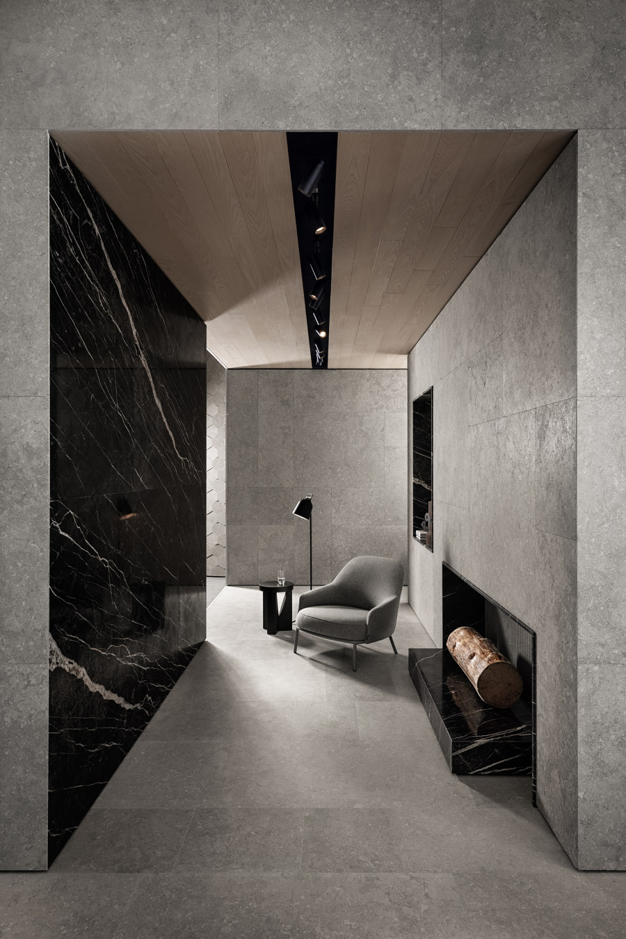
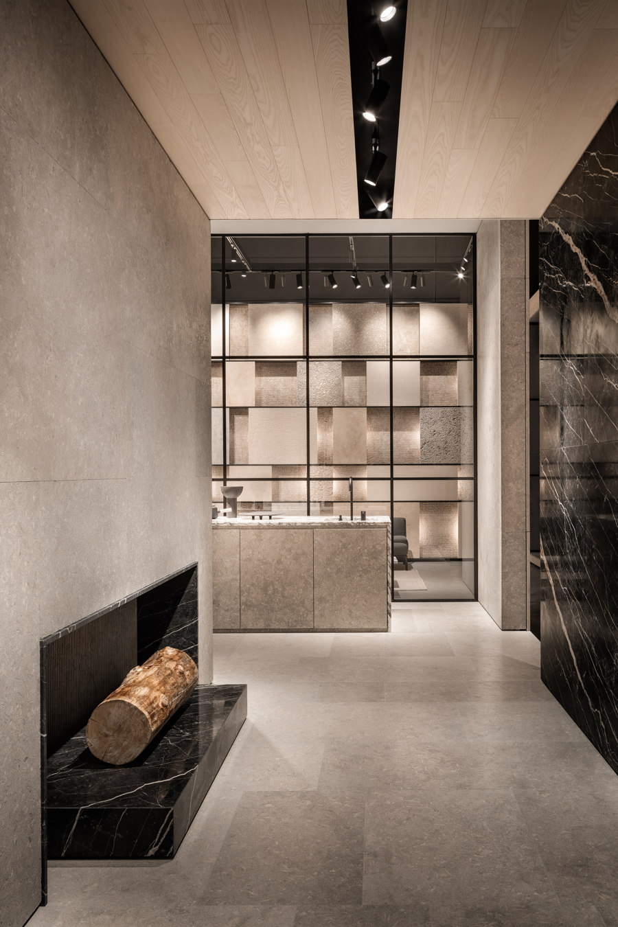
The second and largest volume combines three different spaces that showcase a mixture of contrasting materials, from stone and marble to wood, glass and metal. These contrasts highlight the diverse uses of each material, generating at the same time a strong sense of balance across the different elements.
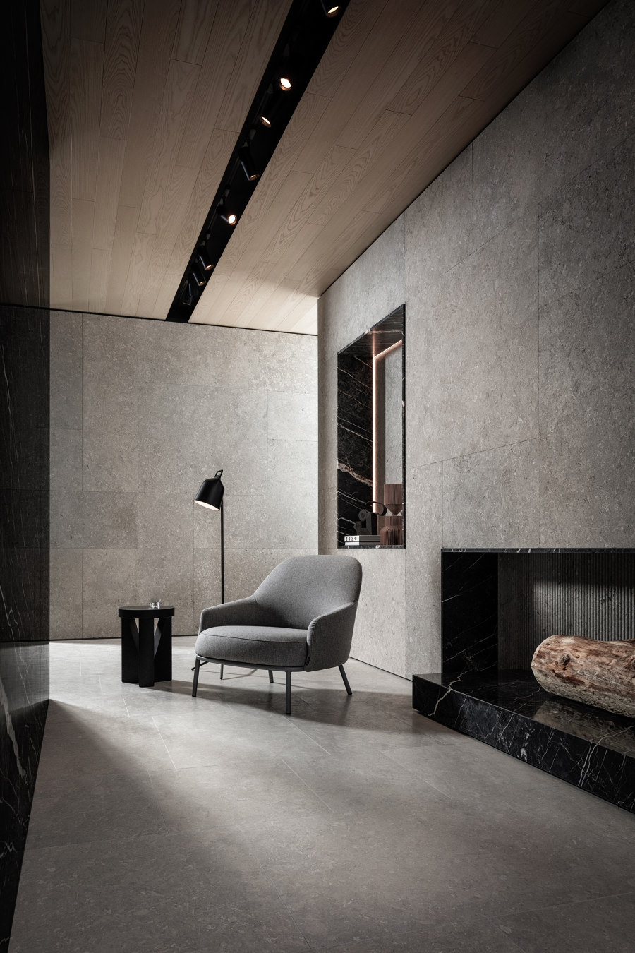
A simple yet astonishing fireplace is placed in the heart of the living room, a space built from 'Port Laurent' marble and ‘Grigio Alpi’ stone while white stained ash was used to craft the wooden ceiling.
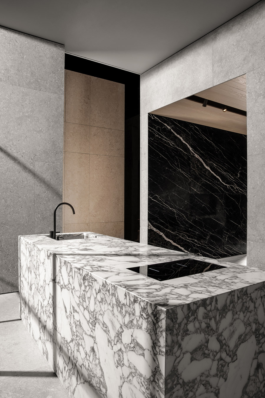
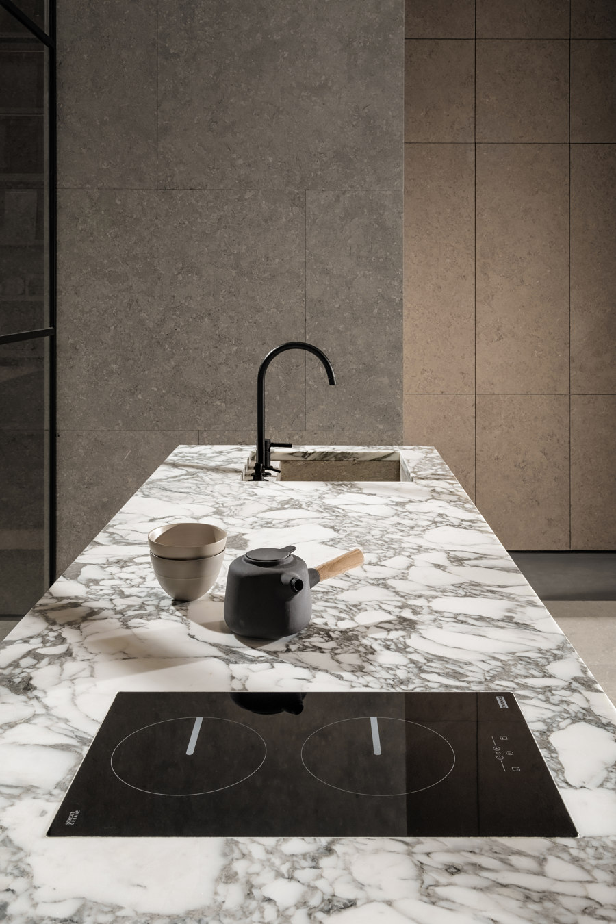
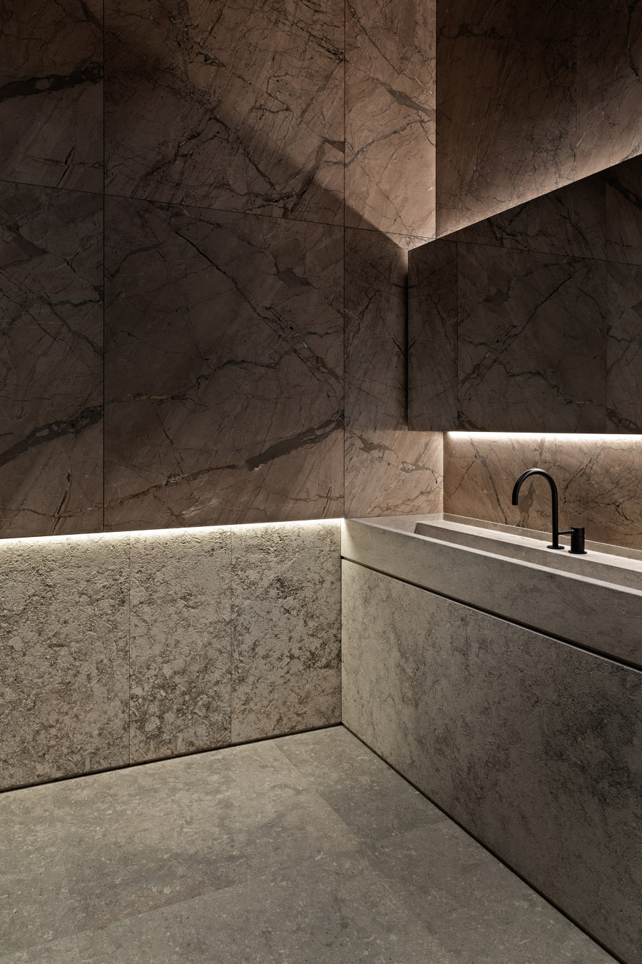
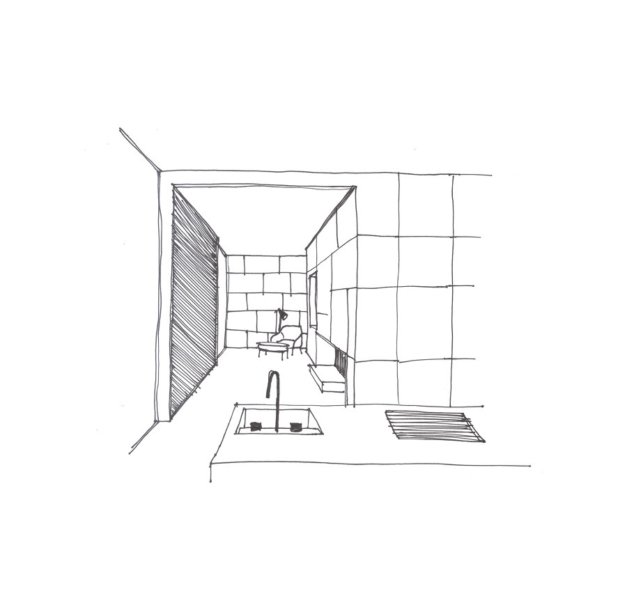
Adjacent to the fireplace area, a monolithic marble kitchen island, covered in ‘Corchia Arabesque’ marble with ‘Grigio Alpi’ stone doors and sink, is installed behind black frame steel windows.
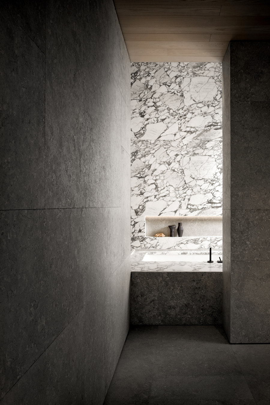
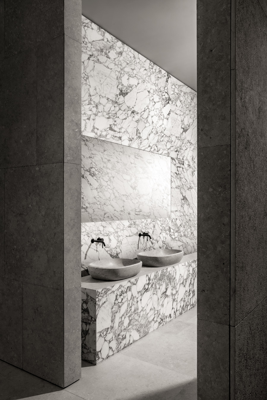
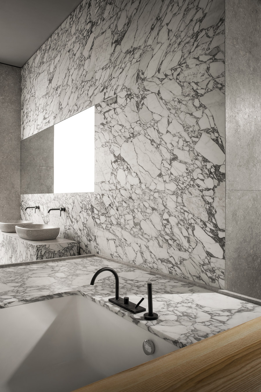
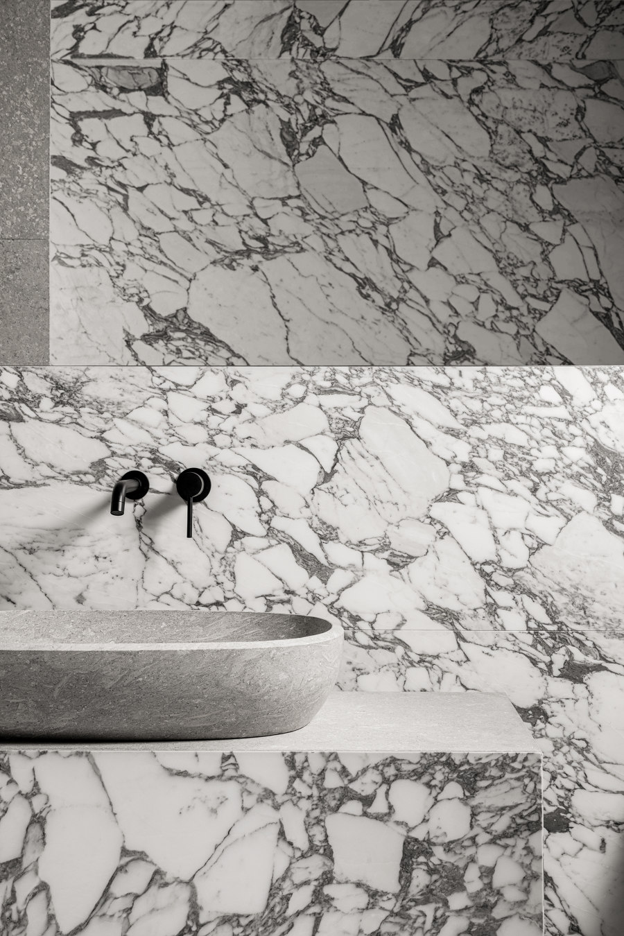
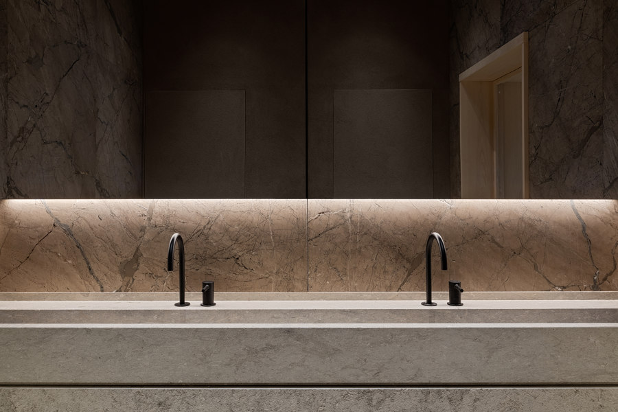
Around the corner, a marble platform with a built-in bathtub is the visual focus while entering the oriental-inspired bathroom covered in ‘Arabesque’ marble. Two ‘Dolina’ countertop washbasins are placed on top of a monolith combining stone and marble and completing the interior.
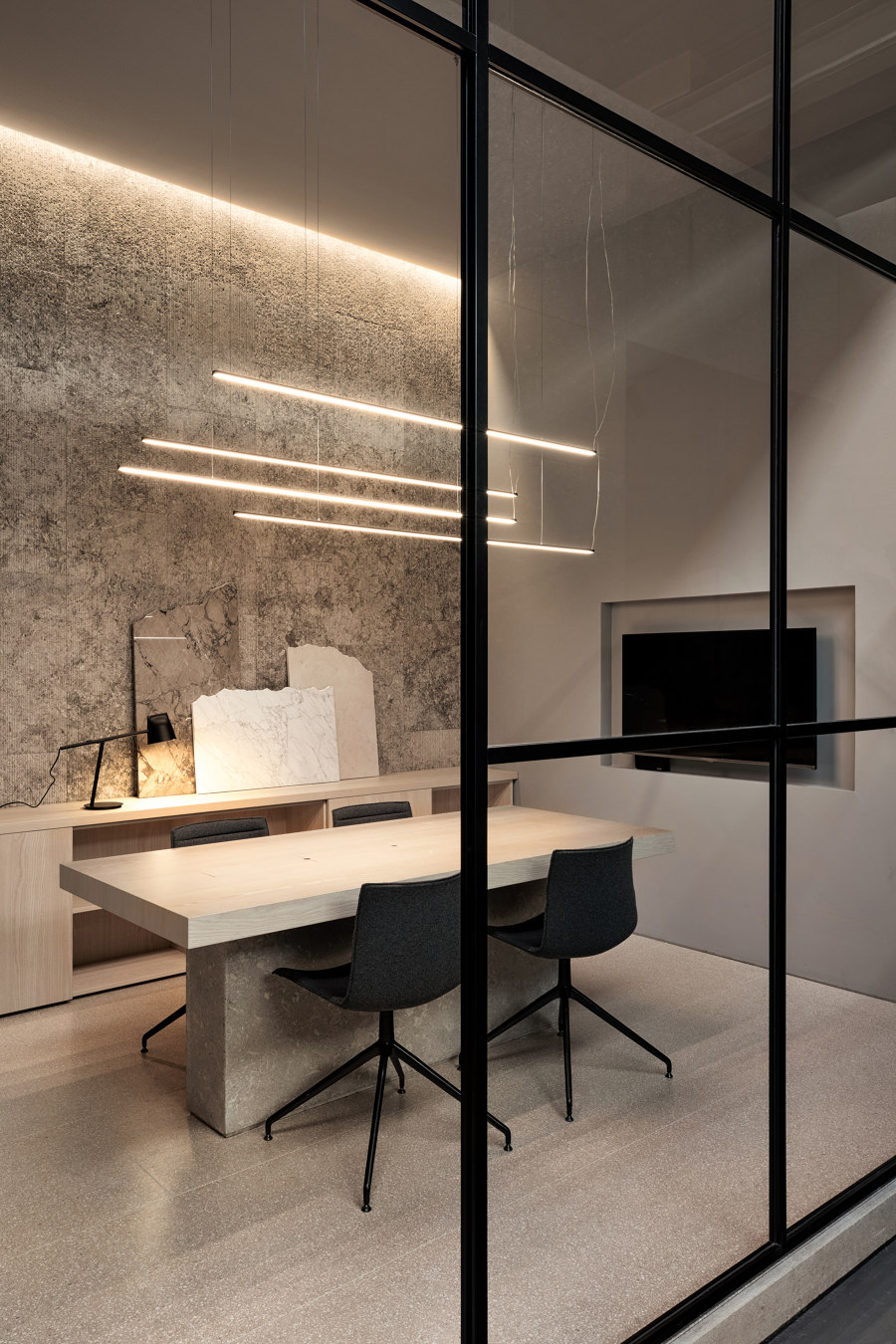
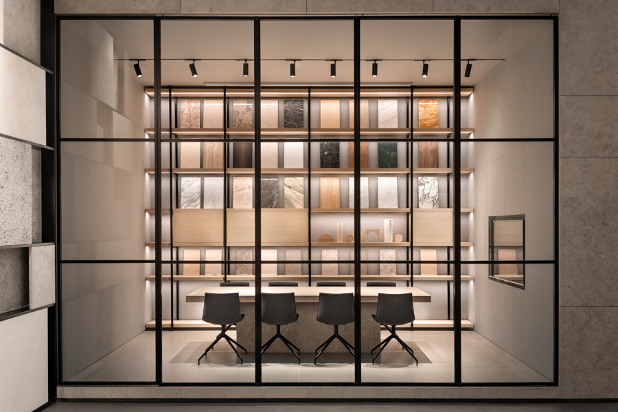
The third volume encompasses two workspace areas. Built from grey ‘Rullato’ stone and behind a glass facade, the first workspace area was created with client intimacy and smaller meetings in mind.
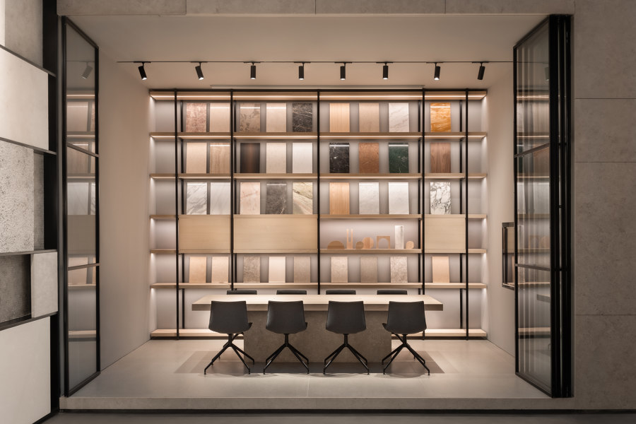
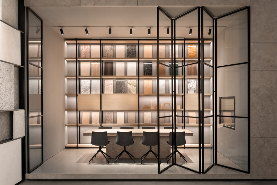
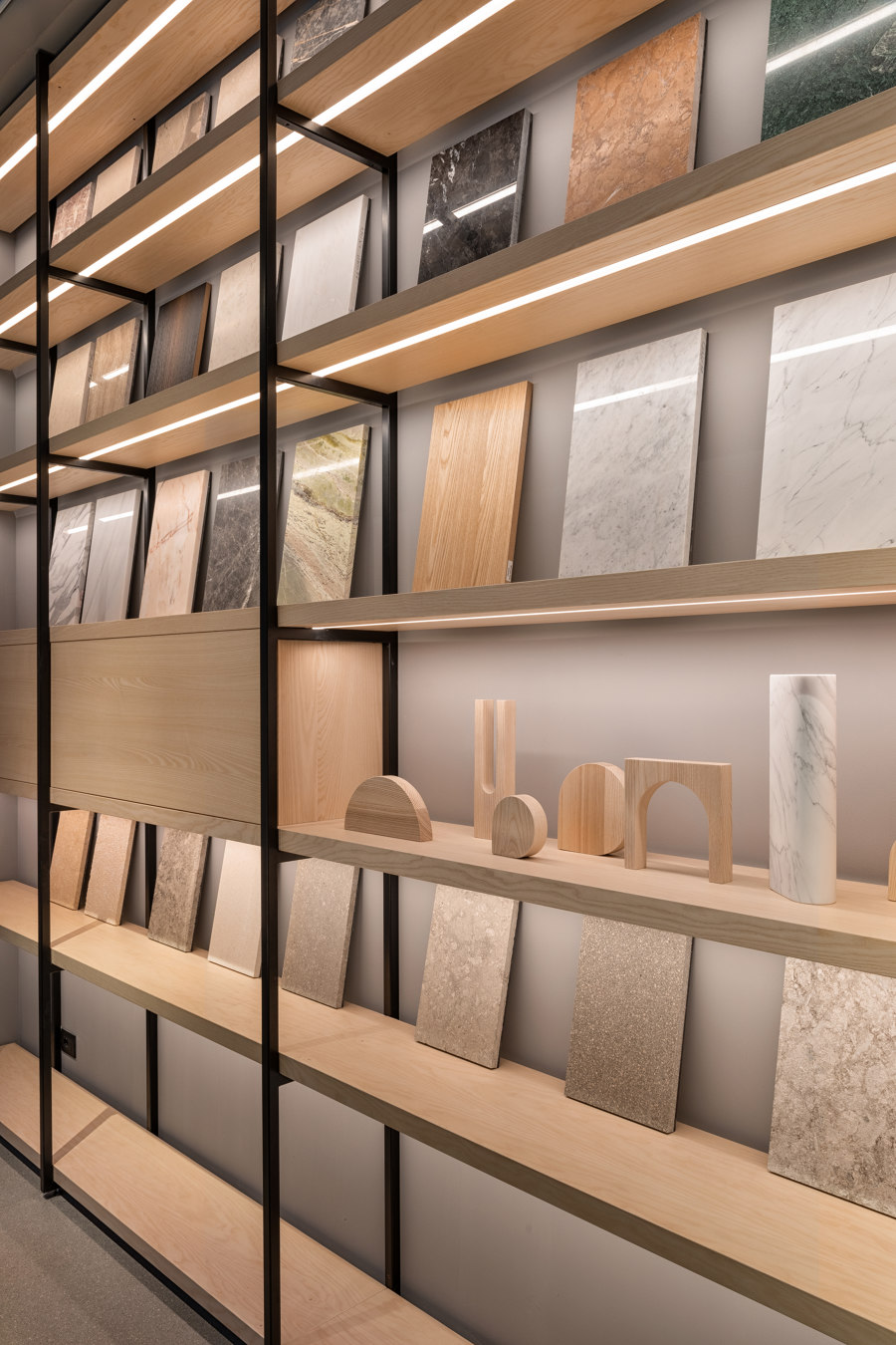
The second area, significantly larger and equipped with a long meeting table, features a material library that allows architects and clients to select and compare different samples. Folding glass doors ensure privacy when needed, or, when completely opened, unite the space and its functions; the room can be converted into a platform facing a generously proportioned lounge, making it ideal for hosting presentations, or accommodating larger groups of people.
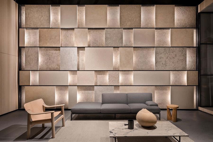
Through a four-meter-high multi layered wall, the designers added a sense of play with texture and lights to the lounge area. Originally created in 2016 for Grassi Pietre’s booth at Marmomacc in order to showcase a rich range of materials in a limited space, this sculptural wall called 'Array' represents an emblem of the company’s know-how. At the same time, it becomes the heart of the project, effortlessly integrated with the rest of the space.
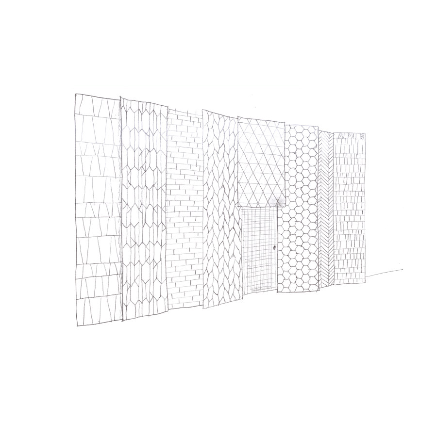
Towards the exit, a pattern collection, envisioned by Debiasi Sandri, aims to inspire architects, designers and clients by bringing to light the versatility of each material as well as possible combinations of forms, colours and finishes.
These patterned tiles are made from smaller reclaimed pieces of stone that are usually disregarded. In this way Debiasi and Sandri want to encourage a more sustainable use of stone.
Design team:
Daniel Debiasi, Federico Sandri
Styling: Maria Redaelli
