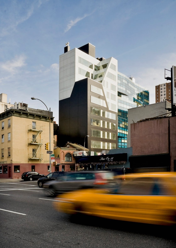
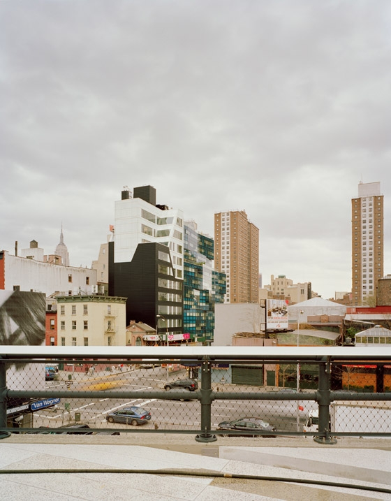
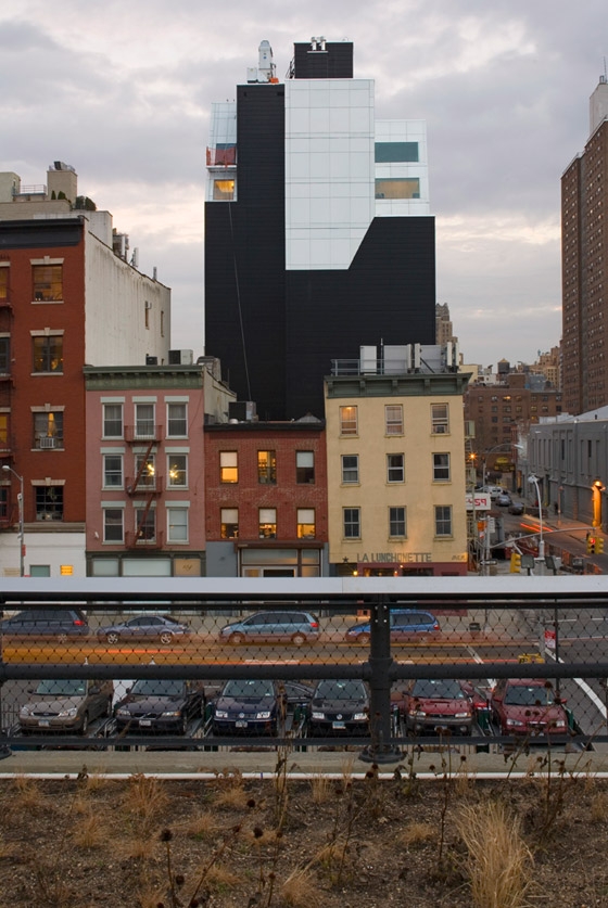
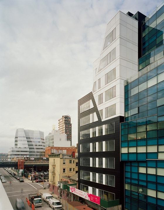
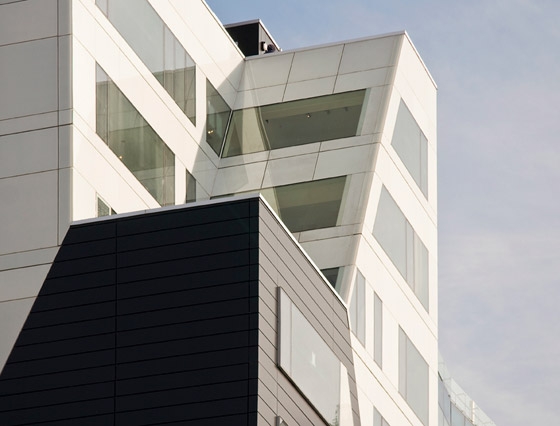
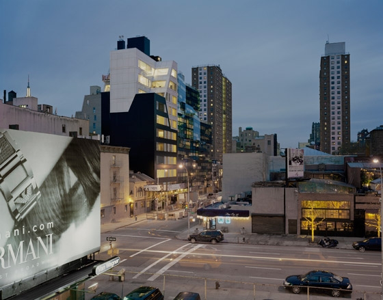
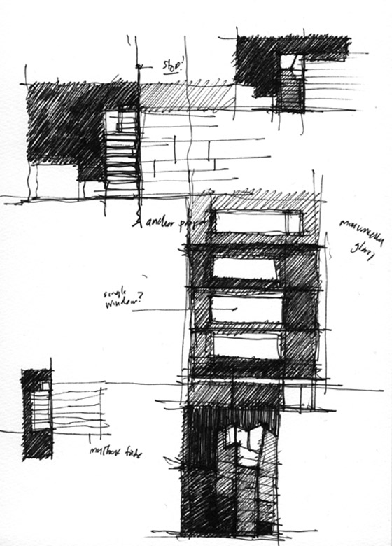
Della Valle Bernheimer acted as both architect and developer of this residential project located between two vibrant and evolving neighborhoods—the Meatpacking District and Chelsea—on the west side of Manhattan. On the edge of what once was the shoreline of Manhattan, the bold design for this mixed-use condominium project appears resolutely within its context. The primary architectural expression for this building is of two interlocking volumes: black and white shapes nest into each other and reveal the zoning requirements of the Special West Chelsea district. These shapes are not sculpted to defy these zoning requirements, but rather these zoning constraints are embraced and then hyper-articulated. On an experiential level the design intention was to construct a solid building that would give occupants a panoramic connection with the city around them. We also sought to avoid fabricating a normative piece of modern architecture: the glass box. Simultaneously we examined the modern precedent of “colorless” architecture: architecture made from metal and glass, materials which, in their primary form, impart no color or tonal gradients upon the artifice they define. Our first studies were those of binary conditions, of architecture made from opposites. Several iterations of orthogonal blocks were composed, with the final form assuming the shape of the idealized zoning diagram.
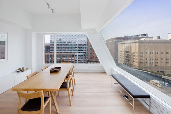
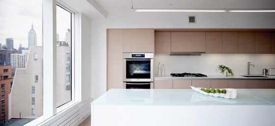
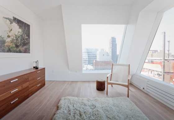
While many new buildings express visual connectivity to the surrounding city through ubiquitous expanses of transparent surfaces (an adjacent property presents exactly this: a new building made from folded planes of floor-to-ceiling curtain wall glass) our design posits that a solid, totemic object can be equally revealing. While many buildings express their openness literally, the façade of 459 West 18th Street is voided only in swatches. Extruded aluminum collars hold enormous expanses of unbroken and seamless glass. In this way, the window becomes a minimal yet severe vitrine, mostly invisible yet enforcing spatial containment. The monumental openings, as large as 8’ x 18’, take the background exteriority of the city and place it at the front of one’s experience, adding a cinematic quality, framing views like art-in-progress. The windows are detailed with minimalism in mind. Mullions are only 2” thick, and the frame for the vent is nested within the Mullion to conceal the operating mechanisms. All hardware disappears, while interruptions of the glass are minimized.
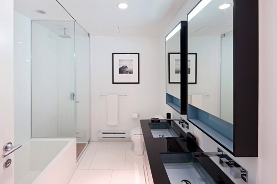
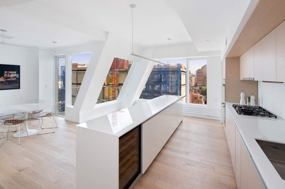
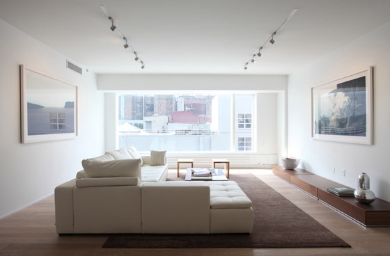
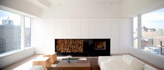
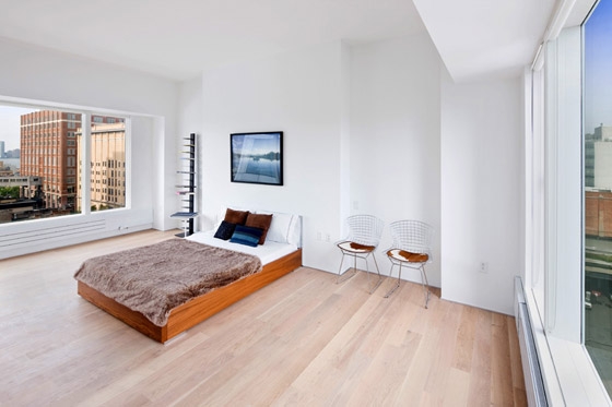
Meticulously-designed details and thoughtfully-selected materials achieve an understated, serene interior that is in marked contrast to the rigorously prominent building exterior and the neighborhood. The building is articulated in a pair of linked or nested dualities: solid and void, black and white.
