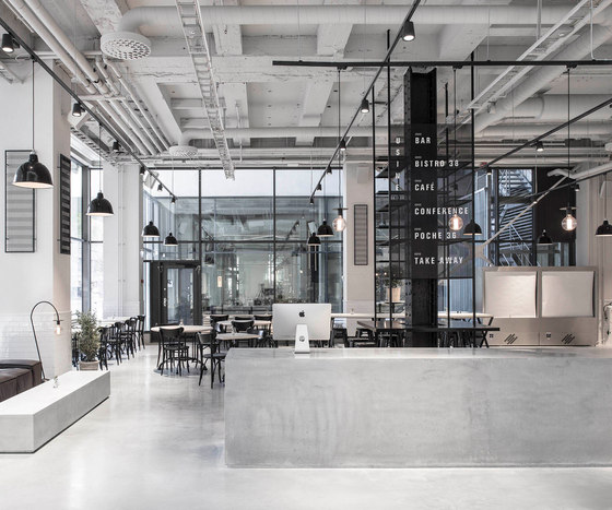
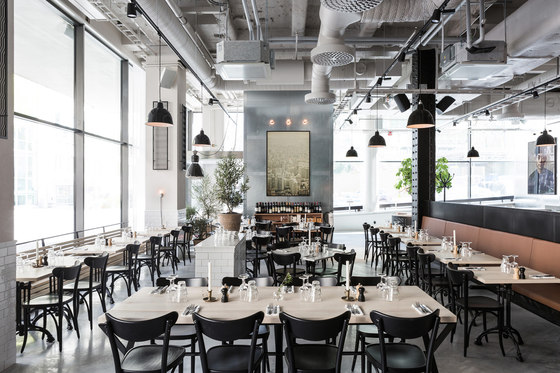
A 2000 square meter former sausage factory in Stockholm has undergone an extensive renovation to give place to the new Usine concept. The new space includes Bistro 38, Poche 36, café, take-away, reception and conference spaces.
Before the one year long renovations, the premises were used by the Swedish Tax Agency and consisted of a maze of tiny meeting rooms with a ceiling height of 240 cm.
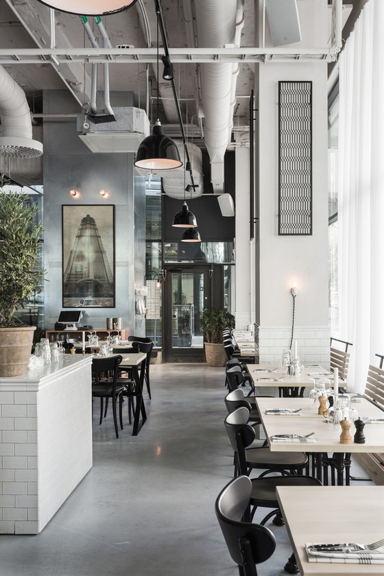
The interior is inspired by Scandinavian minimalism with an industrial twist and with Inspiration from hotels and restaurants in Shanghai, New York and Amsterdam. Big impressive buildings with lots of space and hard materials, but which are still keeping a welcoming atmosphere are rare in Sweden. It was important to create a warmth in the environments, but still keep it raw and fresh.
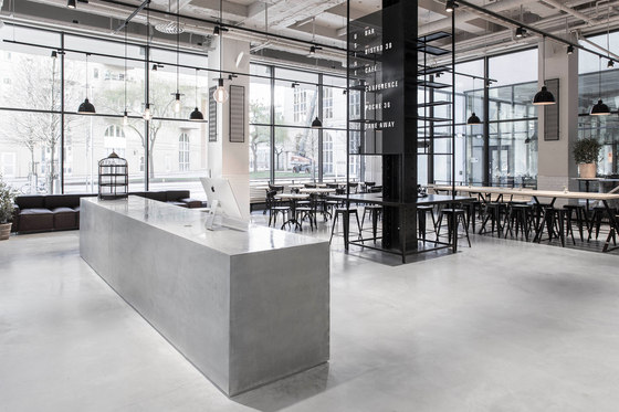
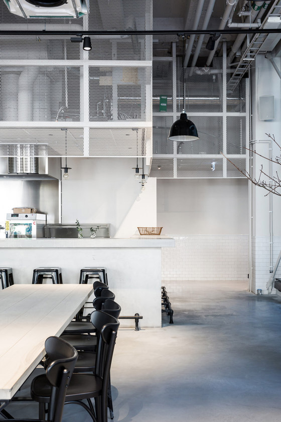
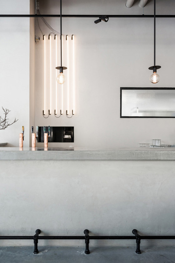
48 tons of concrete was poured into the construction, not only for for the floors, but also to construct the two bars, a reception desk, a large sofa table and a 3,5 meter wash basin in the rest room.
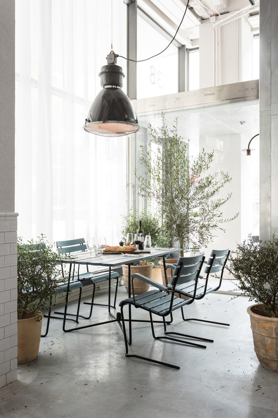
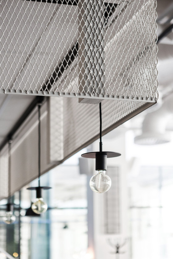
The boards on the walls is made from expanded metal, cut into smaller segments and placed in black lacquered steel frames, which gives a hint of Art Deco style. The tables and sofas are designed by Richard and made by a carpenter in Lithuania, The big fig tree at the entrance was chosen mainly for the amazing gray bark.
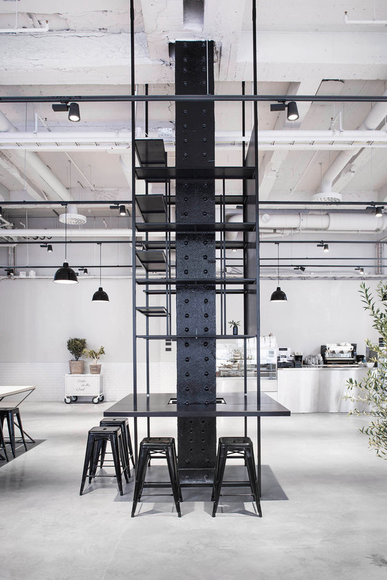
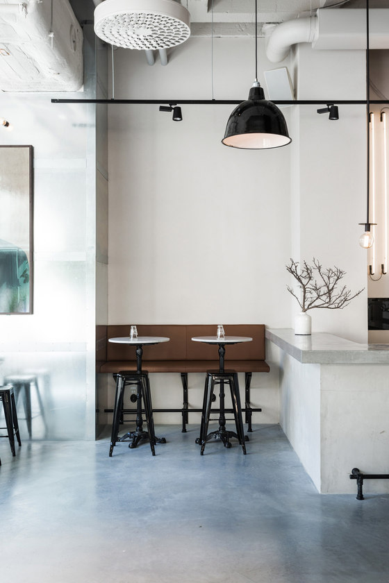
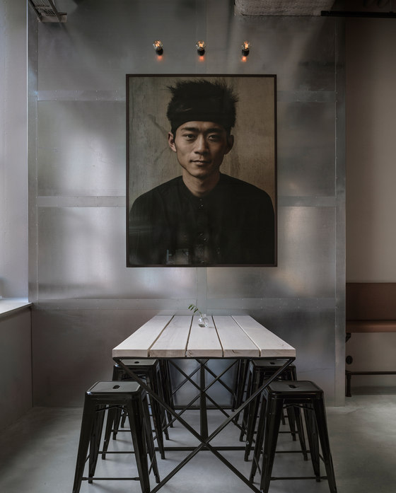
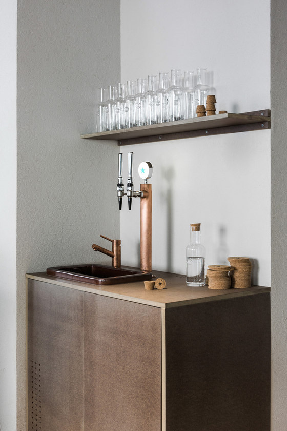
Materials of high quality were selected. Maple wood, cognac colored leather, concrete, galvanized steel, white tiles and black iron details create a stylish but relaxed atmosphere. To add an accent color, Valcromat in orange and brown was used for table tops, side tables, cabinet doors and menus.
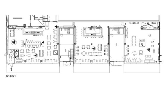
The large space is divided into three rooms, all revolving around a central black iron beam structure that has been designed to serve unique functions for each area. The center of Bistro 38 holds a long two-level sofa where one side faces the massive concrete bar and the other, lower part is turned towards the dining area. In Poche 36, the central iron beam has been transformed into a flexible table that can serve both as seating and as service station for the staff. In the café area the main iron feature was turned into a high shelf structure with bar seating around the base.
Connecting the three areas is a spacious corridor serving as a gallery with new exhibitions coming up continuously.
Company: Design by Richard Lindvall
Team: Richard Lindvall
