Photographe : Assen Emilov

Photographe : Assen Emilov

Photographe : Assen Emilov
The project is the joint response of client and architect to the post-corporate and post-digital condition of our decade. The architectural manifestation of the response tries to make the best of the neutral context of a generic year 2000 office building.
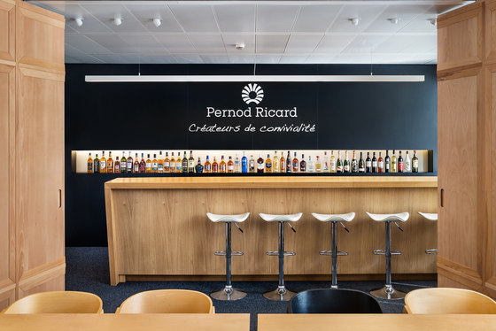
The client's stance: the design should both functionally and aesthetically reflect Pernod Ricard‘s company values, as presented in the slogan "Créateurs de convivialité". Conviviality stands for the culture of sharing, friendliness, liveliness, and this is in fact an ideal whose sincerity becomes increasingly apparent as communication with the company team progresses. Both the friendliness and daily interaction between departments characterizing the inside life of the company, and the liveliness and openness characterizing its public presence in the Sofia social and place-making scene, needed to find their appropriate expression in a multi-functional space that could transcend the limitations of the neutral corridor scheme to which individual offices were attached.
The architect's response: Outside-the-box office environments have certainly, for some time now - been instrumental in elevating a company’s public image and attracting top talent employees. Most of the companies who set up this trend back in the days are widely familiar tech-based entities that are by now an integral part of our daily lives, or startup companies that seem like the logical cradle for office design revolution. The use of contemporary design as not simply a functional background, but rather a key element in shaping company identity, conveying a message, and creating a productive environment is still far from being the standard among larger corporate companies in Bulgaria. Working with a client - in this case the entire company's team - who is fully aware the segregation of work and leisure, public and private are a thing of the past, has been a rare and rewarding experience, as we could actually see the intended change in office dwelling take place immediately to prove the intervention was a necessity that simply accommodated and exposed office life rituals of conviviality that had already been established.
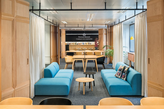
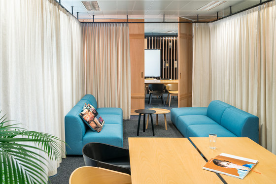
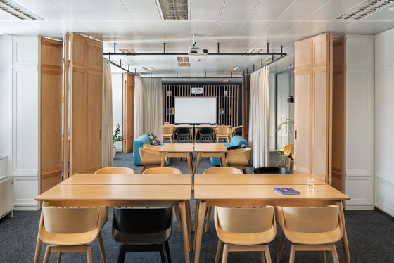
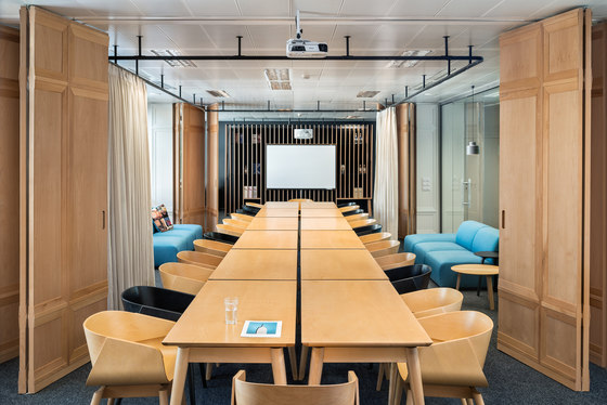
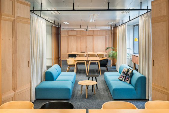
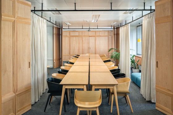
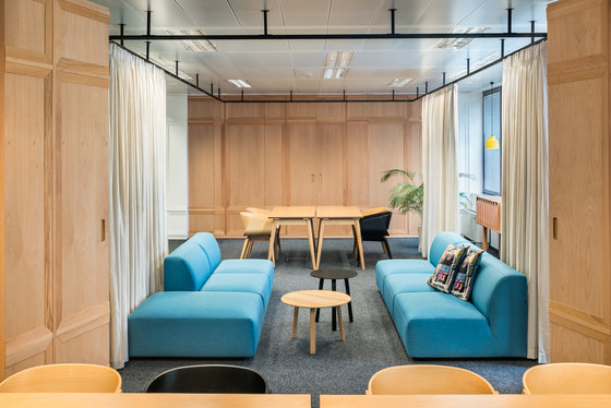
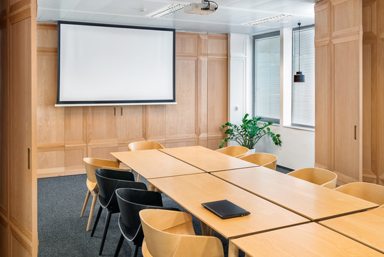
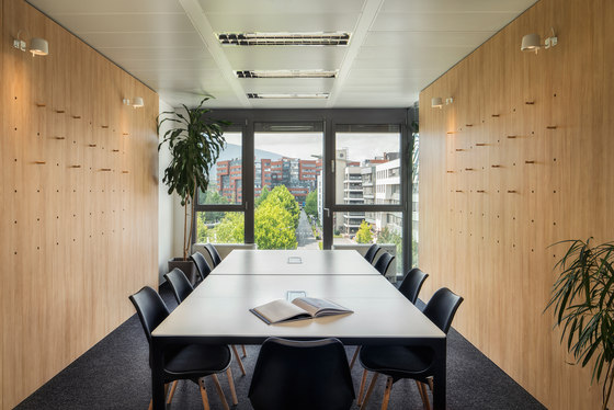
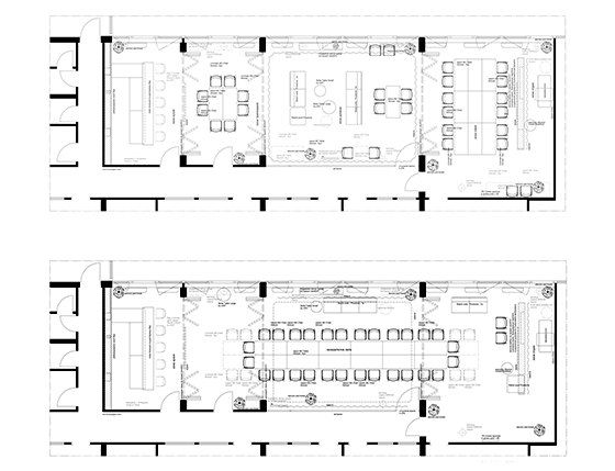
In order to achieve the new meaning of space while considering the givenness of the context as natural for the time when the building was erected, intervention took place on two main levels - space + meaning and objects + use and/or affinity. The proposed scheme tackles the office space as a home. On the one hand, it is a modern-day home that distinguishes between functions such as kitchen (the bar), dining room (small meeting room closest to the bar), living room (large common room for casual meetings with sofas and TV), study (the Sales team crib), recreation room ( the massage chair private space). The same train of thought continues travelling through the office space during the second stage of the intervention the children's room / playground (the Marketing team crib), the representative guest room with library (meeting room on the far end of corridor). On the other hand, the space is a primordial home that can transform according to the needs of the dwellers. The mobile partitions dividing the 'kitchen', 'dining room', 'living room', 'study', and 'recreation room' open up in a fashion that, while preserving the rhythmic aesthetic that comes with the architecture elements that allow it, creates a big shared space for times when the entire company's team, and visitors if need be, can get together to work, discuss, celebrate.
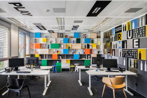
The furniture objects that inhabit the space are all either modular and interchangeable (tables and chairs), thus open to relocation as needed, or specifically designed as modular systems with a number of deviations to accommodate a variety of office items of daily use. The generic quality of the existing floor and ceiling finishes that are not subject to change is considered an intrinsic part of modern day dwelling, and is not treated as a problem, but instead as a canvas for the mobile pieces of furniture of stronger material, structural and chromatic identity.
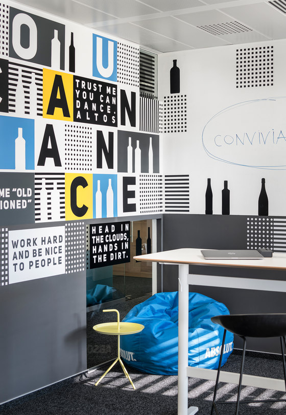
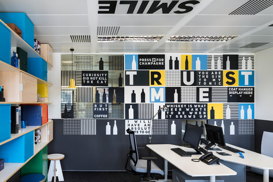
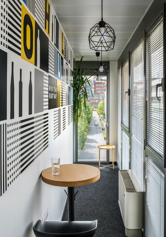
The specific choice of furnishings intentionally reflects the "glocal" (simultaneously global and local) identity of the company. It is important to note, some of the most character-forming furniture pieces present in the space are by Bulgarian designers and artists - chairs and tables in the main area by Almost, decorative lighting by rrrub, graphic design in the 'children's room' (Marketing department) by Maxim Mokdad, ceramic fixture wall installation in the "kitchen" (bar) by tochka & tochka. The presence of accessories and items of furniture from the Balkan and Scandinavian brands such as sofas by Croatian brand Prostoria, and coffee tables from Scandinavian brand HAY, stylistically and symbolically complements the atmosphere of an active and recognizable local office of an international company.
dontDIY

Photographe : Assen Emilov

Photographe : Assen Emilov

Photographe : Assen Emilov

Photographe : Assen Emilov

Photographe : Assen Emilov

Photographe : Assen Emilov

Photographe : Assen Emilov

Photographe : Assen Emilov

Photographe : Assen Emilov

Photographe : Assen Emilov

Photographe : Assen Emilov

Photographe : Assen Emilov
