The project presents the renovation of an apartment in a building of 1916 located in the old town of Barcelona. It has a surface of 46 sqm and originally presented a decayed image and excessively subdivided with rooms. The two windows of the façade are the only ones able to use for ventilation and natural illumination. It has a very small service yard that is closed and an elevator added later occupying most of it.
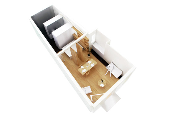
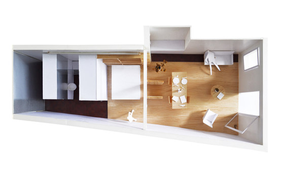
The main goal has been to achieve the maximum use of natural light and ventilation in the apartment. Strategy, accumulate the servant area and storage in the opposite side of the facade to free the rest of the apartment and the living areas can enjoy the outside windows. We took advantage of a recessed wall of the perimeter wall to place the kitchen.
Loft
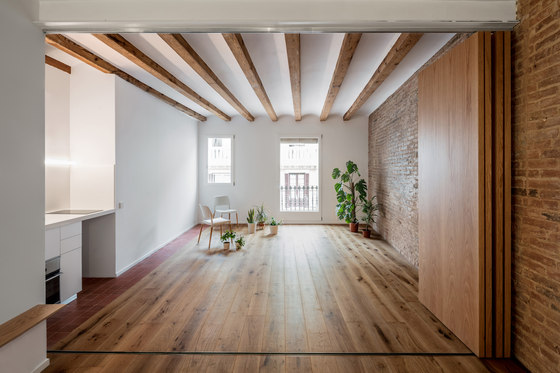
The structure walls of the building are in the perimeter of the apartment, which enabled us demolish all the interior partitions resulting in a diaphanous space. The dwelling is then considered as a loft, we simplified the new distribution to obtain a large and open space being able to enjoy the light and ventilation of the two windows in the facade.
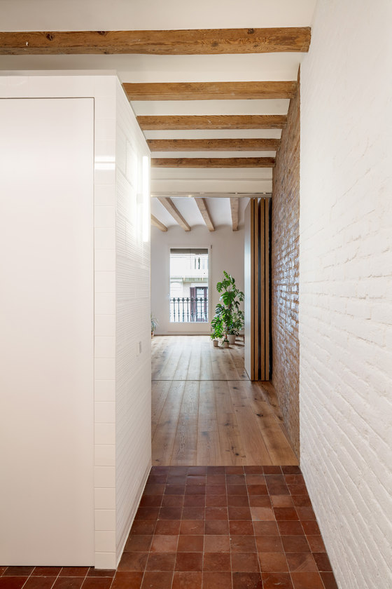
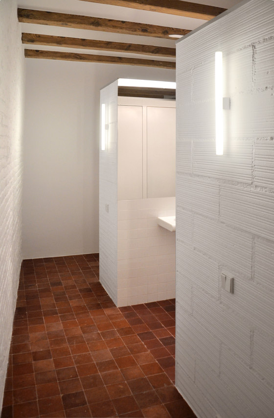
Only the perimeter walls reach the ceiling being able to perceive the whole space from anywhere of the apartment, the wardrobe and WC are the only closed spaces that are placed as boxes transversally to the space offering privacy to the bathroom.
Open boundaries
The apartment is a linear succession of three big spaces connected with a big freedom of relationship: servant area/bedroom/living room. We designed interior boundaries to create different degrees of privacy and use between the spaces.
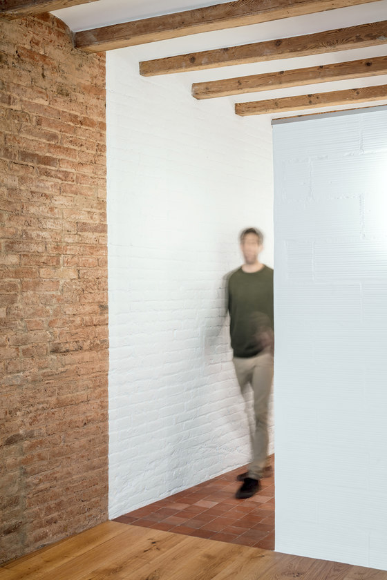
Between the servant area and the bedroom the alignment of the last box matches a sudden change of materials creating a strong limit. Perceptively you can distinguish two different spaces.
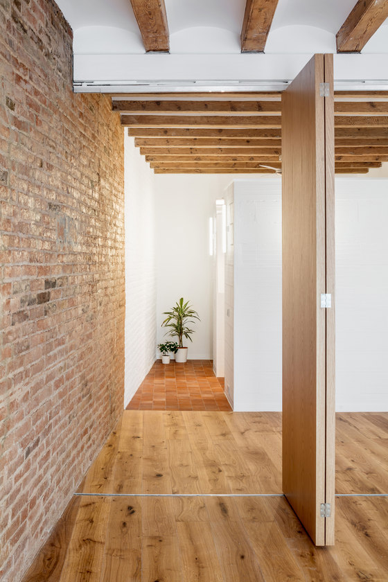
Between the bedroom and the living room, where the structure beams change direction, we designed a sliding and folding door system creating an intermediate flexible membrane that allows you transform the space. The doors move individually creating a dynamic composition of the limit and countless positions and degrees of relationship.
Materiality
The first action undertaken was to remove all the materials overlaid during the years to reach the traditional building elements. The new materials included, though clearly contemporary, discuss harmoniously with the old creating a feeling of unity and timeless atmosphere.
We stripped the paint of the wooden beams to enhance the feeling of a continuous ceiling. The boxes for the wardrobe and WC where built with modern airbricks without plastering so that the texture contrasts with the exposed old brick wall that runs through the apartment. We painted white the back of the apartment to improve natural light as it is the darkest area and highlight the original ceramic tiles relocated in the servant areas.
Design Team:
Architect: Adrian Elizald
