Background of the Residents
The house owner of this project is a couple. Because the host and hostess are all doctors, they are very busy on weekdays. Therefore they hope to have a quiet and elegant residence to relieve fatigue after all-day work. In addition, the owner and his wife like to cook in her spare time, so the need for adequate and spacious dining kitchen space. Besides, this couple likes to cook in their leisure time, so they need a large enough kitchen space.
Original House Situation
Since the house was just newly built, the condition of the house is good. Also, the house is great square, no fractional spaces, so it’s comparably easy to plan the layout. In addition, despite there is a large window, the view and natural lighting are restricted by the neighboring buildings. The lighting in dining room and living area should be strengthened.
Clients' Attitude toward Life
Since they are doctors, kind of work under high tension high pressure, they hope to have a serene space to calm their hearts after all-day work. There is no specific style designated, but modern, simple style with elegance and comfort is preferred.
Concept of Interior Spatial Arrangement
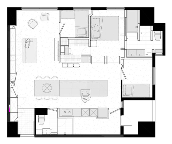
The original compartments are centered on the right side. But the natural lighting of the inner house is inadequate, so designers rearrange the layout of rooms and put those rooms not in common use such as storage in the back area in order to create a wide common area. Besides, there is no-corridor design in this house, so each bedroom and common area can be maximized. Even the master bedroom is an elastic compartment by adopting the revolving door, so the sunlight will go into the interior space while the door is opened.
Arrangement of Traffic Line and Space
Living room:
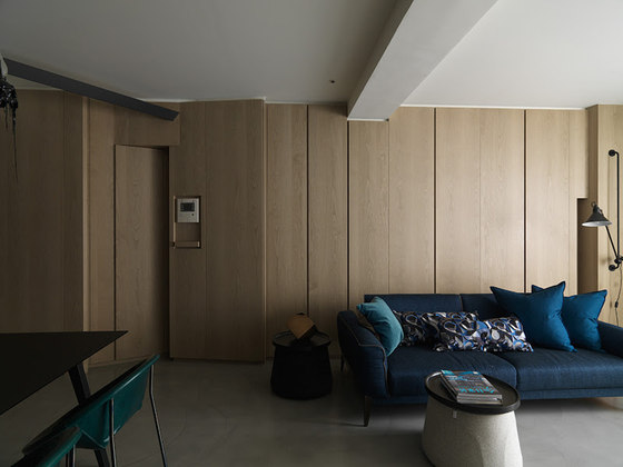
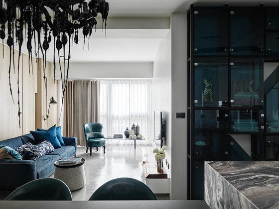
The wooden wall with several oblique angles is the main wall in living area. The design of oblique angle endows the simple living room with a design sense. Furthermore, behind those oblique angles are the closets in different size, the beauty and practical use are thus combined.
Dining room:
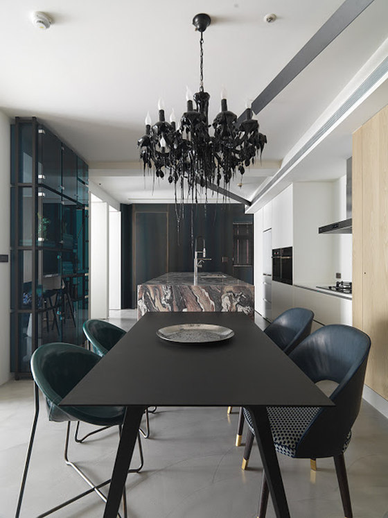
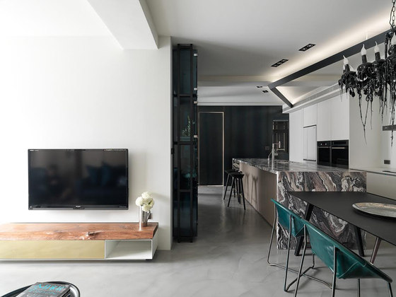
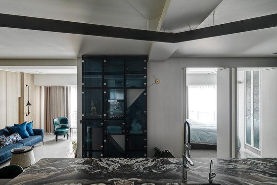
Dining room plays an important role in the family’s leisure life, so designers expand the dining area and the owners can enjoy their cooking time. Above the rectangular cooking platform is a V-shaped light belt which extends the visual feeling of the common area, and guide the wind circulation and light direction. Aquamarine cabinet with bevel design on the door leaf is used to store recipes and objects.
Bedrooms and Bathrooms:
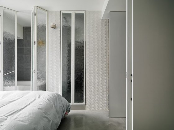
Three rooms were designed. Revolving doors are adopted to save more space. When the door is closed, the house owner can enjoy an independent space. While closed, the sunlight can be let into the kitchen area and people in the bedrooms have more interaction with others outside. Moreover, there is also a bevel design on the wall between the master’s bedroom and the second bedroom. This design cleverly avoids the original window frame and thus the natural light will not be reduced. The most important is that the size of two bedrooms will not be effect by window position.
Bathroom:
The bathroom is of a hotel design. The white wall is pasted with honeycomb-shape tiles used in the master bedroom, adding detail to the overall space. The honeycomb tiles strengthen the image of “home”. The top-hung towel rails raise the quality sensed and increase the visual layers in the bathroom.
Main materials used
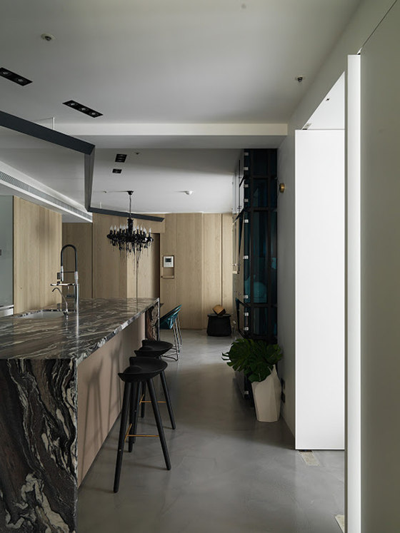
Although the house owners did not prefer any specific style, but they hope space can be simple and elegant. Therefore, material adoption is focused on marble and wood. The wooden bevel cabinet is created to make a simple but not dull wall in public space, and the lines on the marble counter tops colorize this area. Wall in the bathroom is of similar concept; the honeycomb-shape tiles create a sense of layer and enrich the space, even the whole wall is white. The hand-scraping Pandomo flooring adds the artistic sense in the house, relaxing the tiredness of busy homeowners accumulated in a day.
Color Configuration Design and Adoption of Soft Decorative Assembly
The wooden cabinet from the entrance to the living room create a casual sense. The texture on the marble countertop adds grace to the space. Dark blue is the main color adopted on the soft decoration to present the elegance. The blue transparent cabinet next to the dinning table is the visual center of the open space. The concept of it comes from the invert effect in photography or the x-ray film used on medical science. The oblique angle on the vitrine pinpoints the vitrine and thus placed the integration of classical elements and the modern style.
Adoptions to Reduce the Expense
The house owner has no budget issue.
Design Concept Description
"Fold" is not only the geometric configuration, but also an ornament in a space. In this 92.3 square meter house, three bedrooms were preserved by the demand of the house owners. In order to make the best use of each space, the designers think about the honeycomb and make no aisle among the rooms. The partition wall between the main bedroom and the second bedroom is designed with a V-shaped fold to comply with the position of the beam and pillar. Therefore, two rooms will not be confined by windows and the structural limitation.
The common area starts with a V-fold light belt on the ceiling and centers on the kitchen island. The marble countertops, hidden storage cabinets behind the back wall in the living room, and blue vitrine present a dialogue between different cover materials. The blue vitrine beside the kitchen island is the visual center in the kitchen. The white TV wall in the living room is parallel to the black magnet wall in front of balcony wall. Between inside and outside, the visual path goes through the restaurant ceiling lighting belt by which the depth of the room seems to be expanded.
On the condition of not affecting life habit, "fold" design is adopted many corners in the house. From the entrance to the back wall behind the sofa, the hidden storage cabinets are placed in bevel. The designers solve the problem of different depth of the pillar by doing so, and thus make the background appealing. To solve the lighting problem, the designers adopt two turnstiles as the door of two bedrooms, and thus direct the sunlight into the dining area. Besides, the V shape light belt provides the main light source. This V, like a password in the house, hides light in its’ fold and attracts the desire to explore the house.
Ganna design
Shin-Jie Lin
Ting-Liang Chen
