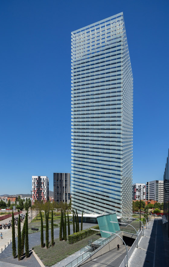
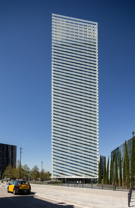
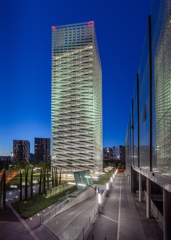
The Plaza Europa was constructed halfway between the El Prat Airport and Barcelona city, with the intention of it becoming a new point of reference for the whole metropolitan area. The floor plan well reflects the original intentions of the man who drew it, Alberto Viaplana, winner of a competition organised for this project. It cannot be overemphasised that the architect seems to have been more concerned with emphasising the value of the intersection of Joan Carles street and the Granvia de Hospitalet Avenue- in which the Feria de Muestras plays an important role- than in merely configuring an urban space in which notions of volume and space prevail. In the face of a possibly complex, turbulent layout; an abstract spread of clearly-identifiable and autonomous towers. The towers - the architectural element in question - intermix with ‘crescents’ and embrace without any break in continuity the aforementioned intersection without defining a clear and evident geometry. The result is an urban void in which the towers, perceived as independent, play their parts with no apparent relation to each other. One of these new towers is the new corporate headquarters of Puig who, intent on fitting in with Barcelona’s new urban image, have chosen Plaza Europa to erect their head office.
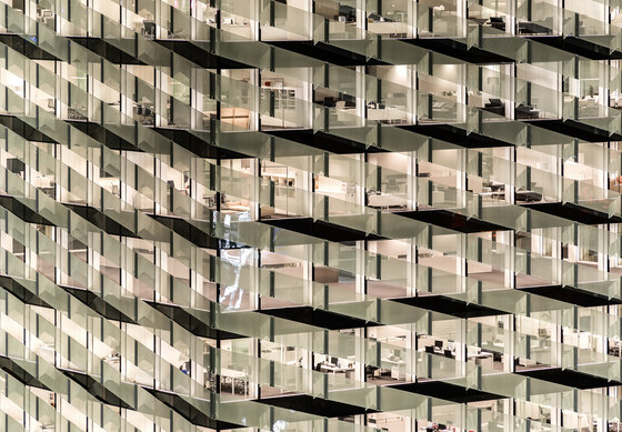
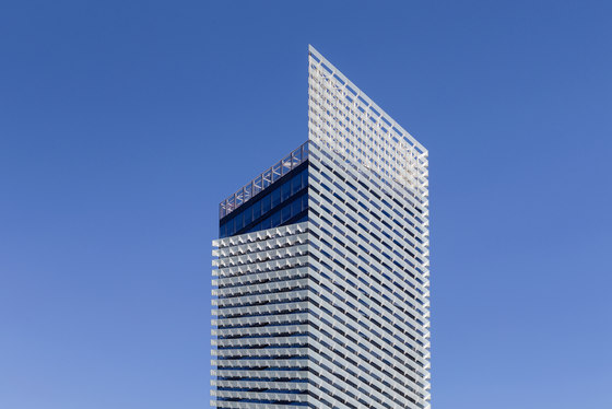
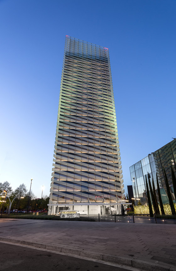
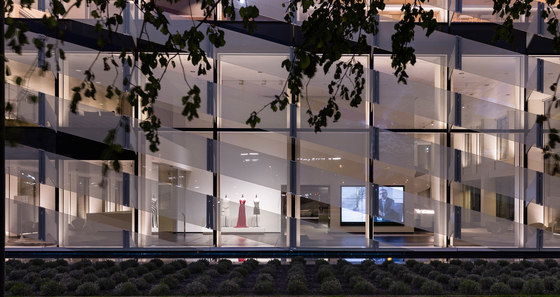
The tower strictly follows the floor plan and height established in the original plans, and the proposition that it was to be perceived as a united figure and not only as a simple superimposition of horizontal floors, led to the suggestion of the spiral glasswork which encases everything. The desire that the Torre Puig should assume the iconic role which befits its corporate headquarters status appears to have been satisfied by the emphatic geometry of its architecture, whilst the boldness of the spiral leads to a shape that in its purity alludes to the touch of class which Puig’s perfume bottles have always been infused with. Furthermore the spiral leads us to contemplate the unshaking desire for improvement and innovation that has always been present in Puig’s business ventures.
The floor plans of the tower - a 27.5m by 27.5m square - shows the importance of the core, which not only resolves the vertical connections, and the service and mechanical elements, but also contributes to defining and structuring the usable space. And all this without diminishing the definitive role of the structure and its structural integrity. Around the nucleus unfold the work areas which enjoy on four sides the urban scenery offered by a city such as Barcelona. The glass covering affords the interior spaces, whether they be offices or workspaces, meeting rooms or other spaces, an attractive filter at the same time as helping to improve the insulation of the building, which incidentally has earned a LEEDGold certification.
It should be pointed out that the way in which the neutrality of the nucleus is installed in the square floor plan has permitted the resolution of a complex space and whoever might study the diverse floors will see that they can have the most varied layouts - making use of a modulation of 1.35, 2.70, 4.05 and – 8.10 - present in all the architectural elements that comprise the tower.
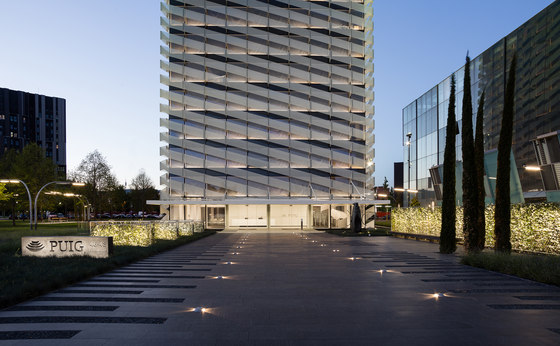
Special attention has been paid at the entrance of the tower to the horizontal plane, resolved via a pool of water surrounding the tower, from where the segments of the spiral originate. Naturally, the pool ends at the façade where the building’s entrance, emphasised by means of a metal protective cover, also acts as protection from the rain, and upon which the effect of the geometry imposed by the spiral is also felt.
Lastly, and for the record, the landscape gardening has contributed decisively to giving the horizontal plane a use that the planning had perhaps not paid sufficient attention to; converting the abstract horizontal plane which the towers inhabit into a garden that can encourage the city of Hospitalet to view the Plaza Europa as a well-kept green enclave capable of fostering a vibrant urban lifestyle.
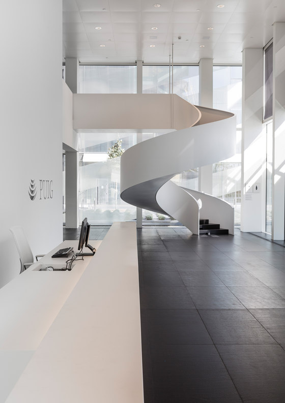
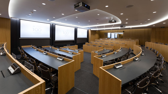
The corporate zone is composed of an auditorium or debating chamber which follows the Harvard model of participatory lecture theatres, and which along with some meeting room annexes are situated on Level 1. Via a staircase that unwinds parallel to the nucleus within a double space, they are linked to the ground floor. On this floor is situated the vestibule and reception area and via a spiral staircase, which punctuates the space, a direct connection is established with the first floor which houses the cafeteria on half of the space, the rest left open creating double story space that characterises the entry hall.
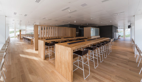
The restaurant is situated on the 2nd floor, with the kitchen attached to the nucleus and circulating parallel to the façade.
The suite of communal spaces is completed on the third floor, on which the gymnasium and its corresponding changing rooms also joined to the nucleus.
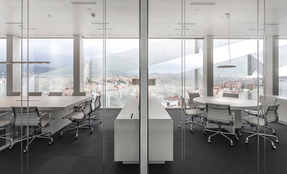
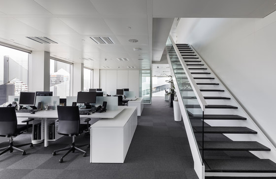
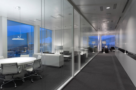
The rest of the floors are operational in character, fulfilling the varied necessities of the organization. Among them the 6th and 7th Floors stand out, linked with a metallic staircase parallel to the nucleus and the 9th Floor which houses the visitor and meeting rooms.
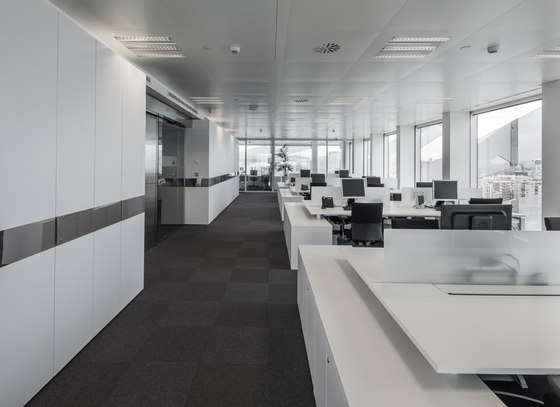
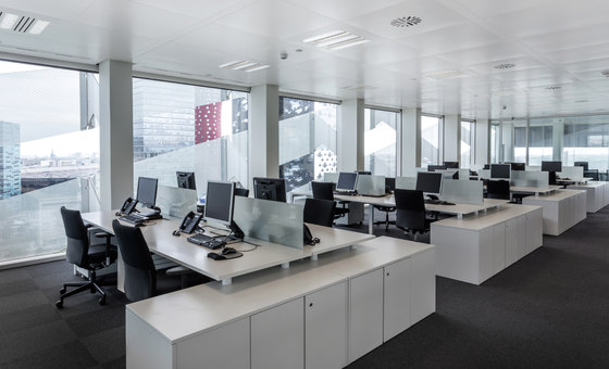
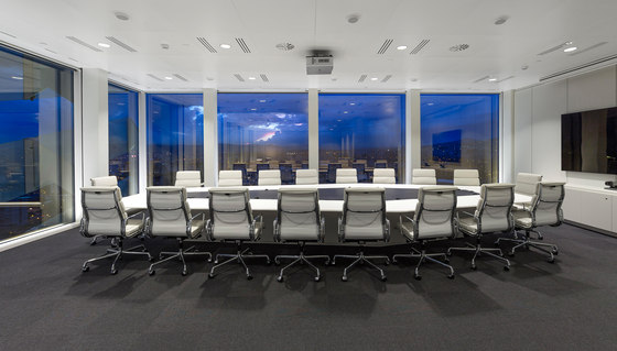
From the beginning the distribution was organized in such a way that the floor space is free from clutter and open, and in consequence from the vestibule of the nucleus the upper floors are reached through ‘open space’ configurations. The most exclusive areas are concentrated on the remaining sides, where glass-covered spaces with their respective partitions are located.
In the design implementation, the neutrality, lightness and purity transmitted by the architecture have been complemented by glass, predominantly white ceilings, cupboards, vertical surfaces and furniture, seeking a unity between the architecture and its interiors.
The natural oak wood appears in those spaces, such as the auditorium, restaurant and gymnasium in which it is necessary to create different atmospheres so that users may disengage from the whole, performing a particular task, breaking with the homogeneity of the rest. The ground-floor vestibule and the elevators, which have been treated as stainless boxes, stand out from the rest of the space as a nucleus of vertical circulation.
GCA Arquitectos Asociados
Architects: Rafael Moneo, Antonio Puig (GCA), Josep Riu (GCA), Lucho Marcial
Lead Project Architects: Roser Huguet (GCA), Josep Puig (GCA), Juan Velasco (GCA), Cristian Naudin (Lucho Marcial Architects)
Project Management: TECNICS G-3 - Victor Forteza, Martí Santana, Aleix Samperiz
Structural Engineering: BOMA - Agustin Obiols, Alicia Huguet
Engineering: PGI GRUP - David Tuset, Miquel Vilanova, Jordi Llobet
Leed Certifier: ERF (Estudi Ramon Folch i Associats) - Ines Alomar, Helena Berlanga
Facade Supervision: FERRES ARQUITECTURA - Xavier Ferres, Javier Garcia
Heath And Safety Coorinator: INGEA - Joan Pinell
Architecture Builder: COMSA, SA
Interior Desging Builder: CODECSA, SA.
