Proekt Agency is a Moscow based, strategy, advertising and branding real estate consultancy. Helping the most prominent real estate market players to create and sell their properties.
This interior was designed for PROEKT AGENCY, which assists prominent developers in building and promoting their properties on the real estate market.
The Client came up with some preferences as part of the brief.
1. The office should not resemble an office.
2. Employees should not have set workplaces.
3. The office should have two working areas, one of which may be a meeting room.
4. The office should make a strong impression on clients.They might find it highly unusual or even odd.
5. Potential employees should want to work in such an office.
6. Employees should feel special working in such an office.
7. The office should be comfortable for 5-6 people.
How did you handle the briefing? What’s the concept of the project and the ideas behind it?
There is a concept in branding called Love Mark, when a brand is created in such a way that there is something to love about it. By way of analogy, our idea was to make a Love Office – an office that employees love and are proud of. The company owner envisioned a work space similar to a very unusual apartment that would astonish clients and at the same time be a comfortable work place for a small team of professionals. With his wishes in mind, we came up with several key concepts that served as the foundation of the project – strange, eccentric and efficient.
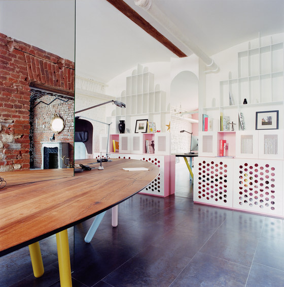
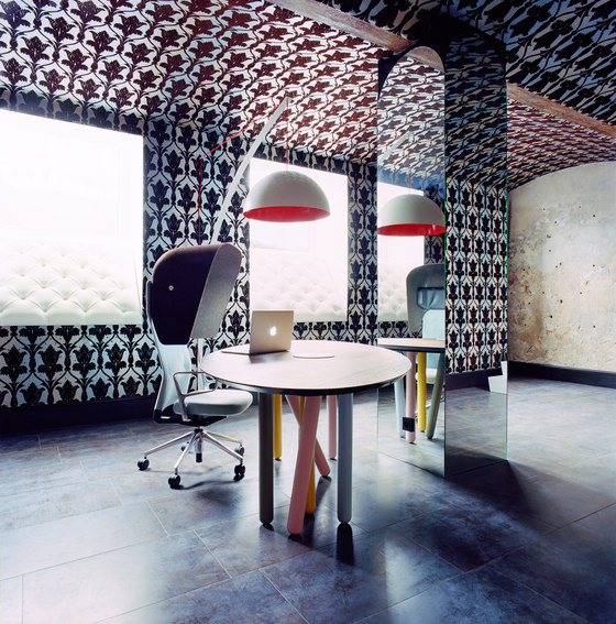
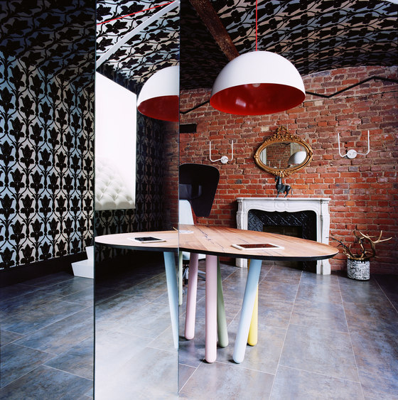
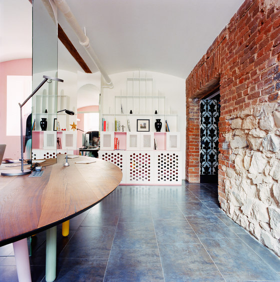
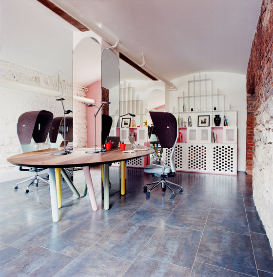
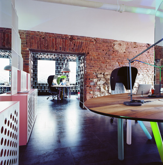
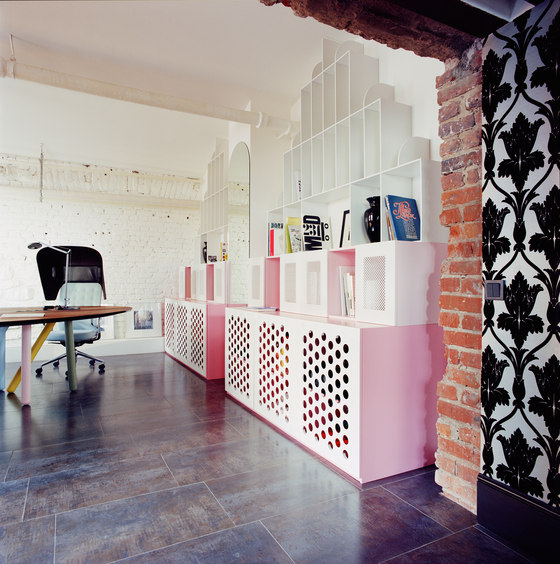
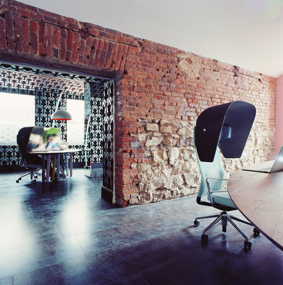
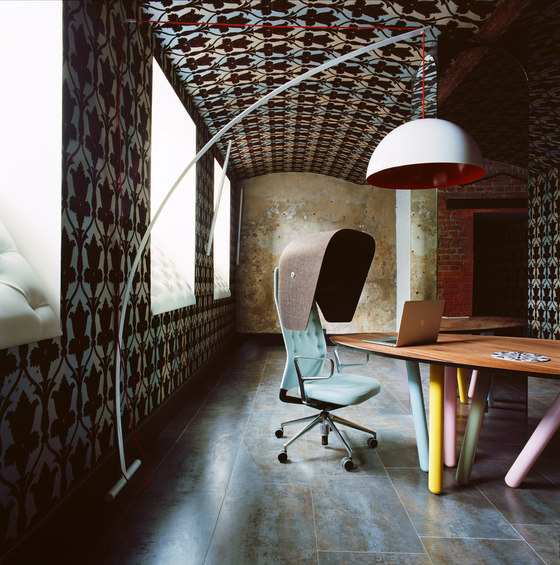
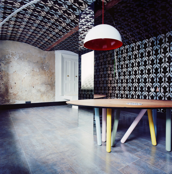
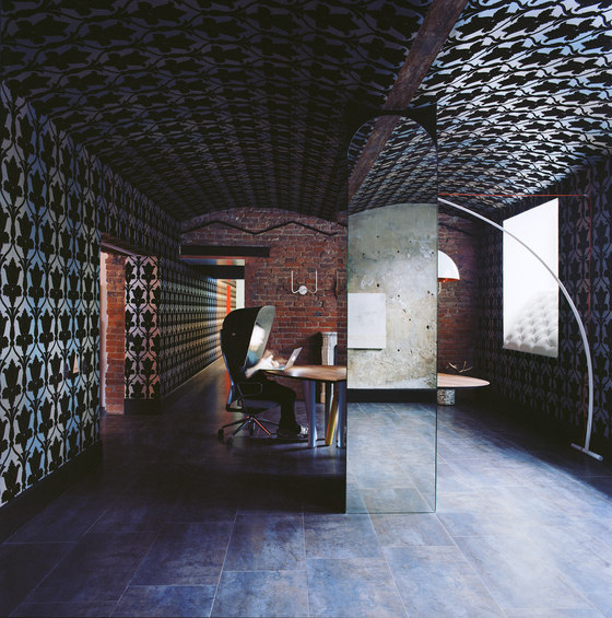
The first thing we started studying was the idea of decoration. The dismantling of the old drywall revealed historical stone masonry (the building is roughly 100 years-old), so naturally we decided to keep part of it in the design while experimenting a little bit with the surface finish (varnish, paint). Next we had to come up with some unconventional techniques while using rather traditional materials. For example, we took some classic English Victorian wallpaper that many people know from the Sherlock Holmes series and put it up on a vaulted ceiling. This resulted in a kind of cocoon and this is the first thing that people notice when they enter this area.
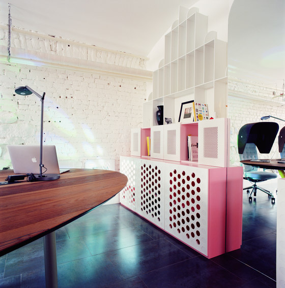
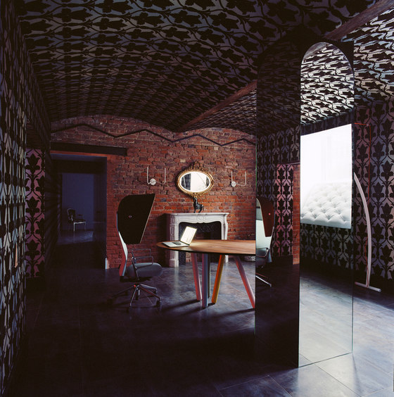
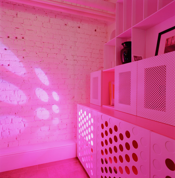
Most of the furniture was made according to our sketches. We decided to mix elements of antiquity with a contemporary design. We created and manufactured some basic but fully functional pink and white shelves because pink is a colour that is least of all associated with a work space. All of these details created the atmosphere of a space that is something between an office, apartment, showroom and God knows what else. Combining things that seem incompatible at first glance actually livens up the space and inspires employees. These employees are the driving force behind the business and its foundation. We designed an elliptical table for them in the middle of the work space that makes it easy for them to navigate around with laptops in mobile desk chairs that have unique semi-circle hoods surrounding the heads of employees. This configuration of the chairs was not chosen by coincidence. It was important for us to create an additional level of personal space for each employee.
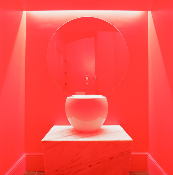
We neutralised the supporting columns with the help of mirrors. The company owner purposely selected vintage handles at an antiques market in Paris and also purchased a French fireplace from the nineteenth century.
What do you see, what does the project look like?
The office looks like how one would imagine the apartment of director David Lynch to appear.
What makes this project/your approach/your solution special?
1. Minimal association with an office.
2. An emotional office that combines very different aesthetics.
3. The office excites employees and impresses clients.
Please outline any challenges of this project and how your team overcame them.
It was difficult to combine such a large number of components into a balanced interior without overloading it. It’s always very interesting to work with the different textures and styles, but it’s also quite complicated. In addition, the task of successfully integrating functions into such an emotional interior presented a certain challenge. Our team handled all of this successfully.
Proekt Agency
ICEOFF
