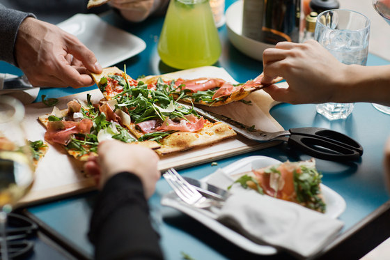
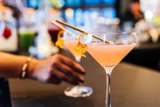
Pizza! Always a delicious slice of memory. Of Italy. Of sun, espresso, the Vespa. Of the unique Italian instinct for lifestyle and dolce vita. Marché International tunes into this attitude towards life with its new restaurant concept, reinventing the pizza with White Monkey. To underscore this unconventional approach, the internationally aligned restaurant brand clearly positions itself as a pizza lab and bar: ingredients are combined in unusual ways; the pizzas are long instead of round, they are cut with scissors and shared amongst friends; the pizzeria becomes a cocktail bar, an urban meeting place that is open all day.
In the constantly expanding yet fiercely competitive market of system gastronomy, it is crucial to do more than just present a coherent restaurant concept. With a Corporate Design that comprises not only interior design, but also the complete brand communication from logo to restaurant décor to website and social media presence, we have created a consistent and remarkable brand image for the White Monkey brand – with interdisciplinary thinking in place of salami tactics. Marché has a passion for quality and freshness. We translate this passion into a visual and spatial identity, which interprets traditional roots in a contemporary and modern way, drawing them firmly into the here and now.
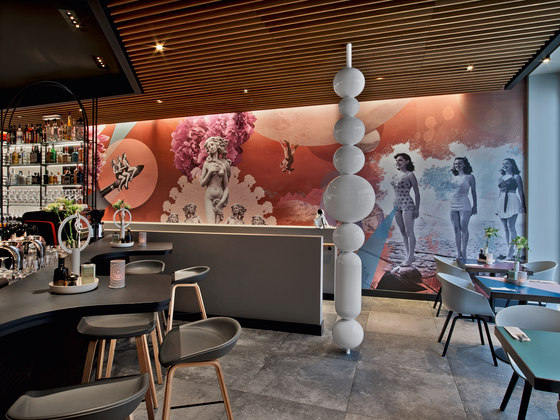
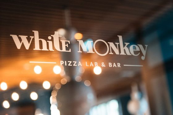
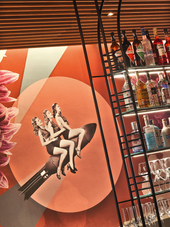
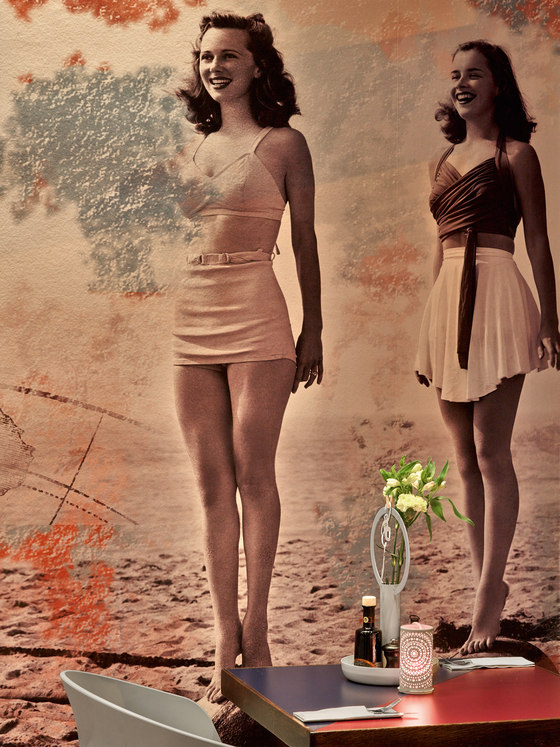
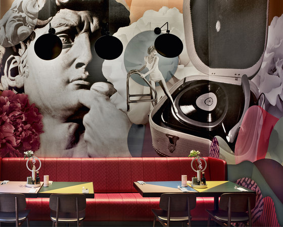
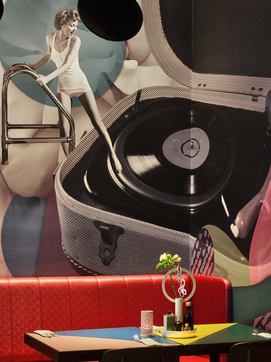
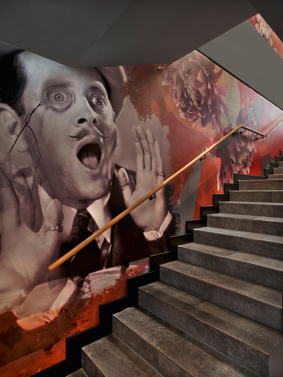
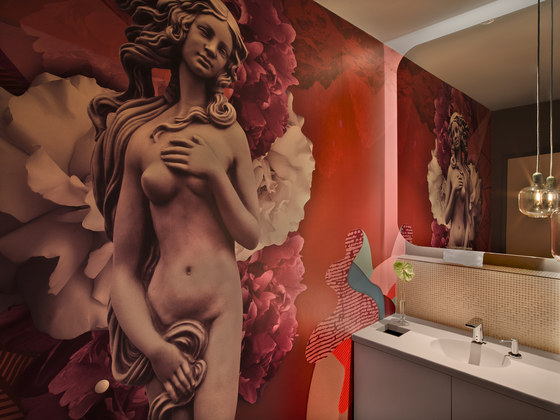
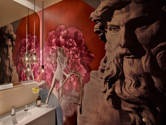
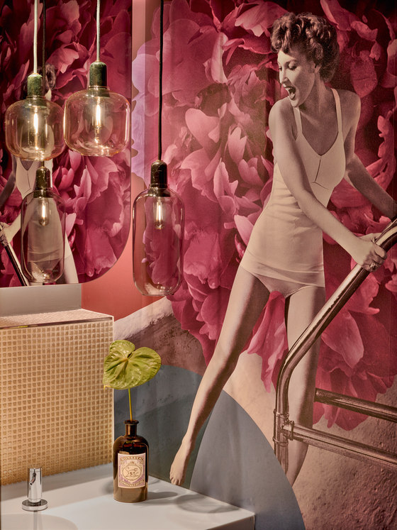
The White Monkey philosophy is already reflected in the logo: trusted memories are replenished with new elements and condensed into a collage. The combination of a classic serif font with a monkey topping the O and a modern font produce a striking visual appearance. The palette of corporate colours features warm rose, red and earthy tones, reflecting traditional Italian culture. Their combination with blue and yellow tones creates a cultivated tonal balance. Wall-filling collages pick up the past through nostalgic motifs, before transposing them into a modern, urban context through oversize flower motifs, colourfully abstract forms and elements of the surreal.
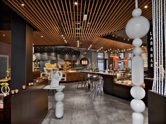
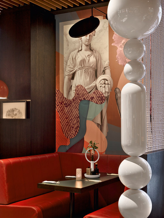
The same applies to the large billboard, a nod to the simpler advertising media of times past, which conveys White Monkey philosophy through tongue-in-cheek slogans. This mixture of traditional and novel elements runs through the entire material, colour and design concept. The materials used are earthy ones, and their tactile nature and tonality succeed in drawing the Italian lifestyle into the space. Acting as a modern antithesis, many oversized chains of pearls are distributed throughout the space. These are formed by different sizes of spheres and ellipsoids, and reflect the form of a pizza.
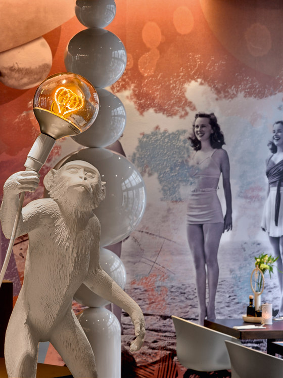
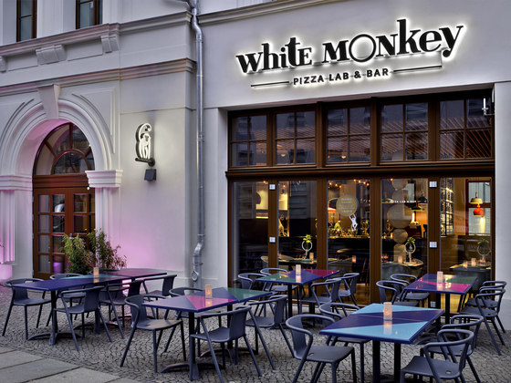
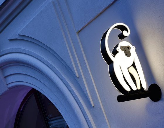
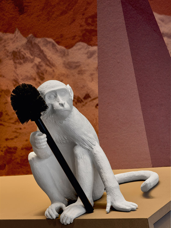
These chains of beads are repeated in the table legs at the bar, in the filter elements, as well as in the wallpaper that was specially designed for White Monkey, in which the abstract forms are transferred into a two-dimensional design. The figure of the eponymous white monkey, that turns the conventional world of pizza on its head with a cheeky twinkle of the eye and fresh ideas, presents itself as a friendly brand ambassador. It greets the guests as a neon sign on the outside façade, before reappearing in different guises inside: as an occasional table, lamp or signpost. As a trusted yet often perplexing element, it accompanies guests throughout their visit – even into the toilets.
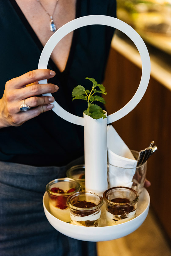
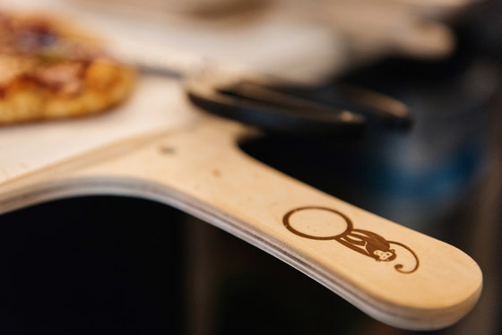
The monkey can be found as a logo on glasses, carafes and bread bags, while monkey-shaped business cards invite you to play with the friendly brand ambassador and taken it with you. Pizza boards and menagerie were also specially designed for White Monkey. The shape of the menus resembles pizza boards; the wall collages are referred to in the graphic design.
We have consistently implemented the branding for all further communication media such as invitation cards, posters, advertisements, website and social media channels. White Monkey is a lusty, lively and often crazy concept with an unusual, almost surreal design and an integrated brand image that focuses on indulgence, lust for life and pleasure in being together.
Everybody knows it, everybody loves it: pizza. Think of a pizzeria and you’ll immediately have a familiar picture and set of emotions in mind. Memories, colours, smells are all conjured up in our mind’s eye. The concept of White Monkey Pizza Lab & Bar for Marché International plays with these familiar elements, while lifting pizza into a whole new dimension: high-quality ingredients are combined in unusual ways; pizzas are long instead of round, they are cut with scissors and shared amongst friends; the pizzeria becomes a cocktail bar.
The design concept makes use of trusted recollections from our collective memory and combines traditional and modern elements to create a surprising story with a tantalising twist. The target audience is one that loves Italian food and the Italian lifestyle as much as it relishes new culinary delights and great cocktails. The name White Monkey and its eponymous symbol create a brand identity that sets surreal and abiding accents in an otherwise familiar world of Italy and the Italian lifestyle. The monkey makes its first entrance as a neon sign on the façade.
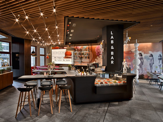
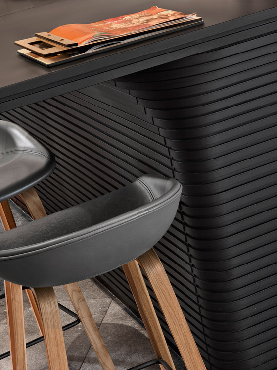
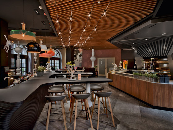
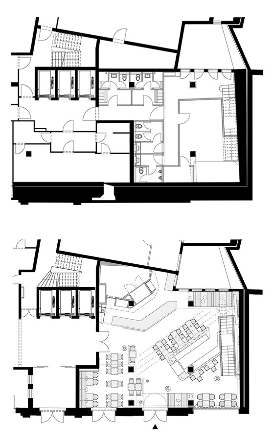
This symbol accompanies guests through the space as a recurring element – popping up as an occasional table, lamp, paper tag or signpost. Upon entering the restaurant, your gaze is drawn to the pizza oven as the centrepiece of the room, as well as to the opposite dining bar. The latter provides the ideal casual setting to meet for a cocktail or a plate of Mediterranean antipasti. The counter of black saturated and lacquered MDF appears to emerge from the floor and grow upward as an organically shaped landscape.
The conjunction of traditional, familiar and modern elements runs throughout the material and colour concept. A ceiling of wooden lamellae fans out from the entrance area above the entire space. Chains of festoon lighting distributed across the ceiling and a rough tiled floor underfoot come together to evoke memories of balmy summer nights in Italy, spent drinking wine under the stars. The ceiling lines reappear in a graphic leading to the stainless steel pizza oven, which concentrates your gaze upon the mouth of the oven.
Pizza ingredients are presented on a wood veneer counter, as White Monkey stands for top quality and exceptional freshness of all its products. This is where pizza is reinvented, using unusual recipes and fresh ingredients from all around the world. The room is zoned by means of incisions in the lamellae ceiling and the zoning is underscored by white, exceptionally shaped pillars at various points throughout the room. These are formed by different sizes of spheres and ellipsoids, reflecting the shape of a pizza, and strung together to create giant chains of pearls.
The pearl chain motif is repeated in the table legs of the bar and in the room dividers. The same visual idiom can also be found as a graphical motif on the walls and in the communication media. The colour concept uses warm pink, red and earthy tones to radiate retro charm, thus creating a link to traditional Italian culture. Wall-filling collages pick up the past through nostalgic motifs from 1950s Italy, before transposing them into a modern, urban context through oversize flower motifs and colourfully abstract forms.
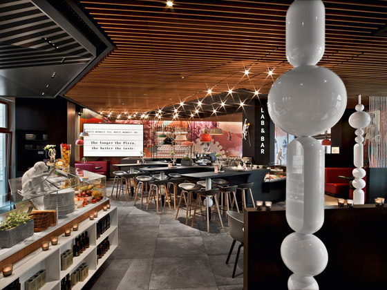
The same applies to the large billboard – a nod to the simpler advertising media of times past – which conveys White Monkey philosophy through tongue-in-cheek slogans. It is also an integral part of the lighting concept, which generates the right atmosphere at all times of day through a targeted use of different lighting sources: from an illuminated monkey and various pendant luminaires to strings of lights. A differentiated range of seating coordinates with different times of the day – from breakfast to bar service.
The dining bar offers a laid-back setting, while more intimate moments can be savoured in the red leather-upholstered booths, which provide sufficient space for small groups or couples. Small square tables cater for informal meals in groups of two or four. Guests visiting White Monkey dive straight into a world of traditional Italian moments and images, recombined with modern elements such as white pillars and pearl chains in new and unexpected ways. The sensuality of the Italian lifestyle is rendered tangible and familiar. At the same time surreal elements and the unusual mix ensure moments of surprise and an utterly unforgettable experience.
Ippolito Fleitz Group
