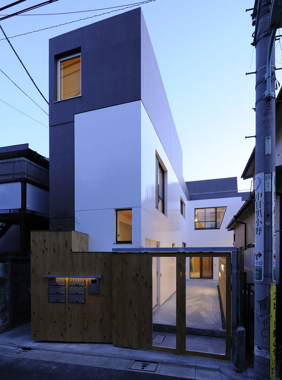
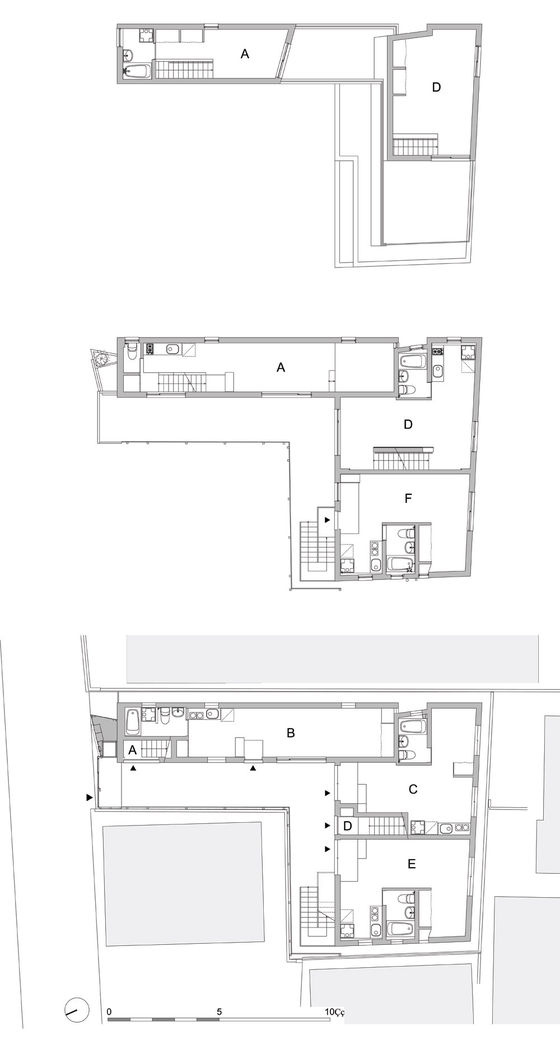
Yutenji Apartments is located in a dense residential area of Tokyo. L shaped site is surrounded by small houses except the tip of the L. Yutenji Apartments had a task to use maximum volume and floor permitted as an apartment complex for rent. More floors, more rent come in.
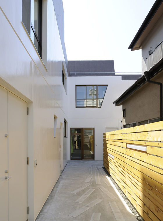
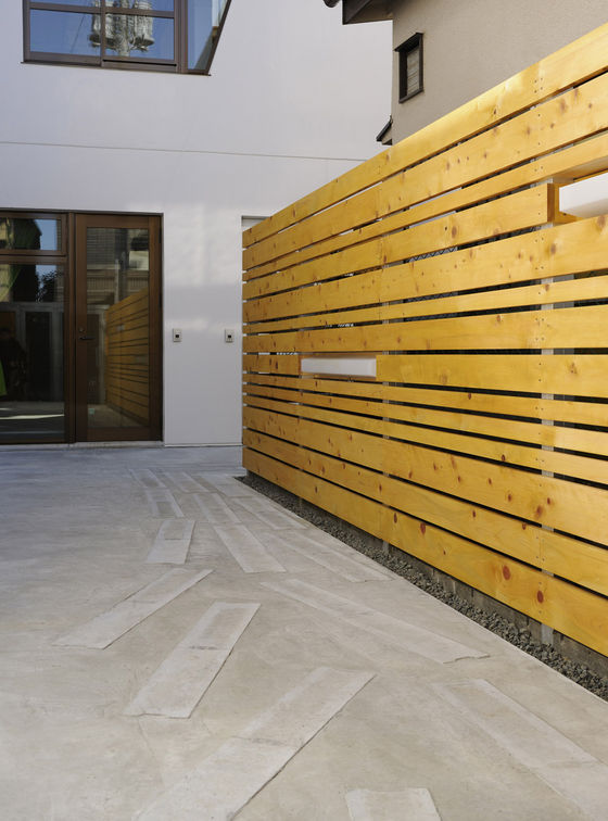
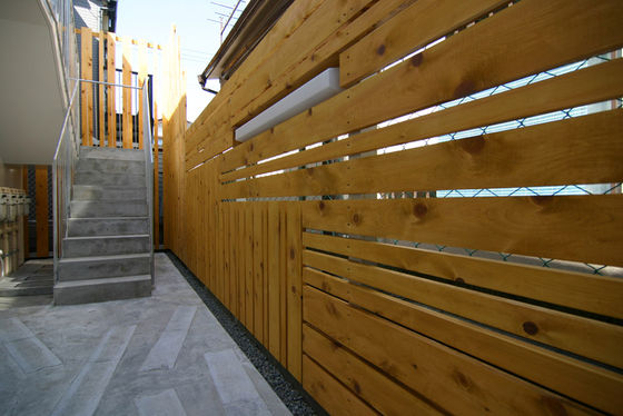
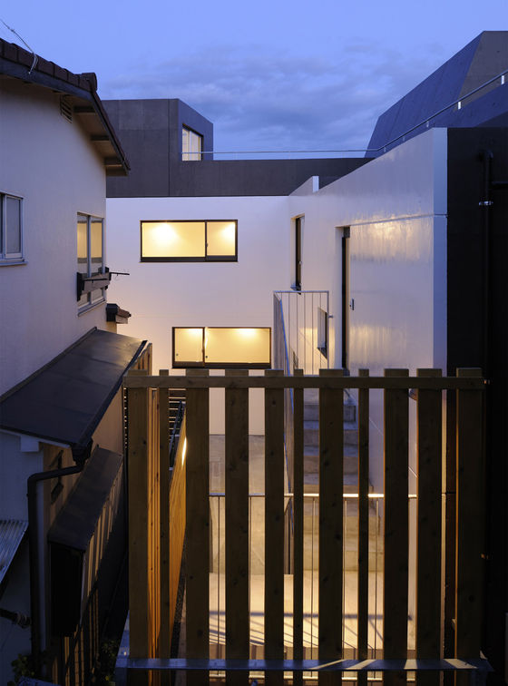
The inside of L is a 2-meter-wide passage on the premises. The rest is the volume of the building. The walls facing to the passage is painted in gloss white up to 2nd floor to concert with 2 storied neighborhoods; a comfortable aggregate of small houses. This bright color welcomes people also. In addition the elements on these white walls were designed in individualistic way. The expansion joints on the surface of concrete walls were irregularly placed and some window frames had non-rectangular shapes. 6 individual entrance doors were chosen out of descent needs of each dwelling unit. In addition artistic pattern were marked on the passage surface with ditch covers. As a material of the border fence pine wood was chosen. Wood is rare material for exterior in Tokyo, a dense city, in terms of regulations against fire. However by limiting the using part to the fence wood was applicable. This rare material in the city became a charm of Yutenji Apartments. At the end the designs along the white walls and the passage could create open and welcome atmosphere on the passage as if a front yard of a gallery or a small library. This openness of the passage also has effects to lighten the dense impression out of 6 dwelling units in a small site, 165sq.meters.
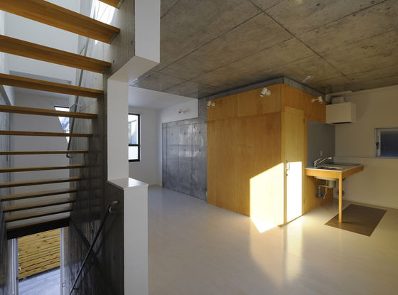
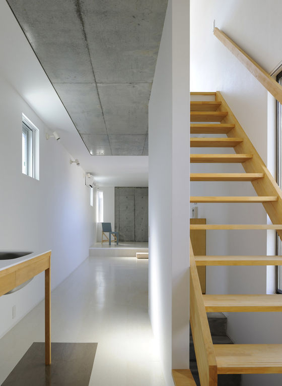
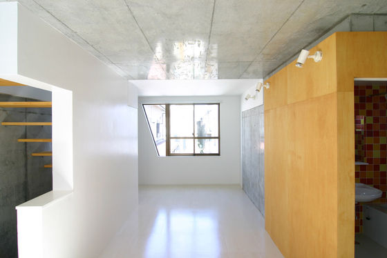
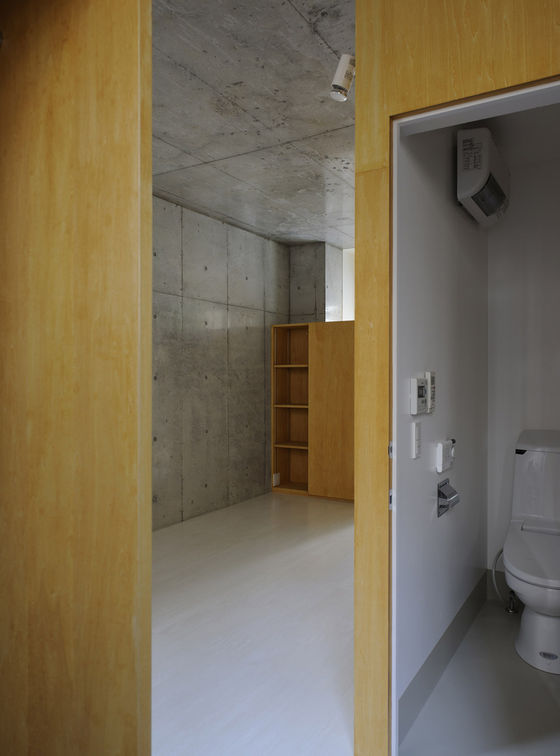
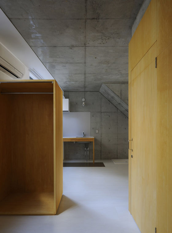
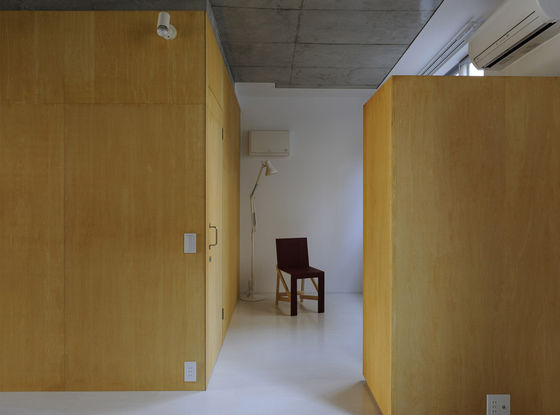
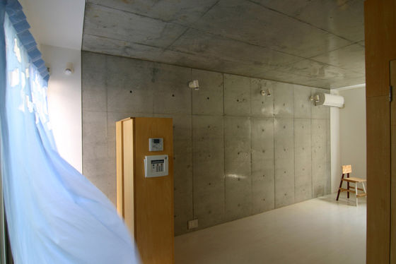
Interior is structured with two different finishes; exposed concrete and white wallpaper over insulation. The walls and slabs exposed to outside need insulations and are finished with wallpaper, and the others are not. This simple rule gives individual expression to each interior space.
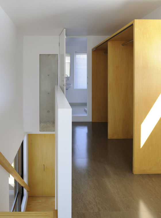
The appearances of bathrooms were designed as wooden boxes with plywood. These wooden boxes and the wooden fences of the passage visually connect interior and exterior. By connecting to the open exterior space the oppression out of units’ boundary is weakened and the interior could have more relax atmosphere in spite of its smallness (about 30sq. meters per dwelling unit).
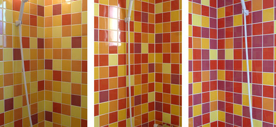
The inside of the bathroom was partially tiled. 5 colors were chosen; light yellow, yellow, orange, red, and russet for tiles. By differing the combination of colors the impression of the bathrooms were gradually changed from the yellowish of the 1st floor to the russetish of the 3rd floor. These colored tiles brightened bathrooms where the only closed room of each dwelling units.
