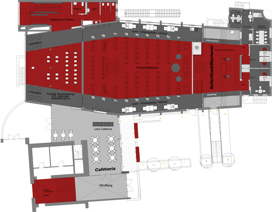
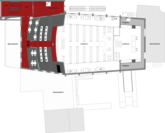
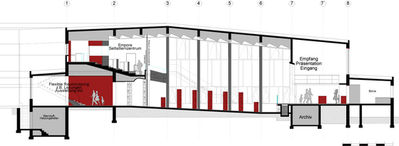
The basic concept of interior design is a high degree of transparency.
A sense of vastness, space and effortlessness is designed to make spending time in a library, in a self-access learning centre, an enjoyable experience. The use of intense colours creates an upbeat atmosphere.
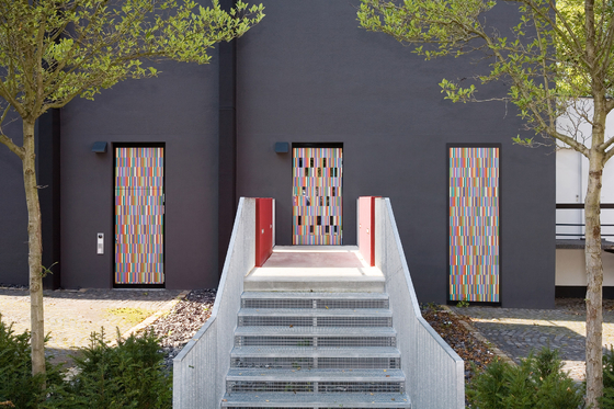
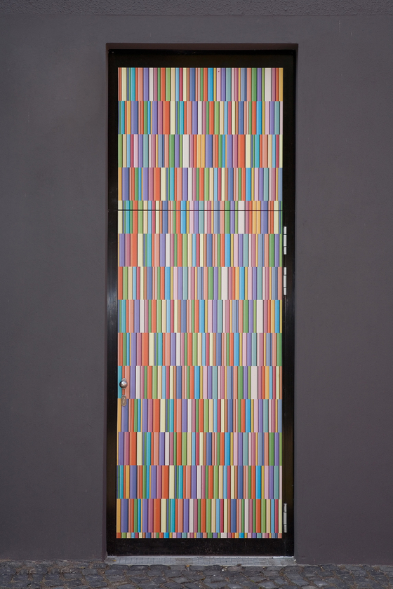
The Schulstadtbücherei is approached via a narrow set of stairs that lead straight to a colourful book spine. With its narrow, vertical opening, the ‘book door’ symbolises the so-called ‘refilling of the shelves’ when a book is returned by the reader.
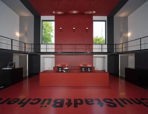
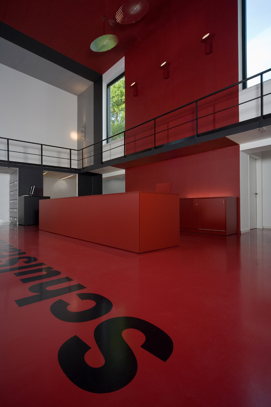
Users are guided to the ‘stage’. The area that was once a stage is now the reception, behind which lie the administrative offices. The stage is a place where visitors experience the full magnitude of the library and where they can get their bearings.
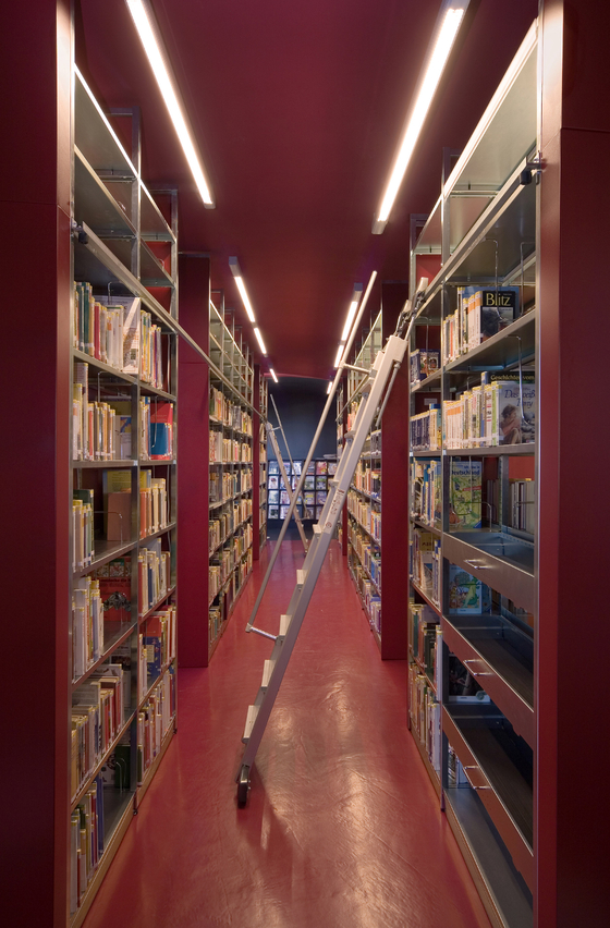
The feeling of being at eye level with the approximately 30,000 media units is designed to inspire and encourage users to rise to the challenge.
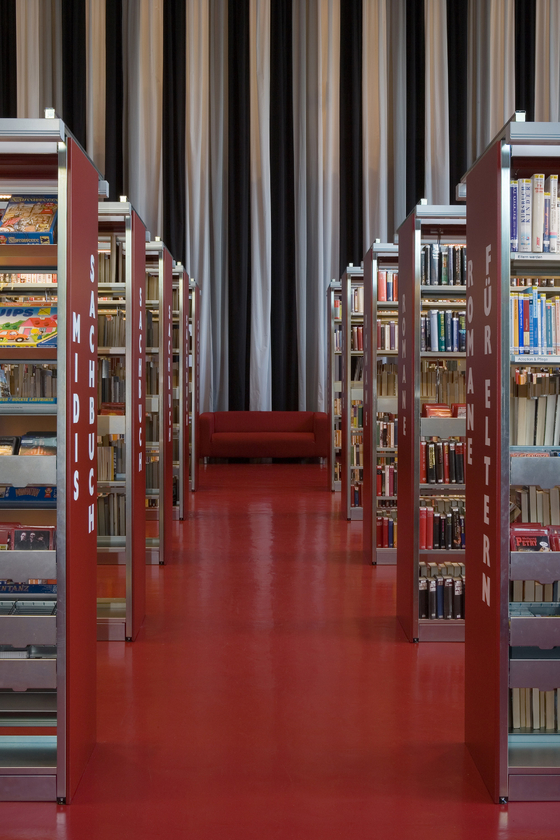
The shelves constitute the central point and form a ‘red band’ that runs through the space in a consistent, linear, rising and arranged contour. To the right and left of the band are the main walkways, with the corresponding functional areas. These include: reading desks, cloakrooms, book return points, photocopiers, new releases, special topics, features and so on. These flanking functional areas are essential to guarantee a seamless flow of use. The ceiling creatively borrows the ‘red band’ and forms a ‘room with a room’.
Visual links and centre points help the user to find his bearings, aided by coordinated typography and graphic art. Panels of colour define the transitions between areas and routes.
The self-access learning centre in the gallery is set out like an auditorium. It forms part of the overall concept and has the same creative feel.
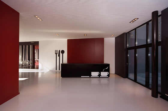
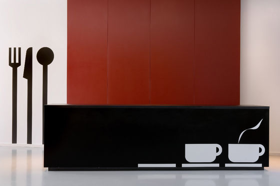
Each individual area of the ‘Schulstadtbücherei‘ overall concept, whether it be the reception, the library section, the fluctuating public area, the cafeteria, the reading area or the self-access learning centre, primarily represents communication between people of all ages.
One of the driving forces behind this interior design composition was to make this ‘place of knowledge’ a popular destination because of its atmosphere. Our aim with the space was to generate enthusiasm, motivation, surprise and inspiration.
The key objectives for the design shown here were:
1. To maintain and increase competitiveness.
2. To create a uniform image.
3. To develop essential flexibility within a skeletal structure.
4. To produce an ambience that would motivate the staff.
5. To create a hotspot for students, citizens and friends of the town of Arnsberg.
In short:
We have provided, on behalf of the town and the school, the spatial platform and spatial quality to ensure that future activities on this site are successful and can be focused on specific target groups.
Stadt Arnsberg, Rathausplatz 1, 59759 Arnsberg
KEGGENHOFF I PARTNER
