The Swedish Candy Shop is a modernist interpretation of a traditional candy shop that specializes in high quality sweets from Scandinavia. The project was born from the clients’ memory of visiting local candy shops with neighbors and friends on weekends as a child. As a tradition, Swedish children receive a weekly allowance and typically spend most of it on ‘lördagsgodis’, meaning ‘Saturday sweets.’ The Swedish Candy Shop welcomes families and tourists alike, showcasing a vast selection of natural sweets while exposing Vancouver, BC to this delightful Scandinavian tradition.
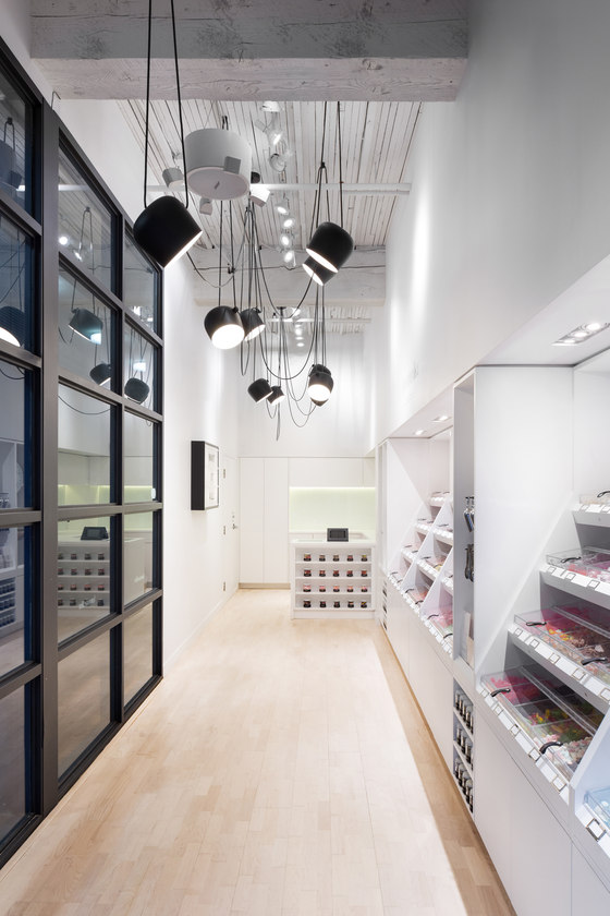
Located in an old railroad warehouse building in Yaletown, the shop finds itself situated within both a thriving urban neighborhood and a historical industrial area. The shop’s long and narrow floor plan and existing open timber framing provided the opportunity to highlight and respect the character of the building through the decision to expose the massive timber columns and joists in the space. Respecting these existing elements not only allowed the ceiling height to increase, but also allowed the shop to connect to the rich built history of the neighborhood.
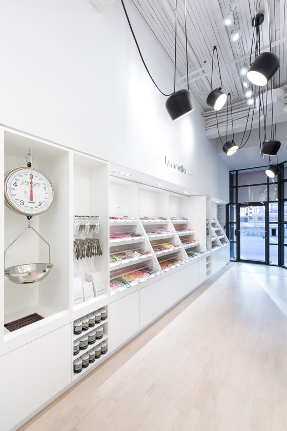
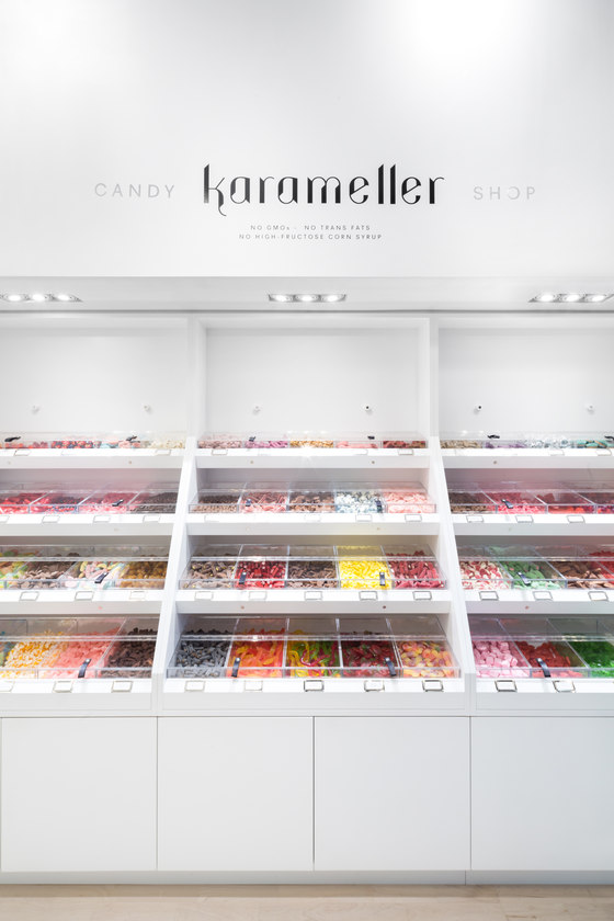
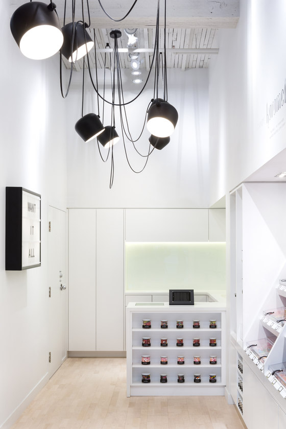
Driven by the attention to detail that is commonly found in contemporary Scandinavian design, the project was conceived of as a celebration of the product – a minimal intervention focusing on a colorful candy display. As such, a long bank of custom casework is the singular design feature in the space, and intended to interpret the compartmental design of classical apothecaries and the medicinal assemblage of Damien Hirst’s installation Pharmacy. Contrasting the whimsical and bright colors of the candy, the shops all white interior allows the space to feel pristine, bright, and airy. The challenge in creating this type of atmosphere within such a small space was to not overcrowd the shop, but rather to focus on the detailing of a singular casework element as the main intervention.
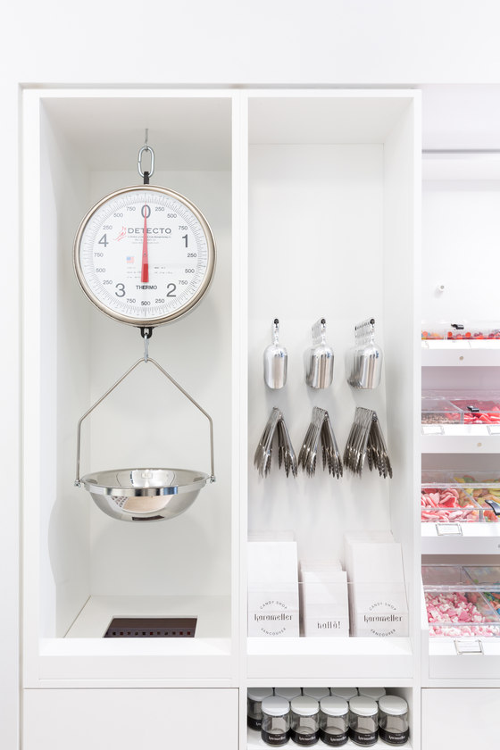
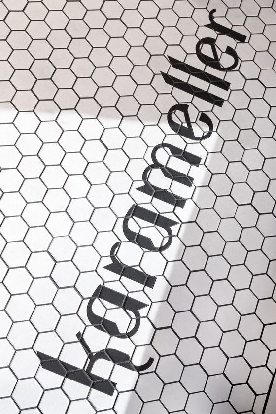
This one element is articulated to provide all the necessary products and equipment, such as tongs, scoops, weigh scales, point-of-purchase equipment, cleaning equipment, and work surfaces, for the daily operation of the store. Careful consideration was given when studying the height and depth of the casework, the size and angle of the custom acrylic candy boxes, and the magnets that allow them to be held open. The design facilitates the desire for people to create their own unique candy bag from start to finish – customers select, bag, and weigh the candy themselves. Additionally, high performance lighting and custom tile add subtle, yet complimentary elements to the minimalist design. The custom white hex tile in the entry features the shops name, while the timeless lamp fixture combines crisp industrial minimalism with a plantlike, organic arrangement in design, bringing additional character to the stark, Scandinavian-inspired interior.
Leckie Studio Architecture + Design
