Photographe : Gregor Ramaekers

Photographe : Gregor Ramaekers

Photographe : Gregor Ramaekers
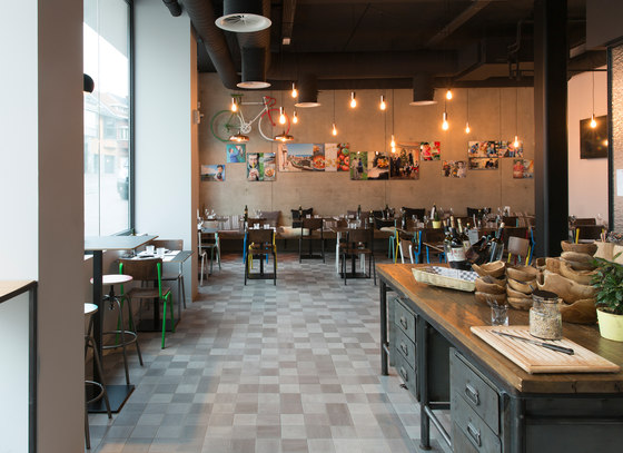
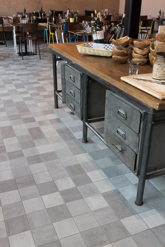
Peppe Giacomazza has become a well-known resident of Flanders. He made his name with La Botte, his Italian restaurant in Genk, Belgium, that serves top-flight Italian food. Not long ago he opened his second restaurant, Peppe’s, barely 50 metres from La Botte. It is an entirely different concept, but of course it features the same delicious Italian dishes, because Peppe himself dons his apron and strides to and fro between the restaurants. Massimo Pignanelli of UAU collectiv designed the interior. ‘A common feature of all our architectural designs is that we don’t want to reveal everything immediately. We want the user to go on a journey of discovery through a building. Walking from room to room, the visitor experiences different atmospheres. Furniture and the products on display, as well as the materials used, such as the 15 cm x 15 cm Blend & Scenes tiles from Mosa, contrasting sharply with the concrete floors and walls, all make their own contribution.’
Tailor-made approach
‘Our firm of architects works for a range of sectors in the Netherlands and abroad. We design exclusive homes and catering establishments, draw up master plans, carry out project development, and also design interiors such as at Peppe’s. That varied range of different daily tasks means we can always approach our work in a different way. That has an inspiring effect. At UAU we never start work immediately. First we listen to the clients. We genuinely make time for that, because we want to provide the right answer and in each case offer them more than they actually ask for. Even if we do so unconsciously, we always pursue something new, something different. In our view, every question deserves a different answer. In that sense we have no specific signature. We don’t want to copy ourselves. In fact, that attitude is precisely what I experience from Mosa. Those people listen to their customers and share ideas. They win them over with their approach and feeling for design. They develop a tailor-made solution for each customer and go the extra mile in delivering their service. That’s where we see eye to eye with them; we apply the same fundamentals in our approach to clients.’
‘We don’t want to reinvent the wheel, but we do want to update it.’
Italian homeliness
‘Peppe Giacomazza’s concept is very distinctive and based on the homeliness of an Italian family. It’s a bistro, a brasserie, where you enter and are welcomed into a kind of living room. It’s a place where you can also buy the products which Peppe himself uses in his kitchen and which you can therefore also eat there. From the living room you move through to the central part, the focal point of every Italian house – the kitchen. It’s the place where everything happens and where the whole family comes together, to talk and share joys and sorrows. Behind the show kitchen, where you see the chefs at work behind glass with an undulating relief, is the dining area, the final destination. By making the kitchen central, each area, and of course each guest, is permanently in contact with what’s happening in the restaurant. They form part of the whole. It’s a connecting element.’
Architecture is a sideshow
‘The starting point for Peppe’s was that I wanted to create a sober black, white, and grey framework. After all, Italian products are very colourful. The white pasta with the red tomato sauce and the green basil, wine with its labels…that already brings in a lot of colour and vibrancy, so you shouldn’t impose yet more variety. It will just become chaotic. By designing a calm environment, it was possible to add accents with the tiles, coloured chairs, and products on sale. I believe that’s what it should all be about; what a business has to offer should be at the centre. It shouldn’t be about the architecture. Architecture is a sideshow, a setting that showcases those products. Or as a guest at the opening said to me, “From something very new, you’ve made something very old.” That’s a nice compliment; the perception that something’s already been in use for 100 years. That it belongs, and is natural and supportive.’
‘As an architect I work from inside out and from outside in. I see these aspects as inextricably linked – something that used to cause my lecturers great frustration during my studies.’
Tiles with myriad tonal gradations
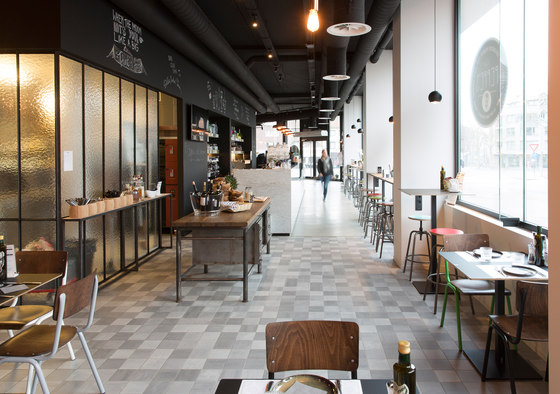
‘Peppe’s was a purely interior assignment with high visibility. This was on the one hand because the former building had enjoyed great notoriety as a ballroom, and on the other hand because of Giacomazza’s unstoppable success as a chef. I decided to use unrefined, basic materials, echoing Peppe’s Sicilian origin. The island is known for its simplicity. But also for its casalinga, or homeliness. I wanted to incorporate both of these aspects in the design. As you enter you immediately notice the light-grey concrete floor and the ceiling bristling with technology. Tubes and ventilation ducts, which we’ve had painted black, and between them bare suspended fittings that used to be found in houses. We’ve also included some antique pieces made of rough wood with metal. That gives the interior an industrial character.
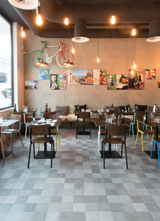
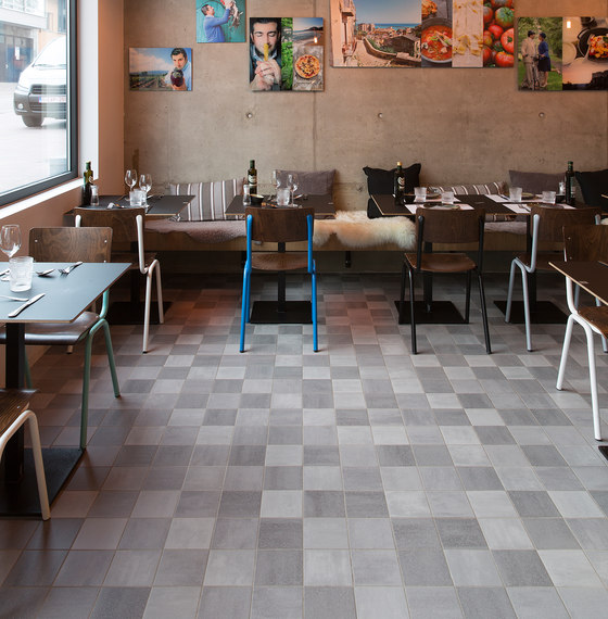
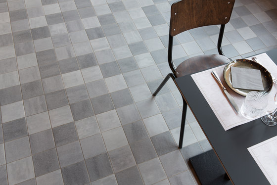
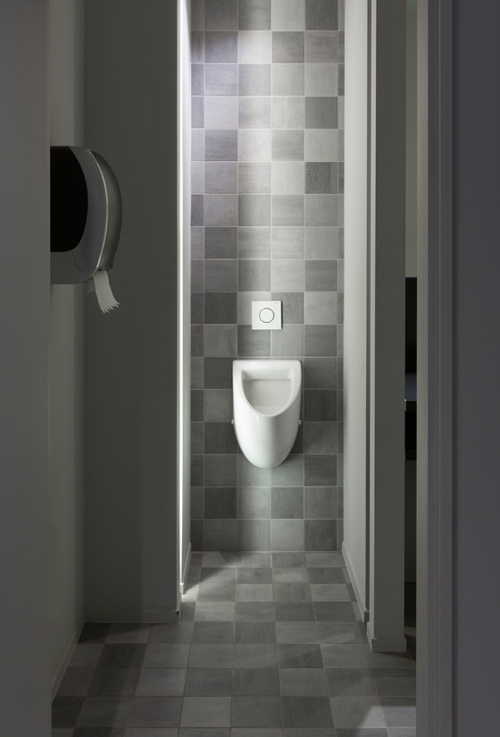
‘The bar, which is 20 metres long, is made of white Carrara marble from Tuscany. Behind it the wall is tiled with niches using the small 15 cm x 15 cm Blend tiles from Mosa. The seven colours we used in that wall – soft pastel shades of yellow, green, and blue to very bright white – form a splendid, refreshing contrast with the robust darker black and grey tones which you see as you enter. It gives the industrial image the warmth that’s appropriate for that island where products are both cooked and sold and where there’s enormous dynamism. The colours, so to speak, draw you towards them. We were keen not to use any large tiles, because they would be too businesslike and would not convey a homely feeling. We wanted to provide a visual stimulus. A cacophony in sobriety, if you will. We also used that small-format tile on the floors of the dining area, together with the exclusive Scenes tile, which has a gradual colour gradient and is suitable for intensive use. Here we opted for different shades of grey, in some cases tending more to black. We then added accents with the wooden chairs with coloured metal frames. In the bathrooms and kitchen we even went for a combination of tiled floors and tiled walls, but by deliberately using different materials on the floors and walls of each part and varying them in the format – concrete floors and tiled walls at the front and in the central area and tiled floors and concrete walls at the rear – we were able to draw clear lines. You see where the bar stops and where the kitchen and dining area actually begin. You immediately get a different atmosphere. And that means the customer can actually explore this space, experiencing and appraising each part differently.’
‘The curved glass and the small coloured tiles take me back to my grandmother’s kitchen in Tuscany.’
Challenge for Mosa
‘The smaller-format tiles are also wonderful to work with. They help evoke the spirit of an Italian kitchen, although the design is naturally an abstraction. The Scenes and the Blend series are both expressive, but also reliable, dimensionally stable, and of high quality. They may be a little more expensive, but for that you get a team that works with you and shares ideas, and that invites you to come and see the factory to examine all the possibilities. Personally I’d like to see Mosa producing even smaller tiles, because we often work with rounded walls, on which these are easier to use. I’ve already asked Mosa and they’ve promised to investigate. In Maastricht they always try to give a customer what he wants.’
Massimo Pignanelli of UAU

Photographe : Gregor Ramaekers

Photographe : Gregor Ramaekers

Photographe : Gregor Ramaekers

Photographe : Gregor Ramaekers

