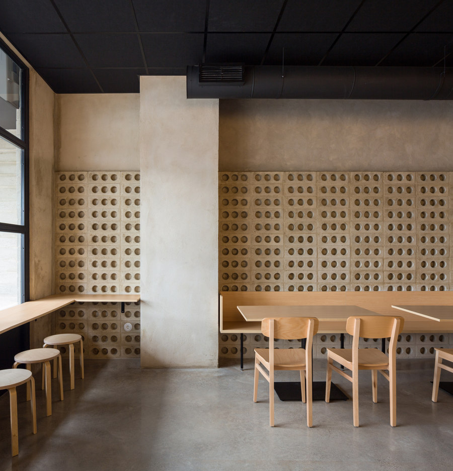
The commission of a family of Chinese origin with several generations dedicated to restaurant business was clear: to convert a warehouse into a new restaurant in the town of El Puig (Valencia, Spain). The new space would be dedicated to Asian fusion cuisine with traditional Mediterranean ingredients. The family wanted a clear, open, modern, unpretentious place where the focus is on gastronomy. In addition, the budget would be very restrained but the result had to be timeless and durable.
With these premises, Nada team has created a peaceful restaurant, with few elements where materials dialogue in an harmonious contrast.
Pure Materials
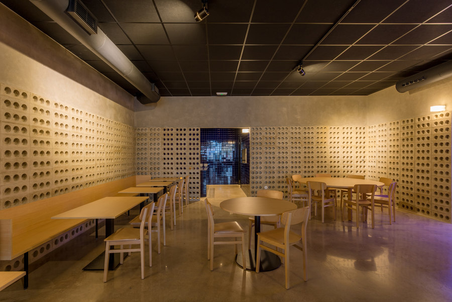
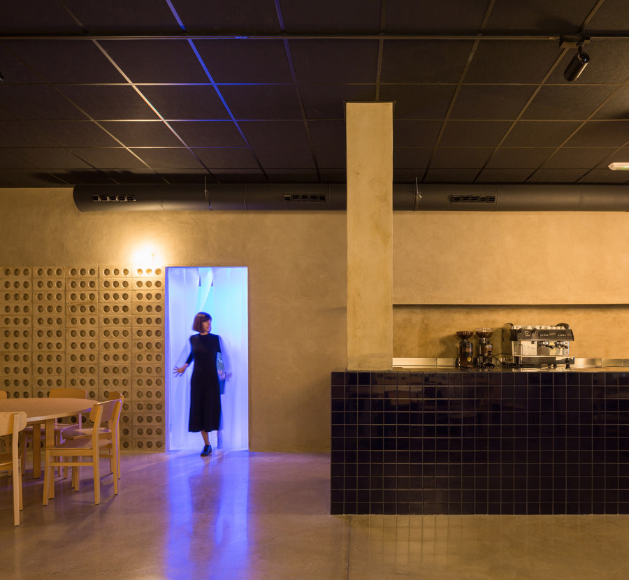
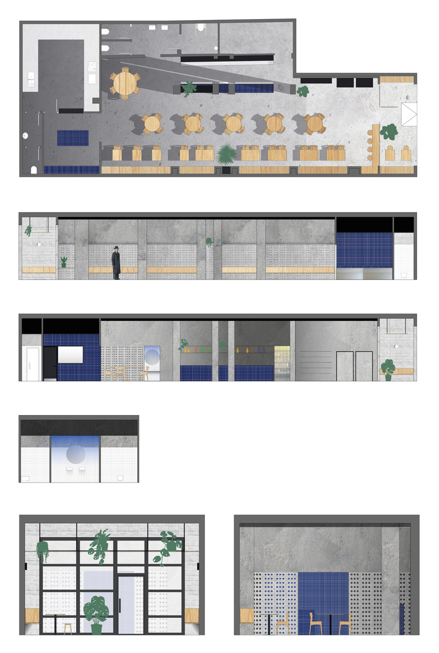
The restaurant is projected as an open space with a large central bar, a cold kitchen visible from the dining room and a transition space between the street and the interior.
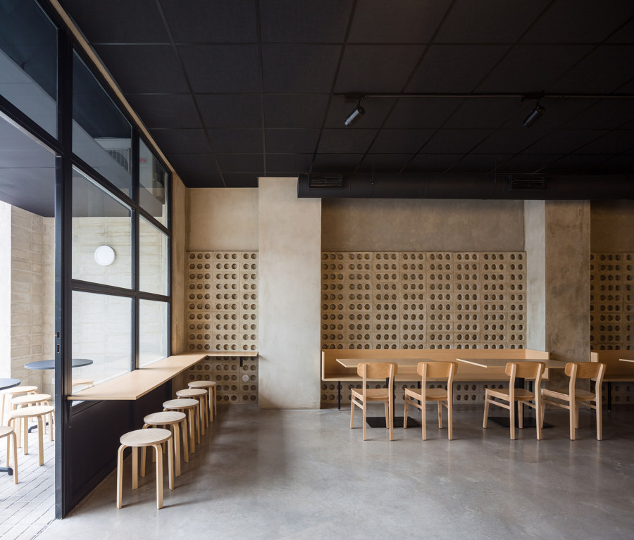
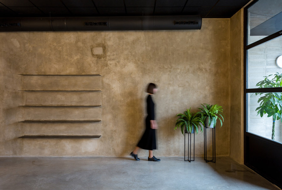
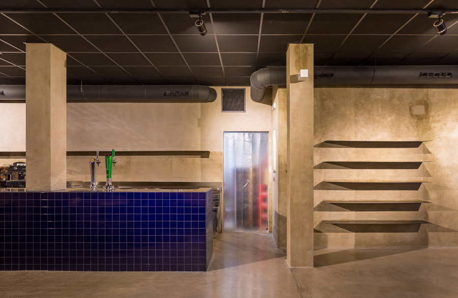
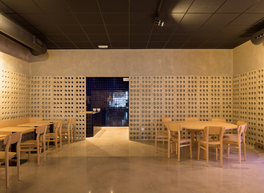
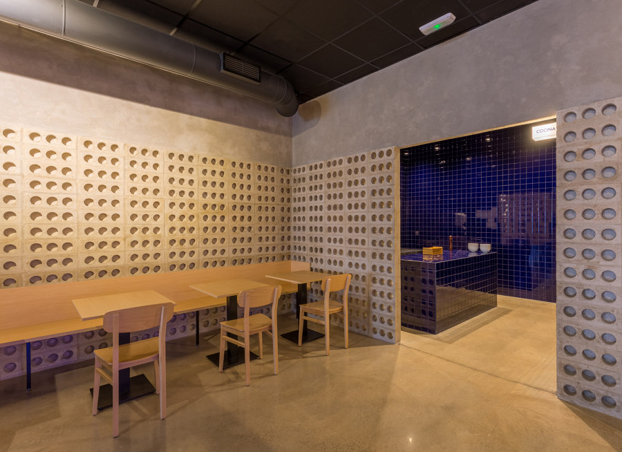
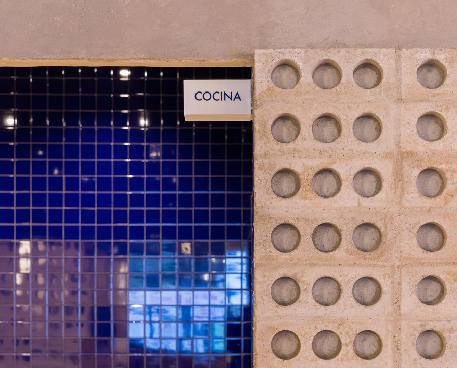
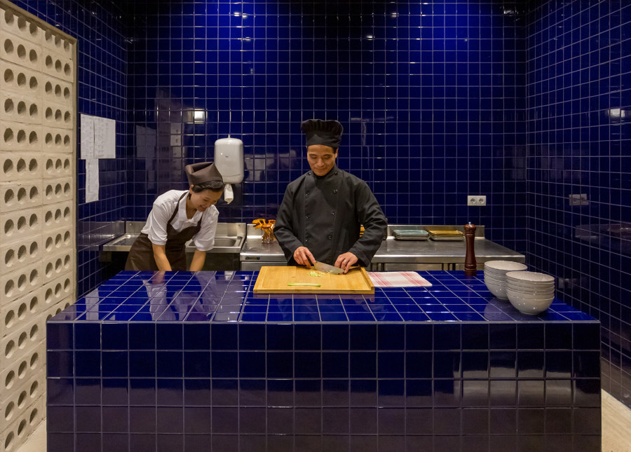
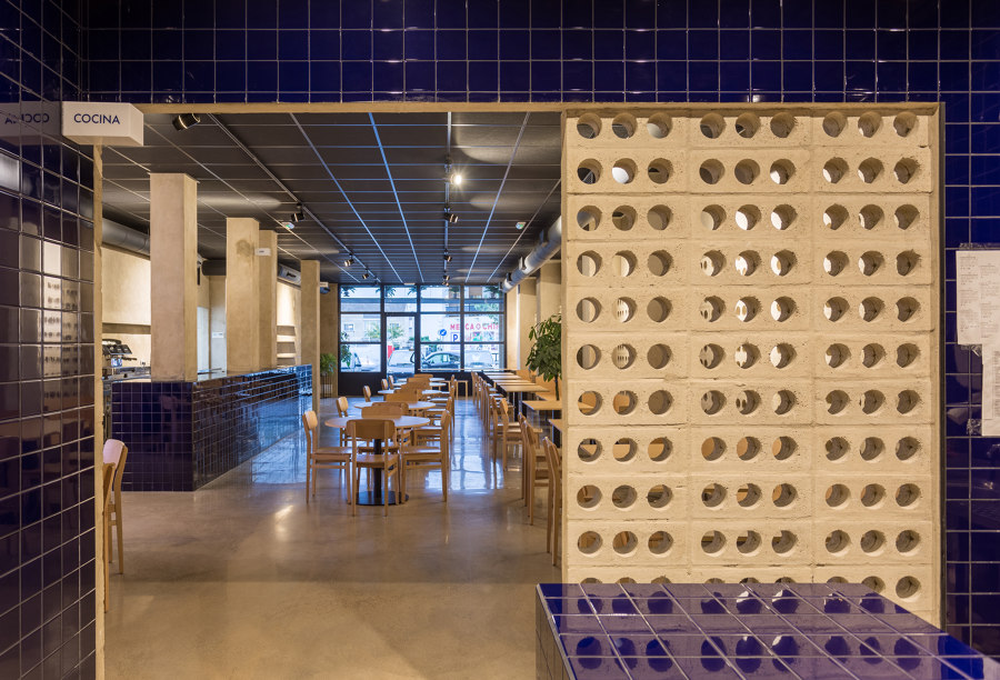
The materials are simple: cement, ceramic and wood. The open-plan space is maintained as a box with cement walls and floor. It maintains the past industrial look of the property. In the center of the open space a large cobalt blue ceramic bar emerges from the pavement. At the back of the room there is a cold kitchen covered entirely with the same ceramic tile. The effect perceived is similar to the sensation of being in a cave in the depths of the sea.
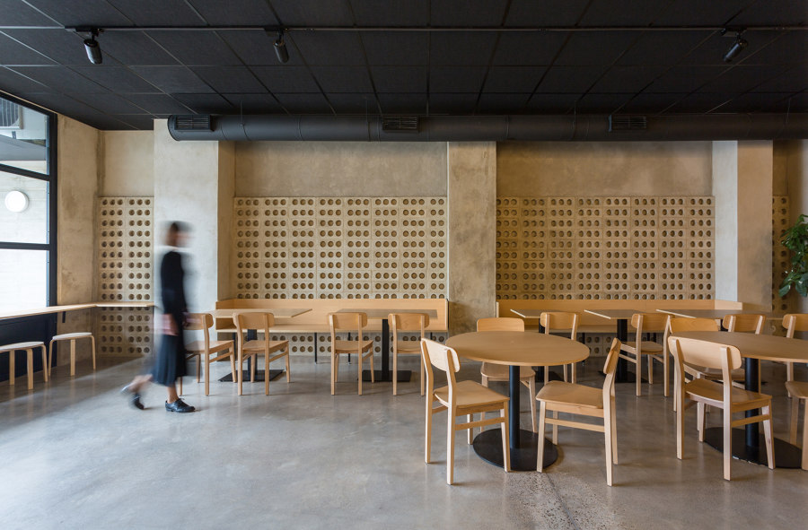
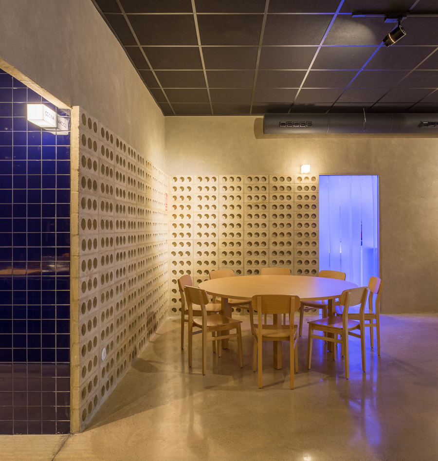
The walls have been finished in the original color of the cement and a block made from the same material that creates a truss. It reveals what is happening behind it sometimes. This is also a gesture to the typical Mediterranean architecture present in Valencia.
Warm furniture
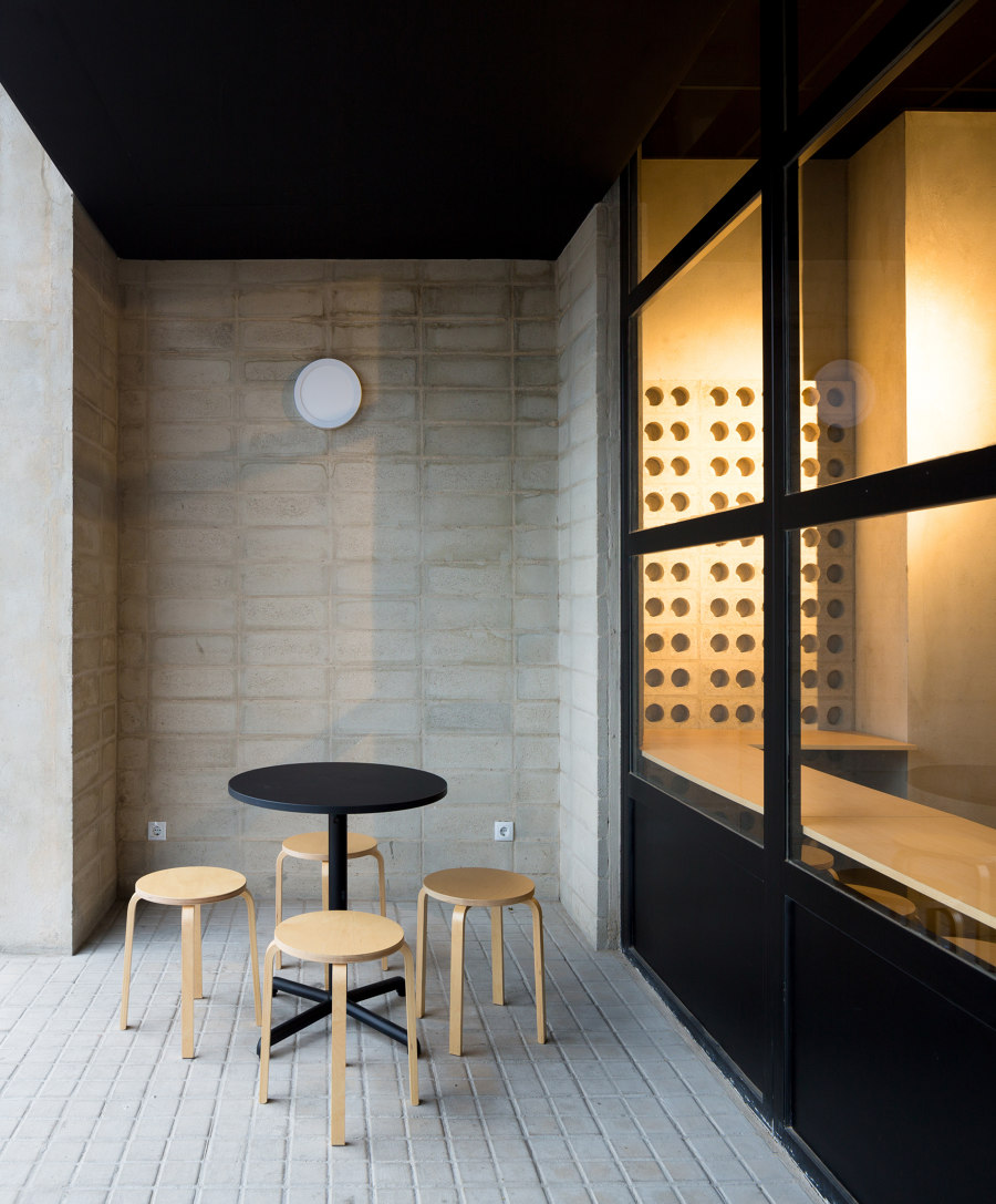
In the apparently rough box where the cobalt blue ceramic provides the color and brightness of the sea, the chosen furniture contrasts with its delicacy and softness. It also connects to the Asian personality of the restaurant by recalling contemporary Japanese architecture. Tables and chairs made of beech wood provide warmth and comfort to enjoy the gastronomy.
Simple lighting with suggestive solutions
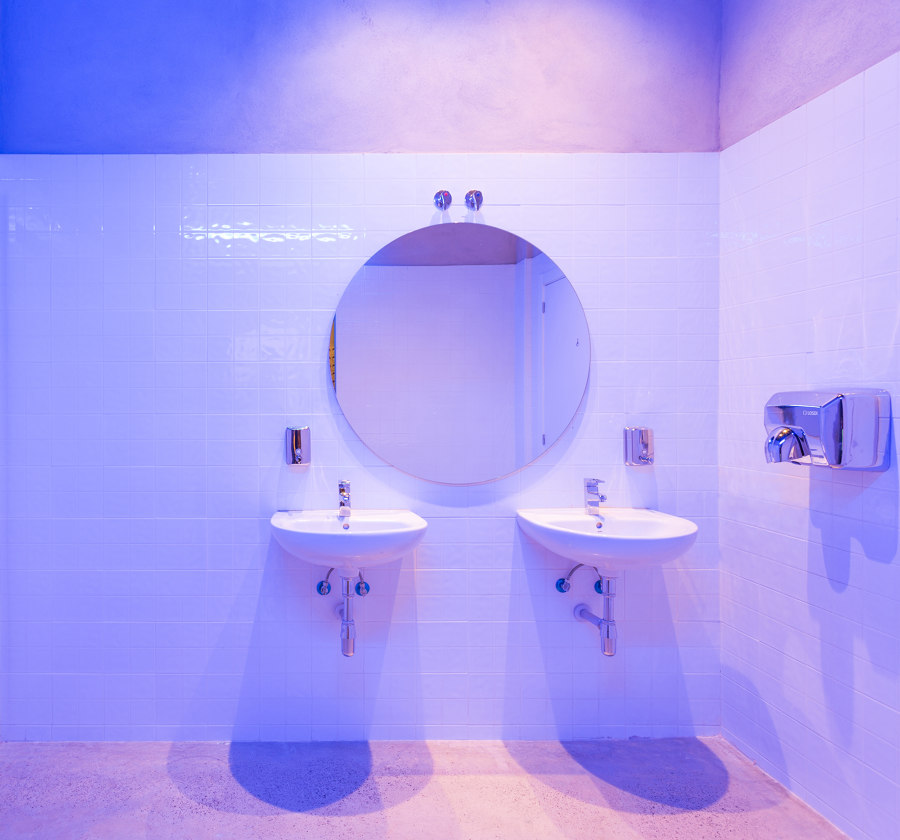
The lighting has been created by spotlight tracks that intentionally create circles of light halos on the walls, avoiding lamps that could reduce the flexibility of the space. However the team led by Borja Hernández and Arcadi Martín has taken a further risk with in the toilets. Nada have created a gradient effect between blue and violet that is reflected in the white ceramics and is perceived from the dining room through the translucent industrial curtain made of PVC slats.
They have also paid special attention to the interior signage. Backlit signs have been designed to indicate the use of some spaces and to zone the space under the suggestive halo of light.
Design team:
Nada: Borja Hernández & Arcadi Martín
Collaborator: Edu Covelo
