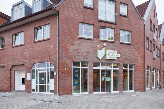
By moving to the site of a former supermarket, the library has gained more space and an exciting new room structure. The polygonal shape created a special structure of beams in the entrance area that was integrated into the architecture.

By moving to the site of a former supermarket, the library has gained more space and an exciting new room structure. The polygonal shape created a special structure of beams in the entrance area that was integrated into the architecture.
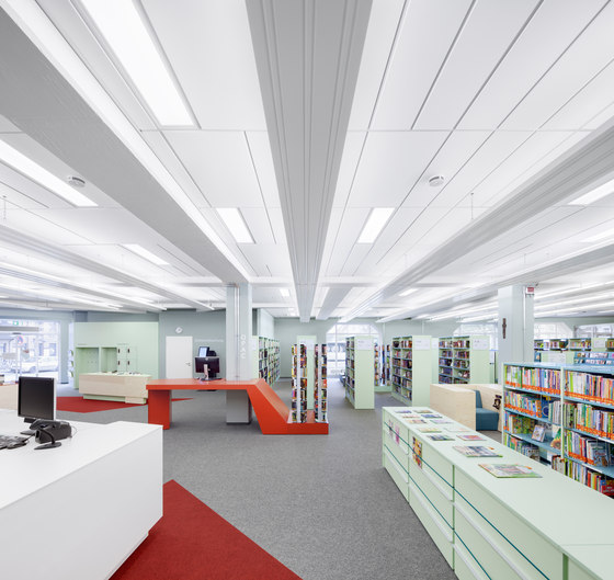
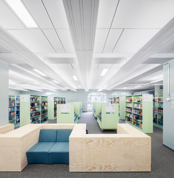
×At the rear of the library with its regular supporting structure, the variable formats of the designer ceiling combine with the beams and the suspended radiant heaters to create an image of calm and clear linearity.

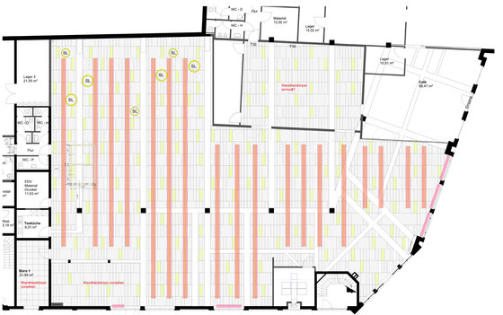
At the rear of the library with its regular supporting structure, the variable formats of the designer ceiling combine with the beams and the suspended radiant heaters to create an image of calm and clear linearity.
×St Lamberti library in Ochtrup
Designer ceiling in a modular format mix
For the conversion into a library, the structure of the supermarket originally located on the premises was to remain deliberately recognisable. For this reason, the new ceiling system does not conceal the beams but sets an accent all of its own with its creatively mixed tile formats within the supporting structure made from reinforced concrete.
Acoustics and light reflection appropriate to a library could thus be achieved with no loss of room height.
“The crucial thing is what the architect makes of it,” said Hadi Teherani when presenting the ceiling collection developed by him alongside ceiling specialist OWA. Ceilings are often conceived in a purely functional manner, but this “OWAconsult® collection, designed by Hadi Teherani” enables them to be completely reinterpreted architecturally. Instead of the usual chessboard pattern, a modular construction system composed primarily of simple shapes, patterns and geometric elements enhances the creative scope available in ceiling design. Precisely what this modular system can achieve is demonstrated by interior architecture firm UKW Innenarchitekten from Krefeld in a surprising and unexpected way through the Flexo ceiling system in Ochtrup.
Even the mandate was unusual: a former supermarket was to be converted to house the St Lamberti library. To achieve this extraordinary metamorphosis, the designers relied primarily on the furnishings, floor and ceiling to create the experience and atmosphere specific to a library. However, the Flexo ceiling with its freely combinable format mix was not employed as the single dominant two-dimensional design high up above but fits into the module of striking beams and the linearity of the suspended radiant heaters.
Visible supporting structure: regular and wild
“With a tight budget, we had to take into account deep rooms with little daylight and low ceilings in relation to the size of the room,” says Prof. Martin Klein-Wiele, describing the situation that he and Jochen Usinger, his partner at UKW Innenarchitekten, found. “Our design is based on making the architecture of the building visible and on the strong use of colours, as well as the combination of standard shelves and individually designed furniture.”
The supermarket’s biggest “legacy” was the compact room height of 3.16 m to the lower edge of the beams, which it was crucial not to reduce any further, considering the library’s size of around 700 m2. Due to the considerable spans, the tees themselves are relatively generously sized at 94 cm in height. At their level and, in some cases, through them run a host of electrical and ventilation installations that are no longer to be seen.
For that reason, the new suspended ceiling was installed between the beams to create areas of ceiling providing a room height of 3.36 m. The bottom 20 cm of the tees that remain visible support the desired concept of keeping the architecture evident. At the same time, they have an elegance – it might almost be said a filigree quality – that reinforced concrete would scarcely have been thought capable of.
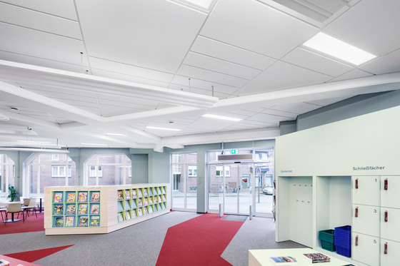
The idea of making the structure visible generates particular tension in the entrance area, where the supporting structure abandons classic right angles. Here, the building’s floor plan demanded the development of a polygonal corner solution. “The beams run through it in various directions at an angle through the room,” explains Prof. Martin Klein-Wiele. “We definitely wanted to preserve this almost wild-looking structure and use it in the design of the room. The arrangement of colour in the carpet and the shapes of the specially designed furniture are therefore based on the star-like lines set out by the beams.”
Designer ceiling: turning away from monotony
In the irregular entrance area, the special format mix of the Flexo designer ceiling collection proved a particular advantage. Instead of one unit size, the fleece-covered mineral wool tiles are available in various freely combinable formats and can be used to create individual ceiling looks and to divide rooms up according to their geometry and use. Flexo’s modular structure is what makes it irresistibly simple and is created from the formats 60 x 60 cm, 120 x 30 cm, 120 x 60 cm and 120 x 120 cm in any arrangement desired. The creativity of the planner thus breaks through the monotony of the same rectangles and squares.
The tiles are installed using the system S 15a cliq from the OWAconsult® collection and can be removed individually to provide access to the installations. So-called rebates create visible tile joints in which the restrained subtlety of the support and cross tees conveys a more high-quality impression in comparison to standard systems.
“We finally moved away from the supermarket character thanks to the ceiling with its format mix and joint look,” explains the architect. This apply both optically and acoustically. With αW/NRC sound absorption values of 0.85 (or 0.70 for the format 120 x 30 cm), the Flexo designer tiles create the quiet, restrained background noise that sets a library apart from a supermarket.
Lighting: height through light
Another legacy of the building’s previous use was the lack of daylight in relation to the size of the room. The windows in the external walls alone are not sufficient, even on bright days, to achieve the 200 lx on the bottom shelves or the 500 lx in reading areas required for a library.
The situation was similar in terms of heating. Radiators along the walls and windows were not enough on their own. However, underfloor heating would have required the floor to be completely taken up.
UKW Innenarchitekten made a double virtual out of this two-fold necessity and combined the solutions for lighting and heating. Radiant heaters are suspended around 26 cm below the ceiling. They radiate their heat downwards and fit in surprisingly well with the long formats of the Flexo ceiling thanks to their distinct linearity.
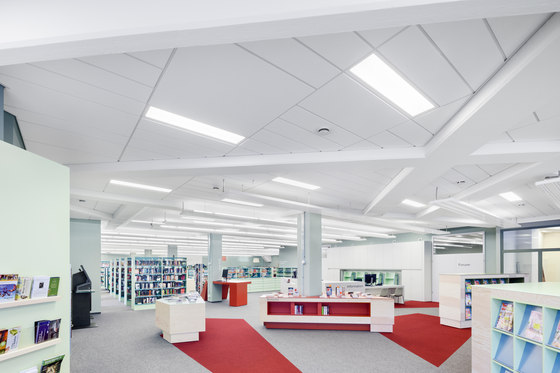
For lighting purposes, there are several direct light fixtures in the ceiling adapted to the module. In addition, fluorescent lights are to be found on the top of the heaters, which illuminate the ceiling and thus light the room indirectly. With its high light reflection value of around 87 according to ISO 7724, the white ceiling supports such lighting solutions very effectively. But when creating this indirect solution, the designers were not only concerned with lighting strength but also the aesthetic effect: “The light ceiling increases the height of the room in the human mind and creates a spaciousness that dark, unlit ceilings never achieve. In addition, the effect of the structure and geometry of the variable tile formats on the ceiling is also reinforced.
Library: a sense of well-being in the lounge
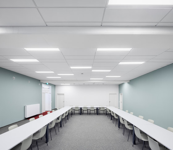
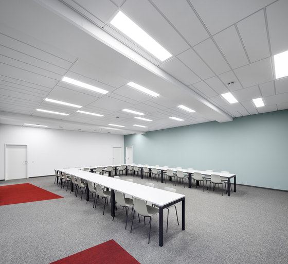
The format mix of the Flexo ceiling system can be experienced in its purest form in the separate function room, which does not feature radiant heaters on the ceiling. This room for readings and events with up to 80 people is used by the library and Caritas, which has likewise rented part of the former supermarket and runs a café there, among other things. Both institutions can be accessed separately but are also connected for cross-over use.
Alongside around 35,000 media at present, from classic books to various data carriers, St Lamberti library also offers the full range of services forming part of a modern library thanks to the café, Internet access and 24-hour automated return-point on the street front. Visitors to the open day before the start of regular lending in spring 2014 showed their appreciation of this. They were also really enthusiastic about the design and atmosphere internally, which is of course characterised by books but also offers cosy corners for children and lounge-like areas for adults to read and spend time.
Katholische Kirchengemeinde St. Lambertus
Architects: UKW Innenarchitekten, Krefeld; Jochen Usinger, Dipl.-Ing. (FH) Innenarchitekt (qualified interior architect) and Martin Klein-Wiele, Prof. Dipl.-Ing. (FH) Innenarchitekt (qualified interior architect)
Ceiling system: Flexo format mix from the OWAconsult® collection designed by Hadi Teherani
The format mix of the ceiling tiles in the event room, where the acoustics of the ceiling are of even greater importance thanks to the lack of books.

The format mix of the ceiling tiles in the event room, where the acoustics of the ceiling are of even greater importance thanks to the lack of books.
×Even deep within the room, a spacious, comparatively high-looking impression is generated thanks to the combination of direct and indirect lighting.

Even deep within the room, a spacious, comparatively high-looking impression is generated thanks to the combination of direct and indirect lighting.
×Four different tile shapes can be combined with one another in the ceiling system on a modular basis to provide scope for creative and individual solutions.

Four different tile shapes can be combined with one another in the ceiling system on a modular basis to provide scope for creative and individual solutions.
×The star-like, and in some cases completely wild, course of the beams was deliberately left visible and picked up on in the shape of the furniture and the coloured areas in the flooring.

The star-like, and in some cases completely wild, course of the beams was deliberately left visible and picked up on in the shape of the furniture and the coloured areas in the flooring.
×
