A new language for a Barbican Type 3C tower flat interior.
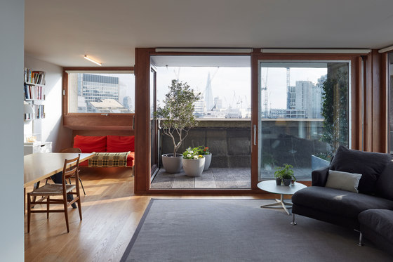
Quinn Architects, on behalf of the Director Laurence Quinn and his family, have recently completed the renovation of an Eleventh floor four bedroom Barbican tower apartment.
Introduction
The Barbican is a radical project and has been designated as a site of special architectural interest for its scale, its cohesion and the quality of the architecture. The complex is architecturally important as it is one of London’s best examples of concrete brutalist architecture.
Quinn Architects interior project is a personal study of living on the estate and due to the intensity of the design development and a desire to experiment it was decided to procure the project in an unusual way. Quinn Architects subsequently rented a workshop in Camberwell and set about designing and prototyping and manufacturing every detail in the apartment directly over a period of 9 months with only the outline designs in place at the outset of the construction.
Concept
Each element of the project has been designed, purchased and procured directly and built using two skilled craftsmen who have been central to the success of the work. The project was seen as a research exercise, were the Architects have taken the opportunity to experiment with materials, fittings and fixtures in a direct and responsive manner. Only the stainless steel kitchen workshop and the MDF two-pack polyurethane paint finishing were manufactured by external specialists.
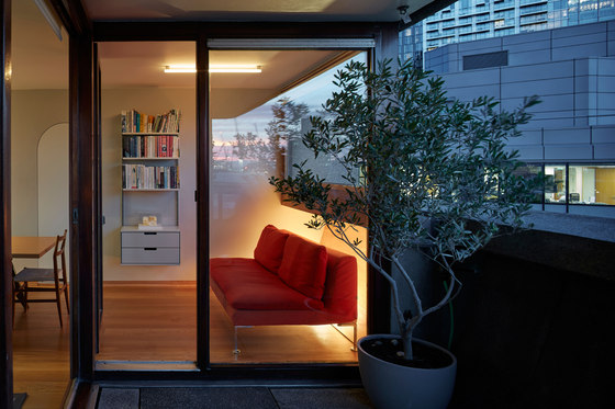
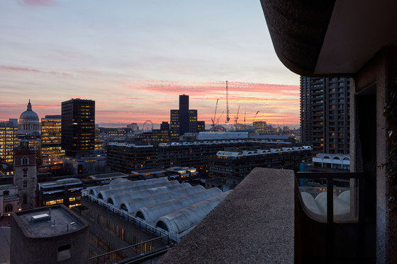
A great respect and affection for the Barbican detailing and the experience and research conducted over 12 years of living in the Grade 2 listed estate was the catalyst for the reconstruction of the historic flat which occupies an 11th floor location with beautiful South West views over London. The forty three year old interior had become tired and the occupants required a set of spaces and precisely organised storage that would respond to ever changing family needs. A focus on clear practical and flexible living were therefore key to this design.
A minimal touch was adopted in the re-planning of the apartment with the
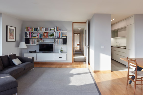
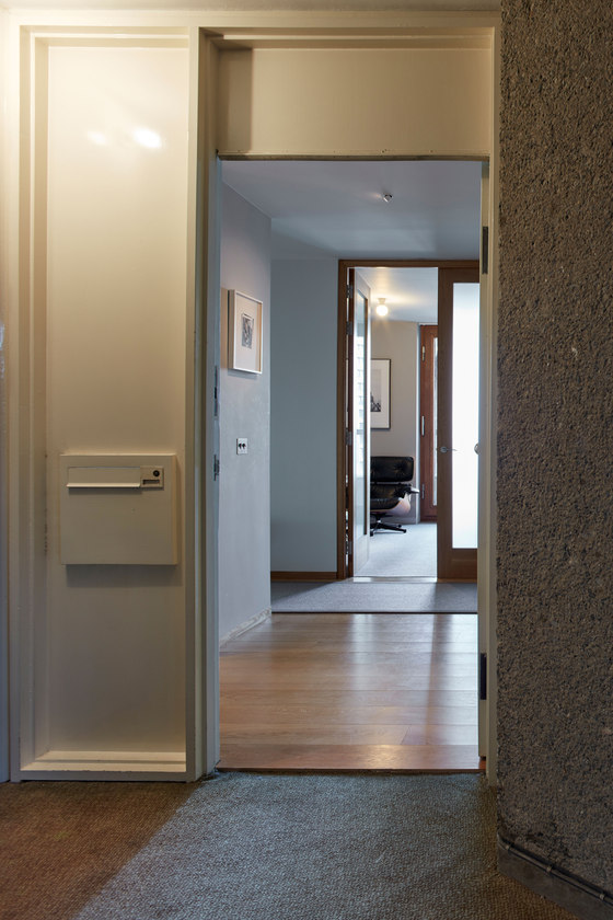
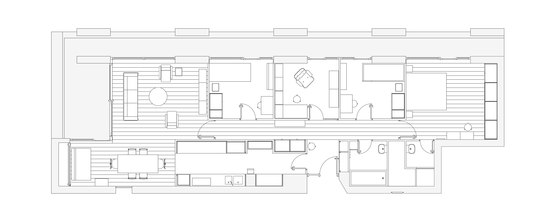
focus on detailed and specific design of the interior cabinets of the storage elements which are incorporated throughout the apartment. Although largely rebuilt the layout of the rooms were altered only with the re-position of two doors where they clashed when open, which was a rare oversight of the original design. A reductive approach to retiring some original elements such as the door between the kitchen and service room was adopted to allow better use of the space, although these decisions were only taken after careful consideration. The small but intimate scheme is neither the sole preservation of the existing details or
a completely new architectural language.
Primary Materials and Detailing
Oak, White Lacquer and Terrazzo
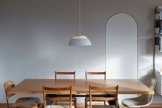
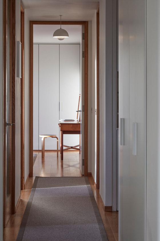
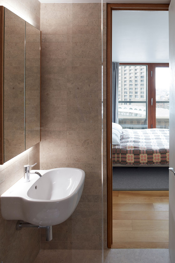
Details, materials and products are consistent in all of the rooms so their design was required to be responsive and articulate to function in various locations. The introduction of an Oak floor provides a catalyst for the revised full height white lacquered doors and the Oak door frame detailing. The door frames are based on the elegant proportions of the original internal shadow-gap but call out the quality found on the external Iroko hardwood windows and doors. The skirting was evolved in timber after a visit to the Aalto house and studio in Helsinki, which was an important reference for the original Architects. The original painted skirting and frames proved problematic to maintain when exposed to the wear and tear of family life, and the exposed Oak finish offer a more resistant and practical long term finish, as well as responding to the new floor material.
The use of white lacquer follows the original painted metal cupboard doors and by using a two pack polyurethane finish the material is used throughout for joinery doors including the kitchen. The 10% sheen give a very clean matt look which contrasts sharply with the painted wall finish. Terrazzo is also used in the kitchen and bathroom as a functional and contextual reference to the use of the material throughout the complex.
Kitchen Design
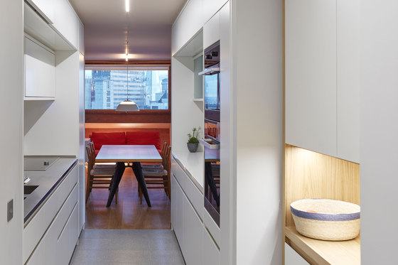
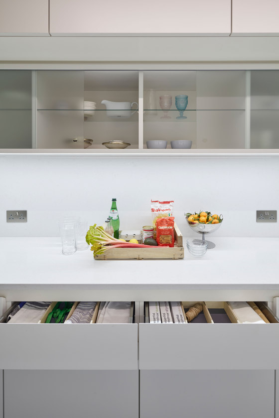
The kitchen has been designed as an evolution of the much loved original Barbican galley kitchen, with every element a bespoke piece down to the texture of the laminate for the cupboard interiors. New interpretations of the recessed kitchen handle details, essential in a galley kitchen, have been evolved as well as the new choice of materials of an extremely practical terrazzo floor, 25mm white lacquered doors, bespoke ABS edged Abet laminate carcass units and a combination of stainless steel and Caesar-stone integrated counters with integrated LED lighting. Intense detailing was carried through to all the drawer and cupboard interiors to ensure the available storage space was maximised. Each drawer and cupboard interior was considered as an individual project with all the required kitchen equipment allocated a storage place using textured drawer matting and 6mm Birch faced plywood dividers and stainless steel drawers with soft closers.
Joinery design
The original steel cupboard design which is common to all bedrooms and the hallway have been replaced to maintain the original design intent, but are delivered in lacquered MDF with integrated lighting and Oak interiors. The handle has been developed as a similar reference to the clutch handles common to the entrance joinery. The interiors of these storage elements have been carefully designed to maximise the available storage allowing the light and open apartment to remain a calm and tranquil oasis for the intensity of city living.
Bathroom
The original 100×100mm white ceramic bathroom tiles have been maintained and complemented with new details such as the continued use of terrazzo flooring. A nod to to CB&Ps original intention to clad the Barbican in Marble, as Aalto did in his Helsinki office building. This is evident in the choice of Italian Limestone for the en-suite shower room, with specially cut 300×75mm tiles fitting within the original module. Likewise the choice of the Arne Jacobsen handle is a personal choice but refers to the Danish Assa originals.
Technical improvements
Through a study of the existing conditions we have targeted various areas where the performance of the original design has been improved. We have taken great care to renovate the external Iroko frames by stripping the varnish that has built up over a long period of time, and replace all the screws and caps with brass slotted heads to match the originals. We have introduced 2 new seals to the rebate and external beading which now offer better protection from the exposed conditions. Likewise we have introduced an insulated strip along the base of the windows to reduce the problems of cold bridging which was evident before. An Epoxy Primer and Moisture Barrier have been used along with an an elastic, sound dampening adhesive to minimise any noise transfer from the timber floor.
Exemplar
The scheme attempts to show a thoughtfulness and direction of how these important interiors can be updated and modernised while still respecting the original architectural character and atmosphere. These new spaces sit happily along side original interiors through a shared knowledge and a close attention to detail.
This is a modern interpretation of a radical language with intense study of the details in a practical, modest and respectful sense.
Quinn Architects
