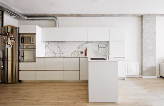
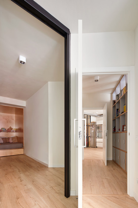
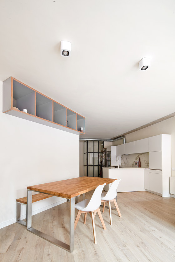
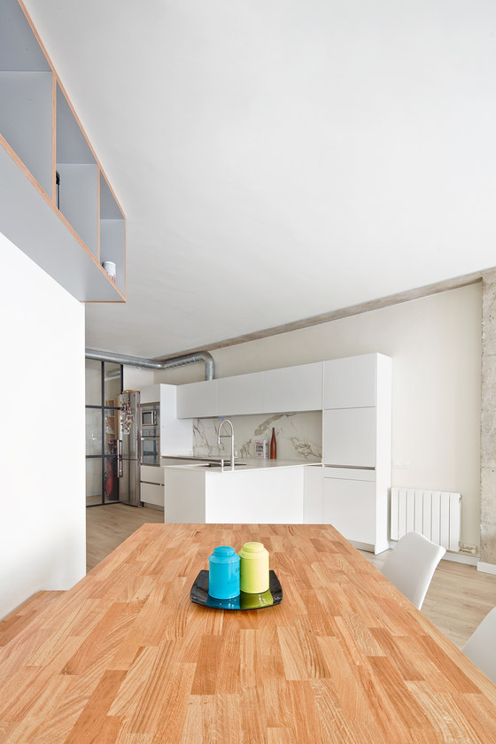
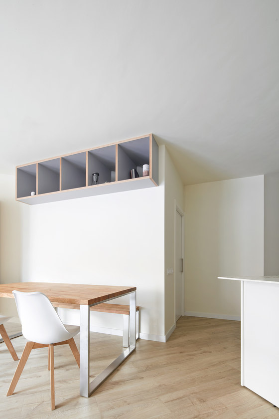
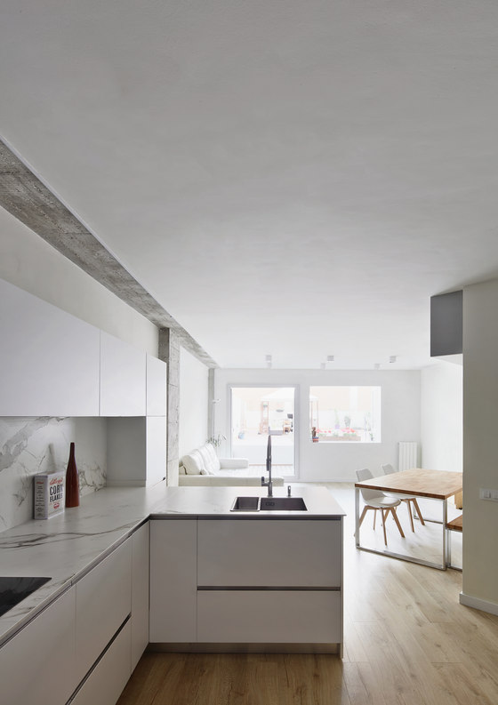
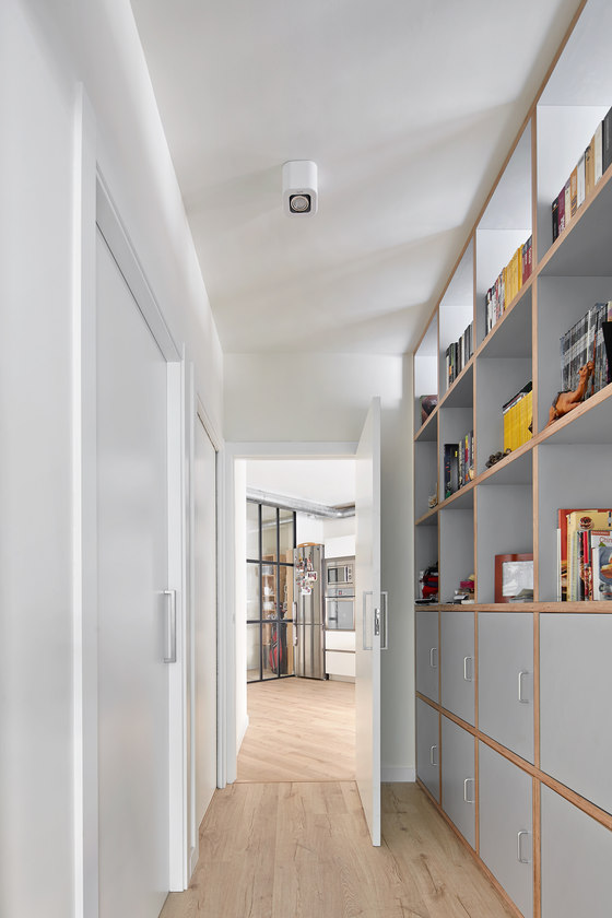
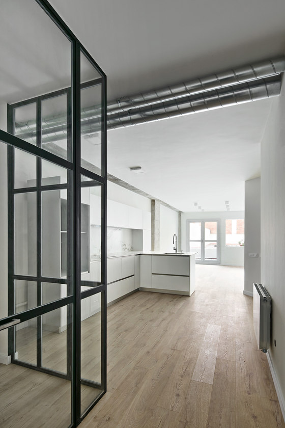
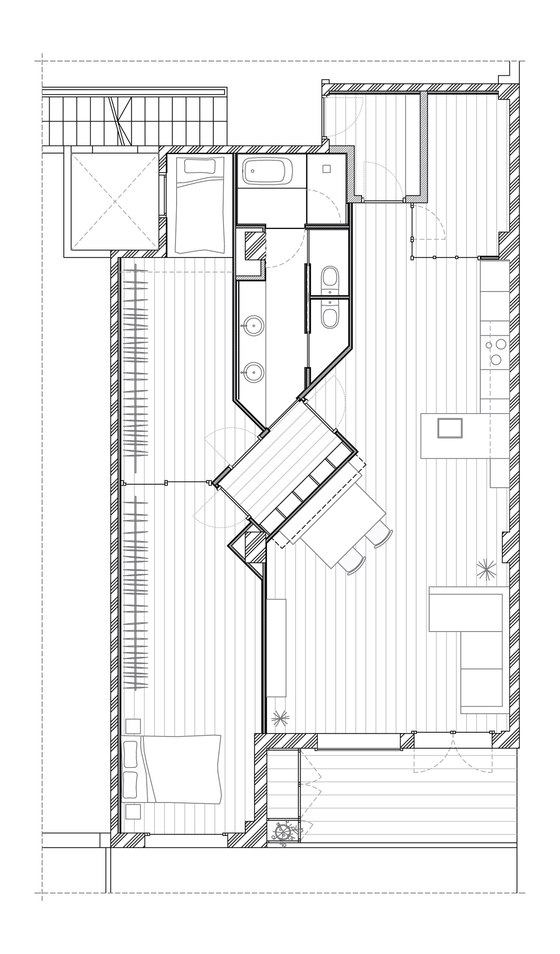
The dwelling is accessed from a vestibule boasting large shelves; after a 90-degree turn, we enter the contiguous kitchen, dining room and living room space, but it is not a space that can be taken in all in one glance: first we see the kitchen - spacious and generous - comprising two Tetris-like arms of various depths and an island setting it apart from the contiguous living room space; exactly at this point the walls turn 45 degrees and insinuates a corridor sliding towards other rooms. Beyond the kitchen island the space expands and embraces the dining room, area which takes advantage of the walls’ inclination to not be visible from the entrance.
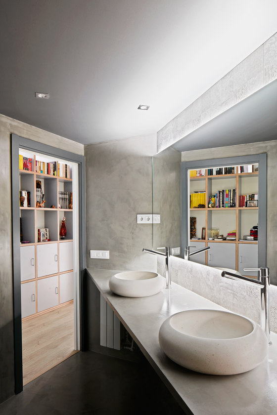
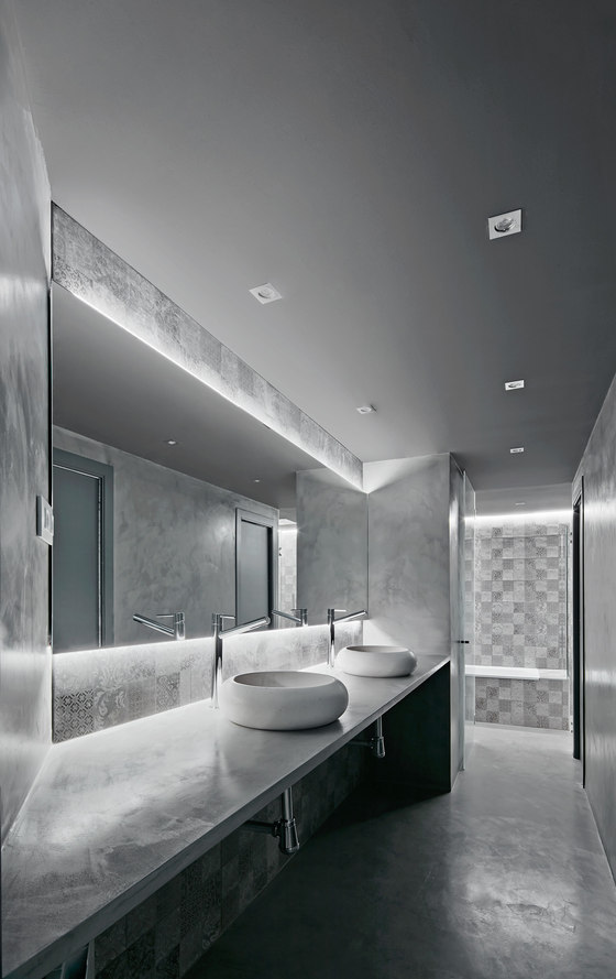
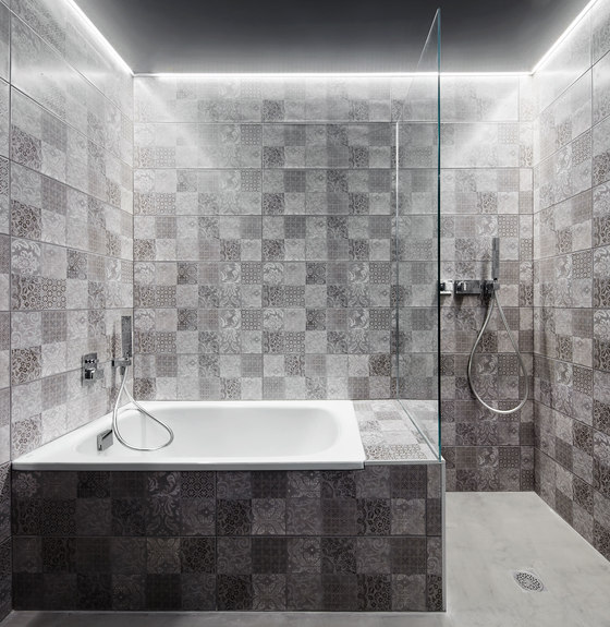
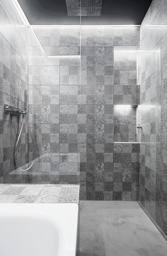
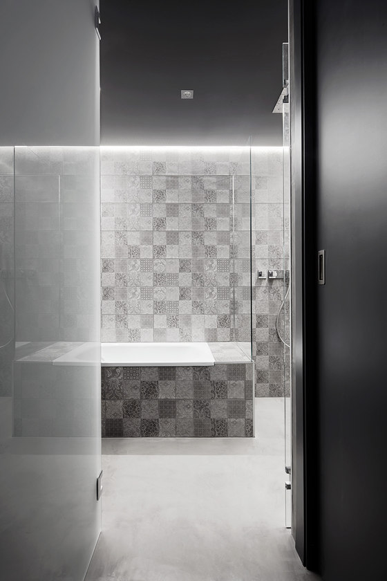
The living room area is also designed in open layout but is likewise protected from view and enjoys a degree of privacy thanks to the spatial geometric play. The bedrooms are located behind a vestibule outlined by the walls’ turn. The vestibule itself is wide and ample, boasting a large, floor-to-ceiling shelf that opens out at the top towards the dining room as a periscope to bring in some natural light intothe space. The vestibule leads to the bathroom, designed as a single room but which is actually three: a large sink area, two separate WC stalls and a bath and shower area. The result is a space which can be used comfortably by several people at the same time.
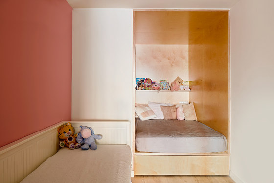
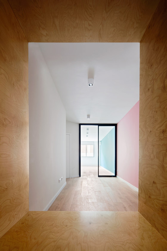
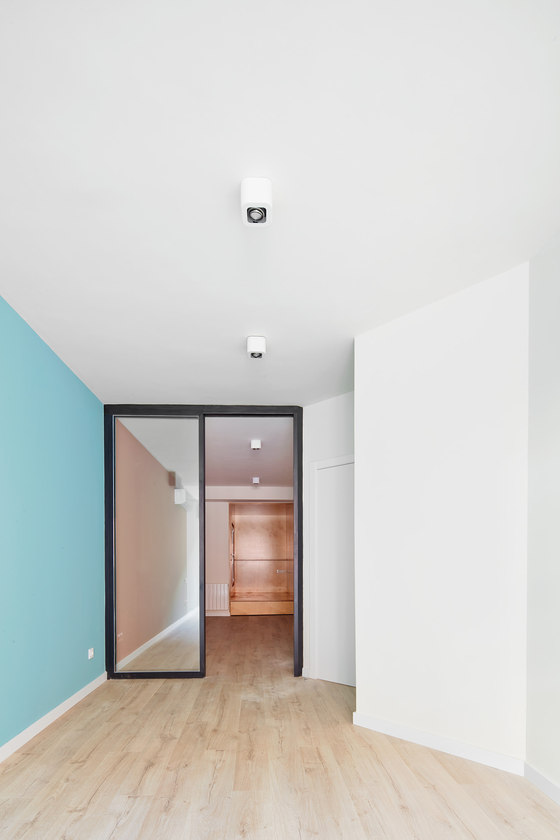
Last but not least, the twolarge and spacious bedrooms are connected by an extensive transparent sliding glass door which opens up so children can play in a single open bedroom and so the light from the outdoor courtyard can reach all the way into the children’s bedroom (which gets light from an insufficient light well); next to the courtyard stands a large bed with storage space underneath built with thick wooden boards.
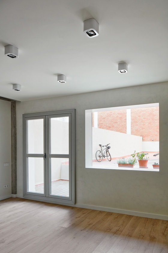
Every last detail of the construction has been given minute attention. The two exits towards the courtyard from the living room have been handled uniquely, with a large showcase window whose frame is visible only from the exteriorfaçade. The impression from indoors is that there is no window, only air, while the door is hung from the inside and with thick frames to give the impression of mass and strength, so that the façade is left with clean gaps, with no built-in frames and coated with white microcement. The bathroom is a dark and shiny world boasting a backlit mirror and ceilings.
The bedrooms are treated with different colours on the wall that connects them, but due to the 45-degree access, upon entering they look like independent rooms. Some concrete pillars and beams have been left visible to underscore the underlying structure and give the room an additional texture. These surfaces have also been used to hide recessed length-wise lighting. Doors were fitted with hidden hinges and ball catches, and handles were replaced with stainless steel knobs. The connection between metal elements always echo the 45-degree-angle pattern, even in the tiniest joins…
Originally this was an office space, a large rectangle connecting to an interior courtyard and with a small window giving out to a tiny light well. Converting it into a dwelling required leveraging a geometric study to ensure the large and open spaces specified by the clients but at the same time implying and suggesting the position of each room without having to segregate them.
RAS Arquitectura
Engineering: Mares Ingenieros
