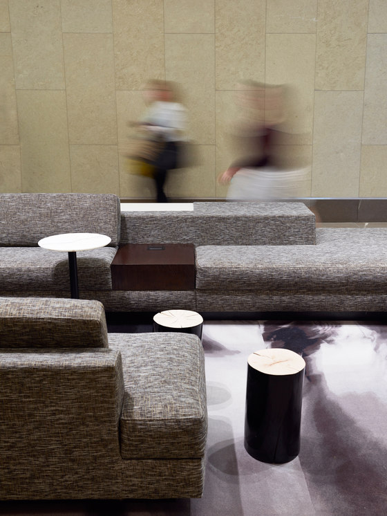
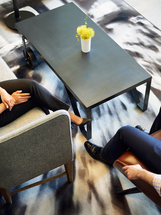
No longer merely pass-through spaces, lobbies have become destinations in their own right; hotelesque settings suitable for impromptu meetings and alternative work places for building tenants. Following the purchase of the 23-story Key Center, the new building owners quickly determined the need to update the common areas of the building which had grown tired since the building’s completion in 2000. To stay competitive in the market for tenants, a redesign of the guest and tenant experience was initiated to entice potential tenants, give existing tenants a reason to stay, and to realign the building within the marketplace.
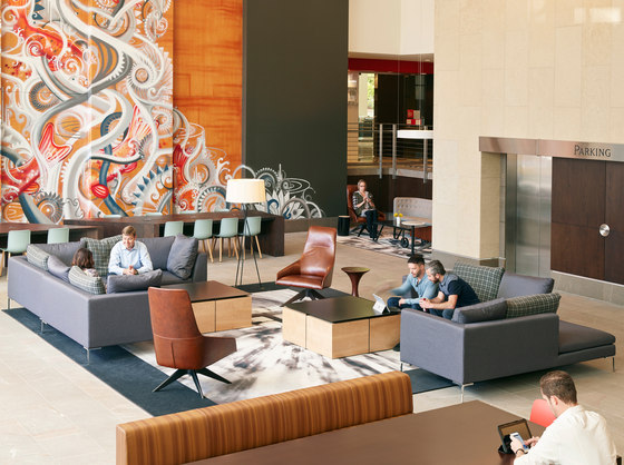
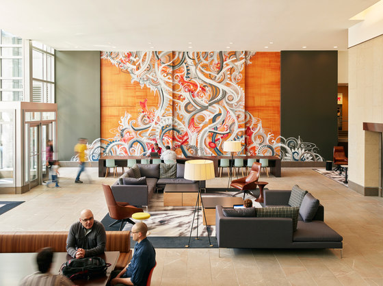
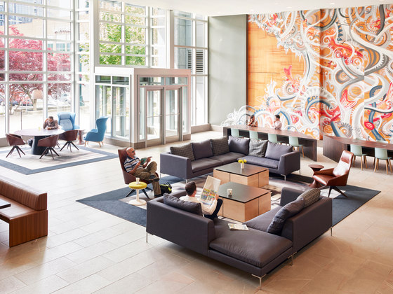
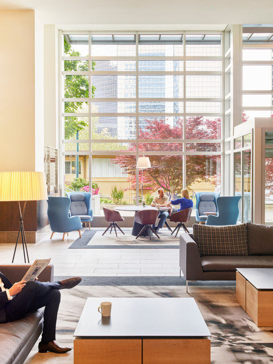
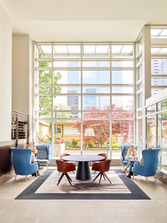
The existing lobby, a sprawling 8,100-square-foot series of contiguous spaces, lacked definition; seating was uncomfortable, and there was little reason to linger any longer than necessary. Transforming the space required reimagining how the space could be used. A survey of building tenants revealed an interest in alternative casual meeting and work spaces. The design solution was to treat the lobby as a series of seven rooms, or stage sets—merging notions of work and hospitality—that were connected through color and seating arrangements. “It was as simple as creating spaces where people actually want to go,” notes Shannon Gaffney, design principal for the project.
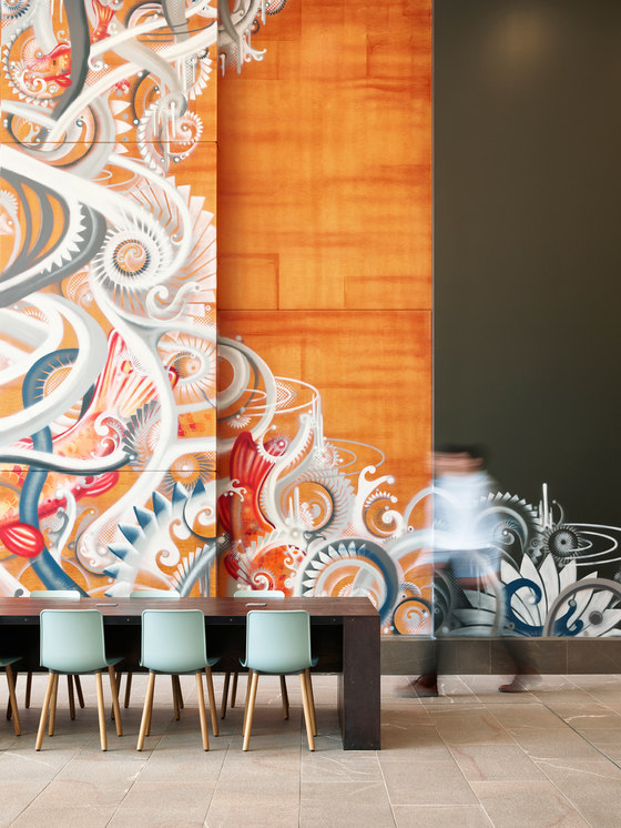
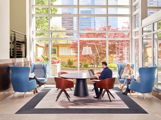
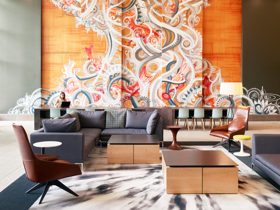
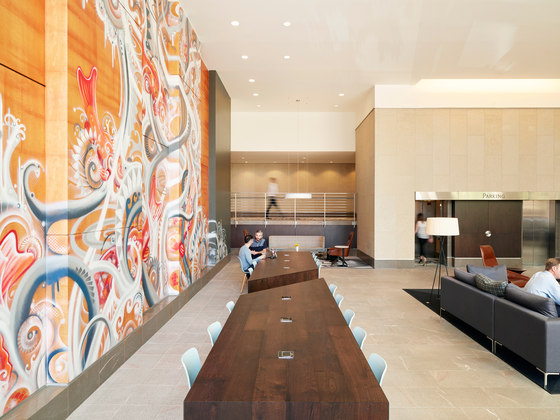
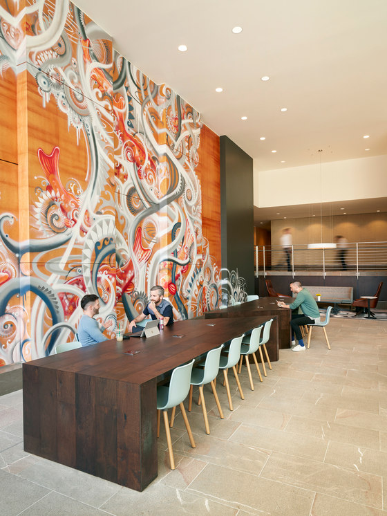
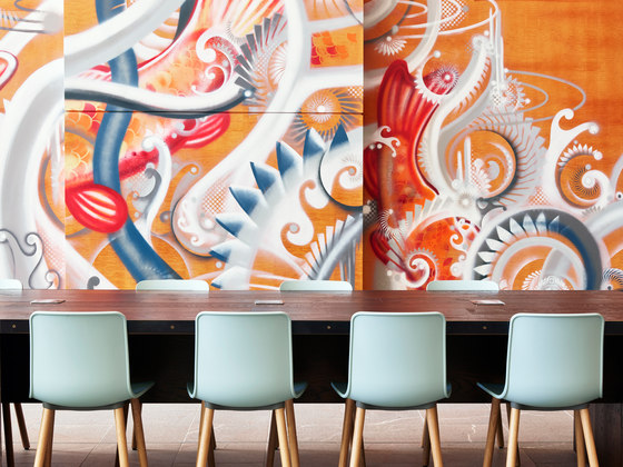
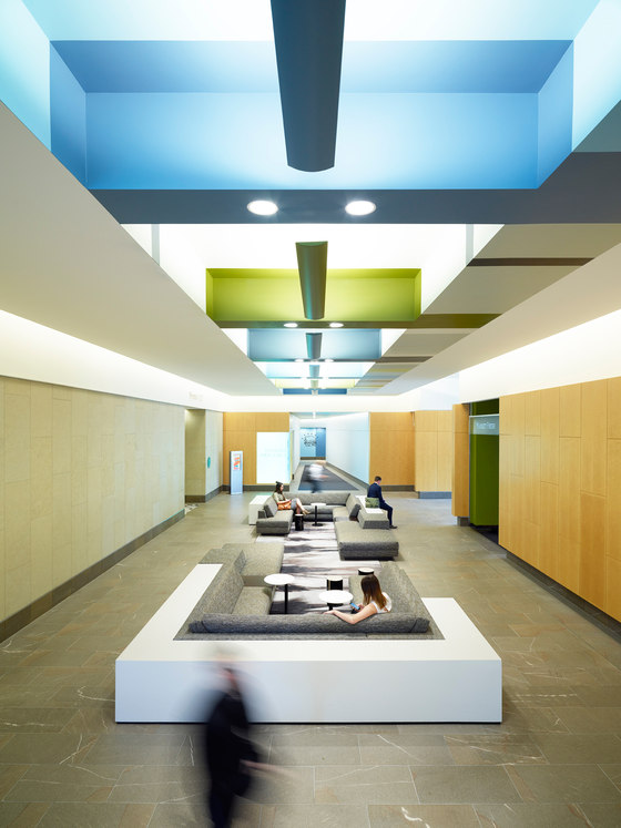
Sitting areas run the gamut between shared spaces similar to those in a library, to grouped seating for informal gatherings. Furnishings support this concept: a long, stained-oak table fitted with outlets and lined with Jasper Morrison shell chairs mirrors an open concept office layout; sectional seating for groups occupies center stage; while comfortable wingback chairs enable small groups to gather in more intimate settings. The area adjacent to the elevator features custom conversation-pit style seating.
Pops of color are found in furnishings and selected interior surfaces. Most notable is the giant “wall tattoo” spray-painted onto an existing wood paneled feature wall. The low-cost effect makes a bold statement and helps to give focus to the lobby. Equally cost-conscious is the James Turrell-inspired ceiling in the elevator corridor, achieved with paint and simple fluorescent fixtures. Color is used to dissolve material surfaces creating an etherial portal to the offices above.
Kilroy Realty Corporation
SkB Architects:
Shannon Gaffney, design principal
Ryan Hitt, project manager
Clint Zehner, interior designer
Jonathan Wakuda Fischer, muralist (wall tattoo)
Birkenstock Lighting Design (lighting)
DCI Engineers (structural engineer)
Northwest Woodworks (woodwork)
HST Construction (general contractor)
