Domestic & General
London, 2022
Projet de
SpaceInvaderMots-clés
Architecture d'intérieur
The brief to SpaceInvader was to adapt and refurbish the workplace to support a new hybrid working approach, with team members spending 2-3 days per week in the office post-pandemic and the rest of the week either WFH (working from home) or remote-working. There was a strong HR focus in the brief, with the new scheme helping retain existing staff, who would feel well-supported - and be equally attractive to new, potential candidates.
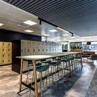
A major driver for the refurbishment was to create reasons for people to want to return to the office. This meant uplifting the facilities both practically and aesthetically, as well as increasing collaboration space and integrating those who might be working remotely. Investment in good collaboration technologies became key. To support the hybrid approach, SpaceInvader appointed an AV specialist early on, so that workspaces could be booked either via an App or a desktop-based booking system. The boundaries of workstations vs alternative work settings were also pushed further, with a generous 1:10 average NIA (net internal area) ratio. The previous 1:1 ratio of desks to full-time employees was also replaced by a new 1:1.6 ratio.
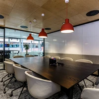
To help develop the collaborative culture outlined in the brief, SpaceInvader created neighbourhood typologies inspired by three concept threads – Societal, Analog and Principle. Societal referred to ‘coming together’, whether for a meeting, event, training or even just lunch. Such spaces would be collaborative with a strong focus on wellbeing; Analog referred to the way the floor is designed, with interchangeable settings. These are agile spaces and can be configured in many different ways; Principle settings, meanwhile, whilst typical in terms of function, were not to be viewed as lesser, but as a solid base upon which to build. These would be designed using classic work settings with a more timeless feel.
Getting the colour scheme right was a priority at the outset. SpaceInvader didn’t want to replicate the brand identity colours too aggressively in a non-retail environment, preferring to celebrate the company identity instead through its values and ethos. The final palette was therefore a new and bespoke creation, employing and blending a colour band of mint, emerald and sea foam green. The palette still loosely refers to Domestic & General’s brand colours, but uses a more subtle and timeless palette, with bolder tones to highlight and accentuate certain areas.
Sarah Dabbs explained that the scheme’s material selection “was influenced by the three neighbourhood concepts, so that materiality became one way to help create a separate identity for each area, whilst common principles also ensured consistency. ‘Societal’ and ‘Principle’ areas feature texture, bold colour, light and pattern, for example, to create visual stimulation and buzz. ‘Analog’ areas, meanwhile, are more understated with subtle pops of colour and bold planting forms. Decorative wallpapers, screens, drapes and voiles were then added to the mix to create interesting textures and layers, without being overwhelming.”
Design Team:
Lead Architect: SpaceInvaderGalerie de projets


