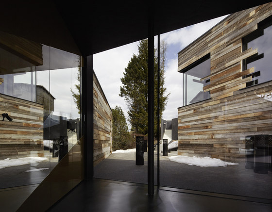
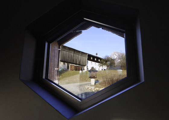
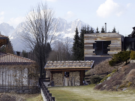
Architecturally, the axis and lines of sight on the Alps were the starting point for the overall planning. To understand this, one must be aware that one could not see a single mountain from the plot.
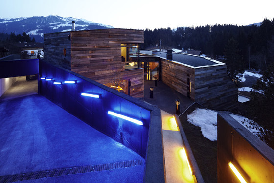
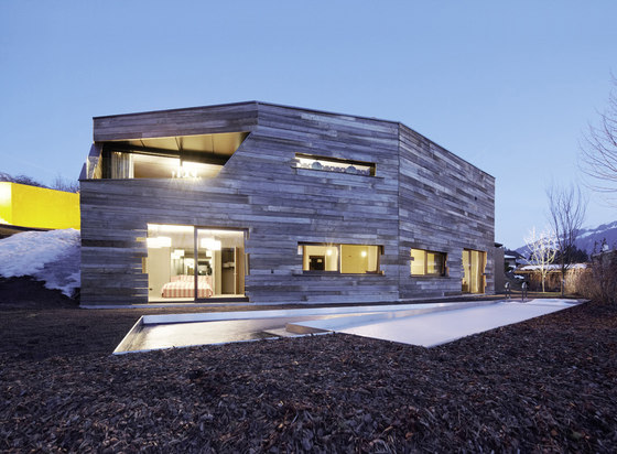
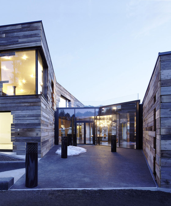
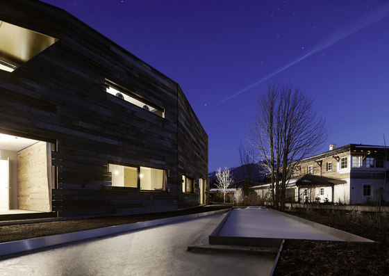
Based on these lines Nina Schmid planned two wings symbolizing two pieces of wood that remind of the wintry Alps. From this idea the central part of the building was developed. The wing in the middle of the house is the heart of the building. It looks like a sparkling, dazzling fire. From this center, the outline structure was further developed. The upper part of the house lies in the east. This bar-shaped component is the residential tract. The sleeping tract is located in the west and lies in the lower part of the property.
To the owners of the house it was particularly important that the house works as perfectly for two people as with many guests.
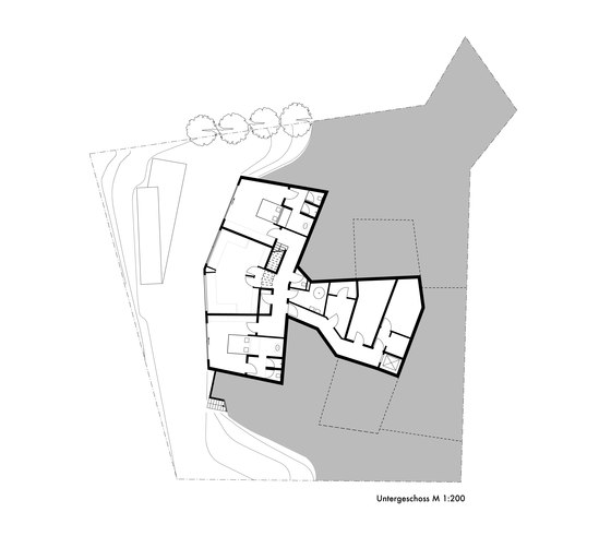
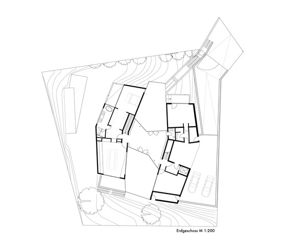
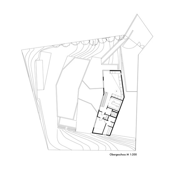
Based on this consideration, the two parts of the building were divided into three levels:
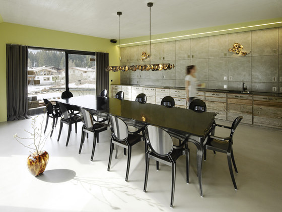
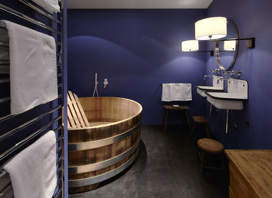
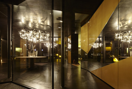
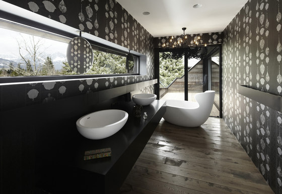
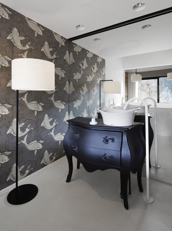
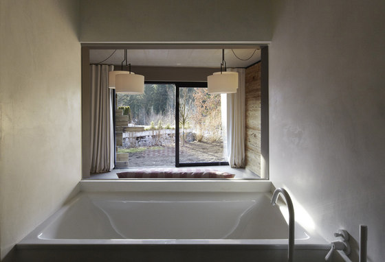
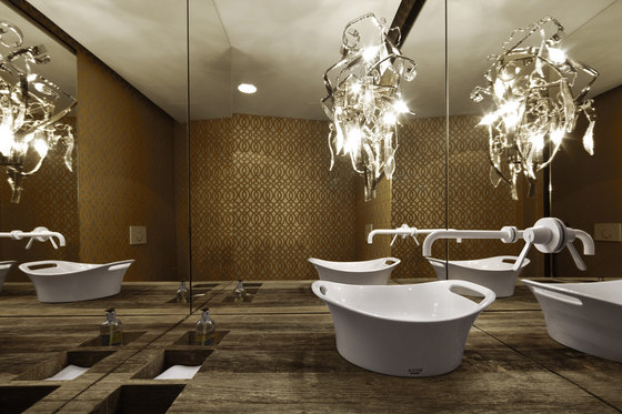
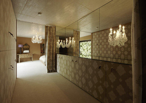
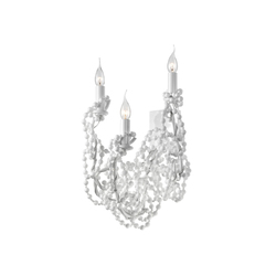
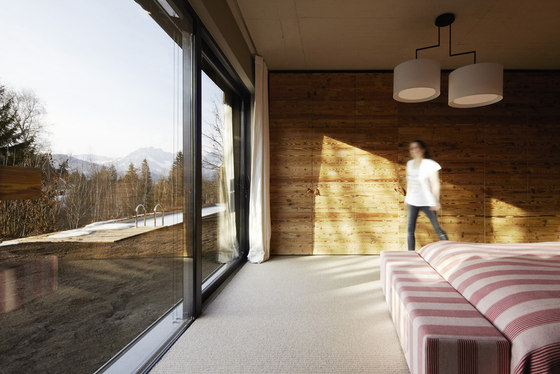
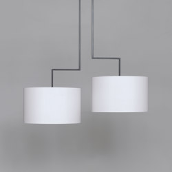
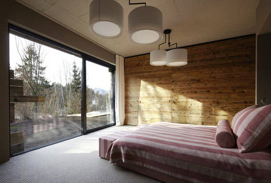
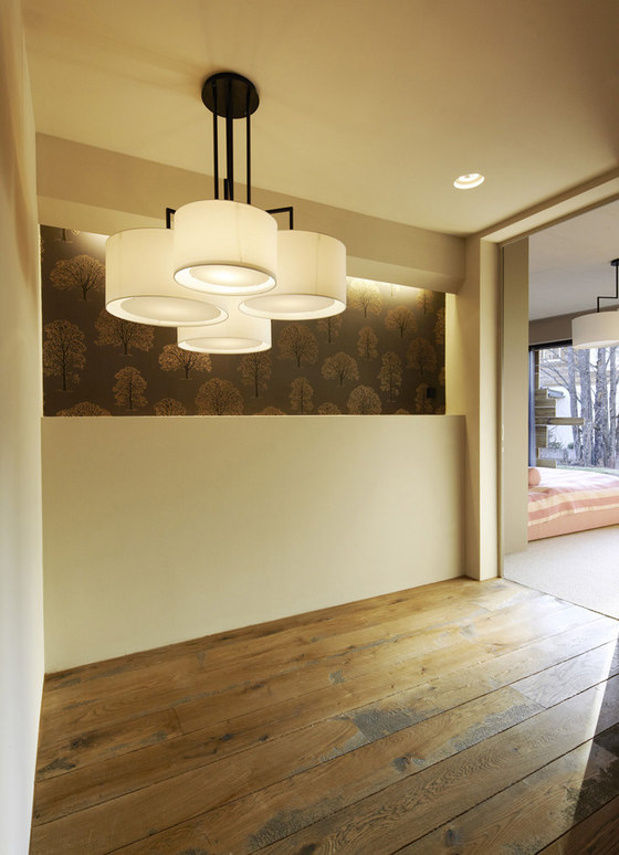
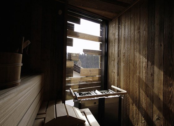
The bottom floor is called the guest floor: in this area the guest bedrooms are located as well as the service area with laundry room, wine cellar, etc. The middle floor is the level with the main entrance, kitchen and dining room, the terraces and the master-tract. On the top floor lies the spacious living room, the library and the spa. This has a reason: these rooms profit most from the wonderful view on the mountains. The comfort and cosiness that can be felt in every room, was created by using warm materials and colours: the oak floor is rough to the touch, there is coloured concrete-floring or goat-hair rugs. Walls are covered with wallpapers that give each room its individual character. Without neglecting the overall concept. Well selected lighting objects seem like all the art needed.
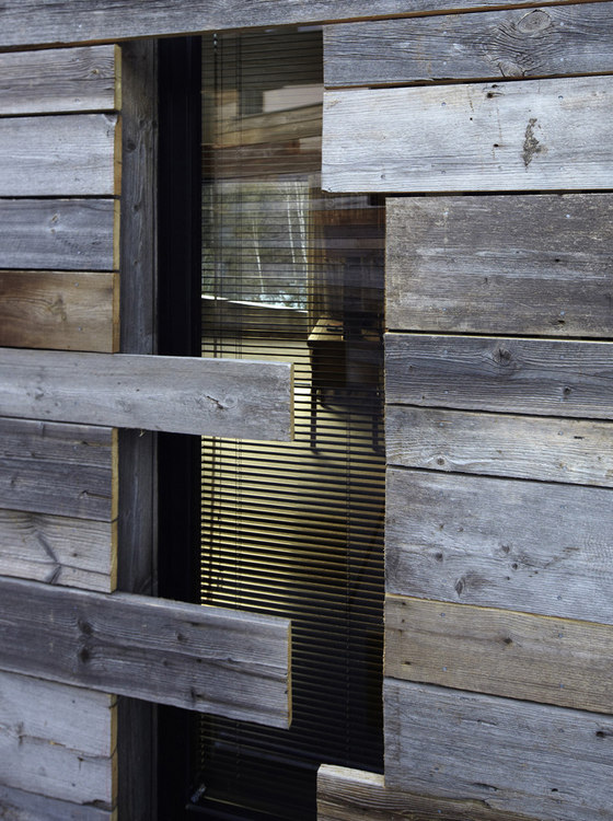
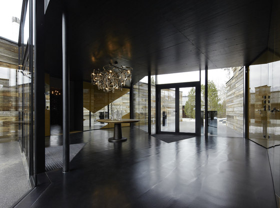
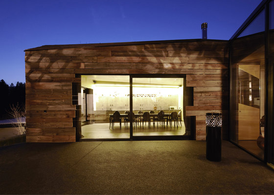
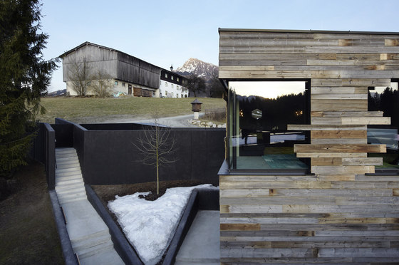
Overall the architectual formulation and detailed implemention is very modern. As a tribute to the traditional Tyrolean architecture Nina Schmid used local materials inside the mansion and for the facade design.
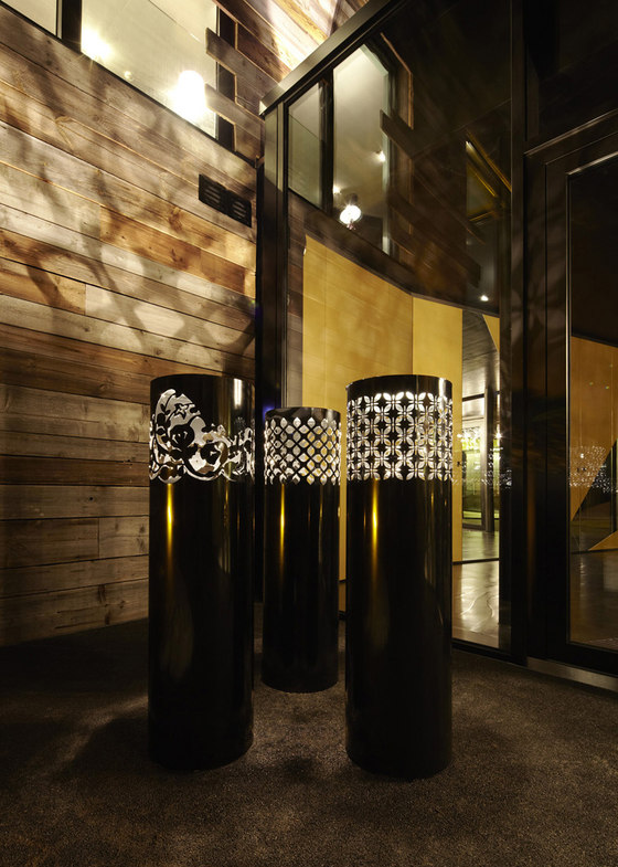
However it sometimes was adventurous to find original, old Tyrolean wood and glass to arrange and structure the facade. All these traditional materials were used in a modern way and combined with contemporary materials and modern processes. Nina Schmid indeed succeeded in creating an exciting symbiosis.
Materials
Outside: Tyrolean wood,glass
Flooring:
Hertog Vloeren, The Netherlands (www.hertogvloeren.com)
Pandomo, Germany (www.pandomo.de)
Limited Edition, Belgium (www.limitededition.be)
Ceilings visible concrete (rough)
Wallpaper:Osborne&Little, England (www.osborneandlittle.com)
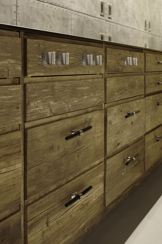
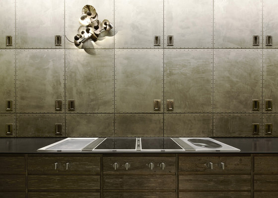
Furniture: kitchen, beds, lounge chairs, sofa, cupboards, etc. were all custom made, designed by splendid architecture.
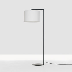
Lighting-planning: splendid-architecture
Lighting objects:
Brand van Egmond, The Netherlands (www.brandvanegmond.nl)
Ochre, England (www.ochre.net)
Zeitraum, Germany (www.zeitraum-moebel.de)
Fireplace: Focus, France (www.focus-creation.com)
splendid architecture GbR


