Photographe : Fernando Guerra

Photographe : Fernando Guerra

Photographe : Fernando Guerra
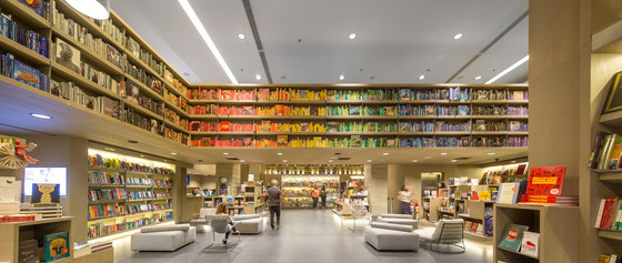
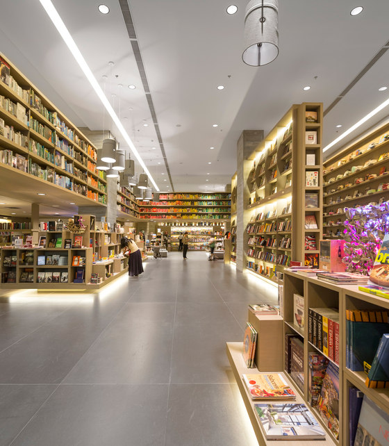
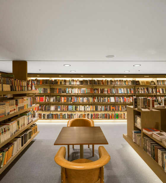
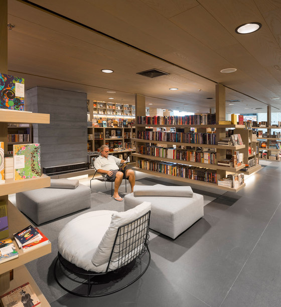
Saraiva Bookstore was conceived as a hybrid between a public square and a library, a place for conviviality, leisure, concentration and rest at the same time. Its architecture is simple and inviting, it aims to disappear behind the books and let the mind wander. A 21st century space, books and new medias share the shelves, demanding a high level of layout flexibility. To organize this myriad of information without creating a monotonous store was as much a challenge as stimulating people to stay, read and interact in a cozy atmosphere.
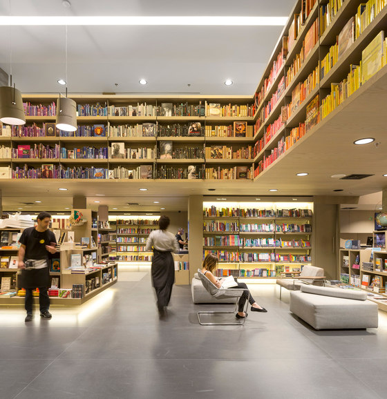
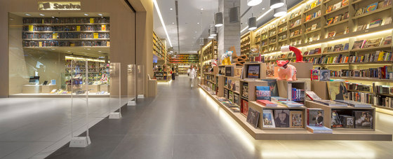
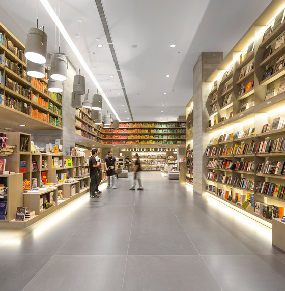
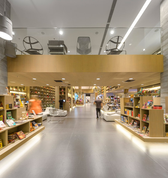
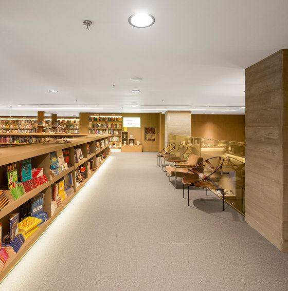
Located inside a mall in Rio, the store is divided into four floors. Visitors enter through a double height space, where shelves and showcases seem to float in order to highlight books and objects. Some shelves are suspended by rails so that the layout can accommodate different configurations. The ceramic floor was specifically developed for this store to be more reflexive and accentuate the lightning effect. Brazilian-walnut was employed in all spaces; it is a warm neutral backdrop for the variety of colors and textures of books and objects.
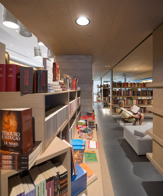
Showcases were designed so a book would not outstand others, inviting visitors to stroll around the diversity of titles. Platforms of different heights are occupied by objects that explore several themes. The shelves closer to the floor have such an inclination that their titles can be read by a standing person.
Armchairs and ottomans are spread throughout the bookstore. Historical Brazilian design items, such as Paulistano Chair by Paulo Mendes da Rocha and Beg Armchair by Sérigio Rodrigues, invite readers to forget about time and enjoy their books.
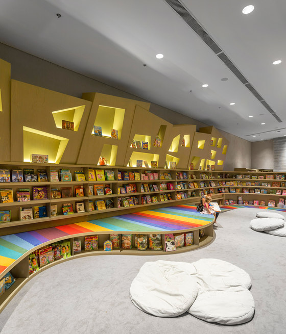
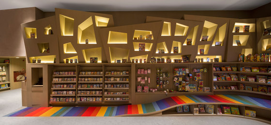
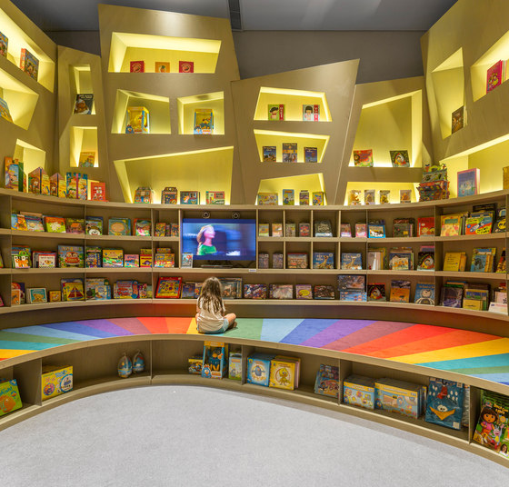
Multimedia spaces, a café, an auditorium and the children’s space are located in the basement floors. Gray tones highlight the electronics contents and organic showcases support interactivity. In the children’s space neutrality is broken with a multicolored ramp that invites the kids to explore the titles rendering the space to their scale. Trapezoidal niches are a playful interpretation of the architectural vocabulary employed in the rest of the bookstore, creating a world apart for the youngsters.
Architects: Studio Arthur Casas
Author: Arthur Casas
Co-authors: Christiane Trolesi, Mônica Nickel, Marcela Muniz e Renata Adoni
Collaborators: André Chung e Christiana Matos.
Contractor: LAR Construtora
Consultants: Studio Serradura (lighting); Akkerman (acoustics); Grau Engenharia (Engineering); Stec (metal structure); Badiá (legal consultancy)
Suppliers: Tresuno (concrete); Levantina (ceramics); StantShop (racks); Mr. Cryll (concrete painting); Montele (wheelchair lift); Atlas (elevator and escalators); Redsplay (millwork); Casa Fortaleza (carpets); Flex tintas (painting)
Interior design: Dpot (Beto, Flávio de Carvalho and Beg armchairs); Futon e Company (Paulistano chair with metal mesh); Carbono Design (C26. C210 armchairs and ottomans); Fort Corporstivo (carpets); Lumini (Fork Lamp); Estudio Xingu (display objects); Herança Cultural (tables)

Photographe : Fernando Guerra

Photographe : Fernando Guerra

Photographe : Fernando Guerra

Photographe : Fernando Guerra

Photographe : Fernando Guerra

Photographe : Fernando Guerra

Photographe : Fernando Guerra

Photographe : Fernando Guerra

Photographe : Fernando Guerra

Photographe : Fernando Guerra
