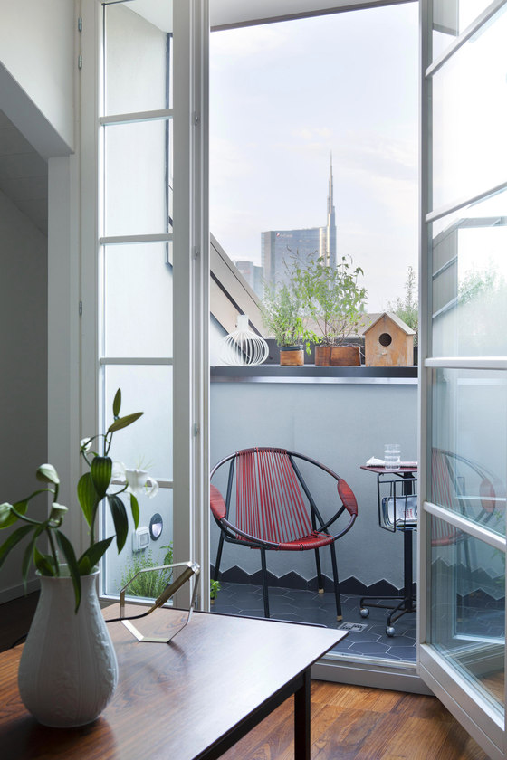
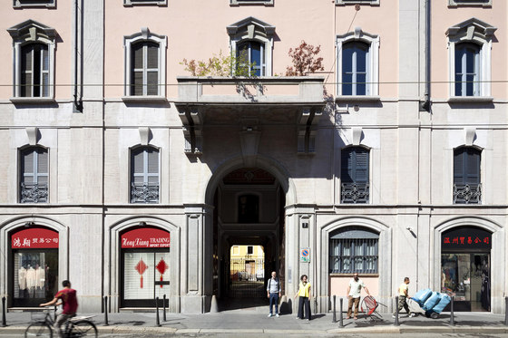
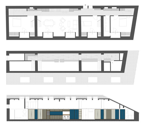
Casa Moscova is a volume with rectangular plan, placed on the fifth and top floor of a nineteenth century building, situated in a street corridor connecting the ‘garden’ of the city of Milan, the Sempione Park, to "Chinatown", whose pronunciation perfectly alludes today to that cosmopolitan quality of big and small cities. The longitudinal development of the plan measures 5x20 m: the elongated west side adjoins to a symmetrical apartment, presenting thus no openings, while towards east wide roof openings offer a broad view onto the skyline of Porta Garibaldi. The structure is of masonry and the thick partition walls of pressed bricks of which it consists divide the space in four communicating areas, connected towards west by a series of aligned openings that offer a full visual lengthwise from one end to the other. On top of the one sided pitched wooden roof, a row of skylights delivers a significant amount of light towards the ‘blind’ side of the house.
The client is a young couple with two children who decides to return to live in Italy after many years abroad. The request consists of three bedrooms, two bathrooms, a laundry room, a living room with adjoining kitchen, a reading area and a study for the children.
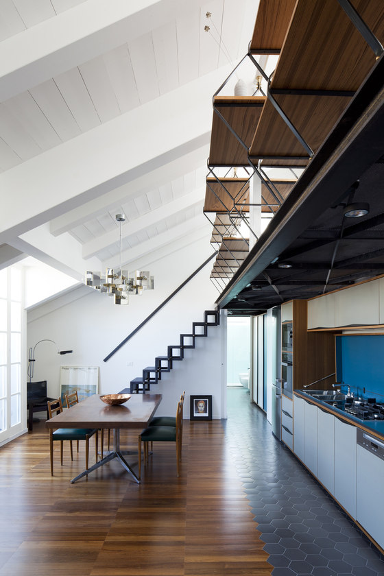
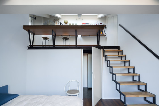
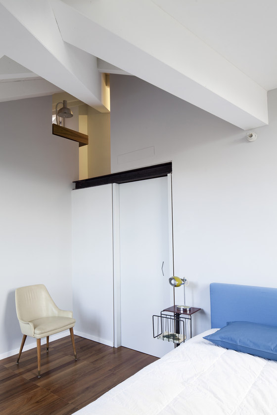
The program foresees to keep and emphasize the longitudinal axis as the funtional and distributive solution to the project. The addition of a mezzanine on top of the axis strengthens the program and, together with a staircase system (one for each room), allows a fluid circulation: from each room it is possible to reach any part of the house, on both levels. A system of sliding doors designed to measure allows to separate, if required, individual areas thus allowing the desired degree of privacy.
The ‘telescope’ organization of ancient palaces, with their sequences of rooms, allined doors and circular connection of all areas is here reintrerpreted and rotated on the vertical plane.
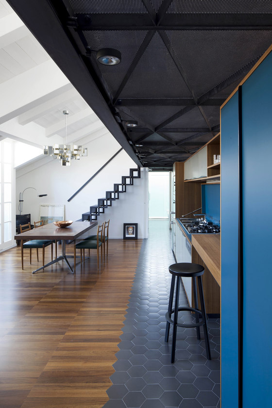
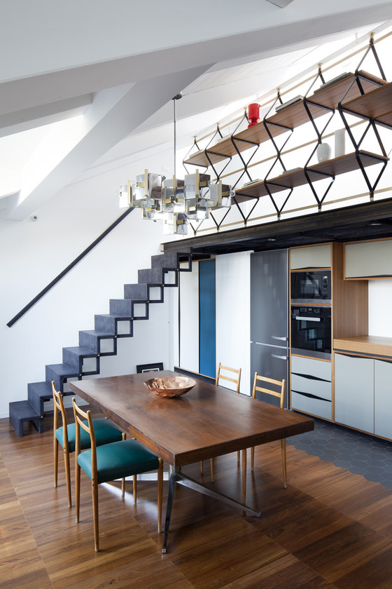
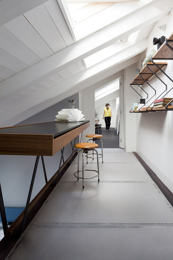
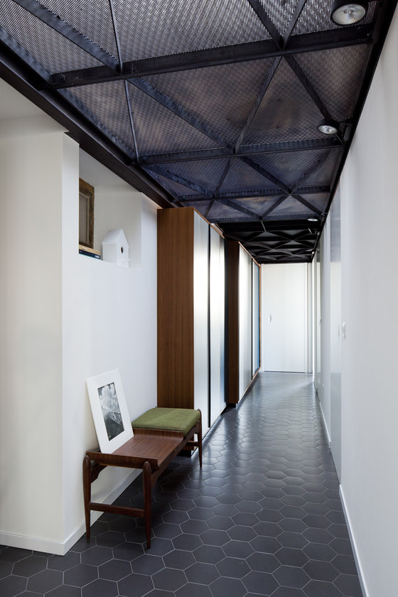
The longitudinal axis acts moreover as an ‘equipped corridor’ hosting a system of wardrobes, the kitchen overlooking the living area, walk-in closets and the cabinets/desks on the upper level.
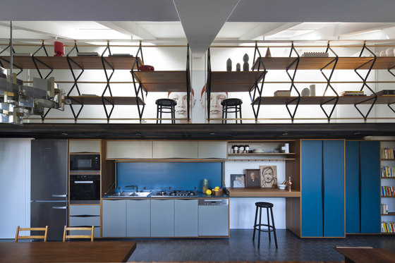
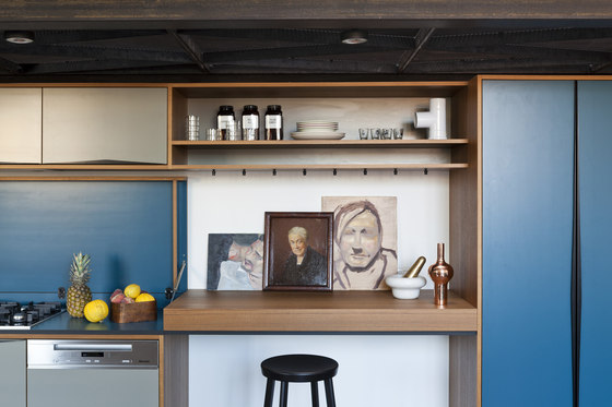
The cabinets of the equipped corridor and the kitchen are made of teak, the edge of which is visible from the front, while the shutters are covered in formica. The handles, designed and made to measure, are realized in galvanized steel, cut, folded and painted. The kitchen overlooks the living area and features a folding teak shelf that reveals internally the fires and the
The interior of the shelf is covered in formica of the same blue of the cabinets. In order to free up all the space within the rooms, closets and drawers have also been designed to measure and placed near the lowest points of the ceiling.
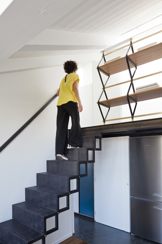
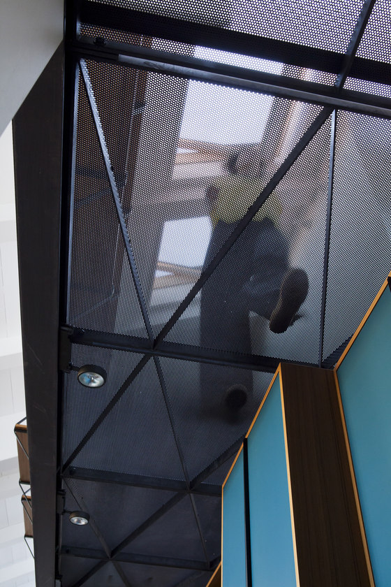
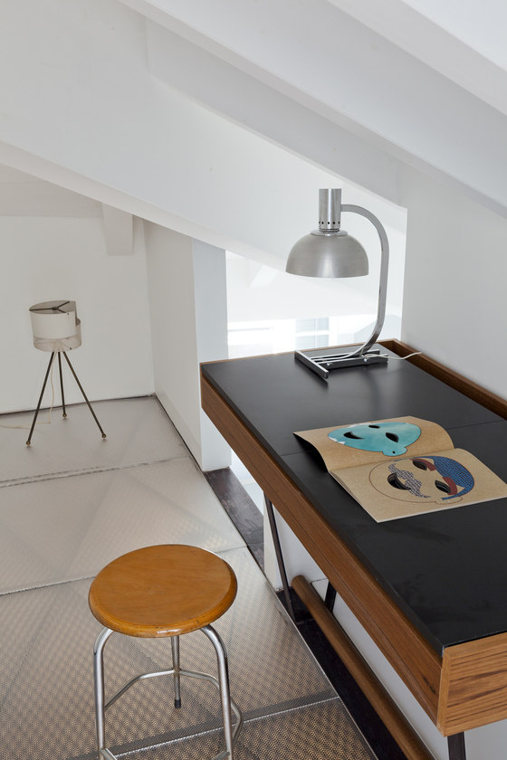
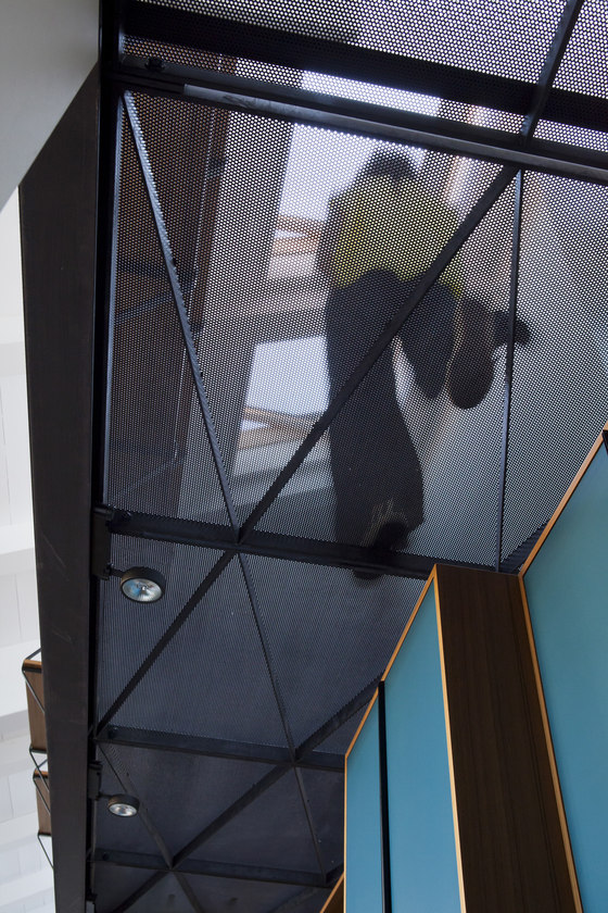
The micro-perforated sheet metal allows natural light coming from the skylights to thus reach the lower level as, similarly, underlying artificial light delivers back to the upper level the geometries of the mezzanine. On the bedrooms, in order to ensure an adequate acoustic insulation, polycarbonate printed panels are applied on top of the metal sheets.
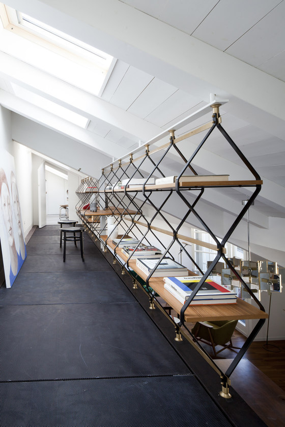
The design of the mezzanine combines the structural aspect with the purely compositive one. A perimetral ring constituted by a HEB iron beam is the bearing structure which carries, as secundary elemets, pre-drilled metal brackets. To these individual walkable panels are bolted, consisting of a structural frame onto which the three millimeters thick microperforated sheets are superimposed. The assembly sequence of the panels overall responds to a rhomboidal geometry.
There are three staircases connecting to the mezzanine: one in the living and two in the bedrooms; for the last room, because of the two sided pitched roof and the reduced height, a pole was designed as a playful vertical connection. The design of the stairs is inspired by the pantograph ones, as intended originally. According to different environments the tread material changes: micro-perforated metal sheets in the living to ensure maximum transparency and oak wood in the bedrooms, more comfortable material.
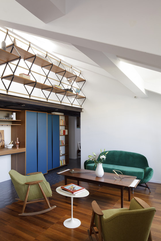
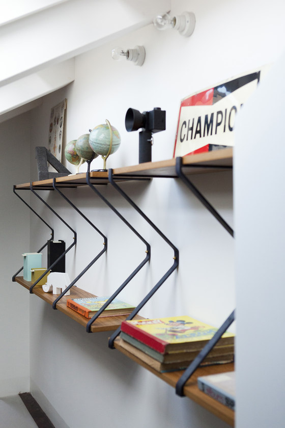
In the living area a large bookcase, partially usable as desk, is an original piece of the designer Pietro Russo: the pantograph-like bookcase ‘Romboidale’ made of iron wood and brass, which he specially adapted to fulfill here the new, yet dual, function of equipped parapet. The collaboration with Pietro has been an occasion for exchange and dialogue on solutions, a fundamental aspect of a project that we like to call one of craftsmanship.
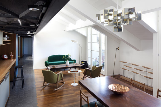
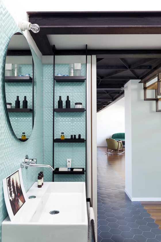
The choice of finishing materials accentuates once again the longitudinal axis: ceramic tiles of hexagonal shape, more durable and better suited for uses as kitchen, bathroom and laundry, run along the corridor and blend inlay-like with the teak floors of the bedrooms and the living. The teak slats are mounted in line to form wide longitudinal bands. The ceramic tiles covering the bathrooms, of an aquamarine color, present on the surface diamond-shaped reliefs which, in their simplicity, confer a vibrant light to the walls. Almost all the furniture of the house, including kitchen, closets, bathrooms fittings, is designed to measure, as well as doors and handles.
studio GUM
Valentina Giampiccolo
Giuseppe Minaldi
Consuelo Rosso, Pietro Russo, Marco Scebb
